Declarations and values
Accepted class forms, native value parsing, units, importance and fixed utilities.
On this page
A class starts with a registered utility or a native declaration, followed by optional selectors, conditions and importance. This page defines those declaration forms, value parsing and rejection rules. For a worked introduction, use the Syntax tutorial; for native property meanings, use the CSS reference.
The named forms below assume the default preset is loaded through @import '@master/css'. Project definitions can add or replace utilities. Native declarations do not require a registered utility.
Accepted forms
| Form | Example | Meaning |
|---|---|---|
| Static utility | flex | A registered name; here, display: flex |
| Token utility | p-md | A registered prefix and token key; here, padding: var(--spacing-md) |
| Functional utility | p(12) | A registered function with arguments; here, padding: calc(12 * 1px) |
| Native declaration | (padding:1rem) | One full CSS property and value |
These are syntax shapes, not interchangeable spellings. Static, token and functional utilities can each contain several declarations: truncate, text-sm and grid-cols(2) are recipes. A native head contains exactly one declaration, which may use a CSS shorthand.
Generated CSS
@layer theme { :root, :host { --spacing-md: 1rem }}@layer utilities { .flex { display: flex } .p-md { padding: var(--spacing-md) } .p\(12\) { padding: calc(12 * 1px) } .\(padding\:1rem\) { padding: 1rem }}Every form accepts suffixes. In p(12):hover@sm!, the head is p(12), :hover is the selector, @sm is the condition and ! marks importance. A suffix affects its own class only. Selectors and Conditions own their complete contracts.
Native declarations
Write (property:value) using the full property name. Master CSS reads the balanced head before parsing suffixes. A colon after a bare name starts a selector: flex:hover selects the registered flex utility; display:block is not an alternative to (display:block).
The closing boundary
Strings, comments, escapes, nested parentheses and brackets, and unquoted url() tokens follow CSS component-value boundaries. A ) inside a quoted string does not close the head:
<span class="(content:')')::before"></span>A quoted parenthesis stays inside the value
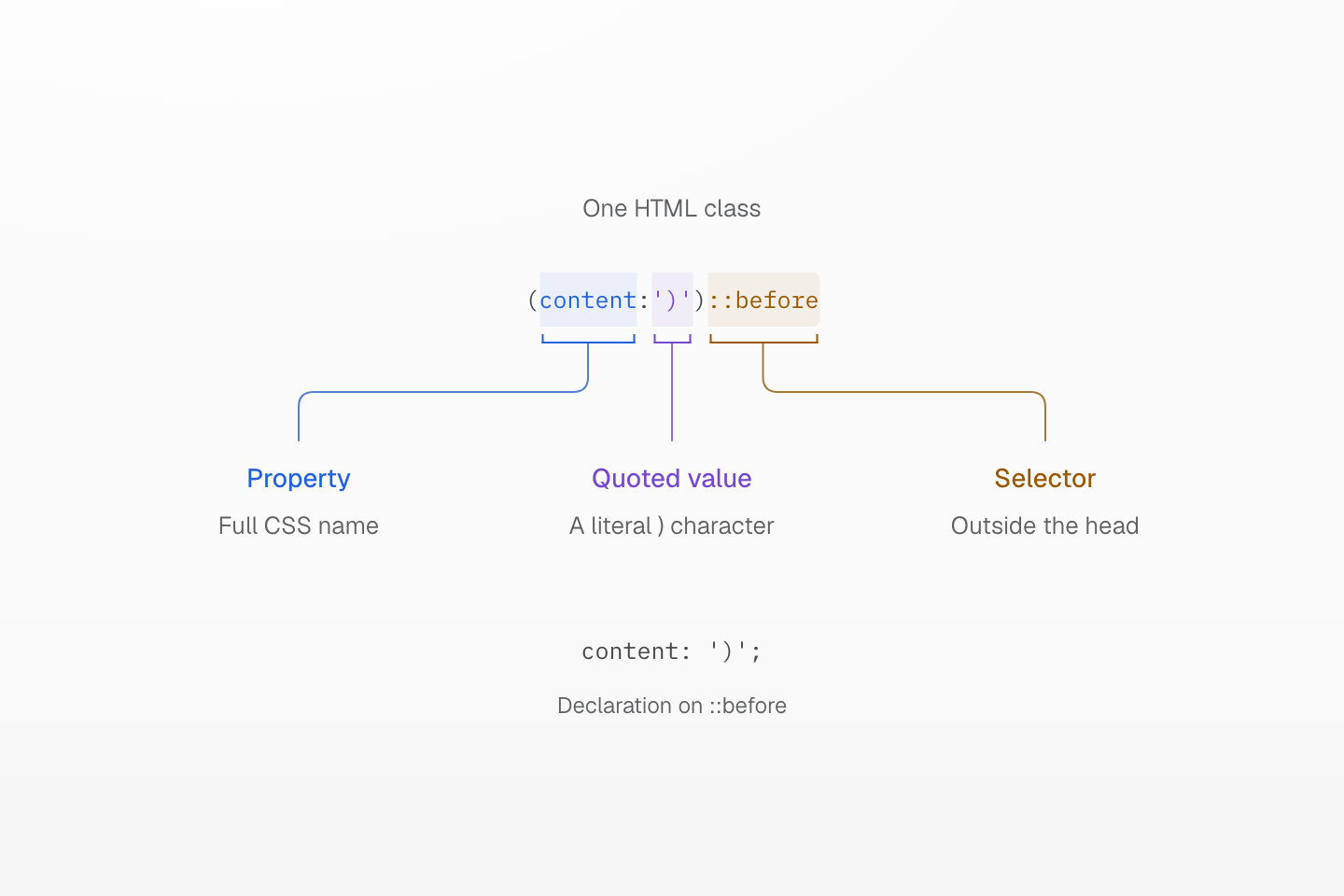
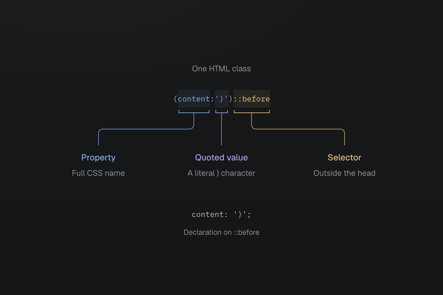
The first closing parenthesis is quoted value text. The next one closes the declaration; ::before begins outside it.
Text description
- In (content:')')::before, content is the property and ')' is its quoted value.
- The ) inside the string is preserved. The next ) closes the native declaration head.
- The ::before suffix targets the pseudo-element. Its generated declaration is content: ')';.
Other CSS constructs keep their own boundaries inside the head:
| Class | Value boundary |
|---|---|
(width:calc(1px+(2px*3))) | Nested parentheses belong to the calculation |
(grid-template-columns:[start]|1fr|[end]) | Brackets enclose grid line names |
(background-image:url(/ | The brace belongs to the unquoted URL token |
Generated CSS
@layer utilities { .\(background-image\:url\(\/a\{b\.svg\)\) { background-image:url(/a{b.svg) } .\(grid-template-columns\:\[start\]\|1fr\|\[end\]\) { grid-template-columns: [start] 1fr [end] } .\(width\:calc\(1px\+\(2px\*3\)\)\) { width: calc(1px + (2px * 3)) } .\(content\:\'\)\'\)\:\:before::before { content: ')' }}CSS escaping still applies inside a value. For an unquoted URL containing parentheses, use a quoted URL or CSS escapes so the token remains valid.
Invalid heads
A malformed head generates no rule; it is not retried as a utility or a different class form.
| Rejected class | Reason |
|---|---|
(display:block | Missing closing parenthesis |
(color:red)(display:block) | Two heads in one class |
(color:red;display:block) | More than one declaration |
(display:block;) | A top-level semicolon, even at the end |
(width:calc(1px]) | Mismatched delimiters |
(width:) | Empty value for an ordinary property |
(color:{red}) | A brace block as an ordinary property value |
(width:calc(((…1px…)))) nested 65 levels | Brackets nested more than 64 levels deep |
A custom property may have an empty value or a balanced brace block: (--slot:) and (--state:{open}) are accepted. (--slot:!important) is an empty important custom property, while (width:!important) is invalid.
Emission and browser validity
A syntactically valid property name can emit a declaration even when tooling does not list it. Native values are not limited to the preset, but they must still be valid for the property in the target browser. For example, (font-size:48) emits font-size: 48; it does not acquire px, and that nonzero unitless length is invalid CSS. Use (font-size:48px) for that length. A native property such as (field-sizing:content) needs no utility registration.
Generated CSS
@layer utilities { .\(field-sizing\:content\) { field-sizing: content } .\(font-size\:48px\) { font-size: 48px }}Master CSS emits selected compatibility declarations, such as -webkit-backdrop-filter beside backdrop-filter. It does not add vendor-specific selectors or polyfill browser features. Inspect the generated CSS and use Compatibility for browser requirements and fallback design.
Generated CSS
@layer utilities { .\(backdrop-filter\:blur\(16px\)\) { -webkit-backdrop-filter: blur(16px); backdrop-filter: blur(16px) } .\(background-color\:\#000\)\:\:-webkit-scrollbar::-webkit-scrollbar { background-color: #000 }}Value encoding
Spaces, strings and underscores
HTML whitespace separates classes, even when the value contains CSS quotes. Within a class value, an unquoted | encodes a space. Inside a quoted string, the pipe remains literal. Keep CSS punctuation such as commas and slashes in place.
<div class="(color:rgb(30|60|90/80%)) (content:'a|b')::before"></div>Generated CSS
@layer utilities { .\(animation-name\:slide_in\) { animation-name: slide_in } .\(color\:rgb\(30\|60\|90\/80\%\)\) { color: rgb(30 60 90/80%) } .\(color\:red\)_a a { color: red } .\(content\:\'a\|b\'\)\:\:before::before { content: 'a|b' }}The color value becomes rgb(30 60 90 / 80%); the content string stays 'a|b'. For an actual space in a CSS string, use a CSS escape such as \000020: (content:'New\000020collection')::before produces “New collection”. The six-digit escape avoids a terminating space in the HTML class.
An underscore inside the native head is literal, as in slide_in. After the head closes, _ starts a descendant selector: (color:red)_a targets descendant links. Registered utility names cannot contain _; a token key containing it can still be referenced through var(--name).
Functions and explicit variables
CSS functions remain values of the native property. Master CSS normalizes arithmetic spacing in calc(100%-2rem), through at most 64 levels of nested parentheses and chained subtractions such as 1px-2px-3px, and leaves anything deeper as written; the browser evaluates the calculation. It does not infer a token from a bare word or evaluate a CSS function as a utility call.
Generated CSS
@layer theme { :root, :host { --color-red-60: oklch(60.94% .2501 29.2) } :root, :host { --color-red: var(--color-red-60) }}@layer utilities { .\(color\:var\(--color-red\)\) { color: var(--color-red) } .\(width\:calc\(100\%-2rem\)\) { width: calc(100% - 2rem) } .\(width\:calc\(100\%-var\(--spacing-md\)\)\) { width: calc(100%-var(--spacing-md)) }}Native color values retain their meaning: (color:red), (color:#175fe9) and (color:rgb(23,95,233)) all supply CSS values. fg-red instead selects a theme token. A var() reference is explicit; (font-family:mono) names the CSS family mono, not --font-mono. See Variables and modes for token resolution, modes and derived values.
Numbers and units
Native declarations preserve units. They do not convert rem to pixels or infer a unit from the property. Leading zeros on decimals are optional: (opacity:.5) and (opacity:0.5) supply the same numeric value.
| Native value | Interpretation |
|---|---|
(margin:1rem) | Length relative to the root font size |
(width:50%) | Percentage resolved in the property's context |
(rotate:30deg) | Explicit angle |
(animation-duration:200ms) | Explicit time; .2s expresses the same duration |
(opacity:.5) | Unitless number |
(background-image:image-set(url(a.png)|1x,url(b.png)|2x)) | Native image resolution in dots per CSS pixel |
Whether a property accepts a number, length, percentage or other type is a CSS values and units rule. p(12) is different: the preset function explicitly multiplies its argument by 1px.
Negative values
Native negatives stay inside the value: (margin-top:-2rem). Direct numeric arguments use mt(-8). Negative token classes put - before the complete class: -mt-sm. The negative-token form requires a numeric token and a supporting utility; -p-sm is rejected because padding does not support it.
Generated CSS
@layer theme { :root, :host { --spacing-sm: .75rem }}@layer utilities { .-mt-sm { margin-top: calc(var(--spacing-sm) * -1) } .mt\(-8\) { margin-top: calc(-8 * 1px) } .\(margin-top\:-2rem\) { margin-top: -2rem }}Argument validation does not redefine the CSS property’s value constraints.
Registered utilities
Token names
Token prefixes are registered by utility definitions, not inferred from property abbreviations. p-md reads --spacing-md; fg-red and bg-red both read --color-red but set different properties. There is no automatic full-property equivalent such as padding-md, and no implicit numeric scale such as p-4: that key must exist in the selected namespace.
A static name wins over a same-spelled token class. For example, w-full remains width: 100% even if the project defines --container-full; pill remains a fully rounded radius even if --radius-pill exists. A static utility and a function with the same name register independently.
Use the token family index for complete prefix-to-namespace mappings, and utility definitions for registration and replacement rules. Theme tokens owns the workflow for defining and scoping project values.
A fixed spelling keeps its own definition
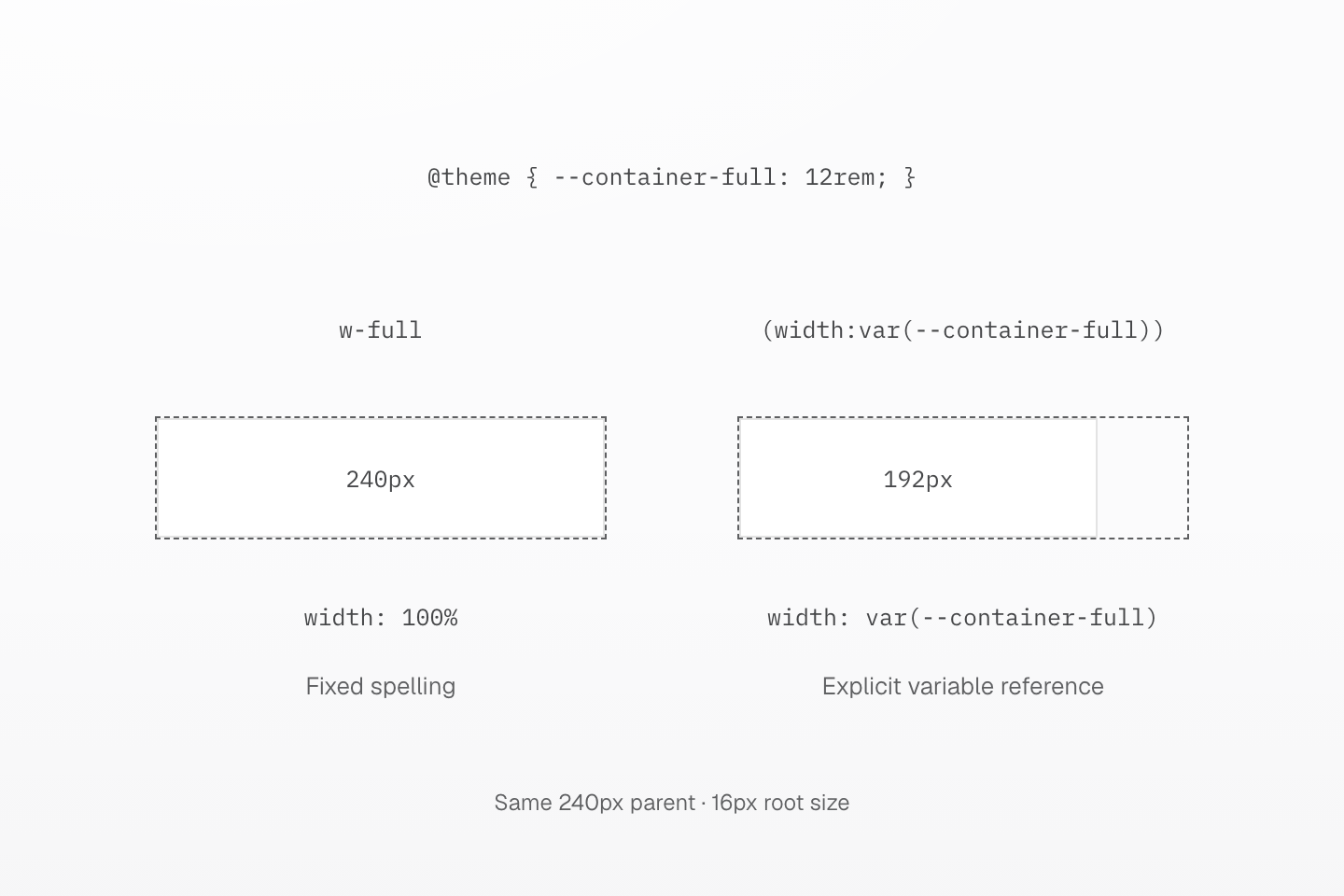
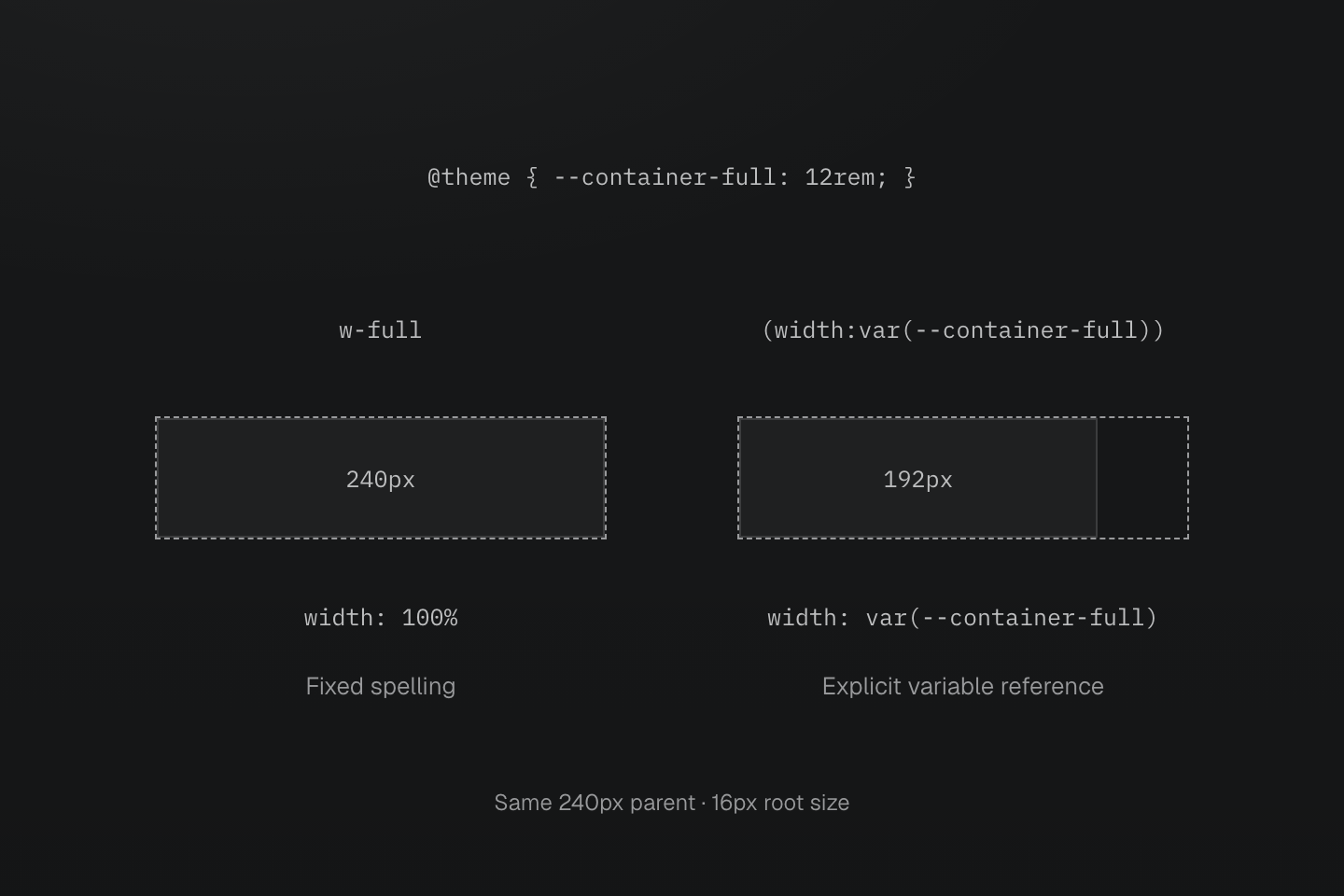
Both parents are 240px wide. The custom --container-full is 12rem (192px at a 16px root); w-full remains the fixed 100% utility.
Text description
- The configuration defines @theme { --container-full: 12rem; }. The preset already registers the complete fixed name w-full with width: 100%.
- w-full therefore fills the 240px parent. The explicit (width:var(--container-full)) class reads --container-full and gives the second block a 192px width.
- The token remains available through an explicit var() reference; defining it does not replace the fixed w-full registration.
Direct numeric values
Preset functions such as m(4), b(1) and grow(1) take one static number. Length functions emit a multiplication by 1px; grow(), shrink() and order() pass the number through, with order() requiring an integer. Zero, decimals and negative arguments follow each parameter's declared type.
Units and dynamic expressions are not numeric arguments: m(1px) and b(var(--x)) generate no rule. Use (margin:1rem) or (border-width:var(--x)) for those values. Direct values owns the complete function list, parameter types and generated declarations.
Recipes can coordinate properties or companions: text-sm includes size, line height and tracking, while animate-fade supplies an animation shorthand. Their lookup and override rules belong to text tokens and motion tokens.
Custom properties
A (--name:value) head declares a CSS custom property on the matched element. It can carry the same selectors and conditions as any other declaration. It does not register a utility or a theme token.
<div class="(--progress:40%) (--progress:60%):hover (width:var(--progress))">Progress</div>Generated CSS
@layer utilities { .\(--progress\:40\%\) { --progress: 40% } .\(width\:var\(--progress\)\) { width: var(--progress) } .\(--progress\:60\%\)\:hover:hover { --progress: 60% }}var(--progress) uses normal CSS resolution and inheritance. An unresolved variable or an incompatible substituted value can make the consuming declaration invalid; use a CSS variable fallback where appropriate. The Syntax tutorial covers keeping a fixed class while supplying a dynamic value.
Composition and importance
Separate classes express independent decisions, such as b(1) b-solid b-line-control. Native shorthands remain supported: this authoring preference does not change CSS grammar. Repeat selectors and conditions on each class that needs them.
<ul class="block>li:hover@md (font-size:14px)>li:hover@md text-center>li:hover@md">…</ul>Within the same layer, conditions and selector, recipes sort before single-declaration utilities, then native declarations. Single-declaration utilities sort by property family and coverage before value source; a token precedes a fixed or direct value for the same property. HTML class order does not determine the result:
Generated CSS
@layer theme { :root, :host { --spacing-md: 1rem }}@layer utilities { .m-md { margin: var(--spacing-md) } .mx-auto { margin-inline: auto } .mt\(0\) { margin-top: calc(0 * 1px) } .p-md { padding: var(--spacing-md) } .p\(12\) { padding: calc(12 * 1px) } .\(padding\:1rem\) { padding: 1rem }}Here the native padding follows both utilities, while mt(0) and mx-auto override the relevant parts of m-md. Cascade layers owns the complete ordering contract. Use Reusing styles to choose a component class, @utility recipe or CSS mixin.
Importance
A final ! marks the class's declarations important. A trailing native !important inside a parenthesized value has the same effect; writing both emits it once. The text '!important' inside a string remains content.
Generated CSS
@layer utilities { .text-center\! { text-align: center !important } .\(color\:red\!important\) { color: red !important } .\(color\:red\!important\)\! { color: red !important } .\(content\:\'\!important\'\)\:\:before::before { content: '!important' }}Importance covers every declaration in the recipe
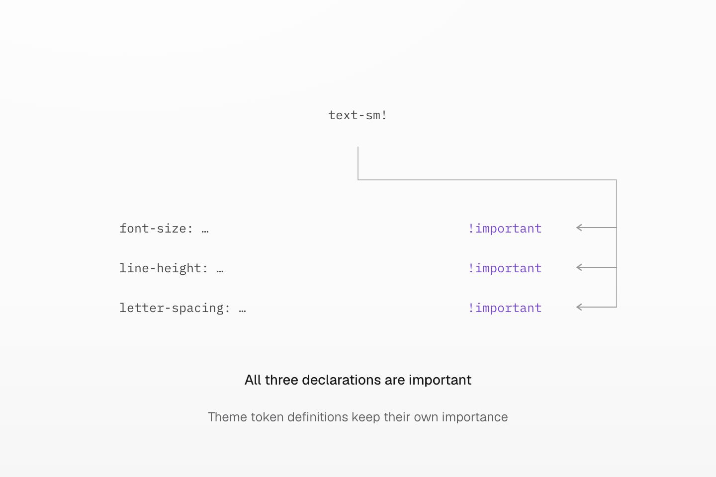
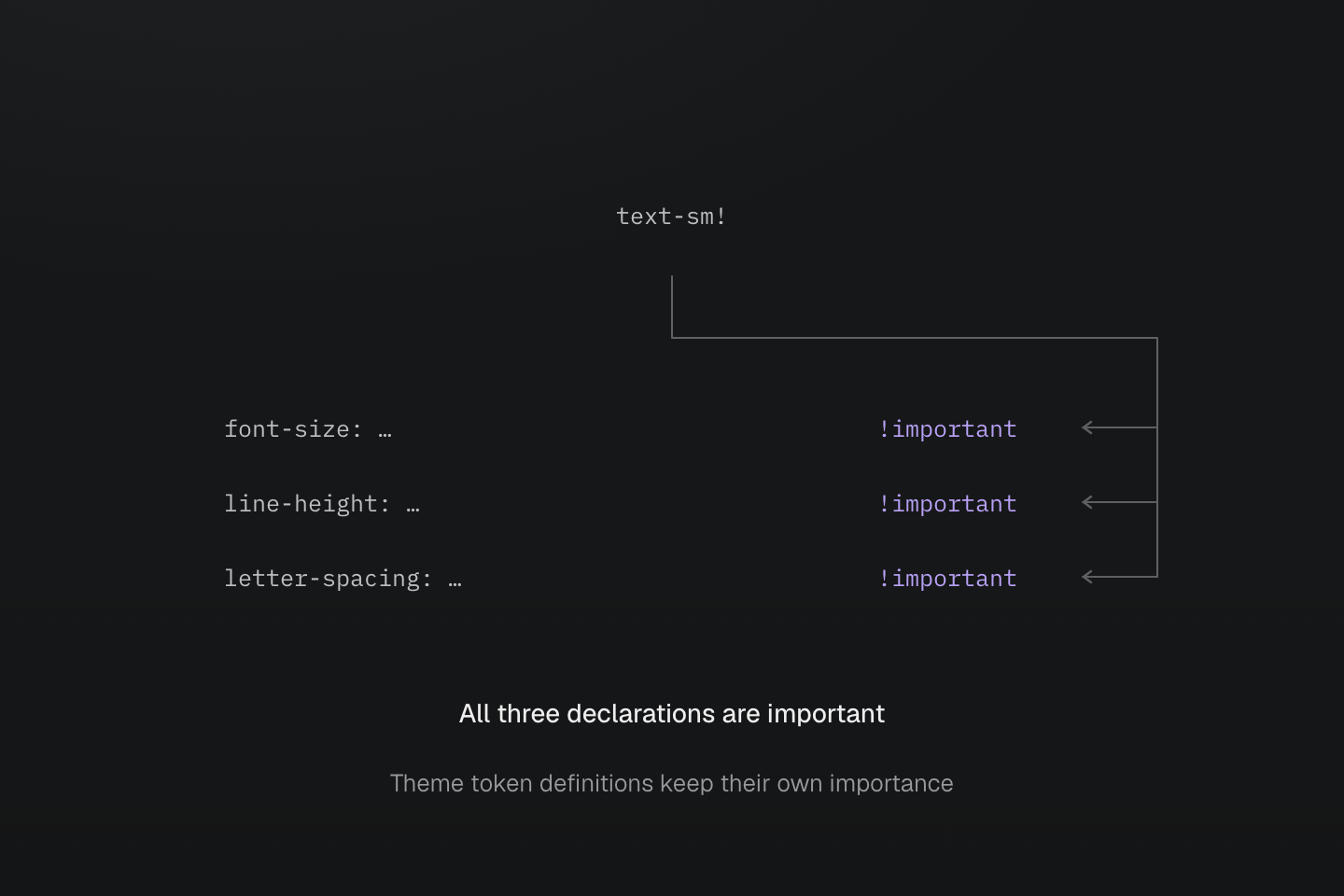
One final ! marks all three declarations; ellipses omit their token references. It does not mark nearby HTML classes or the theme token definitions important.
Text description
- text-sm writes font-size, line-height and letter-spacing using its primary token and companion references.
- text-sm! marks all three generated declarations !important. The dependency declarations remain ordinary theme tokens.
Fixed utility lookup
The preset provides 292 fixed, single-declaration utilities. Each sets only its listed property: flex-col does not enable flex layout, b-none does not reset border width, and pill does not set a size. The multi-declaration truncate recipe is listed separately in Truncation.
| Class, Declarations | CSS |
|---|---|
block | display: block |
inline | display: inline |
inline-block | display: inline-block |
flow-root | display: flow-root |
flex | display: flex |
inline-flex | display: inline-flex |
grid | display: grid |
inline-grid | display: inline-grid |
contents | display: contents |
list-item | display: list-item |
table | display: table |
inline-table | display: inline-table |
table-caption | display: table-caption |
table-cell | display: table-cell |
table-column | display: table-column |
table-column-group | display: table-column-group |
table-header-group | display: table-header-group |
table-footer-group | display: table-footer-group |
table-row | display: table-row |
table-row-group | display: table-row-group |
hidden | display: none |
static | position: static |
relative | position: relative |
absolute | position: absolute |
fixed | position: fixed |
sticky | position: sticky |
visible | visibility: visible |
invisible | visibility: hidden |
isolate | isolation: isolate |
box-border | box-sizing: border-box |
box-content | box-sizing: content-box |
italic | font-style: italic |
oblique | font-style: oblique |
uppercase | text-transform: uppercase |
lowercase | text-transform: lowercase |
capitalize | text-transform: capitalize |
underline | text-decoration-line: underline |
overline | text-decoration-line: overline |
line-through | text-decoration-line: line-through |
flex-row | flex-direction: row |
flex-row-reverse | flex-direction: row-reverse |
flex-col | flex-direction: column |
flex-col-reverse | flex-direction: column-reverse |
flex-wrap | flex-wrap: wrap |
flex-nowrap | flex-wrap: nowrap |
flex-wrap-reverse | flex-wrap: wrap-reverse |
items-normal | align-items: normal |
items-start | align-items: start |
items-end | align-items: end |
items-flex-start | align-items: flex-start |
items-flex-end | align-items: flex-end |
items-center | align-items: center |
items-baseline | align-items: baseline |
items-stretch | align-items: stretch |
content-normal | align-content: normal |
content-start | align-content: start |
content-end | align-content: end |
content-flex-start | align-content: flex-start |
content-flex-end | align-content: flex-end |
content-center | align-content: center |
content-baseline | align-content: baseline |
content-stretch | align-content: stretch |
content-between | align-content: space-between |
content-around | align-content: space-around |
content-evenly | align-content: space-evenly |
self-auto | align-self: auto |
self-normal | align-self: normal |
self-start | align-self: start |
self-end | align-self: end |
self-flex-start | align-self: flex-start |
self-flex-end | align-self: flex-end |
self-center | align-self: center |
self-baseline | align-self: baseline |
self-stretch | align-self: stretch |
justify-normal | justify-content: normal |
justify-start | justify-content: start |
justify-end | justify-content: end |
justify-flex-start | justify-content: flex-start |
justify-flex-end | justify-content: flex-end |
justify-center | justify-content: center |
justify-between | justify-content: space-between |
justify-around | justify-content: space-around |
justify-evenly | justify-content: space-evenly |
justify-stretch | justify-content: stretch |
object-cover | object-fit: cover |
object-contain | object-fit: contain |
object-fill | object-fit: fill |
object-none | object-fit: none |
object-scale-down | object-fit: scale-down |
object-center | object-position: center |
object-top | object-position: top |
object-bottom | object-position: bottom |
object-left | object-position: left |
object-right | object-position: right |
m-auto | margin: auto |
mt-auto | margin-top: auto |
mr-auto | margin-right: auto |
mb-auto | margin-bottom: auto |
ml-auto | margin-left: auto |
mx-auto | margin-inline: auto |
mxs-auto | margin-inline-start: auto |
mxe-auto | margin-inline-end: auto |
my-auto | margin-block: auto |
mys-auto | margin-block-start: auto |
mye-auto | margin-block-end: auto |
top-auto | top: auto |
right-auto | right: auto |
bottom-auto | bottom: auto |
left-auto | left: auto |
inset-auto | inset: auto |
ix-auto | inset-inline: auto |
ixs-auto | inset-inline-start: auto |
ixe-auto | inset-inline-end: auto |
iy-auto | inset-block: auto |
iys-auto | inset-block-start: auto |
iye-auto | inset-block-end: auto |
w-auto | width: auto |
h-auto | height: auto |
size-x-auto | inline-size: auto |
size-y-auto | block-size: auto |
min-w-auto | min-width: auto |
min-h-auto | min-height: auto |
min-size-x-auto | min-inline-size: auto |
min-size-y-auto | min-block-size: auto |
basis-auto | flex-basis: auto |
max-w-none | max-width: none |
max-h-none | max-height: none |
max-size-x-none | max-inline-size: none |
max-size-y-none | max-block-size: none |
w-full | width: 100% |
w-fit | width: fit-content |
w-max | width: max-content |
w-min | width: min-content |
h-full | height: 100% |
h-fit | height: fit-content |
h-max | height: max-content |
h-min | height: min-content |
size-x-full | inline-size: 100% |
size-x-fit | inline-size: fit-content |
size-x-max | inline-size: max-content |
size-x-min | inline-size: min-content |
size-y-full | block-size: 100% |
size-y-fit | block-size: fit-content |
size-y-max | block-size: max-content |
size-y-min | block-size: min-content |
min-w-full | min-width: 100% |
min-w-fit | min-width: fit-content |
min-w-max | min-width: max-content |
min-w-min | min-width: min-content |
min-h-full | min-height: 100% |
min-h-fit | min-height: fit-content |
min-h-max | min-height: max-content |
min-h-min | min-height: min-content |
min-size-x-full | min-inline-size: 100% |
min-size-x-fit | min-inline-size: fit-content |
min-size-x-max | min-inline-size: max-content |
min-size-x-min | min-inline-size: min-content |
min-size-y-full | min-block-size: 100% |
min-size-y-fit | min-block-size: fit-content |
min-size-y-max | min-block-size: max-content |
min-size-y-min | min-block-size: min-content |
max-w-full | max-width: 100% |
max-w-fit | max-width: fit-content |
max-w-max | max-width: max-content |
max-w-min | max-width: min-content |
max-h-full | max-height: 100% |
max-h-fit | max-height: fit-content |
max-h-max | max-height: max-content |
max-h-min | max-height: min-content |
max-size-x-full | max-inline-size: 100% |
max-size-x-fit | max-inline-size: fit-content |
max-size-x-max | max-inline-size: max-content |
max-size-x-min | max-inline-size: min-content |
max-size-y-full | max-block-size: 100% |
max-size-y-fit | max-block-size: fit-content |
max-size-y-max | max-block-size: max-content |
max-size-y-min | max-block-size: min-content |
basis-full | flex-basis: 100% |
basis-fit | flex-basis: fit-content |
basis-max | flex-basis: max-content |
basis-min | flex-basis: min-content |
order-first | order: -999999 |
order-last | order: 999999 |
pill | border-radius: calc(infinity*1px) |
b-solid | border-style: solid |
b-dashed | border-style: dashed |
b-dotted | border-style: dotted |
b-double | border-style: double |
b-none | border-style: none |
bt-solid | border-top-style: solid |
bt-dashed | border-top-style: dashed |
bt-dotted | border-top-style: dotted |
bt-double | border-top-style: double |
bt-none | border-top-style: none |
br-solid | border-right-style: solid |
br-dashed | border-right-style: dashed |
br-dotted | border-right-style: dotted |
br-double | border-right-style: double |
br-none | border-right-style: none |
bb-solid | border-bottom-style: solid |
bb-dashed | border-bottom-style: dashed |
bb-dotted | border-bottom-style: dotted |
bb-double | border-bottom-style: double |
bb-none | border-bottom-style: none |
bl-solid | border-left-style: solid |
bl-dashed | border-left-style: dashed |
bl-dotted | border-left-style: dotted |
bl-double | border-left-style: double |
bl-none | border-left-style: none |
bx-solid | border-inline-style: solid |
bx-dashed | border-inline-style: dashed |
bx-dotted | border-inline-style: dotted |
bx-double | border-inline-style: double |
bx-none | border-inline-style: none |
bxs-solid | border-inline-start-style: solid |
bxs-dashed | border-inline-start-style: dashed |
bxs-dotted | border-inline-start-style: dotted |
bxs-double | border-inline-start-style: double |
bxs-none | border-inline-start-style: none |
bxe-solid | border-inline-end-style: solid |
bxe-dashed | border-inline-end-style: dashed |
bxe-dotted | border-inline-end-style: dotted |
bxe-double | border-inline-end-style: double |
bxe-none | border-inline-end-style: none |
by-solid | border-block-style: solid |
by-dashed | border-block-style: dashed |
by-dotted | border-block-style: dotted |
by-double | border-block-style: double |
by-none | border-block-style: none |
bys-solid | border-block-start-style: solid |
bys-dashed | border-block-start-style: dashed |
bys-dotted | border-block-start-style: dotted |
bys-double | border-block-start-style: double |
bys-none | border-block-start-style: none |
bye-solid | border-block-end-style: solid |
bye-dashed | border-block-end-style: dashed |
bye-dotted | border-block-end-style: dotted |
bye-double | border-block-end-style: double |
bye-none | border-block-end-style: none |
outline-solid | outline-style: solid |
outline-dashed | outline-style: dashed |
outline-dotted | outline-style: dotted |
outline-double | outline-style: double |
outline-none | outline-style: none |
text-left | text-align: left |
text-center | text-align: center |
text-right | text-align: right |
text-start | text-align: start |
text-end | text-align: end |
text-justify | text-align: justify |
overflow-auto | overflow: auto |
overflow-hidden | overflow: hidden |
overflow-clip | overflow: clip |
overflow-visible | overflow: visible |
overflow-scroll | overflow: scroll |
overflow-x-auto | overflow-x: auto |
overflow-x-hidden | overflow-x: hidden |
overflow-x-clip | overflow-x: clip |
overflow-x-visible | overflow-x: visible |
overflow-x-scroll | overflow-x: scroll |
overflow-y-auto | overflow-y: auto |
overflow-y-hidden | overflow-y: hidden |
overflow-y-clip | overflow-y: clip |
overflow-y-visible | overflow-y: visible |
overflow-y-scroll | overflow-y: scroll |
whitespace-normal | white-space: normal |
whitespace-nowrap | white-space: nowrap |
whitespace-pre | white-space: pre |
whitespace-pre-wrap | white-space: pre-wrap |
whitespace-pre-line | white-space: pre-line |
whitespace-break-spaces | white-space: break-spaces |
select-none | user-select: none |
select-text | user-select: text |
select-all | user-select: all |
select-auto | user-select: auto |
pointer-none | pointer-events: none |
pointer-auto | pointer-events: auto |
vertical-baseline | vertical-align: baseline |
vertical-top | vertical-align: top |
vertical-middle | vertical-align: middle |
vertical-bottom | vertical-align: bottom |
vertical-text-top | vertical-align: text-top |
vertical-text-bottom | vertical-align: text-bottom |
vertical-sub | vertical-align: sub |
vertical-super | vertical-align: super |
container-inline | container-type: inline-size |
container-size | container-type: size |
container-normal | container-type: normal |
wrap-anywhere | overflow-wrap: anywhere |
wrap-break-word | overflow-wrap: break-word |
wrap-normal | overflow-wrap: normal |
ellipsis | text-overflow: ellipsis |
start and end retain their native meaning, distinct from flex-start and flex-end. For logical axes, x means inline and y means block; t, r, b and l are physical sides. Fixed utilities accept selectors, conditions and !, and emit CSS when used.