Color palette
Every numbered palette step, fixed hue alias and other preset color token.
On this page
Classes
| Class | Declarations |
|---|---|
bg-<name> | background-color: var(--color-<name>); |
fg-<name> | color: var(--color-<name>); |
b-<name> | border-color: var(--color-<name>); |
16 other color families
| Class | Declarations |
|---|---|
bb-<name> | border-bottom-color: var(--color-<name>); |
bl-<name> | border-left-color: var(--color-<name>); |
br-<name> | border-right-color: var(--color-<name>); |
bt-<name> | border-top-color: var(--color-<name>); |
bx-<name> | border-inline-color: var(--color-<name>); |
by-<name> | border-block-color: var(--color-<name>); |
bxe-<name> | border-inline-end-color: var(--color-<name>); |
bxs-<name> | border-inline-start-color: var(--color-<name>); |
bye-<name> | border-block-end-color: var(--color-<name>); |
bys-<name> | border-block-start-color: var(--color-<name>); |
fill-<name> | fill: var(--color-<name>); |
caret-<name> | caret-color: var(--color-<name>); |
accent-<name> | accent-color: var(--color-<name>); |
stroke-<name> | stroke: var(--color-<name>); |
outline-<name> | outline-color: var(--color-<name>); |
text-fill-color-<name> | -webkit-text-fill-color: var(--color-<name>); |
A color class sets only the named property. For a visible border, combine a width such as b(1), a style such as b-solid and a color such as b-blue-60. Color roles use these same families and have their own value tables.
Values
Palette numbers are token keys, not opacity or lightness percentages. Higher numbered steps have lower OKLCH lightness. Each swatch copies its CSS value or variable reference; hue aliases below retain their authored token reference.
Palette
Choose a swatch to copy its original CSS color value.
Skip color swatchesHue aliases
| Class | Value |
|---|---|
bg-stone | var(--color-stone-30) |
bg-gray | var(--color-gray-30) |
bg-zinc | var(--color-zinc-30) |
bg-neutral | var(--color-neutral-30) |
bg-slate | var(--color-slate-30) |
bg-brown | var(--color-brown-40) |
bg-orange | var(--color-orange-40) |
bg-amber | var(--color-amber-40) |
bg-yellow | var(--color-yellow-40) |
bg-lime | var(--color-lime-40) |
bg-green | var(--color-green-40) |
bg-beryl | var(--color-beryl-40) |
bg-teal | var(--color-teal-40) |
bg-cyan | var(--color-cyan-40) |
bg-sky | var(--color-sky-60) |
bg-blue | var(--color-blue-60) |
bg-indigo | var(--color-indigo-60) |
bg-violet | var(--color-violet-60) |
bg-purple | var(--color-purple-60) |
bg-fuchsia | var(--color-fuchsia-60) |
bg-pink | var(--color-pink-60) |
bg-crimson | var(--color-crimson-60) |
bg-red | var(--color-red-60) |
Other colors
| Class | Value |
|---|---|
bg-white | oklch(100% 0 none) |
bg-black | oklch(0% 0 none) |
bg-current | currentColor |
Hue aliases select a fixed step
bg-blue reads --color-blue, whose preset value is var(--color-blue-60). bg-yellow instead reaches --color-yellow-40. The alias does not imply a common step number across hues.
Hue aliases do not share one step number
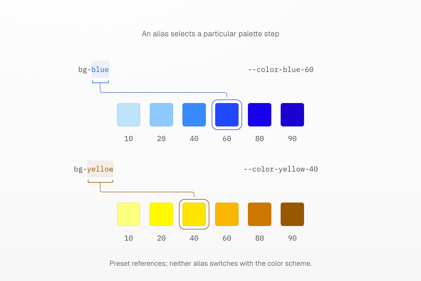
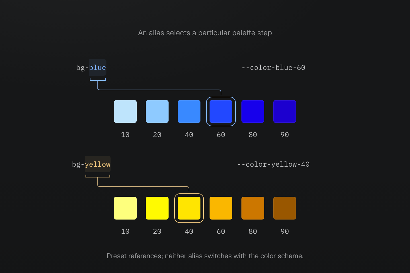
The preset blue alias references blue-60; yellow references yellow-40. The outlines mark those references, not a border added by either background class. Selected palette steps are shown.
Text description
- bg-blue reads --color-blue, which references --color-blue-60 in the preset. The blue strip marks step 60.
- bg-yellow reads --color-yellow, which references --color-yellow-40. The yellow strip marks step 40 in the same set of displayed steps.
- Both strips show actual palette colors at steps 10, 20, 40, 60, 80 and 90. Equal swatch widths are for comparison, not a scale of perceptual distance.
- The two alias chains remain the same in light and dark schemes. Redefining an alias or its referenced token can change its result.
Numbered steps and hue aliases do not switch with the color scheme. Adaptive text aliases such as fg-text-blue belong to Color roles. Redefining a token can change either behavior.
bg-current reads currentColor, so its result follows the element’s text color. There is no preset --color-transparent token. For transparency or another literal color, use a native declaration such as (background-color:transparent) or (background-color:#175fe9).
See Color roles and native values and opacity.
Usage
These status labels use explicit foreground and background steps. The words retain their meaning without color, and the selected colors stay fixed in both schemes.
<div> <span class="… bg-green-5 fg-green-80">Paid</span> <span class="… bg-amber-5 fg-amber-80">Pending</span> <span class="… bg-red-5 fg-red-80">Overdue</span> <span class="… bg-blue-5 fg-blue-70">Draft</span></div>Generated CSS
@layer theme { :root, :host { --color-amber-5: oklch(96.24% .0573 98.1); --color-amber-80: oklch(53.09% .1677 39.7); --color-green-5: oklch(94.95% .071 145.5); --color-green-80: oklch(51.96% .1768 142.5); --color-blue-5: oklch(93.53% .0305 231.3); --color-blue-70: oklch(46.26% .3057 266.7); --color-red-5: oklch(94.05% .0239 17); --color-red-80: oklch(53.09% .2178 29.2) }}@layer utilities { .bg-amber-5 { background-color: var(--color-amber-5) } .bg-blue-5 { background-color: var(--color-blue-5) } .bg-green-5 { background-color: var(--color-green-5) } .bg-red-5 { background-color: var(--color-red-5) } .fg-amber-80 { color: var(--color-amber-80) } .fg-blue-70 { color: var(--color-blue-70) } .fg-green-80 { color: var(--color-green-80) } .fg-red-80 { color: var(--color-red-80) }}Customize
Register a color in @theme to make its key available to the color families. Here brand is available as bg-brand, fg-brand and b-brand, among others.
@theme { --color-brand: oklch(56% .2 262);}Generated CSS
@layer theme { :root, :host { --color-brand: oklch(56% .2 262) }}@layer utilities { .bg-brand { background-color: var(--color-brand) }}See theme directives and Color.