Color
Build interface color from adaptive roles, raise surfaces with radius and shadow, and choose light or dark modes.
On this page
#Overview
Build interface color from roles: surface, line and text colors whose class stays the same in light and dark modes. Use a palette step when the color itself is the point, such as an illustration or a brand accent. Keep color changes tied to a role, a state or a distinction the reader needs to see.
The role stays the same as the scheme changes
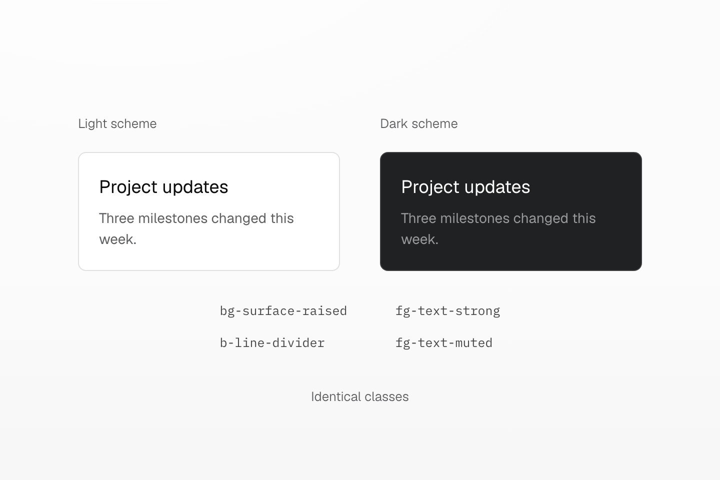
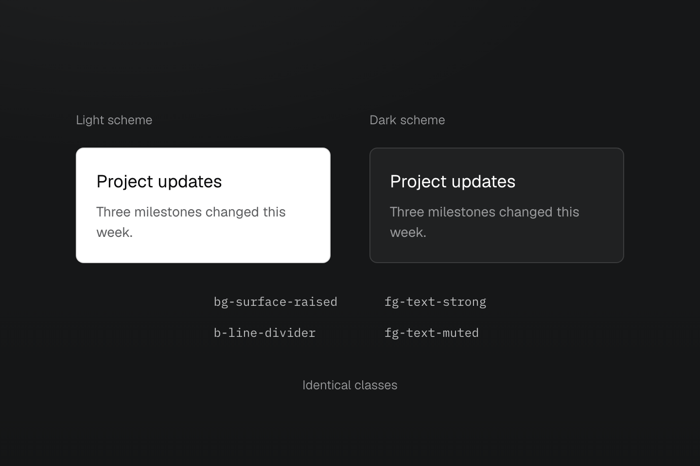
Choose the role once. Its light-dark() value follows the element’s color scheme, including a local region inside another scheme.
Text description
- Preserve the role. Both regions use the same surface, divider, strong-text and muted-text classes.
- Resolve locally. The role values use light-dark(). Each region’s color-scheme selects its light or dark colors without changing the classes.
#Choose roles or palette steps
| Decision | Use | Examples |
|---|---|---|
| Page structure and text hierarchy | Color roles | bg-surface-raised, b-line-divider, fg-text-muted |
| A particular swatch | Palette steps | bg-blue-5, fg-blue-60 |
One composition, two modes
<section class="p-md r-lg b(1) b-solid b-line-divider bg-surface-raised fg-text-body"> <h2 class="m(0) text-lg font-regular fg-text-strong">Project updates</h2> <p class="mt-xs mb-md text-sm fg-text-muted">Three milestones changed this week.</p> <a class="fg-text-link underline" href="/updates">Continue</a></section>Generated CSS
@layer theme { :root, :host { --color-zinc-40: oklch(68.6% .0028 265); --color-zinc-60: oklch(48.6% .003 265); --color-zinc-90: oklch(24.6% .0022 265) } :root, :host { --color-surface-raised: light-dark(var(--color-white), var(--color-zinc-90)); --color-line-divider: light-dark(oklch(0% 0 none / .12), oklch(100% 0 none / .12)); --color-text-muted: light-dark(var(--color-zinc-60), var(--color-zinc-40)) } :root, :host { --color-white: oklch(100% 0 none) }}@layer utilities { .bg-surface-raised { background-color: var(--color-surface-raised) } .b-line-divider { border-color: var(--color-line-divider) } .fg-text-muted { color: var(--color-text-muted) }}The role is part of the color key: bg-surface-raised reads --color-surface-raised, and b-line-divider reads --color-line-divider. A line role sets only the color, so give the border its width and style separately. See Color roles for every role and Color palette for the palette.
A line color needs a width and a style
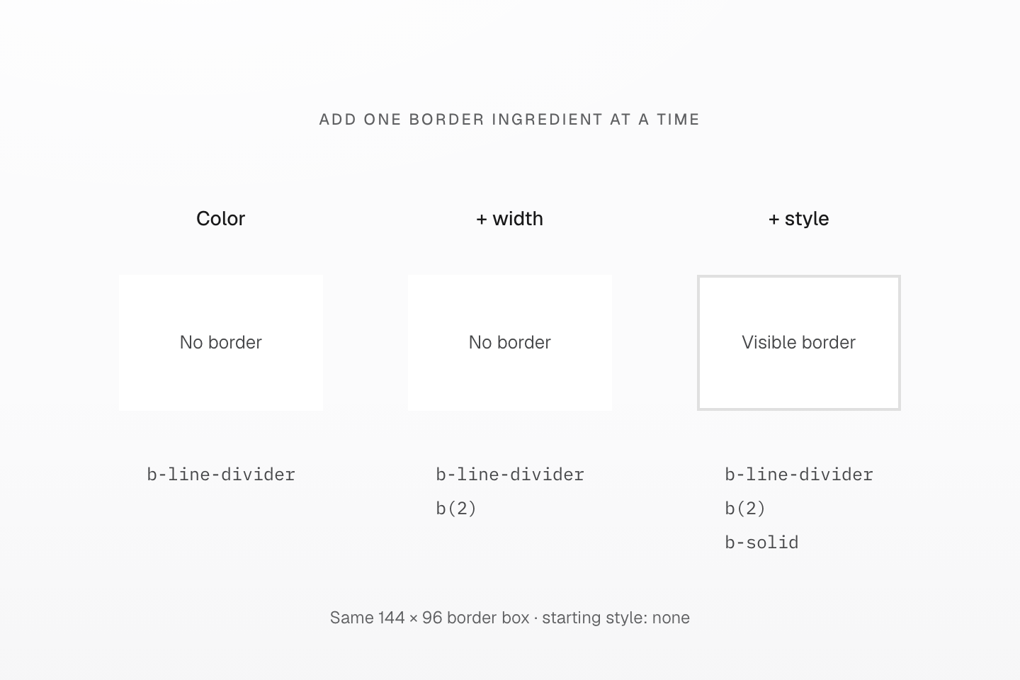
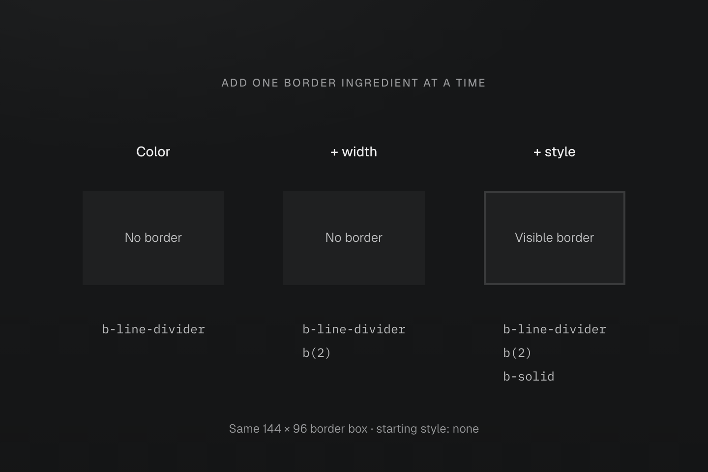
All boxes start with border-style: none. The specimens share their border-box size; only the listed border declarations change.
Text description
- b-line-divider supplies border-color, and b(2) supplies border-width. Neither changes a none border style.
- Adding b-solid allows the 2px border to paint. A border can inherit other authored prerequisites from a component, so inspect the complete style when only a color class is shown.
Separate a fixed hue step from a semantic role
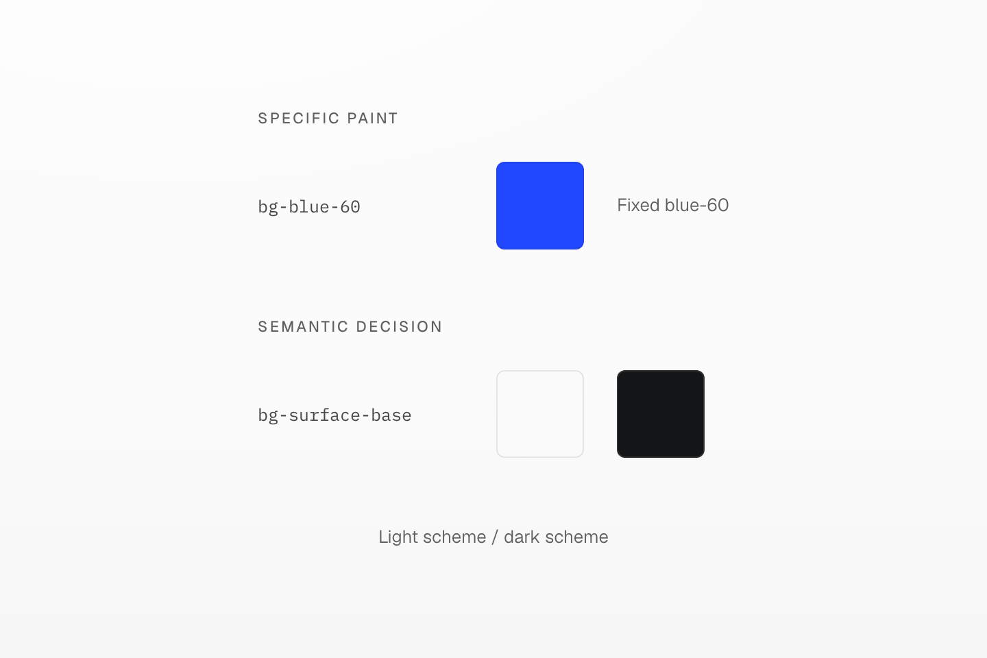
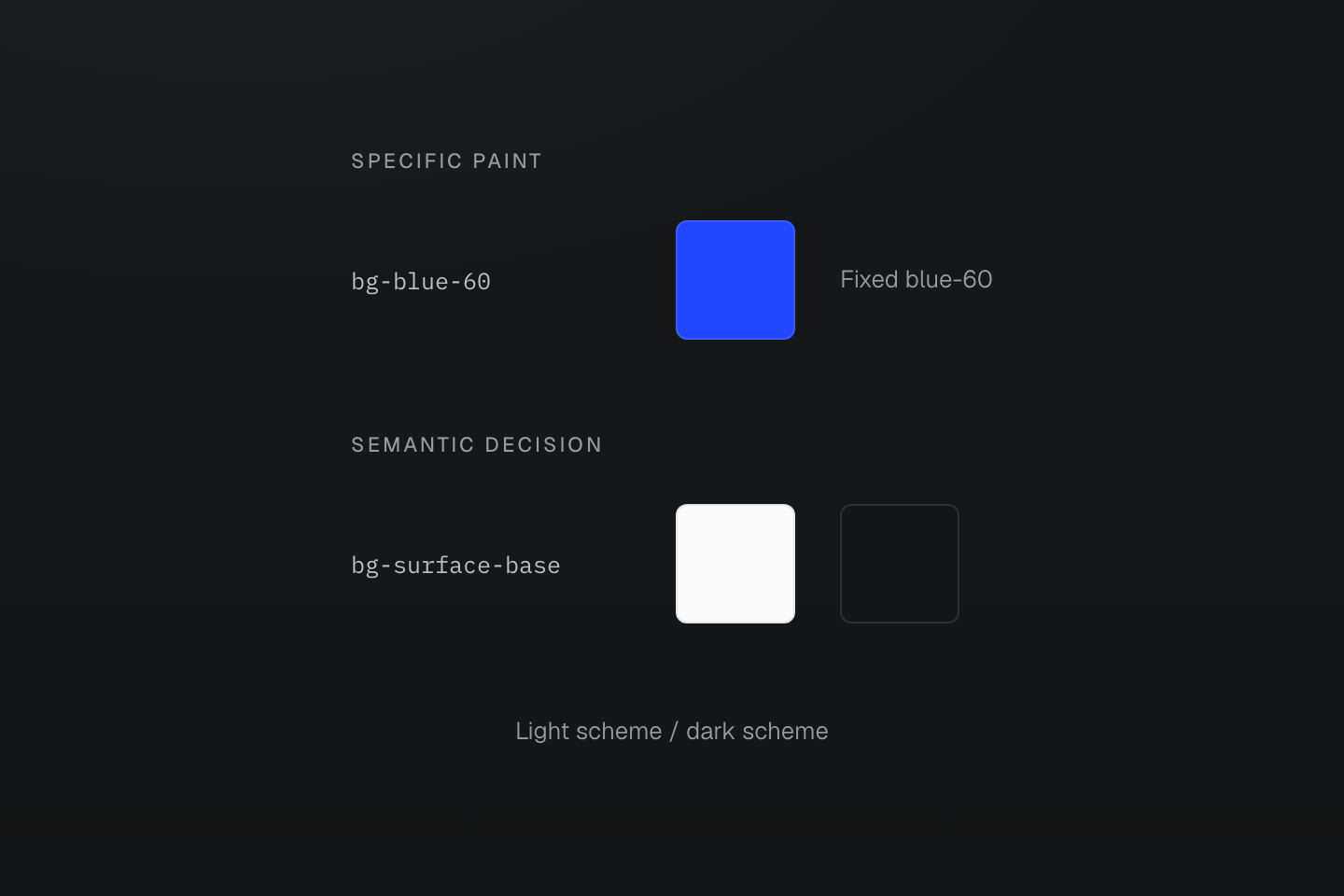
Choose a palette step for a specific paint and a role for a decision that follows its context.
Text description
Two paths separate a fixed palette step from a role that chooses light or dark values.
#Fixed and adaptive hue aliases
A hue alias such as fg-yellow is a fixed swatch with the same value in every mode. A text hue alias such as fg-text-yellow chooses a foreground step intended for text in each mode. Check its contrast on the actual background; an adaptive alias cannot guarantee every pairing.
<svg class="fg-yellow" fill="currentColor" aria-hidden="true">…</svg><p class="fg-text-yellow">Pending review</p>Generated CSS
@layer theme { :root, :host { --color-yellow-40: oklch(91.5% .1909 101.1); --color-yellow-90: oklch(52.17% .1199 62.2) } :root, :host { --color-yellow: var(--color-yellow-40); --color-text-yellow: light-dark(var(--color-yellow-90), var(--color-yellow-40)) }}@layer utilities { .fg-text-yellow { color: var(--color-text-yellow) } .fg-yellow { color: var(--color-yellow) }}Use text hue aliases for colored labels. Keep body copy, emphasis and links on the text roles.
#Raised surfaces
A raised surface combines a surface role, a radius token and a shadow token. Raise the shadow one step when an interactive surface is hovered or focused. Use a small radius for ordinary cards and controls; reserve pill for a deliberately fully rounded shape, such as the badge below.
A raised surface
<a class="block p-md r-lg bg-surface-raised fg-text-body shadow-sm shadow-md:hover shadow-md:focus-visible" href="/notes"> <span class="flex items-center justify-between gap-sm"> <span class="fg-text-strong">Field notes</span> <span class="px-xs py-3xs pill bg-line-subtle text-xs fg-text-muted">12 new</span> </span></a>Generated CSS
@layer theme { :root, :host { --radius-lg: .5rem } :root, :host { --shadow-sm: 0 0 0 1px light-dark(oklch(0% 0 none / .04), oklch(100% 0 none / .05)), 0 1px 1px -.5px light-dark(oklch(0% 0 none / .045), oklch(0% 0 none / .3)), 0 2px 2px -1px light-dark(oklch(0% 0 none / .04), oklch(0% 0 none / .26)), 0 4px 4px -2px light-dark(oklch(0% 0 none / .04), oklch(0% 0 none / .24)); --shadow-md: 0 0 0 1px light-dark(oklch(0% 0 none / .05), oklch(100% 0 none / .06)), 0 1px 1px -.5px light-dark(oklch(0% 0 none / .045), oklch(0% 0 none / .3)), 0 2px 2px -1px light-dark(oklch(0% 0 none / .04), oklch(0% 0 none / .26)), 0 4px 4px -2px light-dark(oklch(0% 0 none / .04), oklch(0% 0 none / .24)), 0 8px 8px -4px light-dark(oklch(0% 0 none / .045), oklch(0% 0 none / .26)) }}@layer utilities { .r-lg { border-radius: var(--radius-lg) } .pill { border-radius: calc(infinity * 1px) } .shadow-sm { box-shadow: var(--shadow-sm) } .shadow-md\:hover:hover { box-shadow: var(--shadow-md) }}Preset shadows use light-dark() for their colors, so shadow-sm keeps its geometry and follows the element's color scheme. pill is a fixed utility, not a radius token; with equal width and height it draws a circle. Round single corners with rtl-lg, rtr-lg, rbl-lg and rbr-lg. See Radius and Shadow for the scales and their customization.
The same pill radius follows the box shape
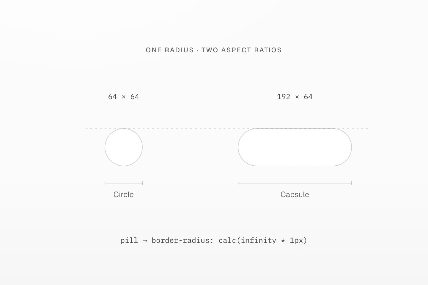
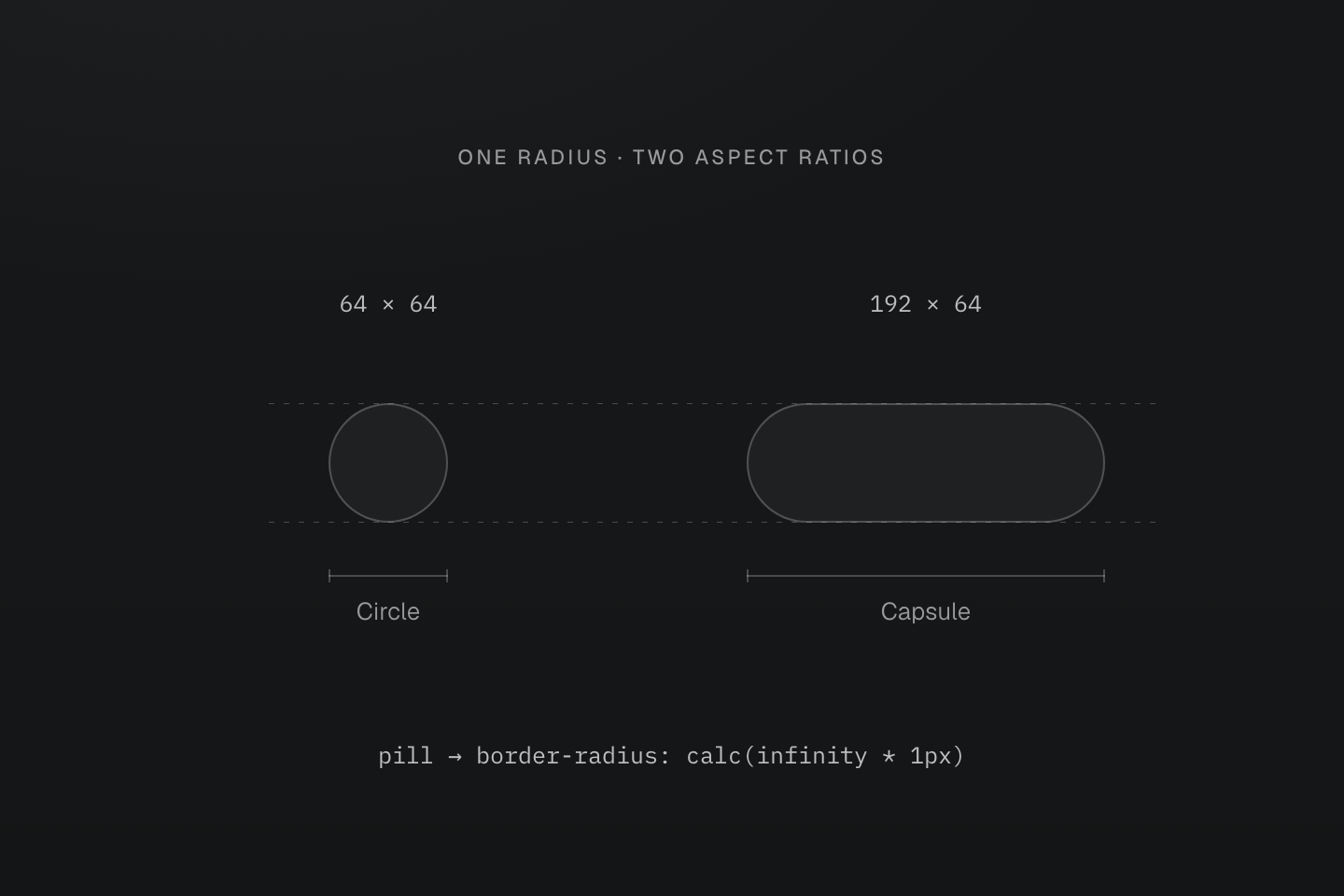
The height stays 64px. pill supplies the radius; the specimen dimensions come from separate sizing declarations.
Text description
- pill sets a fully rounded border radius without setting width, height or padding.
- Equal width and height produce a circle. A wider box with the same height produces a capsule, so the class alone does not promise a circle.
#Light and dark modes
The preset sets color-scheme: light dark on the root, and its roles and shadows use light-dark(), so a page follows the system preference with no extra classes. To choose a mode, set data-theme="light" or data-theme="dark" on the root, a nested region or a shadow host:
One token, two local color schemes
@theme { --color-surface-notes: light-dark(#f4f4f5, #27272a);}@layer base { [data-theme="light"] { color-scheme: light; } [data-theme="dark"] { color-scheme: dark; }}<section data-theme="dark" class="p-md r-lg bg-surface-notes fg-text-body wrap-anywhere"> <h2 class="m(0) text-lg font-regular">Dark notes</h2> <p class="mt-xs mb-md text-sm">This region chooses dark.</p> <article data-theme="light" class="p-md r-md bg-surface-notes fg-text-body"> <h3 class="m(0) text-md font-regular">A light region inside</h3> <p class="mt-xs mb(0) text-sm">The same surface token follows this article’s light scheme.</p> </article></section>Generated CSS
@layer base { [data-theme="light"] { color-scheme: light; } [data-theme="dark"] { color-scheme: dark; }}@layer theme { :root, :host { --color-zinc-30: oklch(78% .0025 265); --color-zinc-70: oklch(39.8% .0028 265) } :root, :host { --color-text-body: light-dark(var(--color-zinc-70), var(--color-zinc-30)) } :root, :host { --font-weight-regular: 400; --font-size-sm: .875rem; --font-size-md: 1rem; --font-size-lg: 1.125rem; --text-sm: var(--font-size-sm); --text-sm--line-height: 1.5; --text-sm--letter-spacing: 0; --text-md: var(--font-size-md); --text-md--line-height: 1.6; --text-md--letter-spacing: 0; --text-lg: var(--font-size-lg); --text-lg--line-height: 1.5; --text-lg--letter-spacing: 0; --radius-md: .375rem; --radius-lg: .5rem; --spacing-xs: .5rem; --spacing-md: 1rem } :root, :host { --color-surface-notes: light-dark(#f4f4f5, #27272a) }}@layer utilities { .text-lg { font-size: var(--text-lg); line-height: var(--text-lg--line-height, normal); letter-spacing: var(--text-lg--letter-spacing, normal) } .text-md { font-size: var(--text-md); line-height: var(--text-md--line-height, normal); letter-spacing: var(--text-md--letter-spacing, normal) } .text-sm { font-size: var(--text-sm); line-height: var(--text-sm--line-height, normal); letter-spacing: var(--text-sm--letter-spacing, normal) } .bg-surface-notes { background-color: var(--color-surface-notes) } .r-lg { border-radius: var(--radius-lg) } .r-md { border-radius: var(--radius-md) } .fg-text-body { color: var(--color-text-body) } .font-regular { font-weight: var(--font-weight-regular) } .m\(0\) { margin: calc(0 * 1px) } .mb-md { margin-bottom: var(--spacing-md) } .mt-xs { margin-top: var(--spacing-xs) } .mb\(0\) { margin-bottom: calc(0 * 1px) } .wrap-anywhere { overflow-wrap: anywhere } .p-md { padding: var(--spacing-md) }}The preset already ships these two data-theme selectors; the CSS repeats them to show the activation. A custom color with light-dark() adapts the same way, and changing the mode needs no recompilation. A nested region inherits its parent's tokens unless it redeclares them; give a brand theme its own selector, such as [data-brand="ocean"], and redeclare its role tokens there.
The @light and @dark suffixes are prefers-color-scheme media queries. A manual data-theme changes the tokens but does not activate them. When a class must react to the manual choice, declare a selector mixin and apply it:
@mixin --manual-dark { &:where([data-theme="dark"], [data-theme="dark"] *) { @contents; }}<img class="(opacity:.85)@apply(--manual-dark)" src="/chart.png" alt="Weekly usage" />The mixin also matches inside a nested light region, because it tests the attribute rather than the used color scheme. Prefer adaptive tokens; see Variables and modes for scope and resolution.
An ancestor selector can reach into a light region
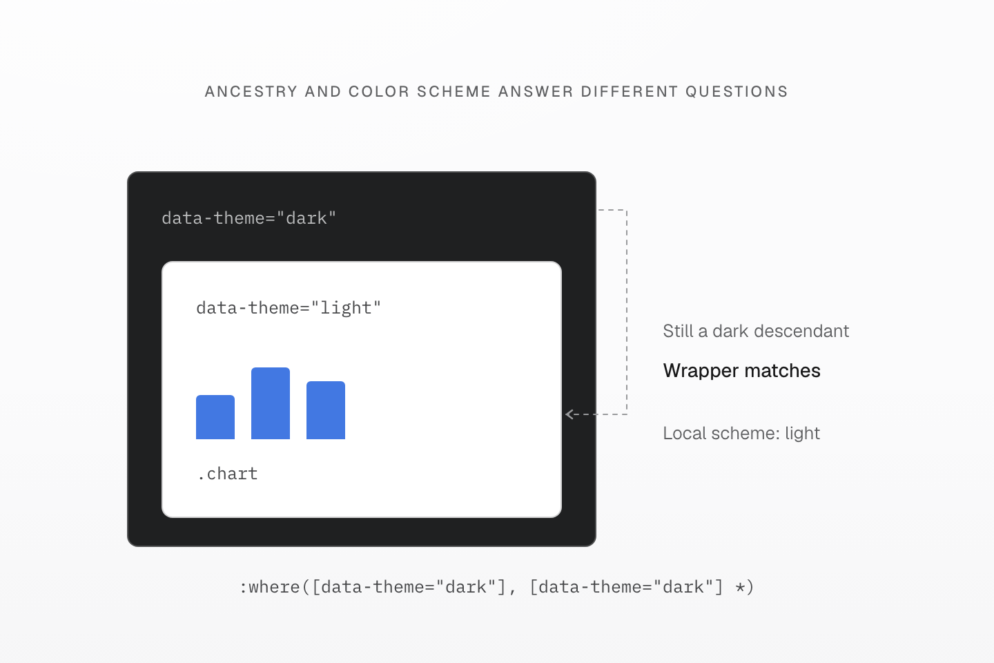
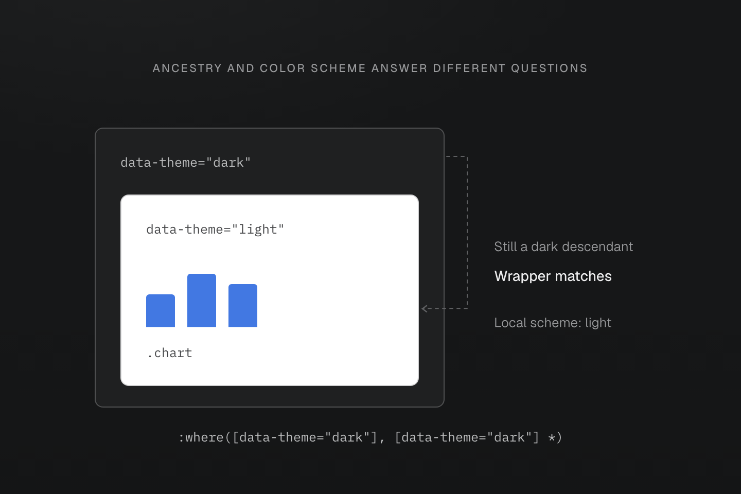
The dashed path follows the explicit dark attribute. The nested light boundary changes color-scheme, not the ancestry tested by the selector.
Text description
- The --manual-dark mixin in this article matches either [data-theme="dark"] or a descendant of that element.
- A chart inside a nested data-theme="light" region is still a descendant of the outer dark region. Its opacity wrapper therefore matches even while light-dark() values use the local light scheme.
- Use adaptive tokens for values that should follow the used color scheme; an attribute selector tests exactly the relationship it names.
The nearest color scheme selects the paint
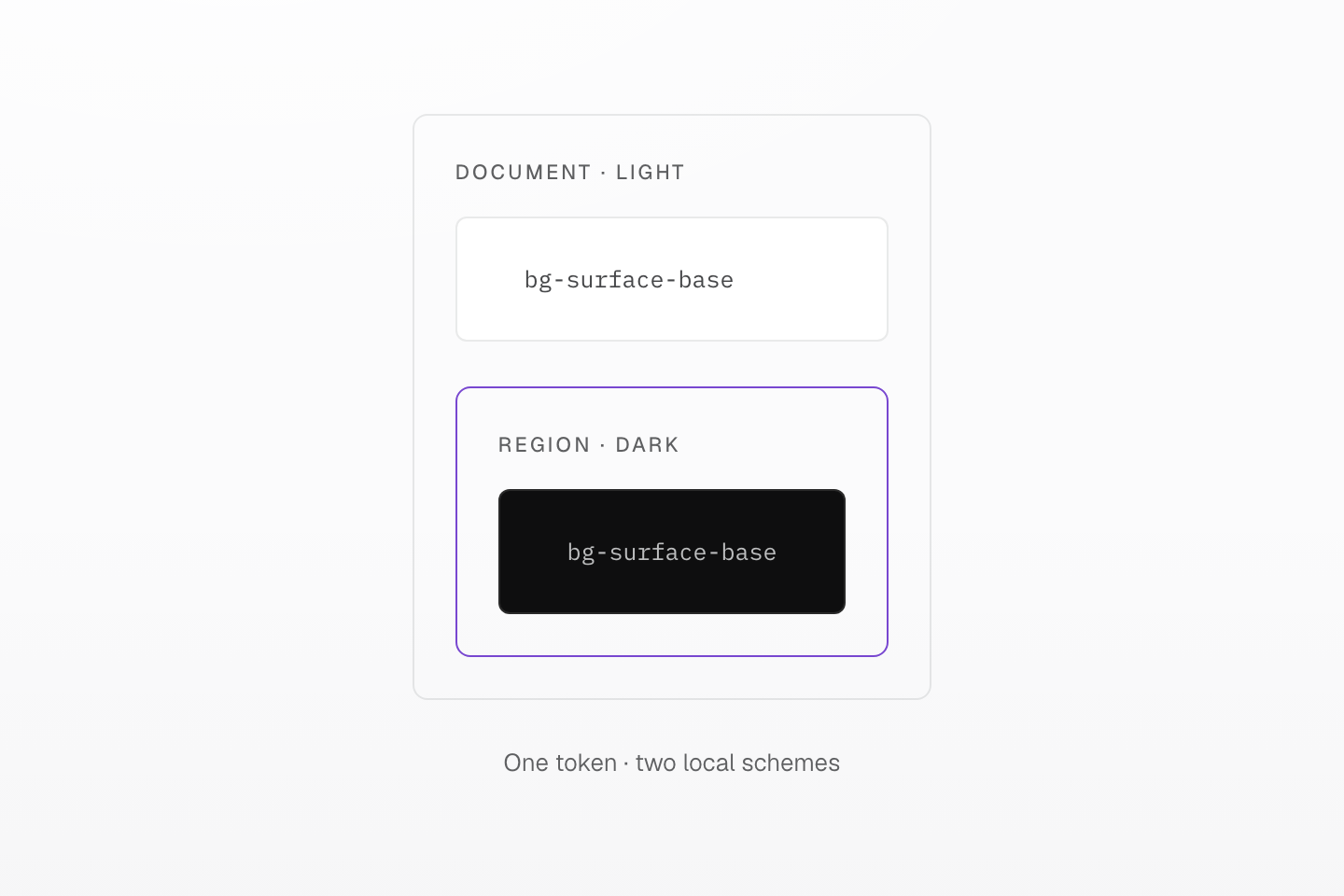
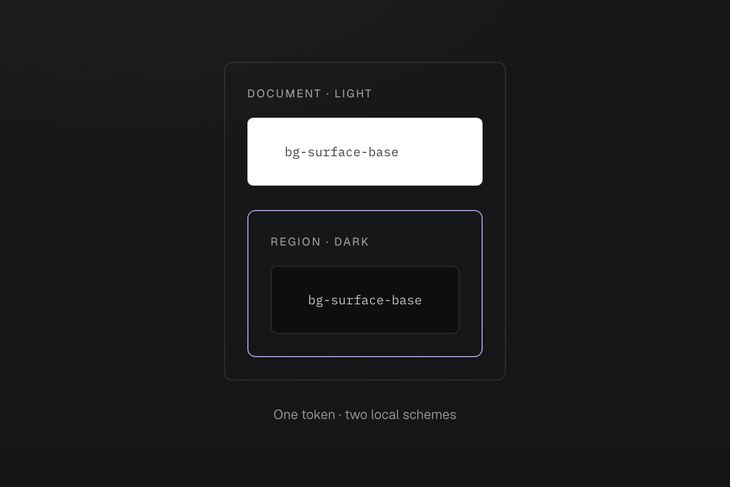
The nested boundary represents color-scheme. Token names and markup stay unchanged.
Text description
A light document encloses a dark region. The same semantic token paints a light surface outside and a dark surface inside the region.
#Check the roles in context
Inspect the same content in both schemes. Check strong and muted text against their actual surfaces, links in rest and focus states, and the boundaries that identify controls. A color token supplies a value; it does not establish contrast, focus visibility or the meaning of a state on its own.
For a selected item or status, pair color with a label, icon or another visible cue. Verify nested regions separately: a manual light region inside a dark page still needs its own readable surface and foreground pairing.