Typography
Choose complete text treatments or single font tokens, and set the site typeface once.
On this page
#Overview
Use text-<token> for a complete type treatment: font size, line height and letter spacing in one class. Add the weight, family and color as separate classes.
A readable type hierarchy
<p class="text-xs font-regular fg-text-muted">Field notes / 024</p><h2 class="text-2xl font-regular fg-text-strong">Make room for the details.</h2><p class="text-sm">A consistent type scale helps readers move from the main idea to the supporting detail.</p>Generated CSS
@layer theme { :root, :host { --font-weight-regular: 400; --font-size-2xl: 1.5rem; --text-2xl: var(--font-size-2xl); --text-2xl--line-height: 1.35; --text-2xl--letter-spacing: -.015em }}@layer utilities { .text-2xl { font-size: var(--text-2xl); line-height: var(--text-2xl--line-height, normal); letter-spacing: var(--text-2xl--letter-spacing, normal) } .font-regular { font-weight: var(--font-weight-regular) }}This hierarchy uses size, spacing and text roles while keeping regular weight. Add emphasis only where the content calls for it; a heading does not need a heavier weight by default. See Text for every treatment and how to add one.
#Text treatments and font sizes
font-<size> changes only the font size and keeps the inherited line height and letter spacing. text-<token> sets all three. Compare the same size in both forms:
The same size can have a different rhythm
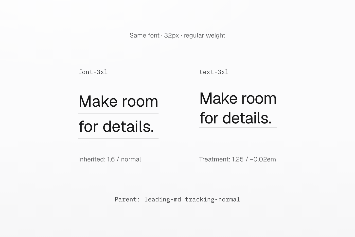
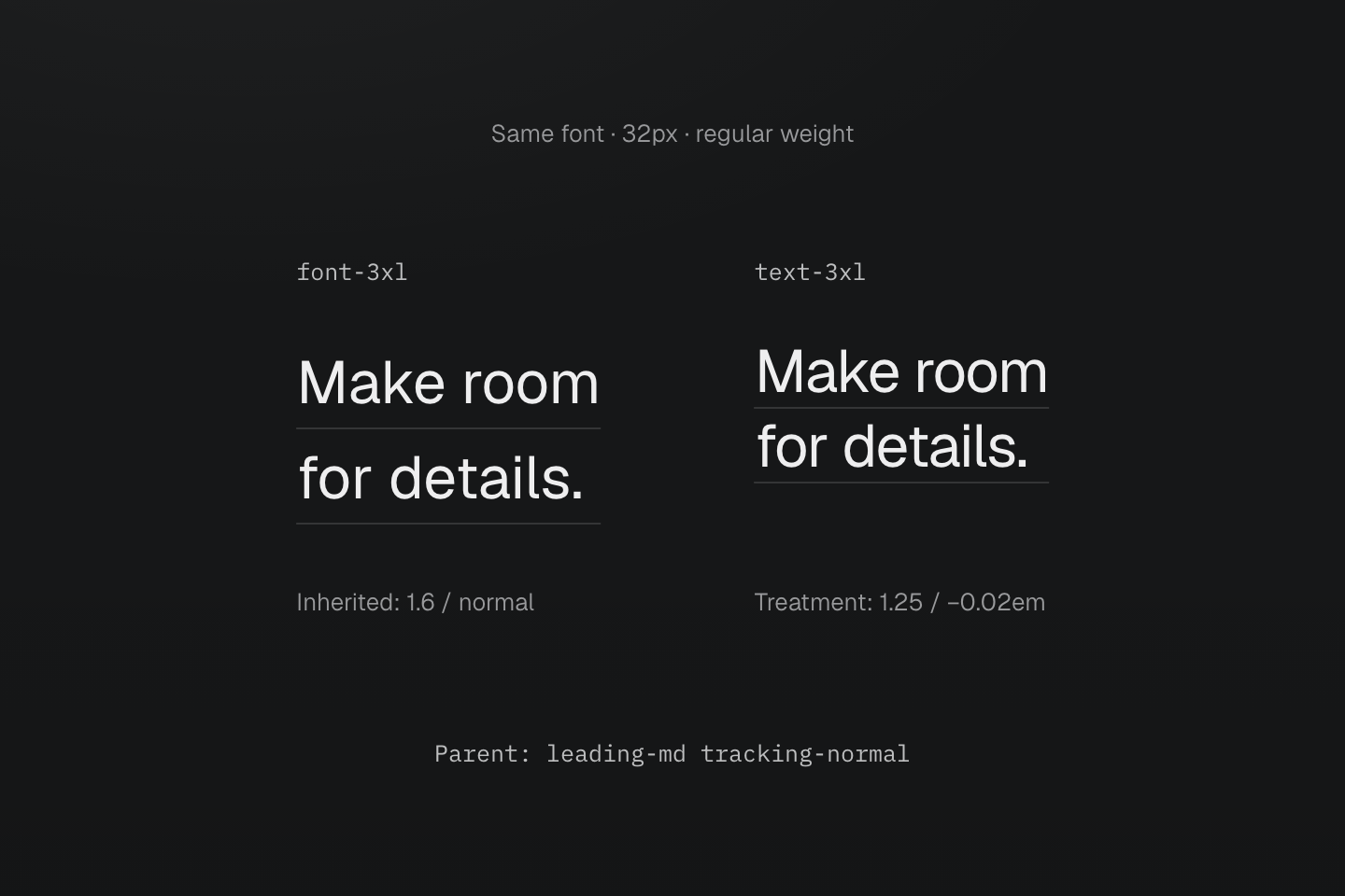
Actual preset typography at a 16px root size. Each row marks a line box; font-size alone does not describe the spacing between lines.
Text description
- Font size only. font-3xl sets the size to 2rem. In this parent it inherits line-height 1.6 and normal letter spacing.
- Complete treatment. text-3xl sets the same 2rem size plus line-height 1.25 and letter-spacing -0.02em.
- Compare the line boxes. With a 16px root size, the examples have 32px text and line heights of 51.2px and 40px. The same two lines occupy different heights.
One size, two type treatments
<div class="leading-md tracking-normal"> <p class="font-3xl">Designing for a clearer reading experience.</p> <p class="text-3xl">Designing for a clearer reading experience.</p></div>Generated CSS
@layer theme { :root, :host { --font-size-3xl: 2rem; --text-3xl: var(--font-size-3xl); --text-3xl--line-height: 1.25; --text-3xl--letter-spacing: -.02em }}@layer utilities { .text-3xl { font-size: var(--text-3xl); line-height: var(--text-3xl--line-height, normal); letter-spacing: var(--text-3xl--letter-spacing, normal) } .font-3xl { font-size: var(--font-size-3xl) }}Use text-<token> for body, heading and display styles. Use font-<size>, leading-<token> or tracking-<token> only when the design deliberately departs from a treatment.
The font- prefix also accepts family and weight keys: font-sans chooses a family and font-bold requests a weight. Keep custom names distinct across these namespaces; Font lists their values and resolution rules.
#Site typeface
Set the app typeface once in @theme. The preset base layer applies it to the document, so markup needs no font classes.
@import "@master/css";@theme { --font-sans: "Geist", "Noto Sans TC"; --font-mono: "IBM Plex Mono"; --font-feature-sans: "ss02", "ss03", "ss04", "ss06", "ss07", "ss08"; --font-feature-mono: "cv01", "cv02", "cv29";}The base layer resolves --font-sans through --font-family-sans and applies it to body and shadow hosts. It resolves --font-mono through --font-family-mono and applies it to code, kbd, samp and pre. The --font-feature-* tokens are optional and fall back to normal; form controls inherit the surrounding font. Load the font files with @font-face or a provider stylesheet. For a single element, use a class such as font-mono instead.
A family request still needs an available font face
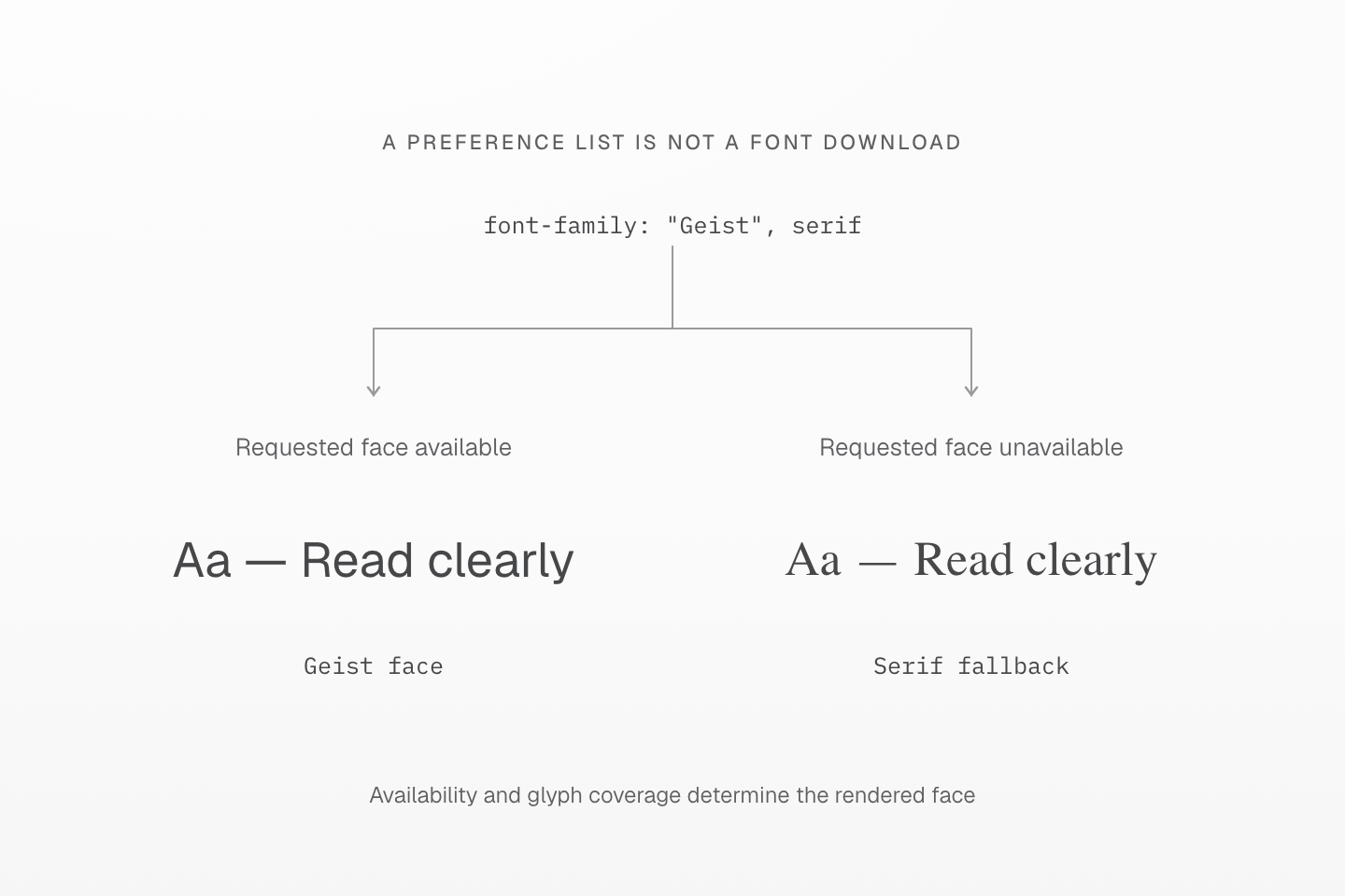
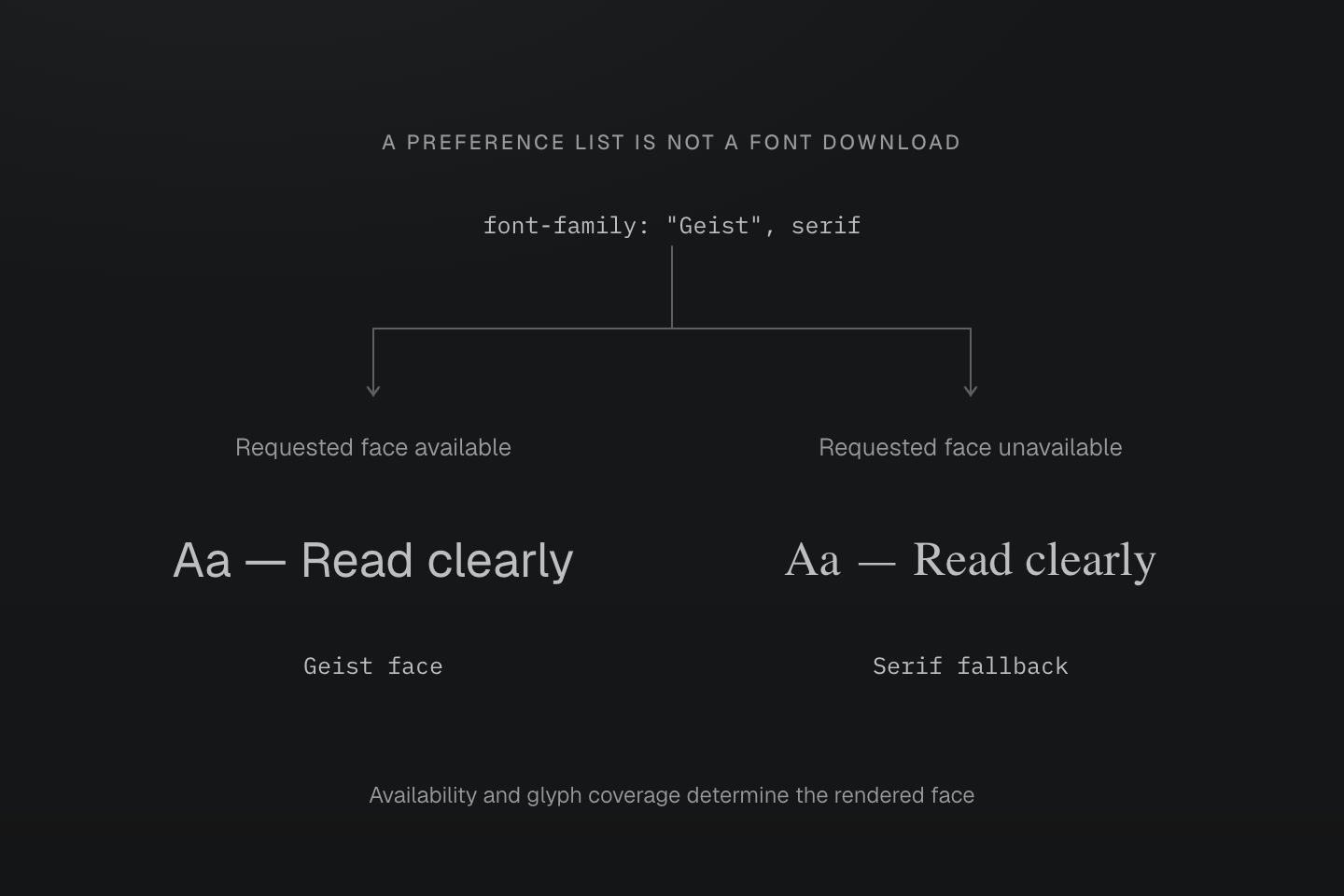
The samples illustrate two availability cases, not a measured download timeline. The requested face is illustrated with the loaded Geist file; the fallback uses the browser’s serif face.
Text description
- A font-family declaration names an ordered preference. It does not download a font by itself.
- An available matching face can render the text; otherwise the browser tries a later family. Glyph coverage also matters, so different characters in one line can use different fonts.
- Load web fonts through @font-face or a provider stylesheet and inspect rendered fonts, not only the computed font-family string.
#Verify with real text
Check a short heading, a long heading and a full paragraph at the actual content width. Repeat with narrow screens and larger text. Watch line breaks and clipped accents or descenders, not only the computed font size.
Changing the text measure changes its line breaks
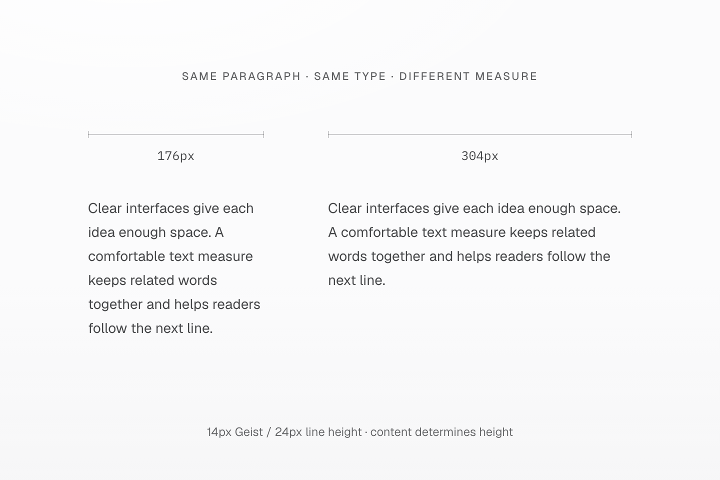
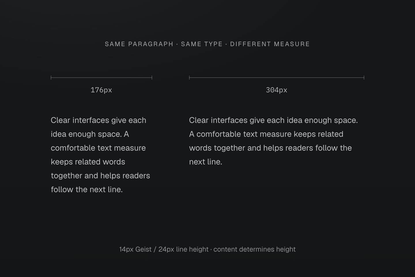
Only the content width changes. Both paragraphs use 14px Geist with a 24px line height and grow to fit all their text.
Text description
- A narrow text measure wraps sooner, making the same paragraph taller. The wider measure keeps more words together on each line.
- Neither specimen has a fixed height or shortened text. Check the actual paragraph width as well as its font size when assessing a composition.
Keep the text measure, let the height grow
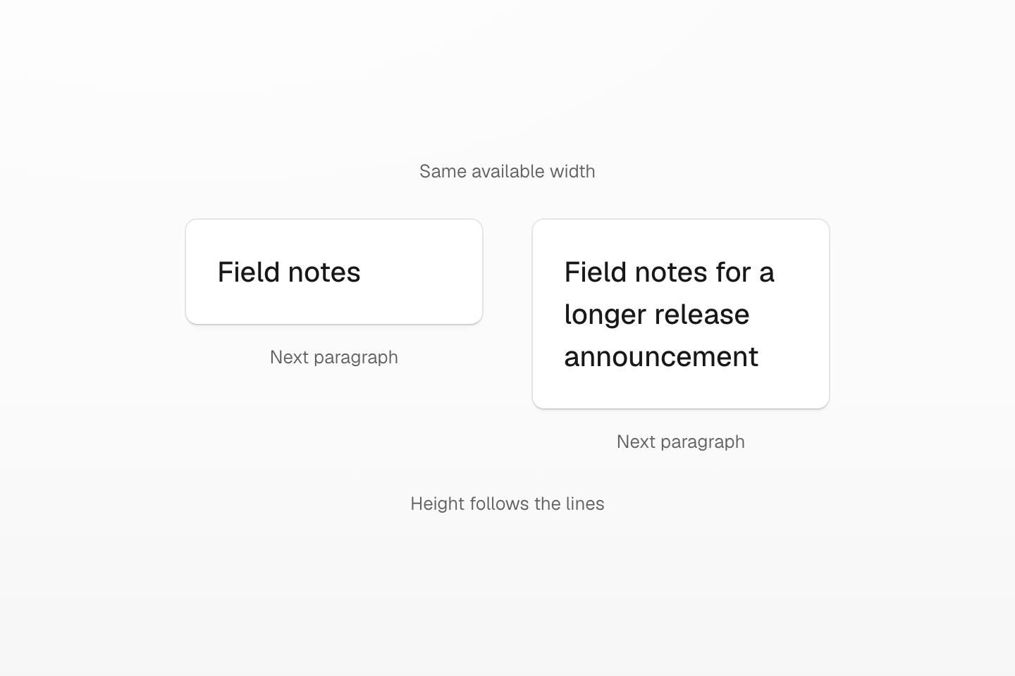
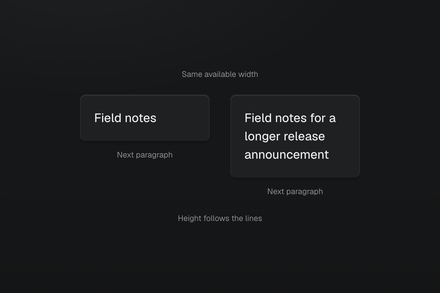
The width is controlled for comparison. Neither text box has a fixed height; the content establishes the vertical extent.
Text description
Two equal-width text specimens contain short and long text. The longer heading takes more lines and pushes the following content down.
A declared font family is a request, not proof that its font file loaded or contains every glyph. Inspect the rendered fonts, especially when Latin and CJK text share a line. Keep containers free to grow with the text; do not set a card height just to preserve one English sample's line count.