Theme tokens
Define shared design values, see how token edits affect consumers, and choose local overrides, static delivery and inline substitution.
On this page
#Overview
Define a token when several elements should change together: card spacing, an action color or the width of a reading column. Put it in @theme after the existing @import '@master/css' in your app stylesheet, then use the matching class in markup.
Three shared values, one card
@theme { --color-brand: #4f46e5; --spacing-card: 1.5rem; --radius-card: 0.5rem;}<article class="max-w-sm mx-auto p-card r-card bg-surface-raised fg-text-body shadow-sm"> <p class="flex items-center gap-xs m(0) text-xs fg-text-muted"> <span aria-hidden="true" class="h(8) w(8) pill bg-brand"></span>Brand color</p> <h2 class="mt-sm mb-xs text-lg font-regular">Field notes</h2> <p class="m(0) text-sm fg-text-muted">Keep the details that matter.</p></article>Generated CSS
@layer theme { :root, :host { --color-zinc-30: oklch(78% .0025 265); --color-zinc-40: oklch(68.6% .0028 265); --color-zinc-60: oklch(48.6% .003 265); --color-zinc-70: oklch(39.8% .0028 265); --color-zinc-90: oklch(24.6% .0022 265) } :root, :host { --color-surface-raised: light-dark(var(--color-white), var(--color-zinc-90)); --color-text-body: light-dark(var(--color-zinc-70), var(--color-zinc-30)); --color-text-muted: light-dark(var(--color-zinc-60), var(--color-zinc-40)) } :root, :host { --color-white: oklch(100% 0 none) } :root, :host { --font-weight-regular: 400; --font-size-xs: .75rem; --font-size-sm: .875rem; --font-size-lg: 1.125rem; --text-xs: var(--font-size-xs); --text-xs--line-height: 1.5; --text-xs--letter-spacing: 0; --text-sm: var(--font-size-sm); --text-sm--line-height: 1.5; --text-sm--letter-spacing: 0; --text-lg: var(--font-size-lg); --text-lg--line-height: 1.5; --text-lg--letter-spacing: 0; --spacing-xs: .5rem; --spacing-sm: .75rem; --container-sm: 24rem } :root, :host { --shadow-sm: 0 0 0 1px light-dark(oklch(0% 0 none / .04), oklch(100% 0 none / .05)), 0 1px 1px -.5px light-dark(oklch(0% 0 none / .045), oklch(0% 0 none / .3)), 0 2px 2px -1px light-dark(oklch(0% 0 none / .04), oklch(0% 0 none / .26)), 0 4px 4px -2px light-dark(oklch(0% 0 none / .04), oklch(0% 0 none / .24)) } :root, :host { --color-brand: #4f46e5; --spacing-card: 1.5rem; --radius-card: .5rem }}@layer utilities { .text-lg { font-size: var(--text-lg); line-height: var(--text-lg--line-height, normal); letter-spacing: var(--text-lg--letter-spacing, normal) } .text-sm { font-size: var(--text-sm); line-height: var(--text-sm--line-height, normal); letter-spacing: var(--text-sm--letter-spacing, normal) } .text-xs { font-size: var(--text-xs); line-height: var(--text-xs--line-height, normal); letter-spacing: var(--text-xs--letter-spacing, normal) } .items-center { align-items: center } .bg-brand { background-color: var(--color-brand) } .bg-surface-raised { background-color: var(--color-surface-raised) } .r-card { border-radius: var(--radius-card) } .pill { border-radius: calc(infinity * 1px) } .shadow-sm { box-shadow: var(--shadow-sm) } .fg-text-body { color: var(--color-text-body) } .fg-text-muted { color: var(--color-text-muted) } .flex { display: flex } .font-regular { font-weight: var(--font-weight-regular) } .gap-xs { gap: var(--spacing-xs) } .h\(8\) { height: calc(8 * 1px) } .m\(0\) { margin: calc(0 * 1px) } .mx-auto { margin-inline: auto } .mb-xs { margin-bottom: var(--spacing-xs) } .mt-sm { margin-top: var(--spacing-sm) } .max-w-sm { max-width: var(--container-sm) } .p-card { padding: var(--spacing-card) } .w\(8\) { width: calc(8 * 1px) }}p-card generates padding: var(--spacing-card); the browser resolves the custom property on the card. Change the token when every consumer should change together, and use a local value when the change belongs to one element.
#Change one value across its consumers
--spacing-card can supply both a card's padding and a list's gap. Change its value from 1.5rem to 2rem, and both uses change without editing their markup:
<article class="p-card">Field notes</article><ul class="flex gap-card"> <li>Draft</li> <li>Ready</li></ul>One shared value changes padding and gap together
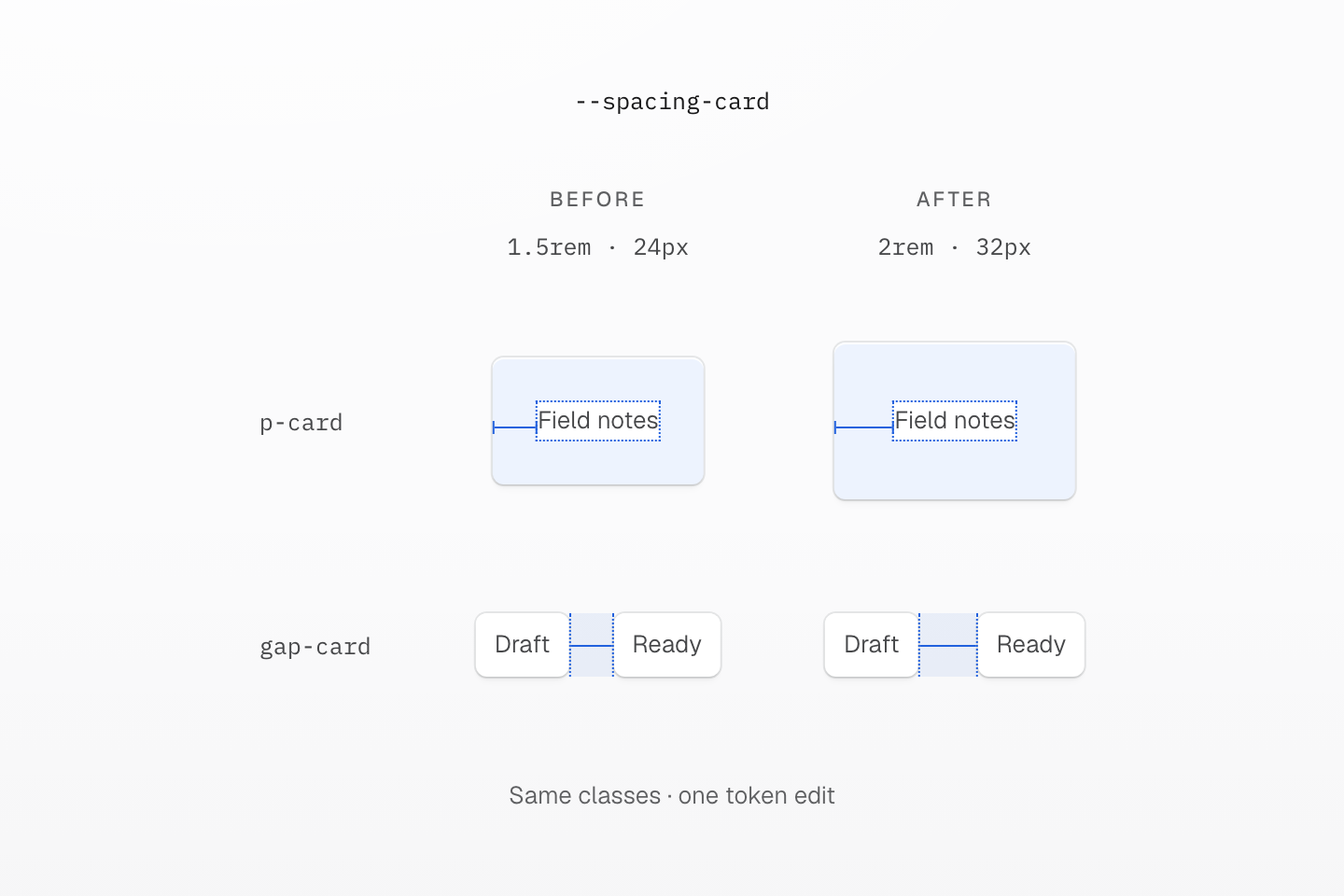
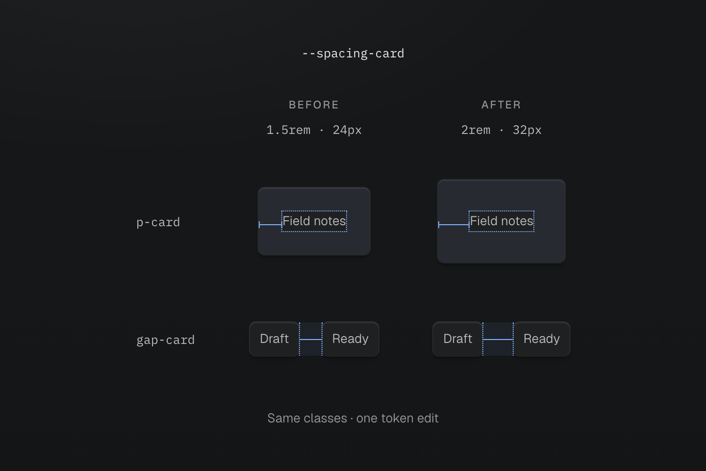
The markup stays the same in both columns. Measurements assume a 16px root font size; the highlighted regions show padding and gap at their actual relative sizes.
Text description
- Before. At a root font size of 16px, --spacing-card: 1.5rem supplies 24px of padding through p-card and a 24px gap through gap-card.
- After. Changing the token to 2rem increases both measurements to 32px without editing the classes.
- Choose the coupling. Use one token only when these spaces should change together. Separate design decisions need separate tokens even if their current values match.
This coupling is a design decision. If cards should become roomier while list spacing stays the same, give those decisions separate tokens. Sharing a number today does not mean two parts of the interface should always change together.
#Name tokens by namespace
The token prefix chooses its namespace, and each class family reads the namespaces it understands. --spacing-card serves p-card, m-card and gap-card; --radius-card serves r-card; --container-panel serves max-w-panel. The same key can mean different values in different families: p-lg reads spacing and r-lg reads radius.
@theme { --color-text-action: var(--color-brand); --font-family-sans: Geist, ui-sans-serif, system-ui, sans-serif; --container-panel: 28rem;}Only @theme declarations register class tokens; a native custom property elsewhere does not. Name a token after the shared decision, such as brand or card, not the first component that used it. Redefine a preset key, such as --spacing-lg, to change it for the whole project. See the family index for which namespaces each class reads, and Variables and modes for resolution.
#Alias and override tokens
Use var() when one token should follow another. Aliases resolve before inheritance: if --color-text-action is declared at the root, overriding --color-brand in a descendant does not rebind the inherited alias. Redeclare the alias in that scope.
A local brand and an inherited alias
@theme { --color-brand: light-dark(#1d4ed8, #93c5fd); --color-text-action: var(--color-brand);}@layer components { [data-brand="plum"] { --color-brand: light-dark(#86198f, #f0abfc); } [data-rebind-action] { --color-text-action: var(--color-brand); }}<section data-brand="plum" class="p-lg r-lg bg-surface-raised"> <h2 class="m(0) text-lg font-regular fg-brand">Plum brand scope</h2> <p class="mt-md mb(0) text-sm font-regular fg-text-action">Inherited action: blue</p> <p data-rebind-action class="mt-sm mb(0) text-sm font-regular fg-text-action">Rebound action: plum</p></section>Generated CSS
@layer components { [data-brand="plum"] { --color-brand: light-dark(#86198f, #f0abfc); } [data-rebind-action] { --color-text-action: var(--color-brand); }}@layer theme { :root, :host { --color-zinc-90: oklch(24.6% .0022 265) } :root, :host { --color-surface-raised: light-dark(var(--color-white), var(--color-zinc-90)) } :root, :host { --color-white: oklch(100% 0 none) } :root, :host { --font-weight-regular: 400; --font-size-sm: .875rem; --font-size-lg: 1.125rem; --text-sm: var(--font-size-sm); --text-sm--line-height: 1.5; --text-sm--letter-spacing: 0; --text-lg: var(--font-size-lg); --text-lg--line-height: 1.5; --text-lg--letter-spacing: 0; --radius-lg: .5rem; --spacing-sm: .75rem; --spacing-md: 1rem; --spacing-lg: 1.5rem } :root, :host { --color-brand: light-dark(#1d4ed8, #93c5fd); --color-text-action: var(--color-brand) }}@layer utilities { .text-lg { font-size: var(--text-lg); line-height: var(--text-lg--line-height, normal); letter-spacing: var(--text-lg--letter-spacing, normal) } .text-sm { font-size: var(--text-sm); line-height: var(--text-sm--line-height, normal); letter-spacing: var(--text-sm--letter-spacing, normal) } .bg-surface-raised { background-color: var(--color-surface-raised) } .r-lg { border-radius: var(--radius-lg) } .fg-brand { color: var(--color-brand) } .fg-text-action { color: var(--color-text-action) } .font-regular { font-weight: var(--font-weight-regular) } .m\(0\) { margin: calc(0 * 1px) } .mt-md { margin-top: var(--spacing-md) } .mt-sm { margin-top: var(--spacing-sm) } .mb\(0\) { margin-bottom: calc(0 * 1px) } .p-lg { padding: var(--spacing-lg) }}An inherited alias keeps its computed value
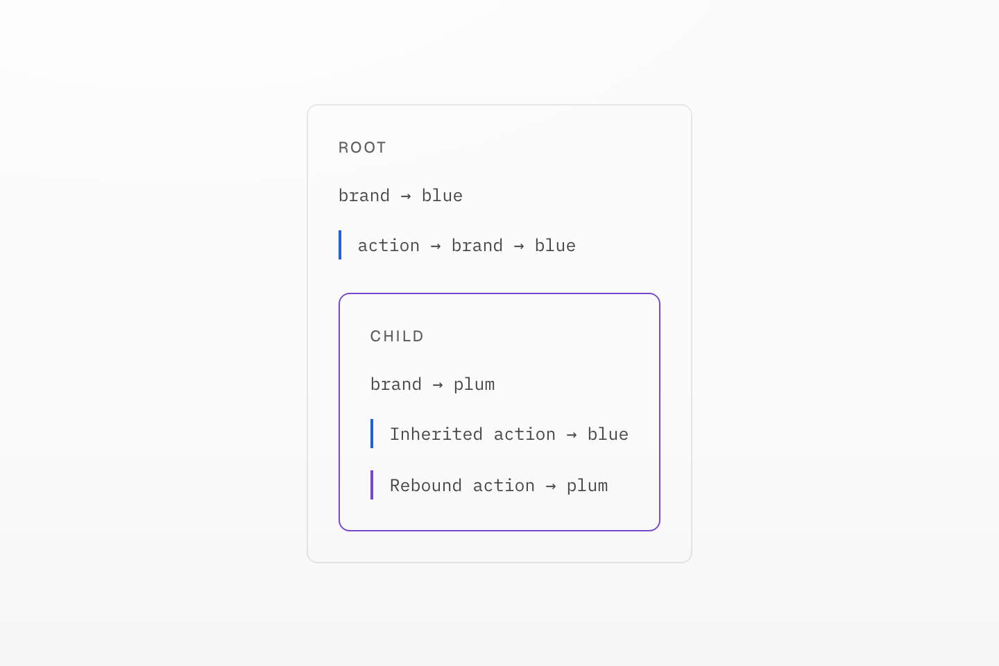
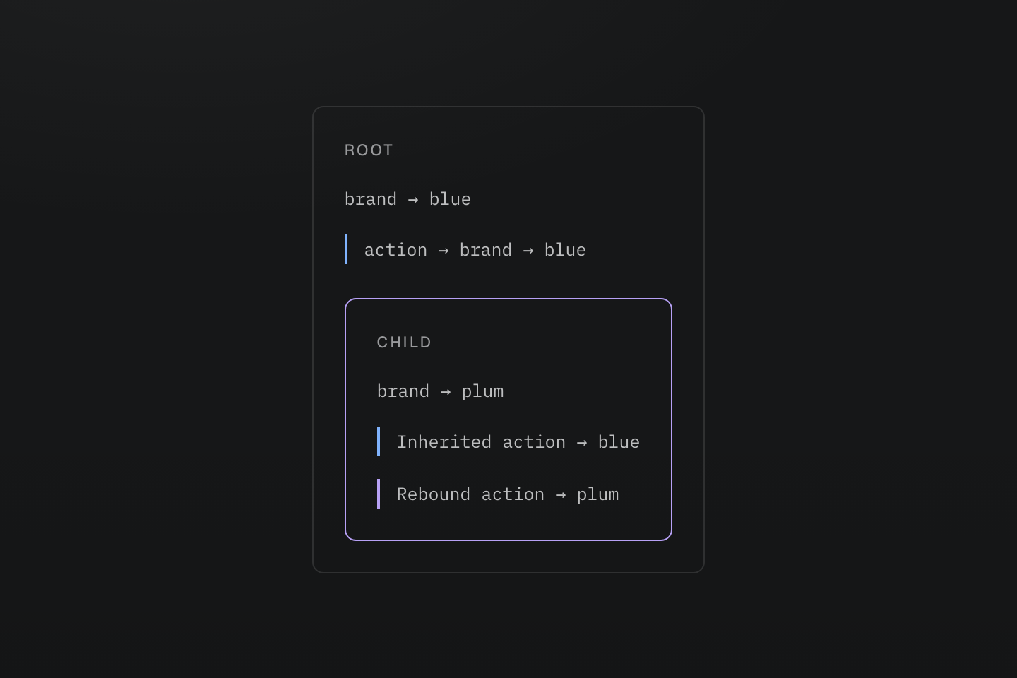
The blue and violet marks identify the two value paths. This is a scope diagram, not an extra theme switch.
Text description
The root resolves an action alias to blue. A child changes brand to plum: the inherited alias remains blue until it is redeclared in that child.
For a color that follows light and dark modes, give the token a light-dark() value and keep its name mode-neutral, such as --color-surface-card. See Color for activating modes.
#Choose token delivery and value substitution
The two modifiers answer different questions:
| Need | Choose | Result |
|---|---|---|
| Emit values when the project uses them | Ordinary @theme | On-demand declarations; classes keep token references. |
| Keep values even without a discovered consumer | @theme static | Token declarations remain available, for example to an external integration. |
| Resolve a referenced variable on each styled element | @theme inline | Generated declarations substitute the token value once. |
Use static for a value read by an integration that static discovery cannot see:
@theme static { --color-integration-brand: #4f46e5; }Use inline to bridge a native variable that should resolve on the element using the class:
@theme inline { --color-brand: var(--app-brand); }:root { --app-brand: #4f46e5; }[data-theme="ocean"] { --app-brand: #0369a1; }<section data-theme="ocean"> <div class="bg-brand">Ocean background</div></section>Here bg-brand emits background-color: var(--app-brand), so the inner element reads the ocean value inherited from its section. The substitution removes the intermediate --color-brand reference; it does not copy a fixed color into every element.
Combine the modifiers with @theme static inline when you need both behaviors. Inline substitution applies to classes and @apply; handwritten native CSS keeps its authored references. See the theme contract.
Choose retention and substitution independently
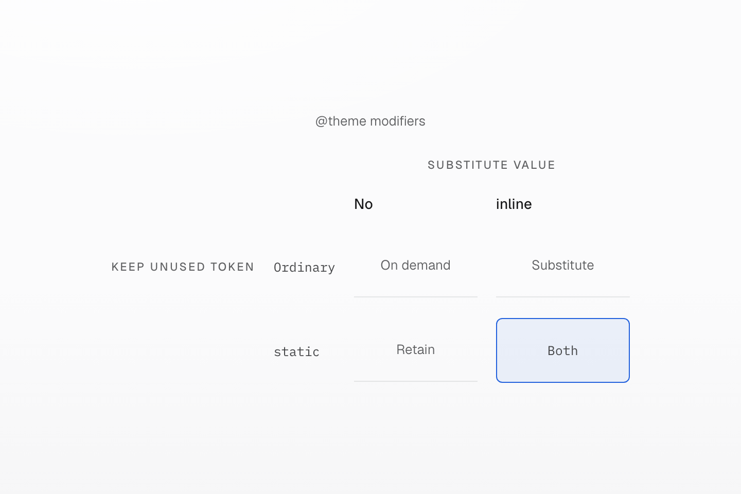
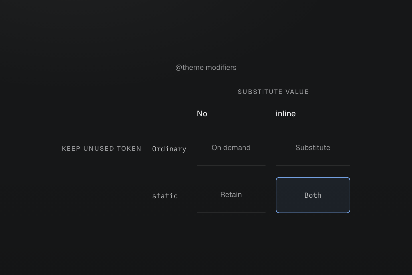
static controls retention; inline controls substitution. Using one does not imply the other.
Text description
Two perpendicular axes separate keeping a token without a consumer from substituting its value into generated declarations.
#Define motion tokens
An --animate-* token is a complete animation shorthand, so it can combine the keyframe name with duration and easing tokens. Write the keyframes as native CSS beside it:
Motion follows a real action
@theme { --duration-enter: 180ms; --easing-emphasized: cubic-bezier(.16, 1, .3, 1); --animate-dialog-in: dialog-in var(--duration-enter) var(--easing-emphasized) both;}@keyframes dialog-in { from { translate: 0 0.5rem; opacity: 0; }}<dialog class="animate-dialog-in@motion-safe">…</dialog>The token has no iteration count, so the entrance runs once; preset animate-* tokens repeat. @motion-safe keeps the dialog still when reduced motion is requested. Keyframes stay in their stylesheet by default; with @prune native, a referenced animation token retains its keyframes. Add @safelist keyframes "dialog-in"; for a name that only JavaScript applies. See Motion and the keyframe contract.