Variables and modes
Token lookup, dependency delivery, inline substitution, inheritance and mode activation.
On this page
A theme token has two roles: its name makes a value available to registered utility families, and its emitted custom property participates in native CSS. Master CSS resolves the class and retains its dependencies. The browser resolves the custom property's value through the cascade and inheritance.
This page defines token lookup, dependency delivery, substitution and mode activation. Theme explains when to share a token and how to build a project theme; the token index lists preset values.
Registration and lookup
Declare tokens in a top-level @theme block. A native custom property declared outside @theme can be used in CSS, but does not register token-backed classes by itself. Native selectors and queries belong outside the block. See @theme for its stylesheet grammar.
A token family determines which namespace to search. The key is the remaining part of the token name; hyphens within the key are preserved.
| Token | Class | Generated declaration |
|---|---|---|
--spacing-card | p-card | padding: var(--spacing-card) |
--radius-card | r-card | border-radius: var(--radius-card) |
--color-brand | bg-brand | background-color: var(--color-brand) |
--color-text-action | fg-text-action | color: var(--color-text-action) |
--color-line-divider | b-line-divider | border-color: var(--color-line-divider) |
text-action and line-divider are keys in the color namespace. outline-line-divider can consume --color-line-divider; outline-divider does not implicitly insert line-. The same key in two namespaces can supply different values: p-card and r-card resolve independently.
@theme { --spacing-card: 1.5rem; --radius-card: .5rem; --color-brand: #1d4ed8; --color-text-action: var(--color-brand); --color-line-divider: rgb(0 0 0 / 12%);}<article class="p-card r-card b(1) b-solid b-line-divider"> <a class="fg-text-action" href="/settings">Settings</a></article>Generated CSS
@layer theme { :root, :host { --color-line-divider: light-dark(oklch(0% 0 none / .12), oklch(100% 0 none / .12)) } :root, :host { --spacing-card: 1.5rem; --radius-card: .5rem; --color-brand: #1d4ed8; --color-text-action: var(--color-brand); --color-line-divider: #0000001f }}@layer utilities { .b-line-divider { border-color: var(--color-line-divider) } .r-card { border-radius: var(--radius-card) } .b-solid { border-style: solid } .b\(1\) { border-width: calc(1 * 1px) } .fg-text-action { color: var(--color-text-action) } .p-card { padding: var(--spacing-card) }}The family index owns the complete prefix-to-namespace mapping. Full CSS property names do not create token families automatically. Register a custom pattern with @utility when a project needs a new mapping. Fixed spellings such as w-full retain their fixed definition even if a token with the same key exists; see class resolution.
A native variable does not register a token class
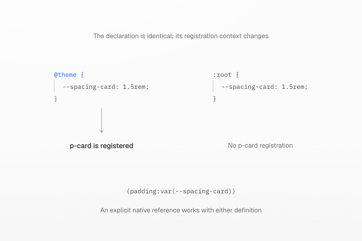
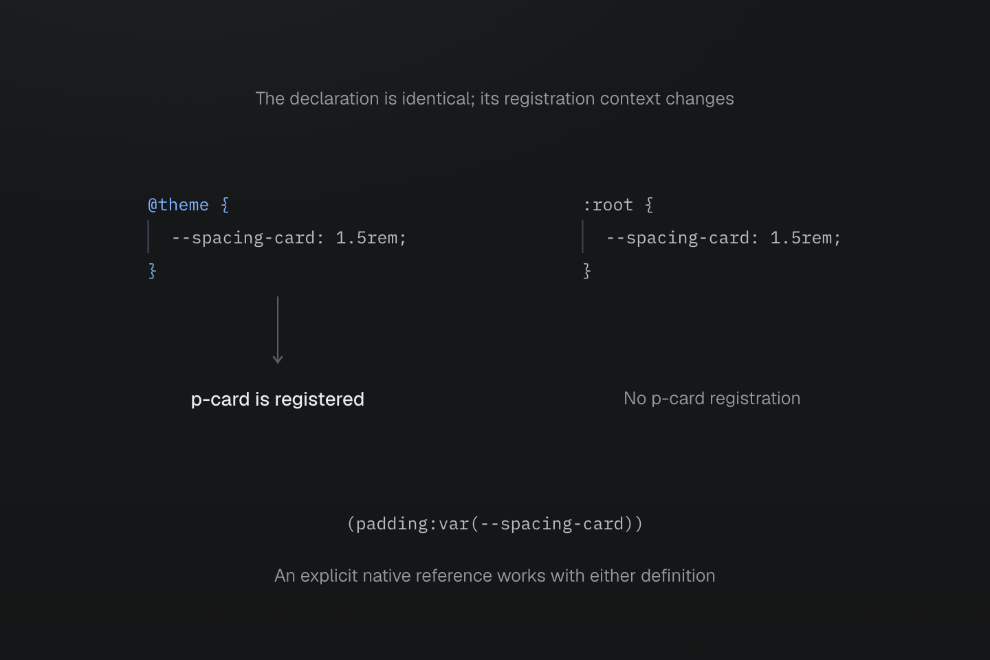
Both examples load the preset utility families. Registration and browser variable availability are separate capabilities.
Text description
- @theme { --spacing-card: 1.5rem; } registers the card key in the spacing namespace, making p-card available.
- :root { --spacing-card: 1.5rem; } supplies a native CSS variable but does not register p-card.
- The explicit native class (padding:var(--spacing-card)) can use the variable from either configuration.
Dependency delivery
A generated declaration normally retains its var() reference. Used managed tokens emit under :root, :host in the theme layer, together with their transitive managed dependencies.
@theme { --spacing-card: 1.5rem;}<div class="p-card">Example</div>Generated CSS
@layer theme { :root, :host { --spacing-card: 1.5rem }}@layer utilities { .p-card { padding: var(--spacing-card) }}When a token is live, its duplicate declarations remain in source order. Dependencies referenced by those values remain live too. Native stylesheet references can retain managed tokens; native custom-property declarations and scoped overrides remain part of their owning stylesheet and follow that file's preservation policy.
Master CSS does not choose a light, dark or viewport-specific value while generating a class. Inspection can report the authored declarations and dependencies; it cannot establish a computed value without the element, its ancestors and the browser environment.
A used token brings its dependencies
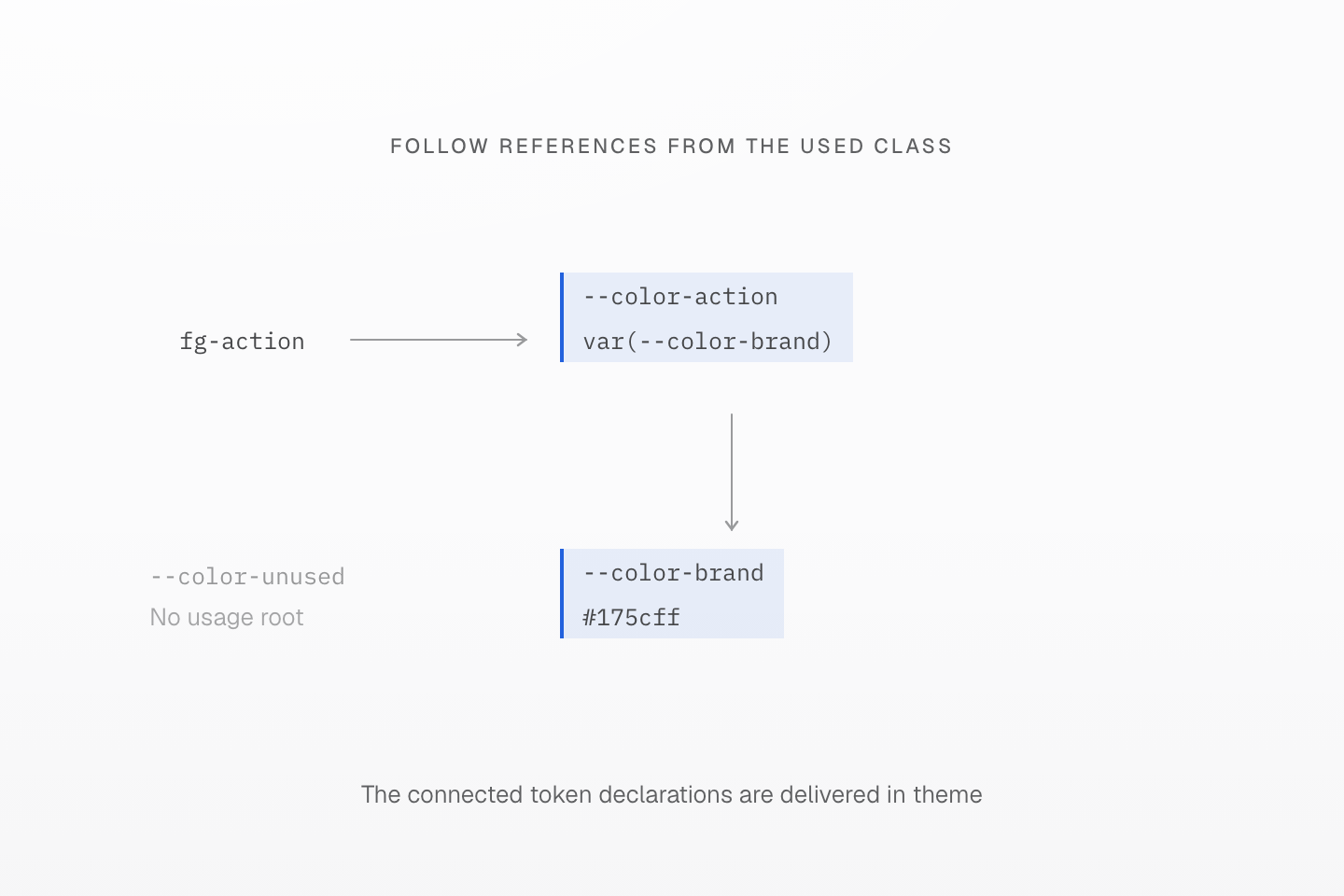
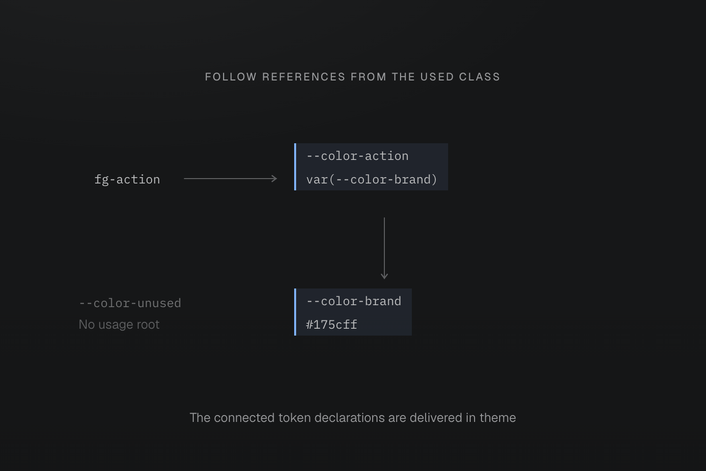
Arrows mean “references”, not execution or cascade priority. This example has no static tokens, safelists or other consumers.
Text description
- The theme defines --color-action: var(--color-brand), --color-brand: #175cff and an unrelated --color-unused.
- Using fg-action retains --color-action and its transitive dependency --color-brand in the theme layer.
- The unrelated token has no usage root in this example and is not emitted. The generated color declaration keeps var(--color-action); the browser resolves its value.
Missing names and invalid values
An unknown token key cannot produce a matching token-family class. This differs from a valid class whose emitted var() later resolves to an invalid value in the browser. Inheritance, cycles, fallbacks and property-value validity follow native custom-property rules; retaining a declaration does not prove that its eventual computed value is valid.
Inheritance and scoped aliases
Declare local overrides with native selectors. The same class can then receive different values in different scopes:
@theme { --color-panel: white;}[data-theme="ocean"] { --color-panel: #082f49;}<section data-theme="ocean"> <div class="bg-panel">Ocean panel</div></section>Derived values
An alias such as --color-link: var(--color-brand) resolves on the element where that alias is declared, before its computed value is inherited. Overriding only --color-brand in a descendant does not rebind the inherited alias. Redeclare the alias in the descendant scope when it should derive from the local brand.
The same scope rule applies to derived expressions such as color-mix():
@theme { --color-brand: #1d4ed8; --color-link: var(--color-brand); --color-link-hover: color-mix(in oklab, var(--color-brand), black 15%);}[data-theme="plum"] { --color-brand: #86198f; --color-link: var(--color-brand); --color-link-hover: color-mix(in oklab, var(--color-brand), black 15%);}These functions remain CSS expressions. Master CSS does not calculate a separate color for every authored scope. See the interactive alias example for the inherited and rebound results side by side.
Inline substitution and static delivery
inline changes what a generated declaration references. static changes whether the token's custom-property declaration needs a discovered consumer. These are independent behaviors.
| Definition | Generated class declaration | Custom-property delivery |
|---|---|---|
@theme | Keeps the token reference | Retained when needed |
@theme inline | Substitutes the token value once | The substituted class does not itself require that token declaration |
@theme static | Keeps the token reference | Retained without a discovered consumer |
@theme static inline | Substitutes the token value once | Retained without a discovered consumer |
Inline substitution removes one level of indirection. References inside the substituted value still resolve in the browser; inline does not recursively replace them with constants. It applies to Master-generated declarations, including @apply expansion. Handwritten native CSS keeps its original var() references.
Where the remaining variable resolves
Both configurations below define --color-brand: var(--app-brand) and use bg-brand. Only the inline modifier changes. In each case the document root is blue and a nested section overrides --app-brand to plum.
Inline substitution changes the remaining reference
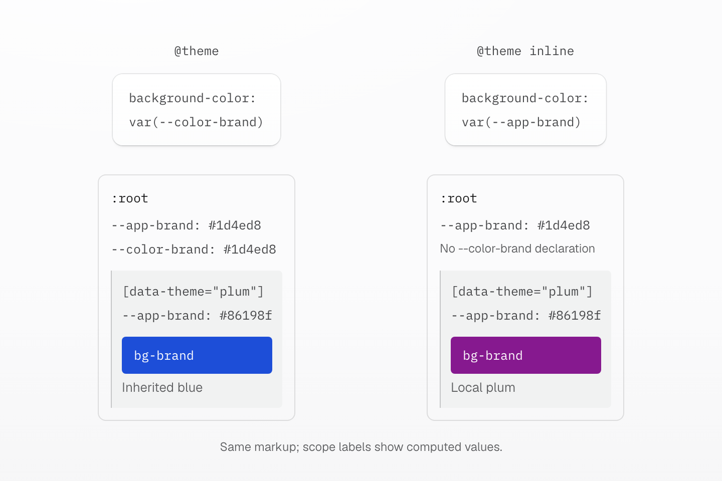
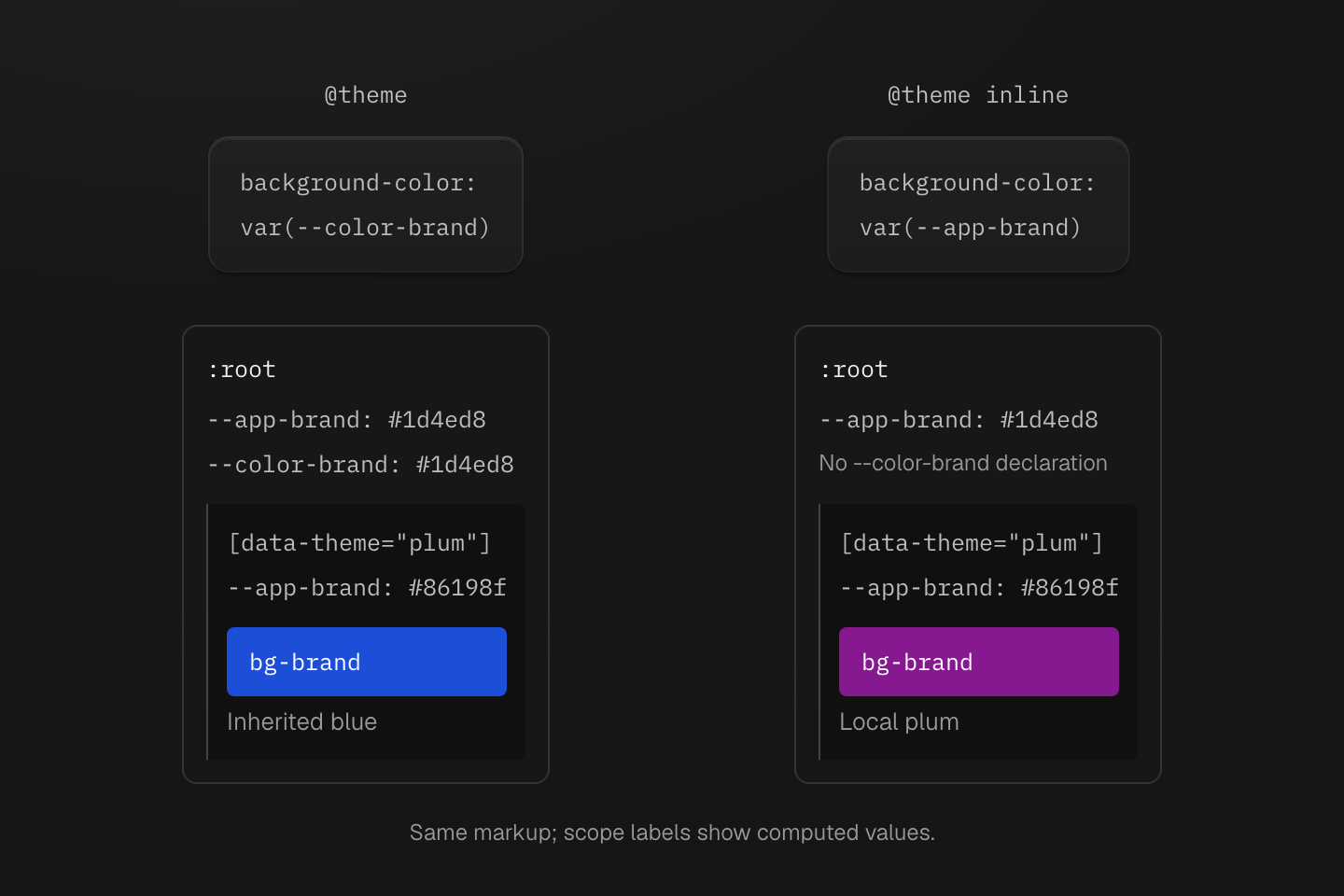
Both examples use bg-brand in the same markup. The ordinary token inherits a value resolved at the root; inline makes the generated declaration read --app-brand on the styled element.
Text description
- Both configurations define --color-brand: var(--app-brand). The root defines --app-brand as #1d4ed8, and a nested section overrides it to #86198f.
- With ordinary @theme, bg-brand emits background-color: var(--color-brand). The root computes --color-brand as blue; the nested consumer inherits that computed value.
- With @theme inline, bg-brand emits background-color: var(--app-brand). The consuming element reads the plum value inherited from its section.
- The swatches show the resulting backgrounds. Root values in the drawing are computed values, not a claim that the compiler evaluates colors.
With ordinary @theme, the generated declaration reads --color-brand. That token's var(--app-brand) resolves at the root; the nested element inherits the resulting blue value.
@theme { --color-brand: var(--app-brand);}:root { --app-brand: #1d4ed8;}[data-theme="plum"] { --app-brand: #86198f;}<section data-theme="plum"> <div class="bg-brand">Inherited blue</div></section>Generated CSS
:root { --app-brand: #1d4ed8;}[data-theme="plum"] { --app-brand: #86198f;}@layer theme { :root, :host { --color-brand: var(--app-brand) }}@layer utilities { .bg-brand { background-color: var(--color-brand) }}With @theme inline, the generated declaration reads --app-brand directly on the styled element. It receives the plum value from its section.
@theme inline { --color-brand: var(--app-brand);}:root { --app-brand: #1d4ed8;}[data-theme="plum"] { --app-brand: #86198f;}<section data-theme="plum"> <div class="bg-brand">Local plum</div></section>Generated CSS
:root { --app-brand: #1d4ed8;}[data-theme="plum"] { --app-brand: #86198f;}@layer utilities { .bg-brand { background-color: var(--app-brand) }}Use static independently when an external consumer needs a token that discovery cannot see. See the theme modifiers for accepted forms and definition scope.
Mode activation
A mode is an authored CSS scope or condition, not a second token namespace. Changing token values and restricting a rule to a mode are separate operations.
| Mechanism | What changes | What activates it |
|---|---|---|
| Native custom-property override | Values inherited in that scope | The authored selector or native query |
light-dark() token | Selected color value | The element's used color scheme |
Preset @dark or @light suffix | Whether a rule can apply | System prefers-color-scheme media query |
Selector mixin via @apply(--name) | Where the generated rule matches | Exactly the selector written in the mixin |
Manual scopes and rule wrappers
A token class such as bg-surface follows the variable it inherits. To apply a different declaration only in an ocean scope, explicitly author that scope in a mixin. & stands for the generated selector; the descendant branch below is written deliberately, not inserted by Master CSS.
@theme { --color-surface: white;}[data-theme="ocean"] { --color-surface: #082f49;}@mixin --ocean { &:where([data-theme="ocean"], [data-theme="ocean"] *) { @contents; }}<section data-theme="ocean"> <div class="bg-surface p(16)@apply(--ocean)">Ocean panel</div></section>Generated CSS
[data-theme="ocean"] { --color-surface: #082f49;}@layer theme { :root, :host { --color-surface: white }}@layer utilities { .p\(16\)\@apply\(--ocean\):where([data-theme="ocean"], [data-theme="ocean"] *) { padding: calc(16 * 1px) } .bg-surface { background-color: var(--color-surface) }}The token override changes the background value. The mixin changes where padding applies. Neither mechanism defines the other. For wrapper arguments and placement, see Utilities and mixins.
System preference and manual color schemes
The full preset supplies native color-scheme rules: the root allows light dark, while data-theme="light" or data-theme="dark" fixes the scheme on a region. A token can use light-dark(white, #111827) to follow that scheme. The browser selects the value; no second class is needed. See light-dark() for native behavior.
The preset's @dark and @light suffixes remain system media queries even inside a manually themed region. Changing data-theme does not activate them. Color demonstrates manual activation and nested regions.
Local overlap and Shadow DOM
Overlapping scopes follow the ordinary cascade, including layer order and specificity. A local value is not automatically stronger merely because its selector describes a theme. See Cascade layers.
Default theme declarations include :host. Write scoped host overrides explicitly and load the needed stylesheets in the shadow tree:
@theme { --color-panel: white;}:host([data-theme="dark"]) { --color-panel: #111827;}Tokens do not replace resource delivery. Native keyframes and their dependency retention are covered by the keyframe contract, and stylesheet preservation by Native CSS pruning.