Conditions
Accepted query suffixes, named conditions, nested wrappers and queries that belong in CSS.
On this page
A condition suffix limits when a class's rule can apply. Master CSS resolves named definitions and emits native CSS queries; the browser evaluates those queries. Compilation does not test the current viewport, input device or browser support.
This page defines accepted suffixes, query encoding and composition. For choosing a viewport or component boundary, see Responsive design. For progressive enhancement, see Compatibility.
Matching a query makes a rule eligible
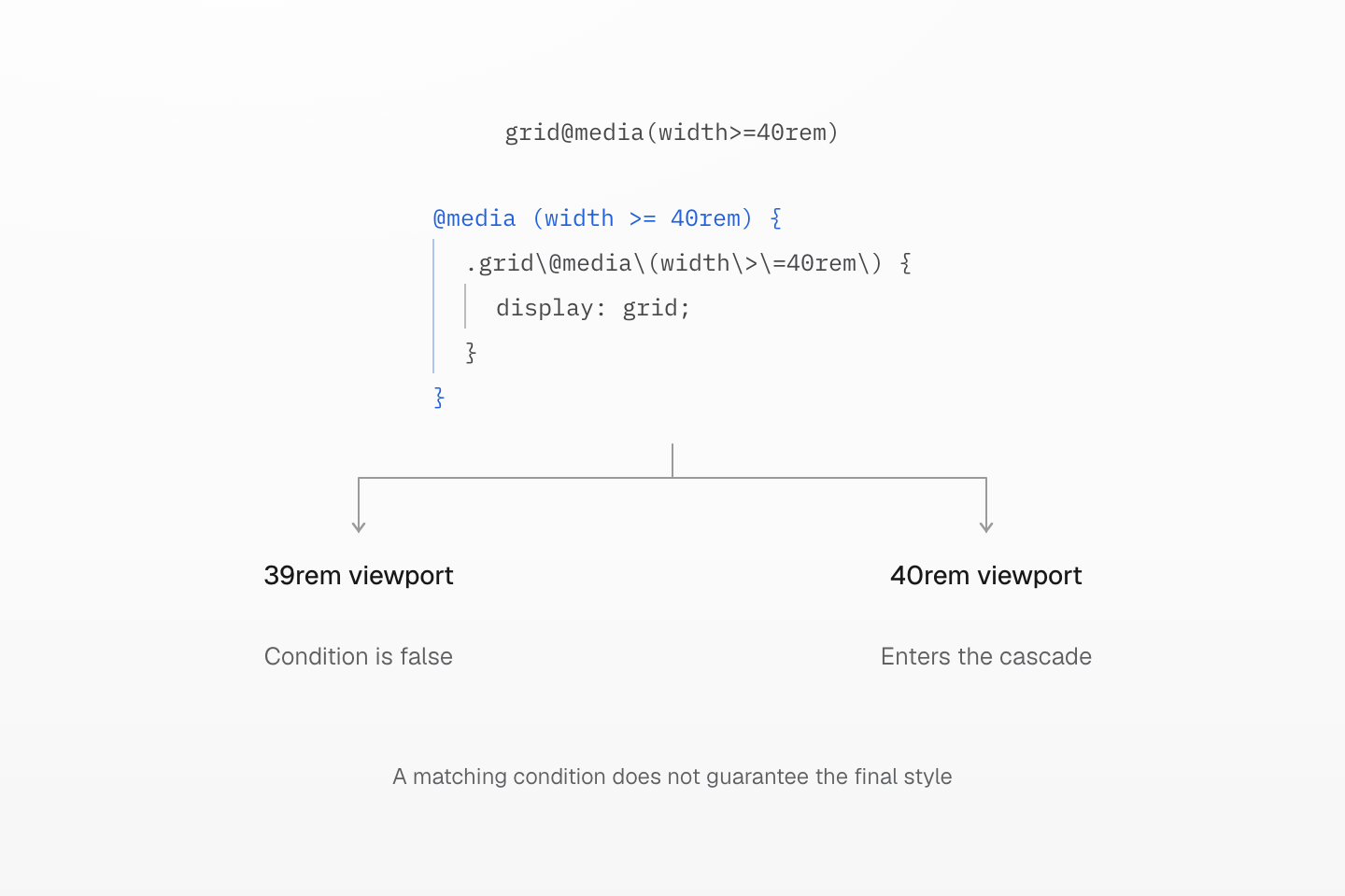
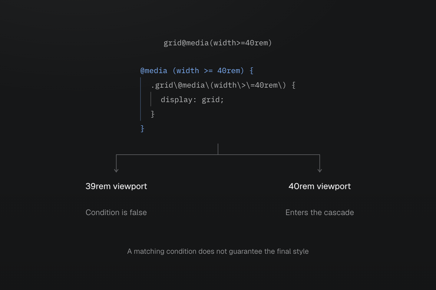
The compiler emits the query before either browser case is evaluated. Matching the query does not guarantee winning the cascade.
Text description
- grid@media(width>=40rem) emits an @media rule containing display: grid without testing a current viewport.
- At 39rem the browser does not apply that rule. At 40rem the condition matches and the declaration participates in the cascade.
- Other cascade rules can still determine the final display value. Compilation, query matching and the final computed style are distinct checks.
Query forms
Append conditions after the utility and any selector suffix. The parentheses in a class delimit the query; do not add a second pair around a media feature, range or supports declaration.
| Query | Class suffix | Native condition |
|---|---|---|
| Named media | @sm | Resolves @custom-media --sm |
| Media type | @media(print) | @media print |
| Boolean media feature | @media(hover) | @media (hover) |
| Media feature | @media(pointer:coarse) | @media (pointer:coarse) |
| Media range | @media(width>=40rem) | @media (width>=40rem) |
| Supports declaration | @supports(display:grid) | @supports (display:grid) |
| Container size | @container(width>=40rem) | @container (width>=40rem) |
| Named container | @container(card|width>=40rem) | @container card (width>=40rem) |
| Custom container condition | @container(card|--md) | Resolves @custom-container --md for card |
| Container style | @container(style(--density:compact)) | @container style(--density:compact) |
Generated CSS
@layer utilities { @media (pointer:coarse) { .hidden\@media\(pointer\:coarse\) { display: none } } @media print { .hidden\@media\(print\) { display: none } } @supports (display:grid) { .grid\@supports\(display\:grid\) { display: grid } }}| encodes whitespace outside strings, comments and CSS escapes. It separates the container name from its condition in @container(card|width>=40rem). Quoted strings and escapes retain their literal content. The encoding belongs to classes; write ordinary whitespace in CSS definitions.
Each suffix accepts one simple query. Balanced functions within a single value are preserved. Master CSS does not restrict feature names to a browser-support database; successful generation does not establish that a browser supports or matches the condition. See queries that belong in CSS for compound expressions and query lists.
Combining conditions
Stack simple query suffixes to require all their conditions. The first suffix becomes the outer query; later suffixes nest inside it. Repeated wrappers of the same kind keep their order too.
Both queries enclose the same declaration
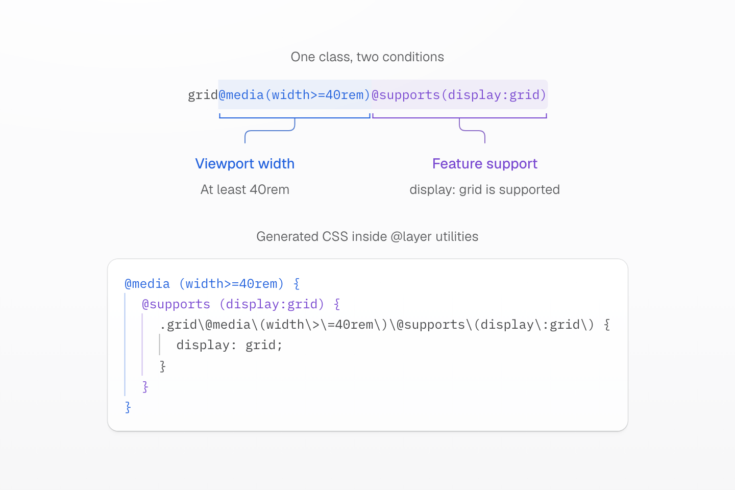
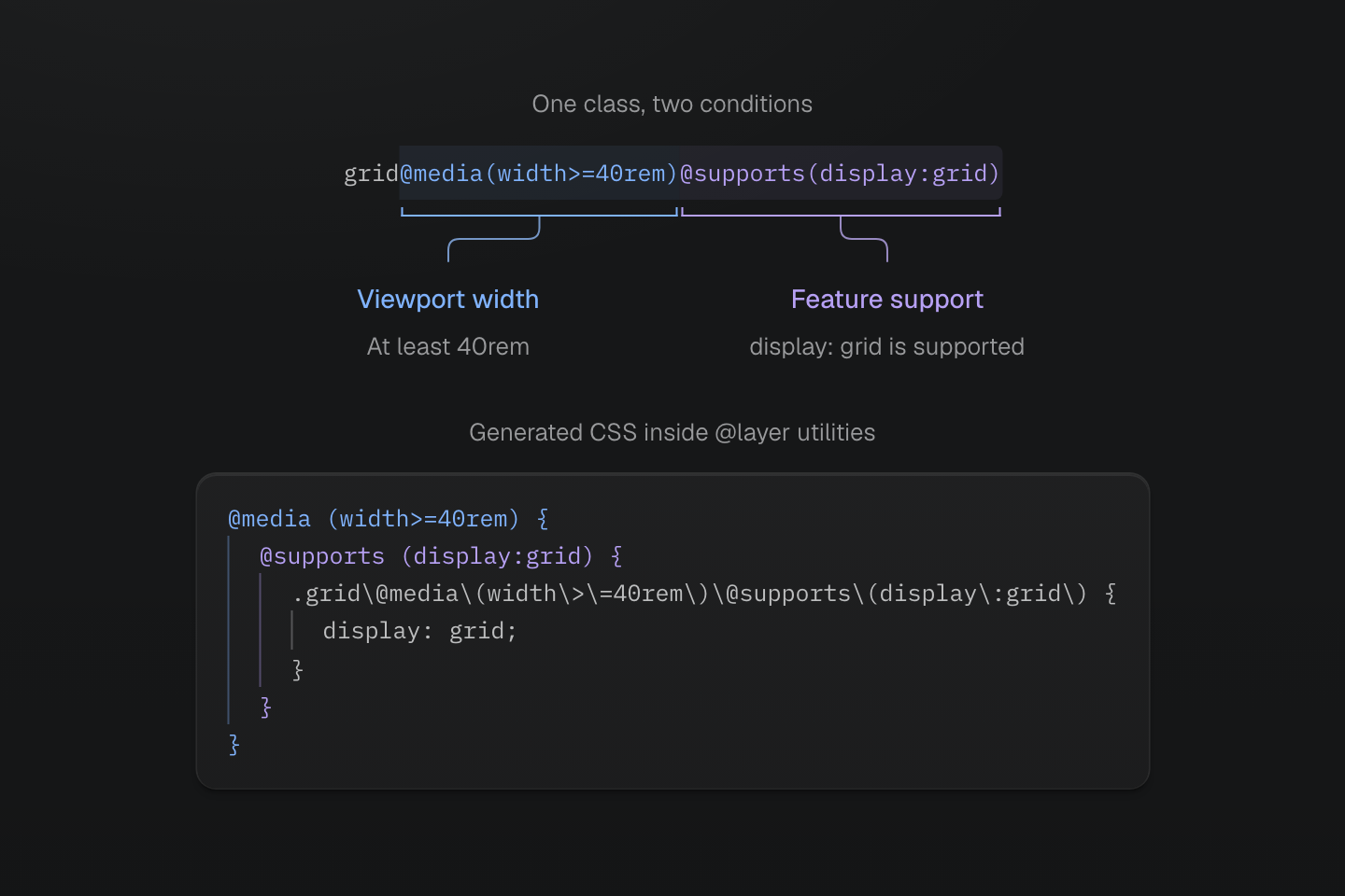
The first query is outermost. The display declaration participates in the cascade only when both conditions match; nesting is not an execution timeline.
Text description
- grid@media(width>=40rem)@supports(display:grid) emits a grid rule inside @supports (display:grid), itself inside @media (width>=40rem).
- The media query tests viewport width; the supports query tests browser support for display: grid. Both must match for this declaration to participate in the cascade.
- The generated selector matches the element carrying the complete class. The surrounding utilities layer is omitted from the drawing and retained in the generated CSS example.
<div class="grid@media(width>=40rem)@supports(display:grid)">Content</div>Generated CSS
@layer utilities { @media (width >= 40rem) { @media (hover:hover) { @supports (display:grid) { .grid\@media\(width\>\=40rem\)\@media\(hover\:hover\)\@supports\(display\:grid\) { display: grid } } } } @media (width >= 40rem) { @supports (display:grid) { .grid\@media\(width\>\=40rem\)\@supports\(display\:grid\) { display: grid } } }}These are nested CSS conditions, not steps executed in sequence. Both queries must match before the display: grid declaration participates in the cascade. A selector still determines which element receives the declaration.
Selectors and token dependencies
fg-red:hover@sm combines a token-backed utility, a selector and a named media condition:
<div class="fg-red:hover@sm">Hover at sm and above</div>With the preset, fg-red uses --color-red, :hover tests the class-bearing element and @sm requires a viewport width of at least 52.125rem. The preset red alias has a fixed color; a project can override its value. The class alone cannot establish the final color without the token values and competing CSS.
Generated CSS
@layer theme { :root, :host { --color-red-60: oklch(60.94% .2501 29.2) } :root, :host { --color-red: var(--color-red-60) }}@layer utilities { @media (width >= 52.125rem) { .fg-red\:hover\@sm:hover { color: var(--color-red) } }}Generated CSS includes required token dependencies. It does not insert the base layer-order statement; load the base stylesheet, normally through @import '@master/css'.
Named media conditions
A bare suffix such as @sm resolves a @custom-media definition. Undefined names are errors. Mixin names use the separate @apply(--name) syntax, and container conditions use @container(--name); neither is selected by a bare suffix.
| Preset suffix | Meaning |
|---|---|
@sm, @md, … | Viewport at least that breakpoint |
@max-sm, @max-md, … | Complement of the corresponding breakpoint |
@landscape, @portrait | Viewport orientation |
@motion-safe, @motion-reduce | Reduced-motion preference |
@light, @dark | System color preference |
Breakpoints
The preset's media.css registers eleven viewport breakpoints. Importing theme.css alone does not register them; theme variables do not define media conditions. The breakpoint reference lists their values.
A project can replace a query while retaining its native units. The preset's --max-* definitions negate the corresponding names: --max-md is not (--md). When these definitions are compiled together, replacing --md updates both ranges, with no overlap at the boundary.
A compiled manifest already contains expanded queries. Adding a definition to that manifest does not re-expand its existing dependent conditions. A configuration fragment that must replace both ranges should declare both names explicitly:
@custom-media --md (width >= 60rem);@custom-media --max-md not (--md);<div class="hidden@md hidden@max-md">Example</div>Generated CSS
@layer utilities { @media not (width >= 60rem) { .hidden\@max-md { display: none } } @media (width >= 60rem) { .hidden\@md { display: none } }}A compiled complement already contains its expanded query
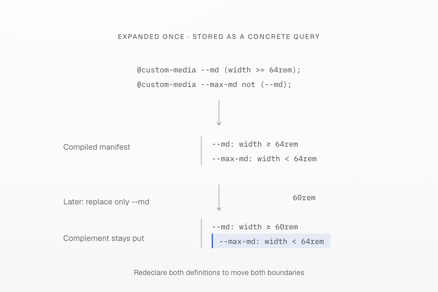
This compares two definition-loading stages. It is not the behavior of compiling both authored definitions together.
Text description
- When --md and --max-md are compiled together, not (--md) expands using the matching minimum definition.
- A compiled manifest already contains the expanded query. Adding a new --md: 60rem definition does not re-expand the old --max-md complement of 64rem.
- Redeclare both names in a later configuration fragment when both ranges must move together.
System color preference
The preset's @light and @dark query prefers-color-scheme. They do not insert an ancestor selector or follow a manually selected site theme. Manual activation uses explicit selector mixins such as @apply(--manual-dark); see Variables and modes.
Native queries
Media features and ranges
Use full native feature names and units. Media types such as print, screen and all emit without group parentheses. A single name that is not a media type is a boolean feature: @media(hover) emits @media (hover).
Ranges accept <, <=, >, >= and =, including chained comparisons. Fractional values and native units are preserved; CSS's resolution unit x retains its native meaning.
Generated CSS
@layer utilities { @media (resolution >= 2x) { .hidden\@media\(resolution\>\=2x\) { display: none } } @media (width < 40rem) { .hidden\@media\(width\<40rem\) { display: none } } @media (40rem <= width < 64rem) { .grid-cols\(2\)\@media\(40rem\<\=width\<64rem\) { display: grid; grid-template-columns: repeat(2, minmax(0, 1fr)) } }}Comparable ranges in the same unit retain range priority. A named media condition and its equivalent native query share sorting evidence. Different units and expressions use stable syntax-based ordering; Master CSS does not assume a browser root font size or convert units for sorting. Container query domains remain distinct from media queries. Within equivalent conditions and the same property scope, direct values follow named tokens.
For browser interpretation of features and ranges, see Media Queries.
Supports declarations
@supports(property:value) accepts one CSS declaration, such as @supports(display:grid). The browser tests support for that property-value pair. Put selector() checks, negation and compound support conditions in a CSS mixin.
Generated CSS
@layer utilities { @supports (display:grid) { .grid\@supports\(display\:grid\) { display: grid } }}Containers
Size queries measure an eligible ancestor query container. Establish that container with ordinary CSS; add a name when the query should select a particular container rather than the nearest eligible one. The queried element is a descendant in this example:
<aside class="(container-name:card) container-inline"> <div class="grid-cols(2)@container(card|width>=40rem)"> <div>First item</div> <div>Second item</div> </div></aside>Generated CSS
@layer utilities { .container-inline { container-type: inline-size } .\(container-name\:card\) { container-name: card } @container card (width >= 40rem) { .grid-cols\(2\)\@container\(card\|width\>\=40rem\) { display: grid; grid-template-columns: repeat(2, minmax(0, 1fr)) } }}The recipe sets both display: grid and two equal columns while the condition matches. Below the threshold, it supplies neither declaration, so these two block children stay stacked in normal flow. The container's own width is established by its surrounding layout.
A custom-property style query checks the value on an ancestor container; it does not need container-inline:
<div style="--density:compact"> <div class="p(8)@container(style(--density:compact))">Compact content</div></div>Generated CSS
@layer utilities { @container style(--density:compact) { .p\(8\)\@container\(style\(--density\:compact\)\) { padding: calc(8 * 1px) } }}Native container queries define container eligibility and matching. Changing a sizing token such as --container-md does not change an explicit query threshold or a named container condition. See container tokens for their separate sizing role.
Named container conditions
@container(--md) resolves @custom-container --md; @container(card|--md) applies the same condition to the eligible container named card. The definition supplies a condition, not a container name.
The preset's container.css registers thirteen component widths and a max- complement for each. These are independent of viewport breakpoints: @container(--md) is 28rem, while @md is 64rem.
See Named conditions for the complete preset container scale and its complements.
Each --max-* name is the negation of its minimum-width condition. For example, --max-md is not (--md). As with media conditions, definitions compiled together follow an override of the referenced name; already-expanded manifest definitions do not re-expand when a fragment replaces only that name.
Generated CSS
@layer utilities { @container card (width >= 28rem) { .grid-cols\(2\)\@container\(card\|--md\) { display: grid; grid-template-columns: repeat(2, minmax(0, 1fr)) } } @container not (width >= 24rem) { .hidden\@container\(--max-sm\) { display: none } }}Define or replace names with @custom-container. An undefined name is an error.
Queries that belong in CSS
Class queries deliberately accept a smaller grammar than native CSS. Define media query lists, compound conditions and negation with @custom-media. For other queries, use an @mixin whose @contents marks where the class's declaration is inserted.
| Rejected class form | Reason | Accepted alternative |
|---|---|---|
@media((width>=50rem)) | Extra group parentheses | @media(width>=50rem) |
@media(screen|and|(width>=50rem)) | Compound query | A named @custom-media |
@media(not|print) | Negated query | A named @custom-media |
@media(screen,print) | Query list | A named @custom-media |
@supports(selector([lang|=en])) | Selector support test | An @mixin with native @supports |
Extra group parentheses report CLASS_SYNTAX_ERROR with the class form to use. The complex forms report MASTER_QUERY_REQUIRES_CSS and generate no rule. Quoting the query does not extend the accepted grammar. Keep literal pipes, such as the |= attribute operator, in native CSS rather than class query encoding.
@custom-media --wide-screen screen and (width >= 50rem);@mixin --language-selector { @supports selector([lang|=en]) { @contents; }}<div class="p-md@wide-screen block@apply(--language-selector)">Example</div>Generated CSS
@layer theme { :root, :host { --spacing-md: 1rem }}@layer utilities { @supports selector([lang|=en]) { .block\@apply\(--language-selector\) { display: block } } @media screen { @media (width >= 50rem) { .p-md\@wide-screen { padding: var(--spacing-md) } } }}For reusable wrappers and arguments, see Utilities and mixins.
Other suffixes
These suffixes share the @ notation but do not test media, support or container conditions.
Cascade layer selection
@layer(base), @layer(defaults), @layer(components) and @layer(utilities) choose the layer for the whole class. They do not create a sublayer. Repeating the same layer is allowed; selecting different layers in one class is an error. See Cascade layers for ordering and restrictions.
Starting styles
@starting-style wraps a rule in the native at-rule. It supplies a before-change style when an element has no previous rendered style, allowing an entry transition. It does not create a transition by itself or act as a general-purpose “first render” selector. See @starting-style for native behavior.
Generated CSS
@layer utilities { @starting-style { .\(opacity\:0\)\@starting-style { opacity: 0 } }}@starting-style and @layer(...) are built-in suffixes and do not require preset definitions. Reusable CSS wrappers instead use @apply(--name).