Grid tracks
Equal grid tracks and spans in one class.
On this page
Classes
| Class | Declarations |
|---|---|
grid-cols(<integer>) | display: grid;grid-template-columns: repeat(<integer>, minmax(0, 1fr)); |
grid-rows(<integer>) | display: grid;grid-auto-flow: column;grid-template-rows: repeat(<integer>, minmax(0, 1fr)); |
grid-col-span(<integer>) | grid-column: span <integer>/span <integer>; |
grid-row-span(<integer>) | grid-row: span <integer>/span <integer>; |
grid-cols() and grid-rows() create the grid; the span functions place an item inside an existing grid.
Track counts and placement have different owners
grid-cols(3) sets display: grid and three minmax(0, 1fr) columns. grid-rows(3) sets three such rows and also sets grid-auto-flow: column. With otherwise default placement, the same six children therefore fill across in the first case and down in the second.
Column and row recipes fill the same children in different directions
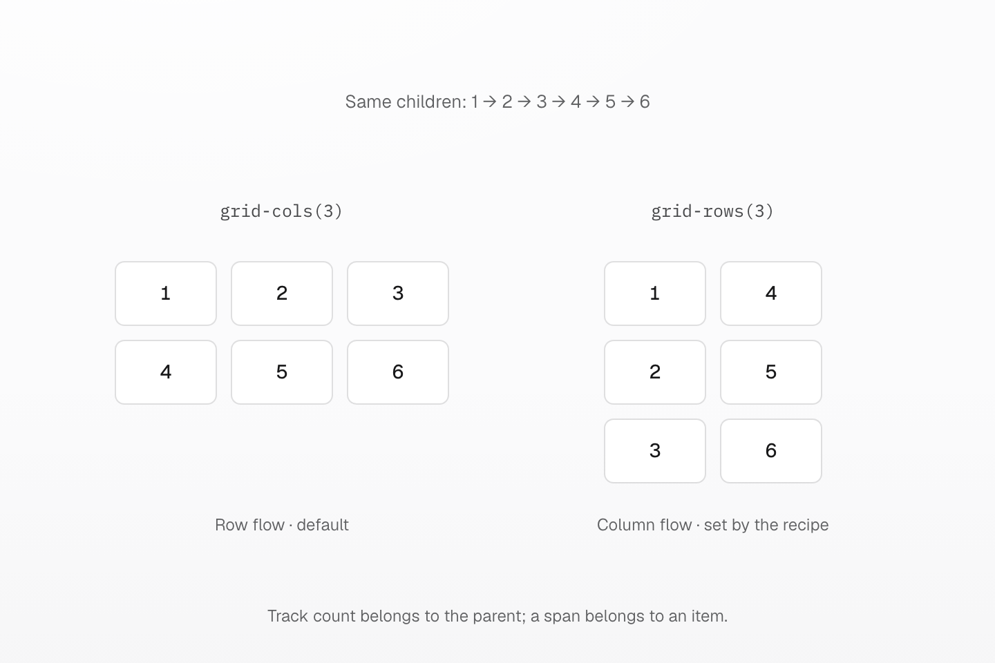
Both grids use the same six children and gap. grid-rows(3) also sets grid-auto-flow: column; grid-cols(3) leaves the default row flow. Tile heights follow their content.
Text description
- The first grid has three explicit minmax(0, 1fr) columns. Default row flow places items 1, 2 and 3 across its first row, followed by 4, 5 and 6.
- The second grid has three explicit minmax(0, 1fr) rows and column auto-flow. Items 1, 2 and 3 fill the first column; 4, 5 and 6 fill the second.
- Both scenes use real preset CSS, six identical content-sized tiles and a 12px gap. Widths keep the tile widths comparable; neither recipe supplies that gap or width.
- The illustration uses default item placement. Explicit placement and spans can change the result; grid-cols does not reset a column flow established elsewhere.
Use positive integers for track counts and spans. Track functions do not add a gap. Equal fractions divide the available space after gaps; a zero minimum lets tracks shrink, but does not itself wrap or clip their contents.
grid-col-span(2) and grid-row-span(2) set an item’s placement, not its parent’s display. A span can create implicit tracks if it exceeds the explicit grid. Layout Guide owns coordinating counts and spans across breakpoints.
grid-cols() does not reset the column flow established by grid-rows(). If both apply, both track definitions remain and auto-placement still runs down columns. Add (grid-auto-flow:row) when you explicitly want row flow.
Row fractions need a constrained available height to divide a fixed vertical space. In an auto-height grid, content participates in row sizing; grid-rows(3) is not a height constraint.
See Layout and native grid placement.
Usage
Lay out three equal columns and let a feature span two columns and two rows.
<div class="… grid-cols(3) gap-xs"> <div class="… grid-col-span(2) grid-row-span(2)">Feature</div> <div>Notes</div> <div>Drafts</div> <div>Archive</div> <div>Shared</div> <div>Trash</div></div>Generated CSS
@layer theme { :root, :host { --spacing-xs: .5rem }}@layer utilities { .grid-cols\(3\) { display: grid; grid-template-columns: repeat(3, minmax(0, 1fr)) } .gap-xs { gap: var(--spacing-xs) } .grid-col-span\(2\) { grid-column: span 2/span 2 } .grid-row-span\(2\) { grid-row: span 2/span 2 }}Customize
The preset defines these classes with @utility. Define the same name in your stylesheet to replace it.
@utility grid-cols(--n <integer>) { display: grid; grid-template-columns: repeat(var(--n), minmax(0, 1fr));}@utility grid-rows(--n <integer>) { display: grid; grid-auto-flow: column; grid-template-rows: repeat(var(--n), minmax(0, 1fr));}@utility grid-col-span(--n <integer>) { grid-column: span var(--n)/span var(--n);}@utility grid-row-span(--n <integer>) { grid-row: span var(--n)/span var(--n);}See utility definitions and Layout.