Named conditions
Every preset media and container condition, its expanded query and the scope it measures.
On this page
The preset defines independent media and container conditions. They share short names, but neither registry is a set of theme tokens. A bare @md queries the viewport; @container(--md) queries an eligible ancestor container.
Media conditions
Media names come from media.css. Width conditions use their authored rem values; orientation and preference conditions use native media features. @dark and @light test the system preference, not a manually selected site theme.
Minimum viewport widths
| Suffix | Expanded query |
|---|---|
@4xs | (width >= 22.5rem) |
@3xs | (width >= 30rem) |
@2xs | (width >= 37.5rem) |
@xs | (width >= 48rem) |
@sm | (width >= 52.125rem) |
@md | (width >= 64rem) |
@lg | (width >= 80rem) |
@xl | (width >= 90rem) |
@2xl | (width >= 100rem) |
@3xl | (width >= 120rem) |
@4xl | (width >= 160rem) |
Below viewport widths
| Suffix | Expanded query |
|---|---|
@max-4xs | not (width >= 22.5rem) |
@max-3xs | not (width >= 30rem) |
@max-2xs | not (width >= 37.5rem) |
@max-xs | not (width >= 48rem) |
@max-sm | not (width >= 52.125rem) |
@max-md | not (width >= 64rem) |
@max-lg | not (width >= 80rem) |
@max-xl | not (width >= 90rem) |
@max-2xl | not (width >= 100rem) |
@max-3xl | not (width >= 120rem) |
@max-4xl | not (width >= 160rem) |
Orientation and preferences
| Suffix | Expanded query |
|---|---|
@dark | (prefers-color-scheme: dark) |
@landscape | (orientation: landscape) |
@light | (prefers-color-scheme: light) |
@motion-reduce | (prefers-reduced-motion: reduce) |
@motion-safe | (prefers-reduced-motion: no-preference) |
@portrait | (orientation: portrait) |
Container conditions
Container names come from container.css. The definition supplies only a query condition: @container(--md) uses the nearest eligible container, while @container(card|--md) selects an eligible container named card. Neither form establishes a container.
Minimum container widths
| Suffix | Expanded query |
|---|---|
@container(--3xs) | (width >= 16rem) |
@container(--2xs) | (width >= 18rem) |
@container(--xs) | (width >= 20rem) |
@container(--sm) | (width >= 24rem) |
@container(--md) | (width >= 28rem) |
@container(--lg) | (width >= 32rem) |
@container(--xl) | (width >= 36rem) |
@container(--2xl) | (width >= 42rem) |
@container(--3xl) | (width >= 48rem) |
@container(--4xl) | (width >= 56rem) |
@container(--5xl) | (width >= 64rem) |
@container(--6xl) | (width >= 72rem) |
@container(--7xl) | (width >= 80rem) |
Below container widths
| Suffix | Expanded query |
|---|---|
@container(--max-3xs) | not (width >= 16rem) |
@container(--max-2xs) | not (width >= 18rem) |
@container(--max-xs) | not (width >= 20rem) |
@container(--max-sm) | not (width >= 24rem) |
@container(--max-md) | not (width >= 28rem) |
@container(--max-lg) | not (width >= 32rem) |
@container(--max-xl) | not (width >= 36rem) |
@container(--max-2xl) | not (width >= 42rem) |
@container(--max-3xl) | not (width >= 48rem) |
@container(--max-4xl) | not (width >= 56rem) |
@container(--max-5xl) | not (width >= 64rem) |
@container(--max-6xl) | not (width >= 72rem) |
@container(--max-7xl) | not (width >= 80rem) |
Each preset max- condition is the complement of its matching minimum condition. The expanded queries below do not overlap at the boundary. The source definitions reference their corresponding names with not (--name).
Same name, different scope
The same key can name different thresholds in different query domains. Container sizing tokens such as --container-md belong to a third, independent role: they supply lengths to sizing utilities.
The same name measures different boundaries
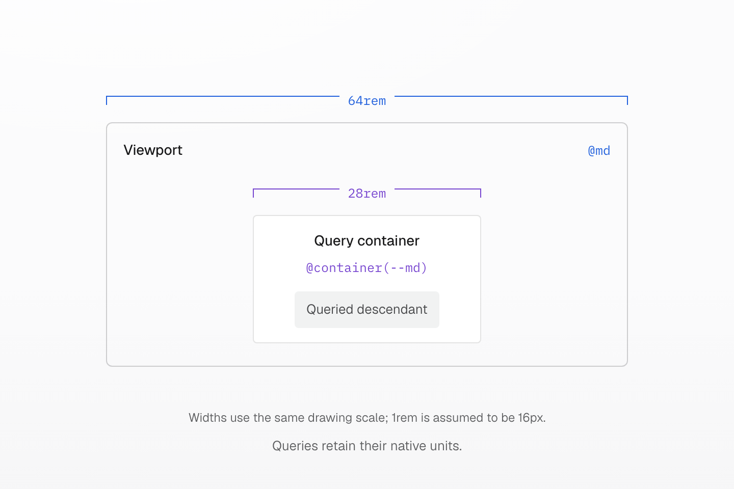
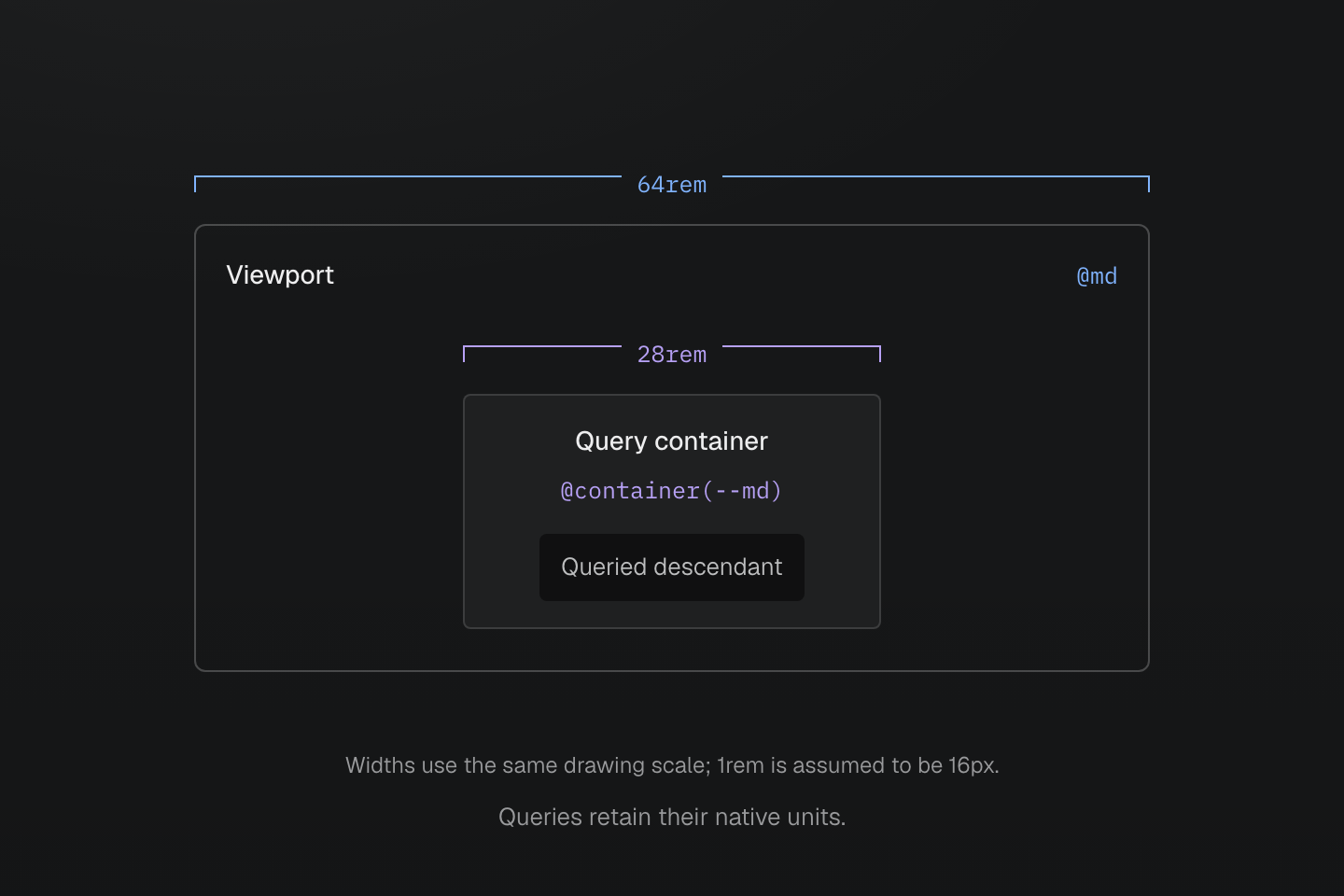
The preset’s @md threshold is 64rem; @container(--md) is 28rem. These independent definitions query different boundaries even though both use the name md.
Text description
- The outer boundary represents a viewport at the preset @md minimum width of 64rem.
- The inner boundary represents a query container at the independent @container(--md) minimum width of 28rem. The queried element is inside that container.
- The two widths use one drawing scale with a 16px initial and root font size. Changing a container sizing token does not change either condition definition.
Usage
This layout uses one column below the preset md viewport threshold and three columns from that threshold onward.
<div class="… grid-cols(1) grid-cols(3)@md"> <div>Notes</div> <div>Drafts</div> <div>Archive</div></div>Generated CSS
@layer utilities { .grid-cols\(1\) { display: grid; grid-template-columns: repeat(1, minmax(0, 1fr)) } @media (width >= 64rem) { .grid-cols\(3\)\@md { display: grid; grid-template-columns: repeat(3, minmax(0, 1fr)) } }}Customize
Declare a custom media name for a viewport or preference query, or a custom container name for a component query. Native units are retained. When replacing a condition in an already-compiled manifest, redeclare its complement too if both thresholds must change.
@custom-media --tablet (width >= 48rem);@custom-container --wide-card (width >= 30rem);<aside class="(container-name:card) container-inline"> <div class="grid-cols(1) grid-cols(2)@container(card|--wide-card)">Card content</div></aside><div class="grid-cols(1) grid-cols(3)@tablet">Page content</div>Generated CSS
@layer utilities { .grid-cols\(1\) { display: grid; grid-template-columns: repeat(1, minmax(0, 1fr)) } .container-inline { container-type: inline-size } .\(container-name\:card\) { container-name: card } @container card (width >= 30rem) { .grid-cols\(2\)\@container\(card\|--wide-card\) { display: grid; grid-template-columns: repeat(2, minmax(0, 1fr)) } } @media (width >= 48rem) { .grid-cols\(3\)\@tablet { display: grid; grid-template-columns: repeat(3, minmax(0, 1fr)) } }}See condition grammar, condition definition scope, query definitions, container sizing tokens and Responsive design.