Query definitions
Define reusable media and container conditions, with shared expansion in stylesheets and class suffixes.
On this page
Name a reusable condition once, then use it in native CSS or a class suffix. Media names describe viewport or device conditions; container names describe a condition tested against a container selected at the use site. Definitions must be top-level and unconditional.
Conditions owns class suffix syntax, Named conditions lists every preset condition, and Responsive design teaches choosing a layout boundary.
A named condition expands without choosing the container
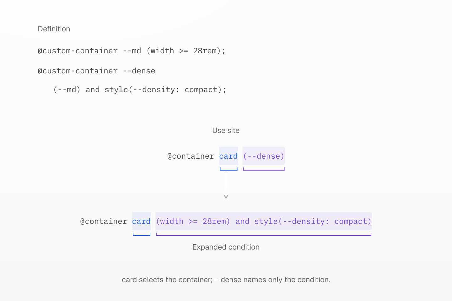
The definition stores the condition. The use site supplies card, the container name. Expanding --dense preserves both the width test and the style test.
Text description
- --md defines the width condition (width >= 28rem). --dense combines that reference with style(--density: compact).
- The use site @container card (--dense) chooses a container named card.
- Expansion produces @container card (width >= 28rem) and style(--density: compact). The container name is unchanged; it does not become part of the definition.
- The same condition can be reused with another container name or with the nearest eligible container. The figure shows compile-time substitution, not a DOM tree.
@custom-media
Define named media queries using the CSS Media Queries specification:
@custom-media --wide (width >= 60rem);@custom-media --reading (--wide), print;@custom-media --outside not (--reading);@custom-media --enabled true;@custom-media --disabled false;@media (--reading) { .article { max-width: 70ch; }}Names begin with --. CSS references use (--name); markup uses @name, and a local named block uses @media (--name). The same registry is used in native CSS, utility and mixin definitions, and markup queries.
Definitions support query lists, forward references, true, false, nested boolean expressions, negation, and media types. Expansion is logical: a list retains its disjunction, and negation applies to the complete referenced expression. Each query in a list becomes a separate branch, and the branches of every condition on a class multiply; a class that expands to more than 4,096 branches, such as one repeating @reading a dozen times, generates no rule. The compiler emits ordinary media queries, using nested blocks where a single query cannot express mixed media types. No browser custom-media API or JavaScript runtime registration is required.
Undefined, cyclic, and invalid references are compilation errors. A later same-name definition wins. Media and mixin names are independent: @name selects media, while @apply(--name) invokes a mixin. --starting-style is reserved because @starting-style is built in. The preset has no --breakpoint-* tokens. A project custom property with that prefix remains ordinary CSS and never implicitly declares a media condition. Use native lengths or independently named layout tokens for width caps. Imports that retain external URLs cannot contain unresolved custom-media queries; resolve those stylesheet imports before lowering or use ordinary native queries on the import.
A named media condition
@custom-media --card (width >= 40rem); .card { @media (--card) { display: grid; } }Generated CSS
.card { @media (width >= 40rem) { display: grid; }}@custom-container
Master CSS expands @custom-container definitions during compilation; browsers receive ordinary @container rules. A definition holds only the condition. Choose the container to measure where the condition is used.
@custom-container --md (width >=28rem);@custom-container --max-md not (--md);@custom-container --compact style(--density: compact);@custom-container --dense (--md) and (--compact);@container card (--md) { .title { font-size: 1.25rem; }}Names begin with --. CSS references use (--name) after an optional container name, such as @container card not (--md). Markup uses the same reference inside the container query: @container(--md) measures the nearest container and @container(card|--md) a named one. Native CSS, utility and mixin definitions, and markup share one registry.
A definition is any container condition: size and style queries, not, and, or, and references to other custom containers, including forward references. Expansion substitutes the referenced condition, parenthesized unless it is already one group or the whole condition, so @container card (--dense) emits @container card (width >= 28rem) and style(--density: compact). A container condition always fits one prelude; expansion never adds branches. The compiler emits ordinary container queries and stores each expanded condition in the manifest's customContainers.
Undefined, cyclic, and empty references are compilation errors, as is a definition that starts with a container name. A later same-name definition wins, and definitions that reference it use the final one. Container names are independent of custom media and mixins: a bare @md always selects custom media, never a container condition. --container-* tokens size elements and never supply container thresholds.
A named container condition
@custom-container --roomy (width >= 40rem); .card { @container (--roomy) { display: grid; } }Generated CSS
.card { @container (width >= 40rem) { display: grid; }}