Truncation
Clip text to one line or a number of lines and end it with an ellipsis.
On this page
Classes
| Class | Declarations |
|---|---|
truncate | overflow: hidden;text-overflow: ellipsis;white-space: nowrap; |
clamp-lines(<integer>) | display: -webkit-box;-webkit-box-orient: vertical;-webkit-line-clamp: <integer>;overflow: hidden;overflow-wrap: break-word;text-overflow: ellipsis; |
Both need a constrained width. Inside a flex or grid item, give that item min-w(0) so it can shrink.
Limit the visible text, keep access to the full text
truncate combines hidden overflow, an ellipsis and no wrapping. It needs a block container with a finite inline width to overflow; applying it to an unconstrained inline span does not make a one-line preview.
The same text can paint all lines, one line or two lines
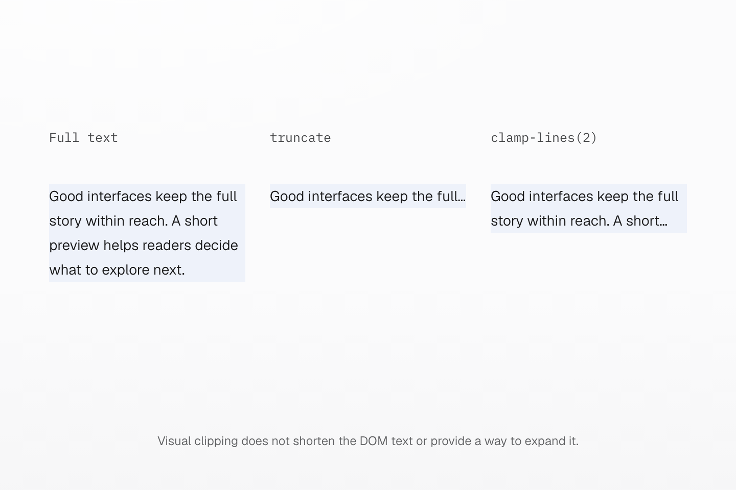
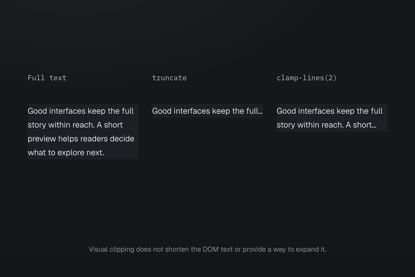
The font, width and text are identical. Only the truncation class changes. The native browser paints the ellipsis; the full string remains available in each element.
Text description
- Each copy has a 192px width, a 14px font and a 24px line height.
- The first copy wraps freely and grows to contain every line. truncate keeps the second on one line and hides the overflow with an ellipsis.
- clamp-lines(2) lets the third copy wrap, then limits its visible content to two lines using the prefixed line-clamp combination.
- All three elements contain the same full string. A separate disclosure or link is needed when readers must access the complete visible text.
clamp-lines(2) uses the prefixed line-clamp combination: display: -webkit-box, vertical box orientation, a two-line clamp and hidden overflow. Use a positive integer. It allows wrapping, so do not combine it with truncate and its white-space: nowrap.
The text stays in the DOM. Clipping is a visual constraint, not a shorter string or a disclosure mechanism. Keep essential information available through a real link or an expandable full-text view; do not rely on a hover-only title.
A flex or grid item’s automatic minimum can keep it wider than the space available. Set min-w(0) on the item that must shrink, then constrain the text within it. With line clamping, keep padding on a wrapper so padding does not expose clipped lines.
The recipe owns its display and overflow declarations. Overriding those declarations with flex, grid or visible overflow can break the clamp. For custom truncation rules, use the native properties explicitly.
See native text overflow and legacy line clamping.
Usage
Keep a file name on one line and its summary to two. Expand the details to read both in full.
field-notes-autumn-collection-final-v03.fig
Good interfaces make space for the details: a short preview helps readers decide what to explore next while a clear link keeps the complete story within reach, so the summary works as an invitation and the full article carries everything else.
Read full details
field-notes-autumn-collection-final-v03.fig
Good interfaces make space for the details: a short preview helps readers decide what to explore next while a clear link keeps the complete story within reach, so the summary works as an invitation and the full article carries everything else.
<article class="… max-w-3xs"> <p class="… truncate">field-notes-autumn-collection-final-v03.fig</p> <p class="… clamp-lines(2)">Good interfaces make space for…</p> <details><summary>Read full details</summary><p>field-notes-autumn-collection-final-v03.fig</p><p>Good interfaces make space for…</p></details></article>Generated CSS
@layer theme { :root, :host { --container-3xs: 16rem }}@layer utilities { .clamp-lines\(2\) { display: -webkit-box; -webkit-box-orient: vertical; -webkit-line-clamp: 2; overflow: hidden; overflow-wrap: break-word; text-overflow: ellipsis } .truncate { overflow: hidden; text-overflow: ellipsis; white-space: nowrap } .max-w-3xs { max-width: var(--container-3xs) }}Customize
The preset defines these classes with @utility. Define the same name in your stylesheet to replace it.
@utility truncate { overflow: hidden; text-overflow: ellipsis; white-space: nowrap;}@utility clamp-lines(--n <integer>) { display: -webkit-box; -webkit-box-orient: vertical; -webkit-line-clamp: var(--n); overflow: hidden; overflow-wrap: break-word; text-overflow: ellipsis;}See utility definitions and Typography.