Motion
Animation shorthands, duration values and easing curves.
On this page
Classes
| Class | Declarations |
|---|---|
animate-<animation> | animation: var(--animate-<animation>); |
animation-<duration> | animation-duration: var(--duration-<duration>); |
transition-<duration> | transition-duration: var(--duration-<duration>); |
animation-delay-<duration> | animation-delay: var(--duration-<duration>); |
transition-delay-<duration> | transition-delay: var(--duration-<duration>); |
animation-<easing> | animation-timing-function: var(--easing-<easing>); |
transition-<easing> | transition-timing-function: var(--easing-<easing>); |
The animation- and transition- prefixes each read both duration and easing namespaces. Custom keys must be distinct across those two namespaces; a shared key is ambiguous. animate- reads a complete animation shorthand instead.
Values
The ten animation tokens include their keyframe names and repeat infinitely. Seven durations supply time lengths; nine easing curves map time progress to value progress. The visual comparisons run animations once, start paused and respect reduced motion.
Animations
| Class | Value |
|---|---|
animate-fade | fade 1s infinite |
animate-flash | flash 1s infinite |
animate-float | float 3s ease-in-out infinite |
animate-heart | heart 1s infinite |
animate-jump | jump 1s infinite |
animate-ping | ping 1s infinite |
animate-pulse | pulse 1s infinite |
animate-rotate | rotate 1s linear infinite |
animate-shake | shake 1s infinite |
animate-zoom | zoom 1s infinite |
Compare all animations
Durations
| Class | Value |
|---|---|
transition-fastest | 75ms |
transition-faster | .1s |
transition-fast | .15s |
transition-normal | .2s |
transition-slow | .3s |
transition-slower | .5s |
transition-slowest | .8s |
Compare all durations
Easing
| Class | Value |
|---|---|
transition-smooth | cubic-bezier(.4, 0, .2, 1) |
transition-soft | cubic-bezier(.33, 1, .68, 1) |
transition-crisp | cubic-bezier(.16, 1, .3, 1) |
transition-snap | cubic-bezier(.2, 0, 0, 1) |
transition-accelerate | cubic-bezier(.4, 0, 1, 1) |
transition-decelerate | cubic-bezier(0, 0, .2, 1) |
transition-overshoot | cubic-bezier(.34, 1.56, .64, 1) |
transition-rewind | cubic-bezier(.36, 0, .66, -.56) |
transition-spring | cubic-bezier(.68, -.6, .32, 1.6) |
Compare all easing curves
Override one part of an animation
animate-pulse writes the complete animation shorthand, including its 1s duration. Under the same conditions, animation-slow sorts after the shorthand and replaces that duration with 300ms. The keyframe name and iteration count remain unchanged; reordering the class attribute does not change this result.
A duration class changes timing while keeping the same keyframes
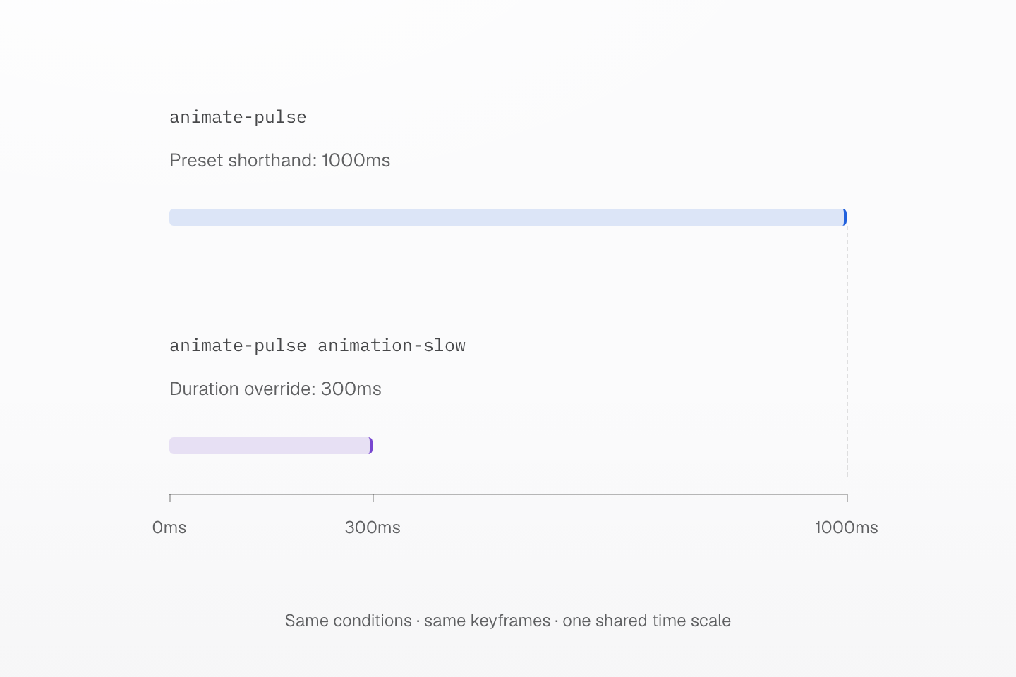
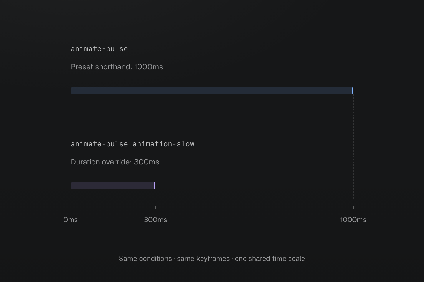
Both cases use the same pulse keyframes. Bars measure one iteration’s duration, not animation progress or rendering speed. The preset repeats; the comparison isolates a single iteration.
Text description
- The animate-pulse shorthand supplies pulse 1s infinite. Its duration is one second per iteration.
- Under the same conditions, animation-slow sorts after animate-pulse and replaces only its duration with var(--duration-slow), or 300ms. The pulse keyframes and infinite iteration count remain the same.
- Both horizontal bars start at zero. Their lengths have a 1000:300 ratio on the same millisecond axis. They measure declared duration per iteration, not performance or the distance a shape travels.
- The preset pulse token repeats infinitely. Add a native iteration count or define a custom token to run once; changing the order of class names does not change generated rule order.
Use the duration or easing family to adjust one part, or compose a custom animation token from their variables. An explicit native declaration such as (animation-duration:450ms) supplies a literal override. The two bars show one iteration on the same time scale; they do not compare rendering performance.
Animation tokens retain the keyframes their values reference. Duration or easing classes alone do not name an animation. A transition also needs a property value to change; transition-fast supplies a duration, not a hover state or a property list.
A delay changes when an effect starts; it does not lengthen its duration. Easing changes progress within the duration. Curves with control points outside the vertical 0–1 range can overshoot or rewind; the property being animated can still constrain its rendered values.
Guard nonessential motion with @motion-safe. For one run of a preset animation, add (animation-iteration-count:1) under the same conditions. Theme Guide owns composing an entrance for a component; View transitions Guide owns transitions between captured page states.
See generated rule order and native animation shorthand and View transitions.
Usage
Ease the link’s background change on hover when motion is allowed. The link returns to the value tables.
<a href="#values" class="… (transition-property:background-color) transition-fast@motion-safe transition-smooth@motion-safe bg-surface-inset:hover">View motion values</a>Generated CSS
@layer theme { :root, :host { --color-zinc-5: oklch(96.5% .0011 265); --color-zinc-100: oklch(15% .0016 265) } :root, :host { --color-surface-inset: light-dark(var(--color-zinc-5), var(--color-zinc-100)) } :root, :host { --duration-fast: .15s; --easing-smooth: cubic-bezier(.4, 0, .2, 1) }}@layer utilities { .\(transition-property\:background-color\) { transition-property: background-color } .bg-surface-inset\:hover:hover { background-color: var(--color-surface-inset) } @media (prefers-reduced-motion: no-preference) { .transition-fast\@motion-safe { transition-duration: var(--duration-fast) } } @media (prefers-reduced-motion: no-preference) { .transition-smooth\@motion-safe { transition-timing-function: var(--easing-smooth) } }}Customize
Compose an animation from duration and easing tokens, and declare its keyframes in native CSS: --animate-reveal creates animate-reveal.
@theme { --animate-reveal: reveal var(--duration-slow) var(--easing-crisp) both;}@keyframes reveal { from { opacity: 0; translate: 0 .5rem; }}Generated CSS
@keyframes reveal { from { opacity: 0; translate: 0 .5rem; }}@layer theme { :root, :host { --duration-slow: .3s; --easing-crisp: cubic-bezier(.16, 1, .3, 1) } :root, :host { --animate-reveal: reveal var(--duration-slow) var(--easing-crisp) both }}@layer utilities { @media (prefers-reduced-motion: no-preference) { .animate-reveal\@motion-safe { animation: var(--animate-reveal) } }}See theme directives and Theme tokens.