Radius
The preset corner radius scale, for whole elements or single corners.
On this page
Classes
| Class | Declarations |
|---|---|
r-<name> | border-radius: var(--radius-<name>); |
rbl-<name> | border-bottom-left-radius: var(--radius-<name>); |
rbr-<name> | border-bottom-right-radius: var(--radius-<name>); |
ree-<name> | border-end-end-radius: var(--radius-<name>); |
res-<name> | border-end-start-radius: var(--radius-<name>); |
rse-<name> | border-start-end-radius: var(--radius-<name>); |
rss-<name> | border-start-start-radius: var(--radius-<name>); |
rtl-<name> | border-top-left-radius: var(--radius-<name>); |
rtr-<name> | border-top-right-radius: var(--radius-<name>); |
Fully rounded corners use the fixed pill utility, not a radius token: it sets only border-radius: calc(infinity * 1px).
Values
The eight preset radii are rem lengths. Pixel equivalents assume a 16px root font size. A radius shapes corners; it does not set the box dimensions.
| Class | Value |
|---|---|
r-xs | .125rem2px |
r-sm | .25rem4px |
r-md | .375rem6px |
r-lg | .5rem8px |
r-xl | .75rem12px |
r-2xl | 1rem16px |
r-3xl | 1.5rem24px |
r-4xl | 2rem32px |
Compare all radius values
r-xsr-smr-mdr-lgr-xlr-2xlr-3xlr-4xlRounding and clipping are separate
r-4xl rounds the parent’s background and border. It does not give a child the same radius or automatically clip that child’s painting. Add overflow-hidden when the parent should clip its contents to the rounded edge.
The parent’s radius does not round its child
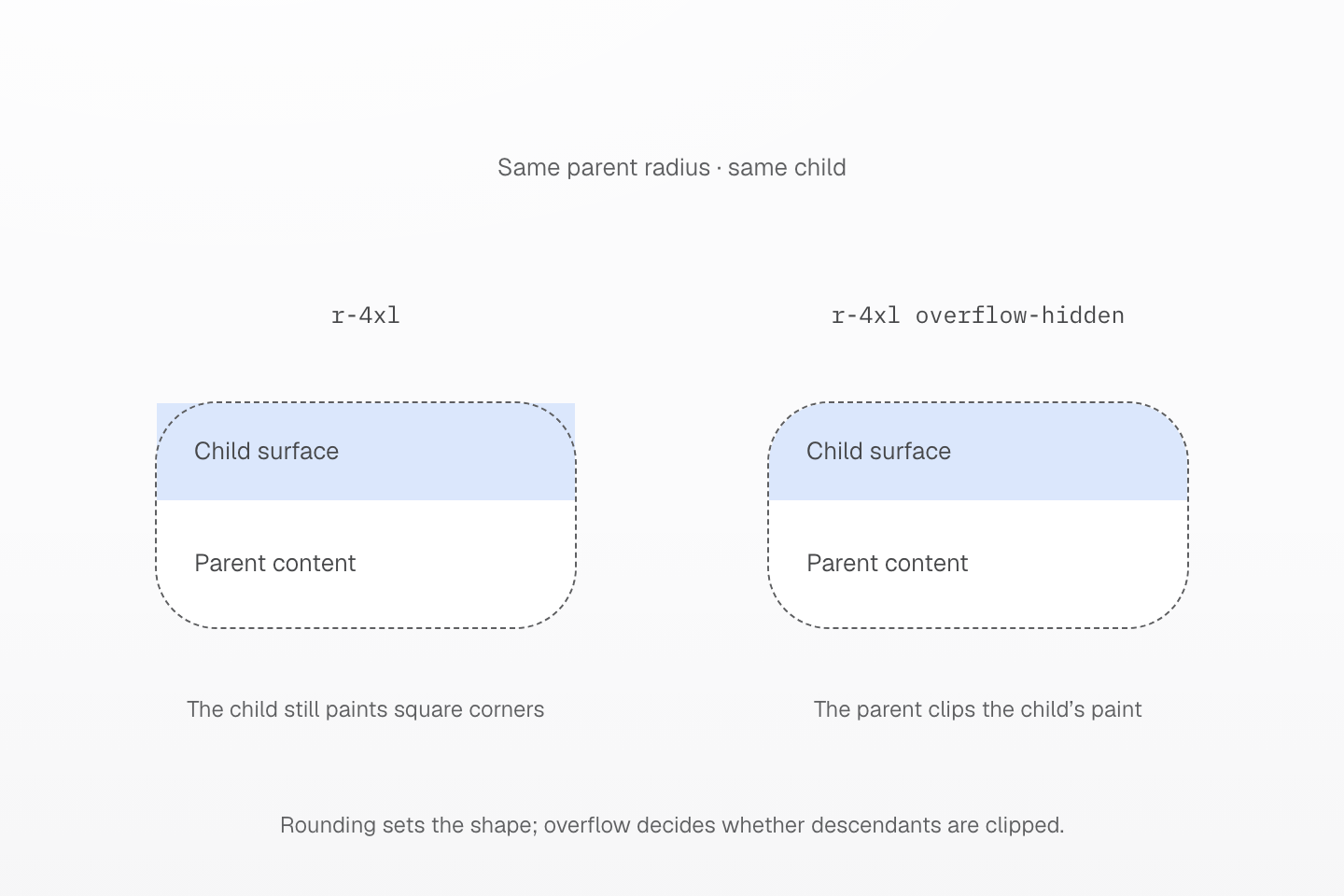
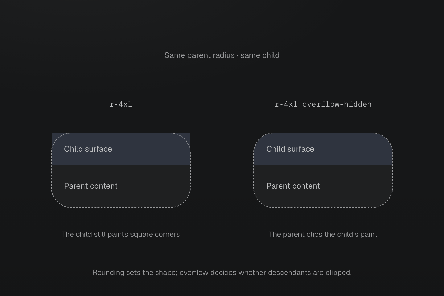
Both parents use r-4xl and the same content. Only the right parent adds overflow-hidden. Blue identifies the child surface; the dashed contour marks the parent’s rounded edge.
Text description
- Both parent boxes use r-4xl, whose preset value is 2rem. They contain identical child and parent-content regions, with dimensions following the same content.
- The left parent keeps the default visible overflow. Its own background is rounded, but the blue child paints a rectangle at the top.
- The right parent adds overflow-hidden. The same child rectangle is clipped to the parent’s rounded edge; the child does not inherit a radius.
- The dashed contour is an inspection annotation, not a border emitted by r-4xl. The color only identifies the same child in both examples.
The physical families such as rtl- always address the top-left corner. Logical families such as rss- follow the block-start and inline-start sides, so their physical corner depends on writing mode and direction. Every mapping is listed above.
Oversized radii are reduced by the browser when adjacent curves would overlap. This is why pill produces a capsule on a wide box and a circle on a square. It does not make an element square.
For a square corner use the direct-value function r(0) or its single-corner counterpart, such as rtl(0). The preset has no --radius-none token. Negative token forms such as -r-md are rejected.
See native corner clipping and direct values.
Usage
Step the radius down from a sheet to the thumbnail inside it.
Field notes
Every Friday
<div class="… r-lg"> <div class="… r-md">FN</div> <div> <p>Field notes</p> <p>Every Friday</p> </div> <span class="… pill">Weekly</span></div>Generated CSS
@layer theme { :root, :host { --radius-md: .375rem; --radius-lg: .5rem }}@layer utilities { .r-lg { border-radius: var(--radius-lg) } .r-md { border-radius: var(--radius-md) } .pill { border-radius: calc(infinity * 1px) }}Customize
Change a preset value or add a token: --radius-card creates r-card and each single-corner class.
@theme { --radius-md: .5rem; --radius-card: 1.25rem;}Generated CSS
@layer theme { :root, :host { --radius-card: 1.25rem }}@layer utilities { .r-card { border-radius: var(--radius-card) }}See theme directives and Color.