Theme
Register theme tokens and control their retention and substitution with static and inline.
On this page
@theme registers tokens for utility definitions. Its modifiers independently control which token declarations are delivered and whether generated values use var() or substitute the authored value. Theme tokens teaches project setup; Variables and modes explains scope, inheritance and resolution.
@theme
Declare utility tokens as custom properties. A theme block must be top-level and accepts only custom-property token declarations. Declare keyframes in native CSS outside the block.
@theme { --color-brand: #4f46e5; --spacing-card: 1.5rem;}Unknown or repeated modifiers are errors. The static and inline modifiers can appear in either order.
| Declaration | Token delivery | Generated value |
|---|---|---|
@theme | On demand | var(--token) |
@theme static | Always | var(--token) |
@theme inline | Only if retained by another reference or dependency | Declared value |
@theme static inline | Always | Declared value |
Tokens emit in @layer theme under :root, :host. The compiler preserves declaration order and repeated values. Used tokens retain their transitive variable dependencies. Selectors and conditional rules belong in native CSS outside the block.
Only @theme registers named tokens for utility patterns. A native declaration such as :root { --app-brand: red; } remains ordinary CSS; use it directly with (color:var(--app-brand)) or bridge it through an inline theme token.
Static controls retention; inline controls the generated value
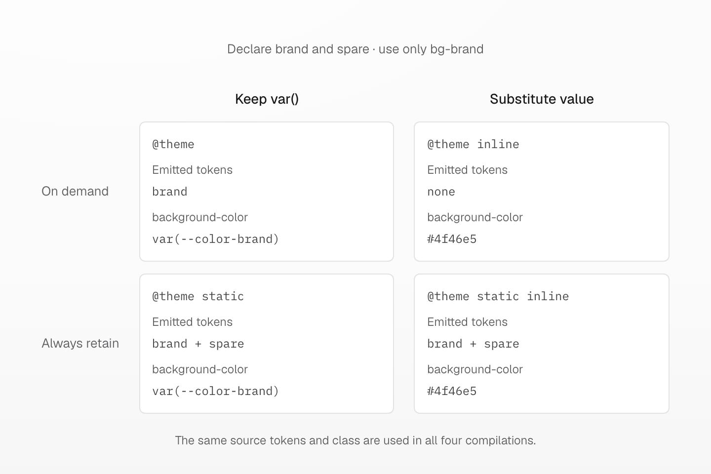
Each case declares brand and spare; only bg-brand is used. With inline alone, neither token needs a declaration. Adding static retains both without changing the substituted class value.
Text description
- All four cases declare --color-brand: #4f46e5 and --color-spare: #0d9488. bg-brand is their only consumer; there are no native token references.
- Ordinary @theme emits the used brand token and background-color: var(--color-brand). The unused spare token is omitted.
- @theme inline substitutes #4f46e5 into the generated declaration. That utility no longer reads either token, so neither token declaration is emitted in this case.
- @theme static retains both tokens. @theme static inline also retains both, while the generated background-color remains #4f46e5. Retention and substitution are independent.
@theme inline
Use inline to substitute a token's declared value into Master-generated declarations:
@theme inline { --color-brand: var(--app-brand);}:root { --app-brand: #4f46e5;}[data-theme="ocean"] { --app-brand: #0369a1;}bg-brand emits background-color:var(--app-brand), resolving the native variable on the element using the class. The same substitution applies to direct declaration classes, utility classes, and native @apply expansion. Handwritten native declarations retain their authored var() references.
Substitution runs once. Variables, functions, and fallbacks inside the replacement value keep native CSS semantics. Dependencies are collected from the resulting declarations; using an inline utility alone does not force its replaced token to emit. A direct native reference to the token can still retain its declaration.
For repeated theme definitions, importance and then source order select the inline value and mode. Custom-property !important does not make the generated utility important. Ordinary aliases resolve in their declaring scope; use inline when a bridge must read another variable at its use site.
@theme static
Use static when tokens must be emitted even without a class or native reference:
@theme static { --color-integration: #4f46e5;}@theme static inline { --color-brand: var(--app-brand);}static controls token delivery; inline controls generated values. They can be combined in either order. A token with any static declaration stays retained, together with its dependencies, until its definition is removed. Referenced stylesheets do not become output roots merely because their tokens are static.
Native theme overrides
Register the default value in @theme, then override the variable using native selectors or queries:
@theme { --color-panel: white;}[data-theme="ocean"] { --color-panel: #082f49;}@media (prefers-color-scheme: dark) { :root { --color-panel: #111827; }}Native overrides retain their authored scope, layer, and stylesheet delivery. Unlayered normal overrides outrank normal theme-layer declarations on the same element. A later layer such as defaults also gives overrides priority while allowing component and utility layers to take precedence. Import the native stylesheet wherever its overrides are needed; @reference supplies definitions without delivering those rules.
The preset uses native light-dark() for adaptive colors and shadows. Both variable branches remain dependencies. Its native base CSS sets the root to color-scheme: light dark, with light/dark data-theme selectors for elements and shadow hosts. See Colors.
Scoped tokens in native CSS
@theme { --color-brand: #4f46e5; } .dark { --color-brand: #111827; } .card { color: var(--color-brand); }Generated CSS
.dark { --color-brand: #111827;}.card { color: var(--color-brand);}@layer theme { :root, :host { --color-brand: #4f46e5 }}