Container sizes
Preset lengths for width, height, minimum and maximum sizes.
On this page
Classes
| Class | Declarations |
|---|---|
max-w-<name> | max-width: var(--container-<name>); |
w-<name> | width: var(--container-<name>); |
11 more classes
| Class | Declarations |
|---|---|
h-<name> | height: var(--container-<name>); |
basis-<name> | flex-basis: var(--container-<name>); |
max-h-<name> | max-height: var(--container-<name>); |
min-h-<name> | min-height: var(--container-<name>); |
min-w-<name> | min-width: var(--container-<name>); |
size-x-<name> | inline-size: var(--container-<name>); |
size-y-<name> | block-size: var(--container-<name>); |
max-size-x-<name> | max-inline-size: var(--container-<name>); |
max-size-y-<name> | max-block-size: var(--container-<name>); |
min-size-x-<name> | min-inline-size: var(--container-<name>); |
min-size-y-<name> | min-block-size: var(--container-<name>); |
Container tokens set lengths; they do not define viewport or container queries. Full and intrinsic sizes such as w-full, max-w-fit and basis-min are fixed utilities, independent of these tokens.
Values
Each value is a length consumed by sizing properties. Pixel equivalents assume a 16px root font size. These are not viewport breakpoints or container-query definitions.
| Class | Value |
|---|---|
max-w-3xs | 16rem256px |
max-w-2xs | 18rem288px |
max-w-xs | 20rem320px |
max-w-sm | 24rem384px |
max-w-md | 28rem448px |
max-w-lg | 32rem512px |
max-w-xl | 36rem576px |
max-w-2xl | 42rem672px |
max-w-3xl | 48rem768px |
max-w-4xl | 56rem896px |
max-w-5xl | 64rem1024px |
max-w-6xl | 72rem1152px |
max-w-7xl | 80rem1280px |
max-w-8xl | 90rem1440px |
A maximum is an upper bound
max-w-3xs sets max-width: var(--container-3xs), whose preset value is 16rem. An ordinary block with auto width can be narrower when its containing block has less room.
The same maximum can produce different widths
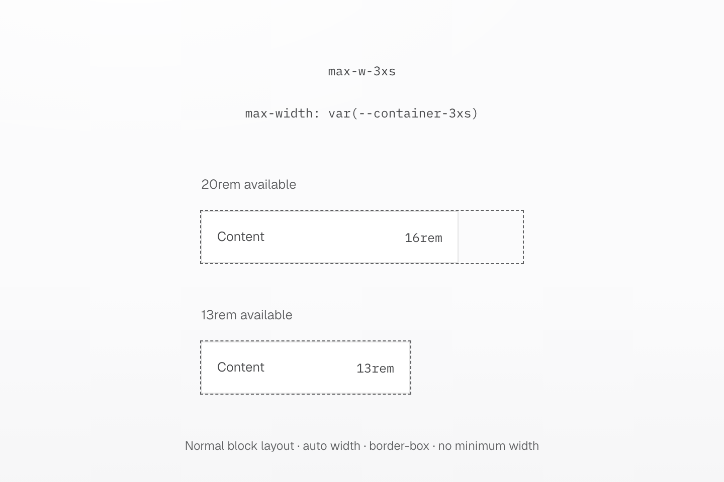
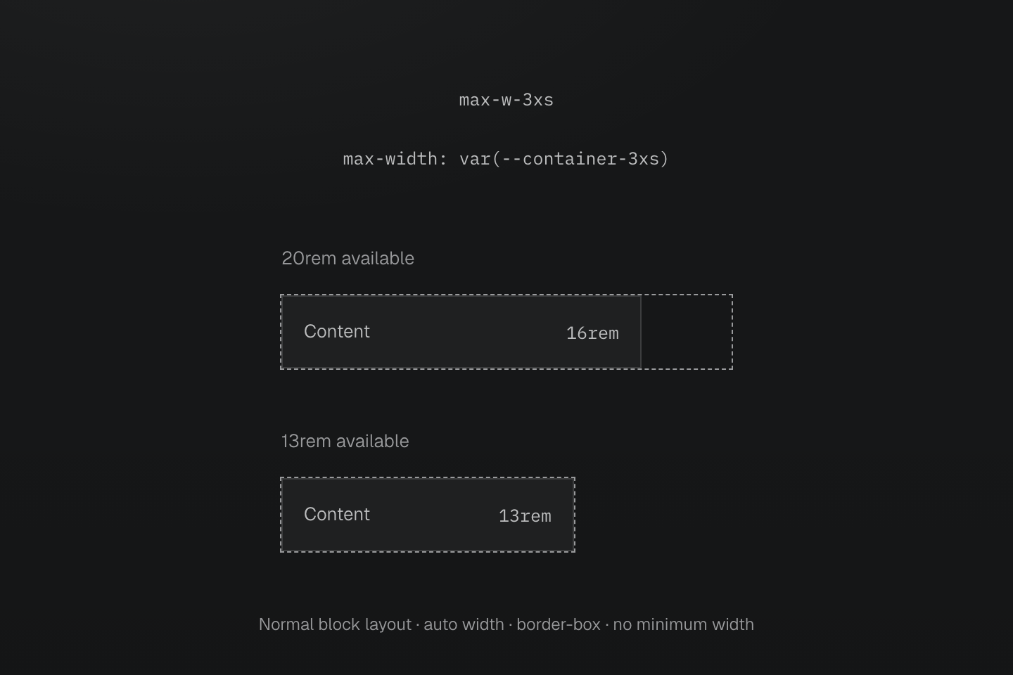
A normal block with auto width fits the available space up to its maximum. The two parent widths are drawn at the same scale, with a 16px root font size.
Text description
- max-w-3xs reads the preset --container-3xs value of 16rem. Both examples have auto width in normal block layout, use border-box sizing and have no minimum-width constraint.
- The first parent provides 20rem. The child stops at its 16rem maximum, leaving unused space after it.
- The second parent provides 13rem. The child fits that smaller space instead of becoming 16rem wide.
- The dashed contour identifies the available width; it is not a generated border or query container. Both parents are drawn at the same scale with a 16px root font size. Heights follow the same content.
w-3xs instead sets the width. Neither class adds centering, padding or query containment. Changing --container-md does not redefine @container(--md) or an explicit query threshold. Use native container-type and container-name when establishing a query container.
The native layout still matters: minimum sizes, box sizing, Flexbox and Grid can affect the used size. A maximum does not change text-wrapping or overflow rules. For a page wrapper and responsive layout decisions, continue with the Layout guide.
See named query conditions and container query grammar and native sizing rules.
Usage
Cap a dialog and the measure of its text.
Leave this page?
Changes you made will not be saved.
<div class="… max-w-xs"> <p>Leave this page?</p> <p class="… max-w-3xs">Changes you made will not be saved.</p></div>Generated CSS
@layer theme { :root, :host { --container-3xs: 16rem; --container-xs: 20rem }}@layer utilities { .max-w-3xs { max-width: var(--container-3xs) } .max-w-xs { max-width: var(--container-xs) }}Customize
Change a preset value or add a size: --container-prose creates max-w-prose, w-prose and the other size classes.
@theme { --container-prose: 40rem;}Generated CSS
@layer theme { :root, :host { --container-prose: 40rem }}@layer utilities { .max-w-prose { max-width: var(--container-prose) }}See theme directives and Layout.