Introduction to Master CSS
Build an interface with classes, follow them into CSS, and define the values your project shares.
On this page
Master CSS is a CSS framework for styling interfaces in markup and defining shared styles in CSS. Write classes where you build an element; use your stylesheet for the values and patterns that belong to the wider project. Master generates the CSS those classes need.
You can start with the supplied colors, spacing and typography. You do not need to design a complete theme before building your first component.
#Build an interface with CSS and utilities
This card combines a native component class with utilities. .action defines the button's base styles in CSS; w-full, mt-md and bg-blue-60 choose its width, margin and color for this card. The rest of the markup uses preset utilities for layout, spacing and typography.
After Installation, add the example's CSS after the preset import in your app stylesheet, and put its HTML in a source file your integration scans:
@import '@master/css';A card built with CSS and utilities
@layer components { .action { display: flex; align-items: center; justify-content: center; min-height: 2.75rem; padding: var(--spacing-xs) var(--spacing-md); border-radius: var(--radius-md); font-size: var(--text-sm); font-weight: var(--font-weight-regular); line-height: var(--text-sm--line-height, normal); letter-spacing: var(--text-sm--letter-spacing, normal); text-decoration-line: none; outline-offset: 3px; &:focus-visible { outline: 2px solid; } }}<article class="overflow-hidden w-full (max-width:22.5rem) mx-auto r-lg bg-surface-raised shadow-sm"> <img src="/building.jpg" width="640" height="360" alt="Sunlit facade of a contemporary building" class="block w-full h-auto (aspect-ratio:16/9) object-cover"> <div class="p-lg"> <p class="m(0) text-2xs font-regular tracking-widest uppercase fg-text-blue">Launch panel</p> <h2 class="mt-xs mb(0) text-md font-regular fg-text-strong">Build the first screen in markup</h2> <p class="mt-xs mb(0) text-sm leading-lg fg-text-muted">Start with local classes, then promote repeated values into your project theme when the interface settles.</p> <a class="action w-full mt-md bg-blue-60 fg-white bg-blue-70:hover bg-blue-80:active outline-blue-60:focus-visible" href="/guide/installation" target="_top">Start building</a> </div></article>Generated CSS
@layer components { .action { min-height: 2.75rem; padding: var(--spacing-xs) var(--spacing-md); border-radius: var(--radius-md); font-size: var(--text-sm); font-weight: var(--font-weight-regular); line-height: var(--text-sm--line-height, normal); letter-spacing: var(--text-sm--letter-spacing, normal); outline-offset: 3px; justify-content: center; align-items: center; text-decoration-line: none; display: flex; &:focus-visible { outline: 2px solid; } }}@layer theme { :root, :host { --color-zinc-40: oklch(68.6% .0028 265); --color-zinc-60: oklch(48.6% .003 265); --color-zinc-90: oklch(24.6% .0022 265); --color-zinc-100: oklch(15% .0016 265); --color-blue-30: oklch(72.87% .1468 249.3); --color-blue-60: oklch(51.83% .2687 266.1); --color-blue-70: oklch(46.26% .3057 266.7); --color-blue-80: oklch(42.89% .2907 266.3) } :root, :host { --color-surface-raised: light-dark(var(--color-white), var(--color-zinc-90)); --color-text-strong: light-dark(var(--color-zinc-100), var(--color-white)); --color-text-muted: light-dark(var(--color-zinc-60), var(--color-zinc-40)); --color-text-blue: light-dark(var(--color-blue-60), var(--color-blue-30)) } :root, :host { --color-white: oklch(100% 0 none) } :root, :host { --tracking-widest: .12em; --leading-lg: 1.8; --font-weight-regular: 400; --font-size-2xs: .625rem; --font-size-sm: .875rem; --font-size-md: 1rem; --text-2xs: var(--font-size-2xs); --text-2xs--line-height: 1.5; --text-2xs--letter-spacing: 0; --text-sm: var(--font-size-sm); --text-sm--line-height: 1.5; --text-sm--letter-spacing: 0; --text-md: var(--font-size-md); --text-md--line-height: 1.6; --text-md--letter-spacing: 0; --radius-md: .375rem; --radius-lg: .5rem; --spacing-xs: .5rem; --spacing-md: 1rem; --spacing-lg: 1.5rem } :root, :host { --shadow-sm: 0 0 0 1px light-dark(oklch(0% 0 none / .04), oklch(100% 0 none / .05)), 0 1px 1px -.5px light-dark(oklch(0% 0 none / .045), oklch(0% 0 none / .3)), 0 2px 2px -1px light-dark(oklch(0% 0 none / .04), oklch(0% 0 none / .26)), 0 4px 4px -2px light-dark(oklch(0% 0 none / .04), oklch(0% 0 none / .24)) }}@layer utilities { .text-2xs { font-size: var(--text-2xs); line-height: var(--text-2xs--line-height, normal); letter-spacing: var(--text-2xs--letter-spacing, normal) } .text-md { font-size: var(--text-md); line-height: var(--text-md--line-height, normal); letter-spacing: var(--text-md--letter-spacing, normal) } .text-sm { font-size: var(--text-sm); line-height: var(--text-sm--line-height, normal); letter-spacing: var(--text-sm--letter-spacing, normal) } .bg-blue-60 { background-color: var(--color-blue-60) } .bg-surface-raised { background-color: var(--color-surface-raised) } .r-lg { border-radius: var(--radius-lg) } .shadow-sm { box-shadow: var(--shadow-sm) } .fg-text-blue { color: var(--color-text-blue) } .fg-text-muted { color: var(--color-text-muted) } .fg-text-strong { color: var(--color-text-strong) } .fg-white { color: var(--color-white) } .block { display: block } .font-regular { font-weight: var(--font-weight-regular) } .h-auto { height: auto } .tracking-widest { letter-spacing: var(--tracking-widest) } .leading-lg { line-height: var(--leading-lg) } .m\(0\) { margin: calc(0 * 1px) } .mx-auto { margin-inline: auto } .mt-md { margin-top: var(--spacing-md) } .mt-xs { margin-top: var(--spacing-xs) } .mb\(0\) { margin-bottom: calc(0 * 1px) } .object-cover { object-fit: cover } .overflow-hidden { overflow: hidden } .p-lg { padding: var(--spacing-lg) } .uppercase { text-transform: uppercase } .w-full { width: 100% } .\(aspect-ratio\:16\/9\) { aspect-ratio: 16/9 } .\(max-width\:22\.5rem\) { max-width: 22.5rem } .bg-blue-70\:hover:hover { background-color: var(--color-blue-70) } .outline-blue-60\:focus-visible:focus-visible { outline-color: var(--color-blue-60) } .bg-blue-80\:active:active { background-color: var(--color-blue-80) }}The preview uses the displayed CSS and HTML together. .action is defined by this example in @layer components; Master generates the utility rules from the classes in markup. Keep the button's common geometry and focus treatment in .action, while this instance keeps its blue colors and full width.
Try changing p-lg to p-md: the card's content padding becomes smaller without changing the button's base styles.
The image URL assumes your app serves /building.jpg. Replace it with your own image and alternative text, and point the link to a page in your app.
#Follow a class into CSS
Take p-lg from the card. The preset connects p- to padding and lg to the spacing token --spacing-lg. Master generates a class selector whose declaration references that CSS variable.
A class selects the style; a token supplies the value
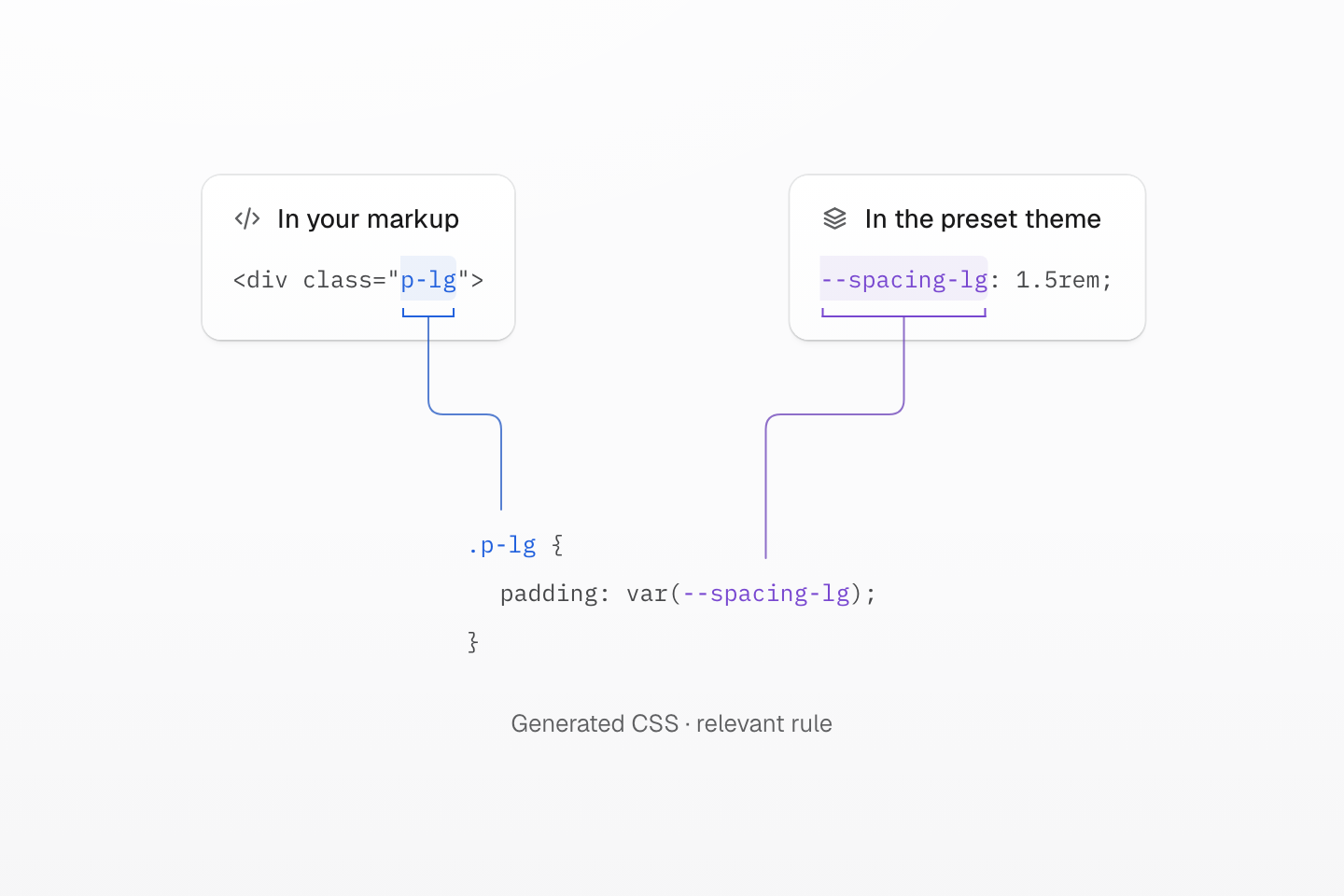
Matching names connect the pieces: p-lg selects the rule, and var(--spacing-lg) reads the shared value. The figure shows the relevant declaration; the complete output below includes its layers.
Text description
- Class match. The HTML class p-lg matches the generated selector .p-lg. The blue bracket and line connect those two occurrences.
- Shared value. The preset defines --spacing-lg as 1.5rem. The violet bracket and line connect its definition to the reference in padding: var(--spacing-lg).
- Browser result. The browser resolves the CSS variable and applies 1.5rem of padding on all four sides. The generated rule keeps the variable reference rather than copying its value into the declaration.
Generated CSS
@layer theme { :root, :host { --spacing-lg: 1.5rem }}@layer utilities { .p-lg { padding: var(--spacing-lg) }}The browser applies padding: var(--spacing-lg) to the matching element. With the preset's value, that is 1.5rem on all four sides. The class stays the same if you change the shared value in your theme.
Other classes express different kinds of decisions: w-full is a fixed utility for width: 100%, while bg-blue-70:hover adds a hover state. The Syntax tutorial walks through values, selectors and conditions in a working example.
#Define what should change together
Add a theme token when several elements should share a project decision. For a primary action color, define --color-brand after the import in your app stylesheet, then use bg-brand in markup:
@theme { --color-brand: #2563eb;}<a class="inline-flex px-md py-xs r-md bg-brand fg-white" href="/guide/installation">Start building</a>Generated CSS
@layer theme { :root, :host { --color-white: oklch(100% 0 none) } :root, :host { --radius-md: .375rem; --spacing-xs: .5rem; --spacing-md: 1rem } :root, :host { --color-brand: #2563eb }}@layer utilities { .bg-brand { background-color: var(--color-brand) } .r-md { border-radius: var(--radius-md) } .fg-white { color: var(--color-white) } .inline-flex { display: inline-flex } .py-xs { padding-block: var(--spacing-xs) } .px-md { padding-inline: var(--spacing-md) }}Changing --color-brand updates elements that use it. Share that token because the elements should change together; two unrelated colors can have the same value without needing the same name. Theme tokens explains how to define and override shared values.
Use a component class such as .action when several elements should share a styling contract, and a UI component when they should share markup. A long class list alone does not require a new CSS name. Reusing styles helps you choose between a shared token, a component class and a custom utility.
The class vocabulary survives a delivery choice
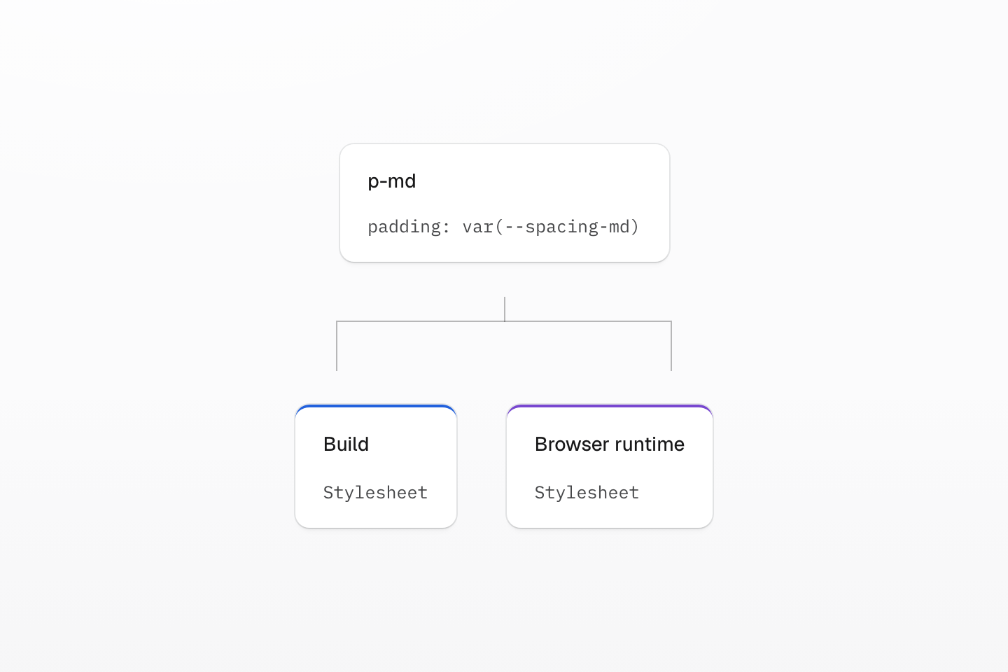
The syntax answers what style is requested. Rendering mode answers when and where its CSS is generated.
Text description
One class and its declaration sit above two delivery paths: build-generated stylesheet and browser-generated stylesheet.
#Start with static CSS
Use the recommended static integration for your framework. It finds complete class names in your source at build time and delivers ordinary CSS, without a Master browser runtime or engine.
Interactive interfaces still work: switch between known classes, use selectors such as :hover, or update CSS custom properties for values such as progress and coordinates. A runtime is useful when a playground, visual editor or deployed content introduces previously unknown class names. Rendering modes explains the delivery choices.
Follow Installation to connect Master CSS to your app, then build a card with interaction states and responsive conditions in the Syntax tutorial. For completion and diagnostics while you write, set up the Language service.