Cascade layers
Override a shared component with utilities and diagnose competing rules, unlayered CSS and importance.
On this page
#Overview
Make a one-off adjustment without increasing selector specificity. Put shared component rules in the components layer and let an instance's utilities override the properties that need to change.
A later layer supplies the local padding
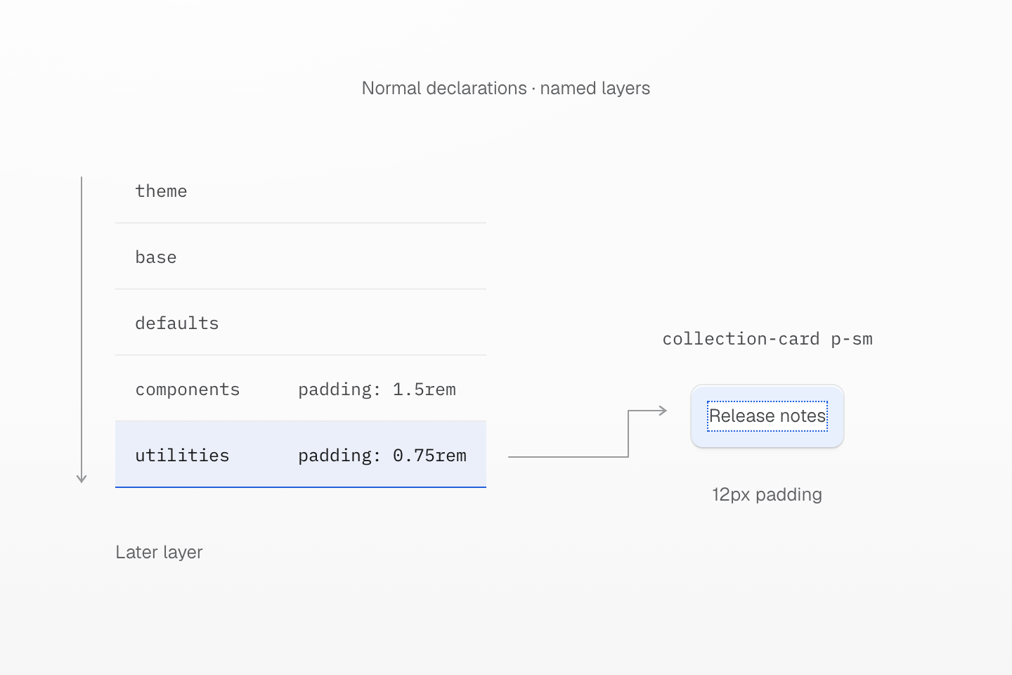
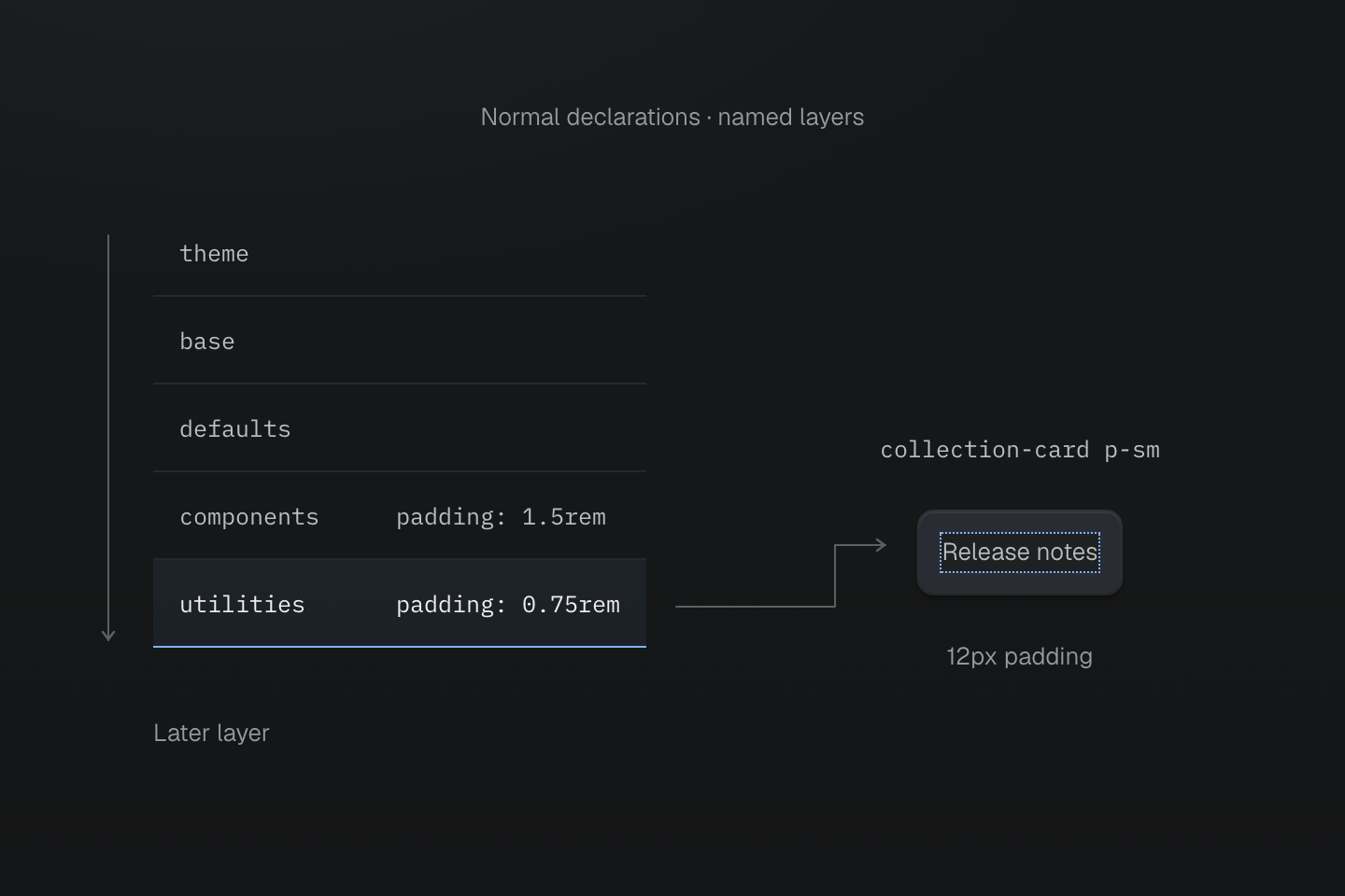
For these normal declarations, utilities wins over components. Class order in the HTML does not change that result.
Text description
- Establish order. The preset declares theme, base, defaults, components, utilities in that order.
- Compare declarations. The native collection-card component supplies 1.5rem padding. On the same element, p-sm supplies 0.75rem in the later utilities layer.
- Observe the result. The utility wins for these normal declarations. With a 16px root font size, the computed padding is 12px.
#Override a component locally
CSS cascade layers give groups of declarations an order before selector specificity is compared. Keep reusable component styling in the components layer, then apply a utility when one instance needs a different value:
A shared component, a local adjustment
@layer components { .collection-card { padding: 1.5rem; border: 1px solid var(--color-line-divider); border-radius: var(--radius-lg); background-color: var(--color-surface-raised); }}<div class="grid-cols(1) gap-lg wrap-anywhere"> <article class="collection-card"> <h2 class="m(0) text-lg font-regular">Release notes</h2> <p class="mt-xs mb(0) text-sm fg-text-muted">Updates for your workspace.</p> </article> <article class="collection-card p-sm"> <h2 class="m(0) text-lg font-regular">Release notes</h2> <p class="mt-xs mb(0) text-sm fg-text-muted">Updates for your workspace.</p> </article></div>Generated CSS
@layer components { .collection-card { border: 1px solid var(--color-line-divider); border-radius: var(--radius-lg); background-color: var(--color-surface-raised); padding: 1.5rem; }}@layer theme { :root, :host { --color-zinc-40: oklch(68.6% .0028 265); --color-zinc-60: oklch(48.6% .003 265); --color-zinc-90: oklch(24.6% .0022 265) } :root, :host { --color-surface-raised: light-dark(var(--color-white), var(--color-zinc-90)); --color-line-divider: light-dark(oklch(0% 0 none / .12), oklch(100% 0 none / .12)); --color-text-muted: light-dark(var(--color-zinc-60), var(--color-zinc-40)) } :root, :host { --color-white: oklch(100% 0 none) } :root, :host { --font-weight-regular: 400; --font-size-sm: .875rem; --font-size-lg: 1.125rem; --text-sm: var(--font-size-sm); --text-sm--line-height: 1.5; --text-sm--letter-spacing: 0; --text-lg: var(--font-size-lg); --text-lg--line-height: 1.5; --text-lg--letter-spacing: 0; --radius-lg: .5rem; --spacing-xs: .5rem; --spacing-sm: .75rem; --spacing-lg: 1.5rem }}@layer utilities { .text-lg { font-size: var(--text-lg); line-height: var(--text-lg--line-height, normal); letter-spacing: var(--text-lg--letter-spacing, normal) } .text-sm { font-size: var(--text-sm); line-height: var(--text-sm--line-height, normal); letter-spacing: var(--text-sm--letter-spacing, normal) } .grid-cols\(1\) { display: grid; grid-template-columns: repeat(1, minmax(0, 1fr)) } .fg-text-muted { color: var(--color-text-muted) } .font-regular { font-weight: var(--font-weight-regular) } .gap-lg { gap: var(--spacing-lg) } .m\(0\) { margin: calc(0 * 1px) } .mt-xs { margin-top: var(--spacing-xs) } .mb\(0\) { margin-bottom: calc(0 * 1px) } .wrap-anywhere { overflow-wrap: anywhere } .p-sm { padding: var(--spacing-sm) }}The preset establishes this order for normal declarations:
@layer theme, base, defaults, components, utilities;The p-sm utility takes precedence over the component's padding declaration, regardless of where the class appears in the HTML attribute. The cascade contract describes the order and its scope.
The utility changes only padding. It does not replace the component or remove its other declarations. This makes a small local adjustment possible without another component variant or an !important declaration.
#Keep native rules in the intended layer
A normal rule outside every layer takes precedence over normal rules inside named layers. If a utility compiles but appears to do nothing, look for an unlayered component rule:
/* This normal rule wins over a layered padding utility. */.collection-card { padding: 1.5rem;}Move that shared rule into @layer components when it should permit utility overrides. Avoid adding !important just to compensate for an unintended layer boundary.
An unlayered rule sits above normal layered rules
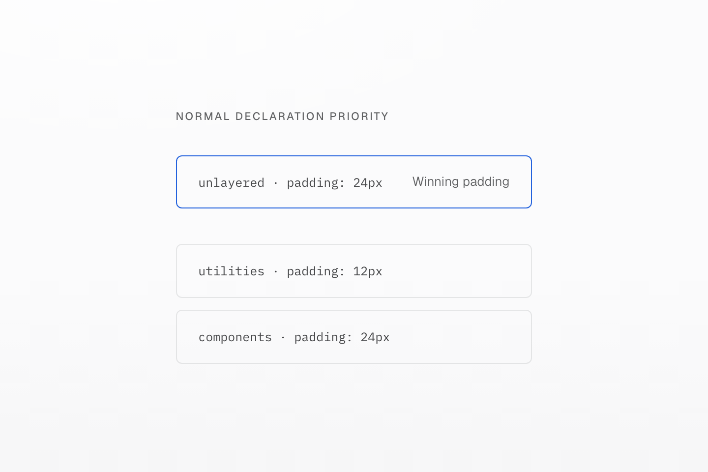
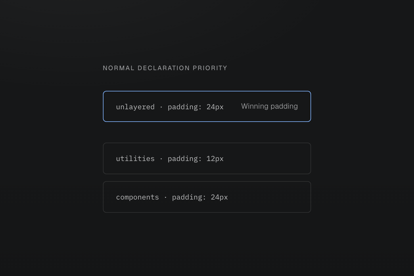
This compares normal author declarations. Important declarations have different layer precedence.
Text description
An ordered stack puts components before utilities, then separates an unlayered rule above both. The winning padding belongs to that unlayered rule.
Layers do not replace the rest of the cascade. Importance is considered before normal layer precedence, and !important reverses the order between layers. Inline declarations, animations and transitions have their own precedence. See the CSS cascade specification for those rules and the Master CSS layer contract for the preset order.
#Diagnose a competing declaration
- Select the element in browser DevTools and find the property in Computed styles. Follow it to the winning declaration.
- Confirm both rules target the element and their conditions match.
- Check which layer owns each declaration, including native CSS outside layers.
- Keep broad defaults in their intended layer before adding local overrides.
- Inspect importance and the native cascade when layer order alone does not explain the result.
Load the base stylesheet through the normal Master CSS entry. Generated rules contain their layer blocks; they do not add the base layer statement themselves.
Reversing collection-card p-sm to p-sm collection-card is not a fix: HTML class order does not control the cascade. If two utilities in the same condition overlap, use Code linting to find the conflict, then inspect which declaration you want to keep.