Compatibility
Use new CSS features with a usable fallback, verify browser behavior, and place third-party styles in the cascade.
On this page
Master CSS generates CSS; the browser decides which properties, values and selectors it can apply. Build a usable baseline, add newer features where they improve it, and check how existing styles participate in the cascade.
These examples assume Installation is complete and your app loads @import '@master/css';.
#Check the browser baseline
The default preset uses cascade layers, OKLCH colors and light-dark() for adaptive values. An enhancement fallback does not remove those baseline requirements. Check the browser baseline and vendor prefixes against the browsers you need to support.
A recognized class is not a browser-compatibility guarantee. Master emits compatibility prefixes for selected properties; it does not polyfill every new feature. Likewise, a tooling result of unknown means the CSS has not been verified by that check, rather than proving it invalid or safe to ship.
#Add a feature without losing the fallback
#Native declarations
A note field should remain editable even when automatic sizing is unavailable. Give it an ordinary textarea size and allow vertical resizing, then add field-sizing: content as an enhancement. The native property can size the control from its contents; minimum and maximum heights keep it within a useful range.
field-sizing: content Checking…
A note field with a fallback
<div class="w-full (max-width:28rem) mx-auto"> <label for="project-note" class="block mb-xs text-sm fg-text-strong">Project notes</label> <textarea id="project-note" name="note" rows="3" class="block w-full p-sm r-md b(1) b-solid b-line-divider bg-surface-inset text-sm fg-text-strong (resize:vertical) (min-height:6rem) (max-height:12rem) outline(2):focus-visible outline-solid:focus-visible outline-offset(3) (field-sizing:content)@supports(field-sizing:content)">Plan the next release. Review the draft. Check the examples. Test with a keyboard. Verify the small screen. Publish when ready.</textarea></div>Generated CSS
@layer theme { :root, :host { --color-zinc-5: oklch(96.5% .0011 265); --color-zinc-100: oklch(15% .0016 265) } :root, :host { --color-surface-inset: light-dark(var(--color-zinc-5), var(--color-zinc-100)); --color-line-divider: light-dark(oklch(0% 0 none / .12), oklch(100% 0 none / .12)); --color-text-strong: light-dark(var(--color-zinc-100), var(--color-white)) } :root, :host { --color-white: oklch(100% 0 none) } :root, :host { --font-size-sm: .875rem; --text-sm: var(--font-size-sm); --text-sm--line-height: 1.5; --text-sm--letter-spacing: 0; --radius-md: .375rem; --spacing-xs: .5rem; --spacing-sm: .75rem }}@layer utilities { .text-sm { font-size: var(--text-sm); line-height: var(--text-sm--line-height, normal); letter-spacing: var(--text-sm--letter-spacing, normal) } .bg-surface-inset { background-color: var(--color-surface-inset) } .b-line-divider { border-color: var(--color-line-divider) } .r-md { border-radius: var(--radius-md) } .b-solid { border-style: solid } .b\(1\) { border-width: calc(1 * 1px) } .fg-text-strong { color: var(--color-text-strong) } .block { display: block } .mx-auto { margin-inline: auto } .mb-xs { margin-bottom: var(--spacing-xs) } .outline-offset\(3\) { outline-offset: calc(3 * 1px) } .p-sm { padding: var(--spacing-sm) } .w-full { width: 100% } .\(max-height\:12rem\) { max-height: 12rem } .\(max-width\:28rem\) { max-width: 28rem } .\(min-height\:6rem\) { min-height: 6rem } .\(resize\:vertical\) { resize: vertical } .outline-solid\:focus-visible:focus-visible { outline-style: solid } .outline\(2\)\:focus-visible:focus-visible { outline-width: calc(2 * 1px) } @supports (field-sizing:content) { .\(field-sizing\:content\)\@supports\(field-sizing\:content\) { field-sizing: content } }}(field-sizing:content) supplies the native declaration. Its @supports(field-sizing:content) suffix places that declaration inside a CSS feature query. If the query does not match, the base styles and normal textarea behavior remain.
The enhancement changes the size, not access to the note
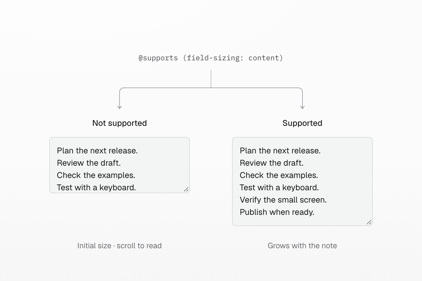
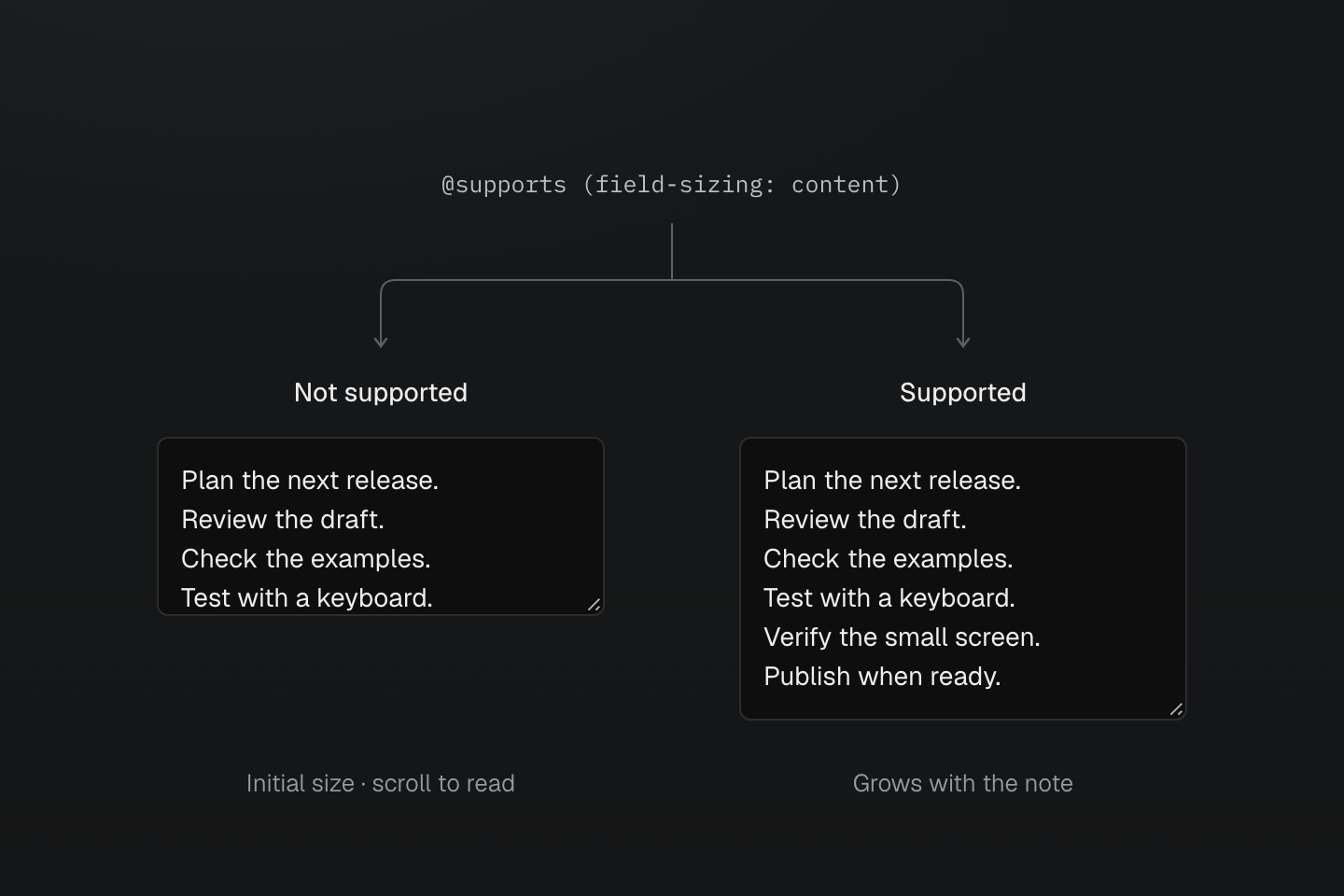
Same note, same width and limits. Without the enhancement the field scrolls; with it the field grows, then scrolls at the maximum height.
Text description
- Shared baseline. Both textareas contain the same six lines and have the same width, padding and height limits. The control remains editable, vertically resizable and scrollable.
- Query does not match. The field uses its ordinary initial size. Some lines are below the visible area, but scrolling still reaches them.
- Query matches. The field-sizing: content declaration lets the field grow with the note. A maximum height stops further growth; longer notes then scroll.
The preview checks syntax support in your current browser. Test the actual editing behavior in your target browsers too. To inspect the fallback in a supporting browser, temporarily remove the conditional class: the field should stop growing automatically while keeping all its text accessible by scrolling. This isolates the enhancement; it does not emulate an older browser.
Use Generated CSS to inspect the emitted condition. Conditions documents the class syntax; native CSS can express more complex feature queries.
An enhancement starts from a working fallback
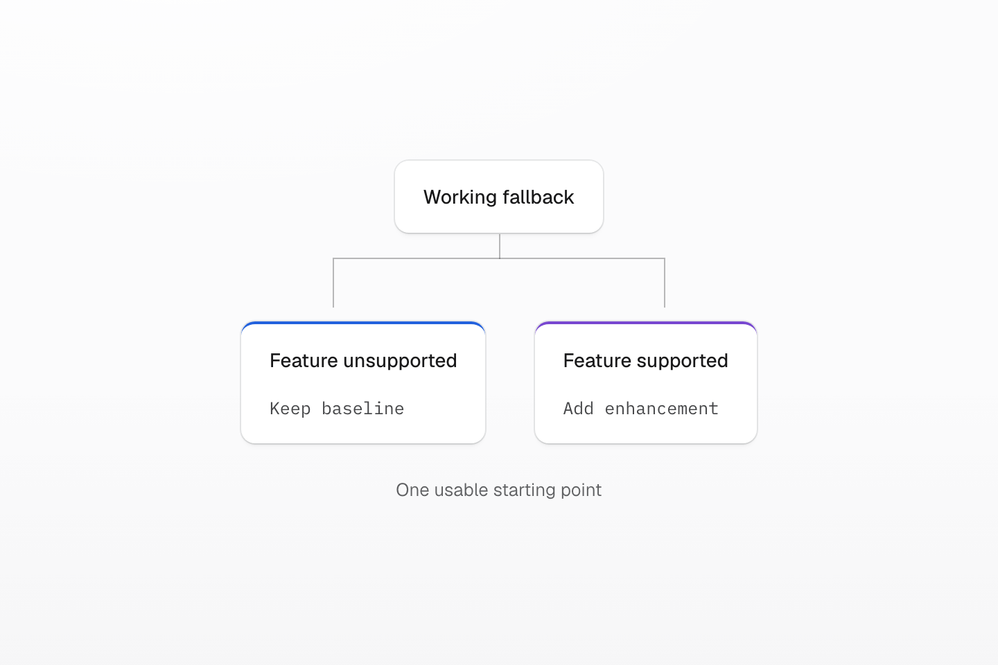
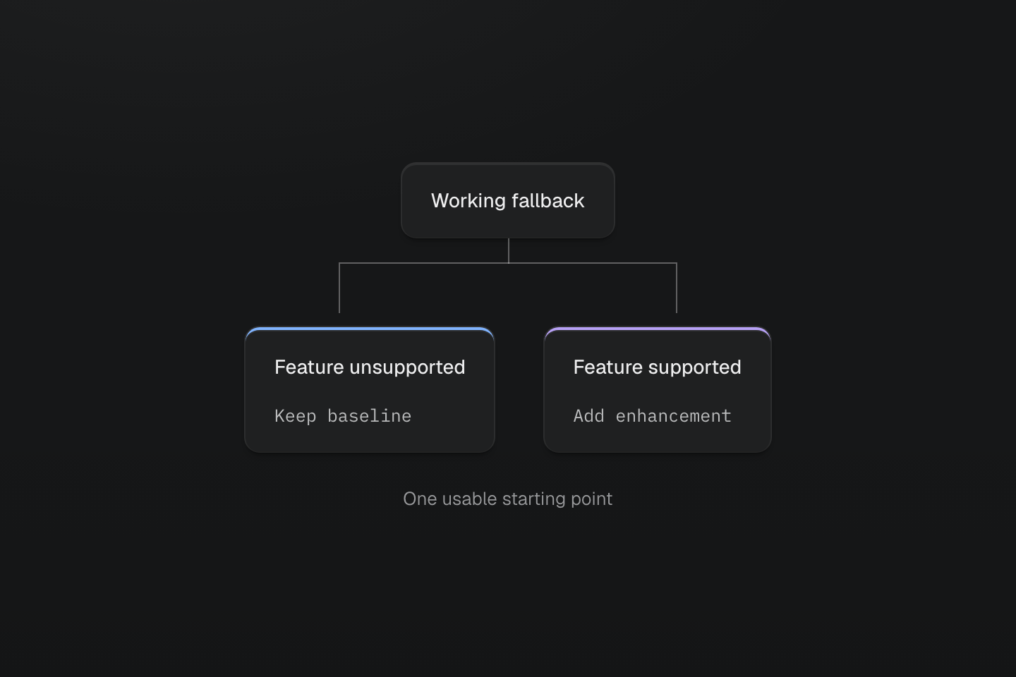
@supports controls the enhancement. The fallback remains a normal declaration outside that condition.
Text description
Both branches start from one baseline. Unsupported browsers keep it; supporting browsers add the conditional enhancement.
#New selectors
The same approach applies to selector-based enhancements. Here, :has(:checked) gives the label a blue border when its checkbox is checked. The native checkbox still records the choice if that selector is unsupported:
A checked state with optional emphasis
<label class="flex items-center gap-sm w-fit mx-auto p-sm r-md b(1) b-solid b-line-divider bg-surface-raised text-sm fg-text-strong b-blue-60:has(:checked)"> <input type="checkbox" name="updates" class="m(0) shrink(0) (accent-color:currentColor)"> <span>Send me release notes</span></label>Generated CSS
@layer theme { :root, :host { --color-zinc-90: oklch(24.6% .0022 265); --color-zinc-100: oklch(15% .0016 265); --color-blue-60: oklch(51.83% .2687 266.1) } :root, :host { --color-surface-raised: light-dark(var(--color-white), var(--color-zinc-90)); --color-line-divider: light-dark(oklch(0% 0 none / .12), oklch(100% 0 none / .12)); --color-text-strong: light-dark(var(--color-zinc-100), var(--color-white)) } :root, :host { --color-white: oklch(100% 0 none) } :root, :host { --font-size-sm: .875rem; --text-sm: var(--font-size-sm); --text-sm--line-height: 1.5; --text-sm--letter-spacing: 0; --radius-md: .375rem; --spacing-sm: .75rem }}@layer utilities { .text-sm { font-size: var(--text-sm); line-height: var(--text-sm--line-height, normal); letter-spacing: var(--text-sm--letter-spacing, normal) } .items-center { align-items: center } .bg-surface-raised { background-color: var(--color-surface-raised) } .b-line-divider { border-color: var(--color-line-divider) } .r-md { border-radius: var(--radius-md) } .b-solid { border-style: solid } .b\(1\) { border-width: calc(1 * 1px) } .fg-text-strong { color: var(--color-text-strong) } .flex { display: flex } .shrink\(0\) { flex-shrink: 0 } .gap-sm { gap: var(--spacing-sm) } .m\(0\) { margin: calc(0 * 1px) } .mx-auto { margin-inline: auto } .p-sm { padding: var(--spacing-sm) } .w-fit { width: fit-content } .\(accent-color\:currentColor\) { accent-color: currentColor } .b-blue-60\:has\(\:checked\):has(:checked) { border-color: var(--color-blue-60) }}Keep the base styling independent of the new selector. Do not make essential controls or content depend on the enhancement. For selector spelling and composition, see Selectors.
#Fit third-party CSS into the cascade
When normal utilities should override a library's normal styles, import its CSS into the earlier defaults layer. Declare the layer order before those imports, in the app CSS entry processed by your Master integration.
For a project that already uses Swiper's core, navigation and pagination styles, load them through this entry instead of also importing unlayered copies elsewhere:
@layer theme, base, defaults, components, utilities;@import 'swiper/css' layer(defaults);@import 'swiper/css/navigation' layer(defaults);@import 'swiper/css/pagination' layer(defaults);@import '@master/css';@layer components { .swiper-slide { background-color: var(--color-surface-raised); }}Within the slider's existing markup, one slide can keep the component surface while another adds a local utility:
<div class="swiper-slide">Default surface</div><div class="swiper-slide bg-blue-60 fg-white">Featured slide</div>The normal background declaration in utilities wins over the one in components, which in turn sits above defaults. Reordering the class names in HTML does not change that result.
Check competing declarations in browser devtools before adding stronger overrides. Within the same author origin and context, normal unlayered styles outrank normal layered styles. A vendor !important declaration also beats a normal utility; important declarations reverse the layer order. These are native cascade rules, not a Master-specific priority system. Cascade layers walks through diagnosis.
Native selectors in Master-managed stylesheets are preserved by default. If you enable native pruning, protect vendor, CMS and externally injected selectors with @preserve native in a stylesheet you control, or keep those sources outside pruning. A selector used by a third-party widget may not appear in your app's scanned markup.