Reusing styles
Choose tokens, component classes, utilities and mixins by what should change together, while keeping local variations easy to express.
On this page
Two screens can share a Save button while giving one instance more space. Put the button's shared appearance in a component class, then keep that local adjustment in markup. The same approach applies at smaller scales: name a value when its consumers should change together, or share a piece of CSS when several rules need it.
Complete Installation and the Syntax tutorial first. Each example below supplies its own CSS and markup. Add its CSS after the existing preset import in your app stylesheet, and put the markup in a source file your integration scans:
@import '@master/css';#Keep a component's shared appearance together
A product role such as an action button needs a recognizable appearance wherever it is used. Define that role as a native class in @layer components, including the states that belong to every instance.
One button, a local spacing adjustment
@theme { --spacing-action-x: 1rem; --color-action: var(--color-surface-raised);}@layer components { .action { display: inline-flex; align-items: center; justify-content: center; min-height: 2.375rem; padding: .5rem var(--spacing-action-x); border: 1px solid var(--color-line-divider); border-radius: var(--radius-md); background-color: var(--color-action); color: var(--color-text-strong); box-shadow: var(--shadow-sm); font: inherit; font-size: var(--font-size-sm); font-weight: 400; line-height: 1.2; &:is(:hover, :focus-visible) { box-shadow: var(--shadow-md); } &:active { background-color: var(--color-surface-inset); box-shadow: none; } &:focus-visible { outline: 2px solid var(--color-text-strong); outline-offset: 3px; } }}<div class="flex flex-wrap items-start gap-lg"> <div class="flex flex-col items-start gap-sm"> <p class="m(0) text-xs fg-text-muted">Shared component</p> <button type="button" class="action">Save changes</button> </div> <div class="flex flex-col items-start gap-sm"> <p class="m(0) text-xs fg-text-muted">Local adjustment</p> <button type="button" class="action px-lg">Save changes</button> </div></div>Generated CSS
@layer components { .action { min-height: 2.375rem; padding: .5rem var(--spacing-action-x); border: 1px solid var(--color-line-divider); border-radius: var(--radius-md); background-color: var(--color-action); color: var(--color-text-strong); box-shadow: var(--shadow-sm); font: inherit; font-size: var(--font-size-sm); justify-content: center; align-items: center; font-weight: 400; line-height: 1.2; display: inline-flex; &:is(:hover, :focus-visible) { box-shadow: var(--shadow-md); } &:active { background-color: var(--color-surface-inset); box-shadow: none; } &:focus-visible { outline: 2px solid var(--color-text-strong); outline-offset: 3px; } }}@layer theme { :root, :host { --color-zinc-5: oklch(96.5% .0011 265); --color-zinc-40: oklch(68.6% .0028 265); --color-zinc-60: oklch(48.6% .003 265); --color-zinc-90: oklch(24.6% .0022 265); --color-zinc-100: oklch(15% .0016 265) } :root, :host { --color-surface-inset: light-dark(var(--color-zinc-5), var(--color-zinc-100)); --color-surface-raised: light-dark(var(--color-white), var(--color-zinc-90)); --color-line-divider: light-dark(oklch(0% 0 none / .12), oklch(100% 0 none / .12)); --color-text-strong: light-dark(var(--color-zinc-100), var(--color-white)); --color-text-muted: light-dark(var(--color-zinc-60), var(--color-zinc-40)) } :root, :host { --color-white: oklch(100% 0 none) } :root, :host { --font-size-xs: .75rem; --font-size-sm: .875rem; --text-xs: var(--font-size-xs); --text-xs--line-height: 1.5; --text-xs--letter-spacing: 0; --radius-md: .375rem; --spacing-sm: .75rem; --spacing-lg: 1.5rem } :root, :host { --shadow-sm: 0 0 0 1px light-dark(oklch(0% 0 none / .04), oklch(100% 0 none / .05)), 0 1px 1px -.5px light-dark(oklch(0% 0 none / .045), oklch(0% 0 none / .3)), 0 2px 2px -1px light-dark(oklch(0% 0 none / .04), oklch(0% 0 none / .26)), 0 4px 4px -2px light-dark(oklch(0% 0 none / .04), oklch(0% 0 none / .24)); --shadow-md: 0 0 0 1px light-dark(oklch(0% 0 none / .05), oklch(100% 0 none / .06)), 0 1px 1px -.5px light-dark(oklch(0% 0 none / .045), oklch(0% 0 none / .3)), 0 2px 2px -1px light-dark(oklch(0% 0 none / .04), oklch(0% 0 none / .26)), 0 4px 4px -2px light-dark(oklch(0% 0 none / .04), oklch(0% 0 none / .24)), 0 8px 8px -4px light-dark(oklch(0% 0 none / .045), oklch(0% 0 none / .26)) } :root, :host { --spacing-action-x: 1rem; --color-action: var(--color-surface-raised) }}@layer utilities { .text-xs { font-size: var(--text-xs); line-height: var(--text-xs--line-height, normal); letter-spacing: var(--text-xs--letter-spacing, normal) } .items-start { align-items: start } .fg-text-muted { color: var(--color-text-muted) } .flex { display: flex } .flex-col { flex-direction: column } .flex-wrap { flex-wrap: wrap } .gap-lg { gap: var(--spacing-lg) } .gap-sm { gap: var(--spacing-sm) } .m\(0\) { margin: calc(0 * 1px) } .px-lg { padding-inline: var(--spacing-lg) }}The normal utility declaration from px-lg wins over the component's padding because the preset places the utilities layer after components. The class order in HTML does not decide the winner. Keep this local adjustment on the second button; put it in .action only when every instance should receive it. See Cascade layers for competing declarations.
One definition, two uses
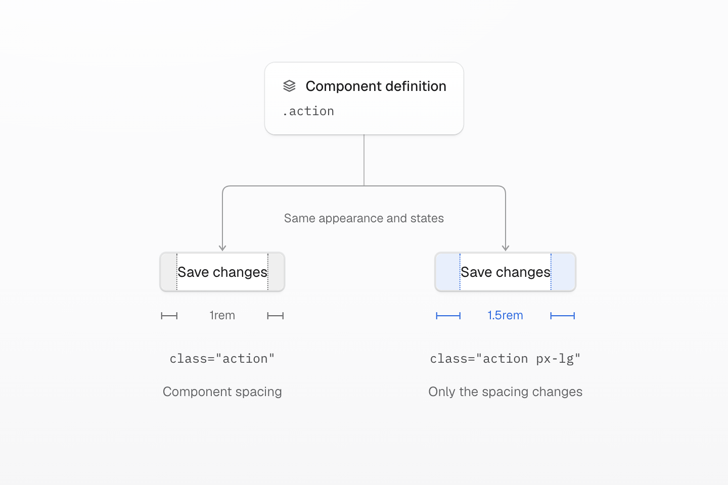
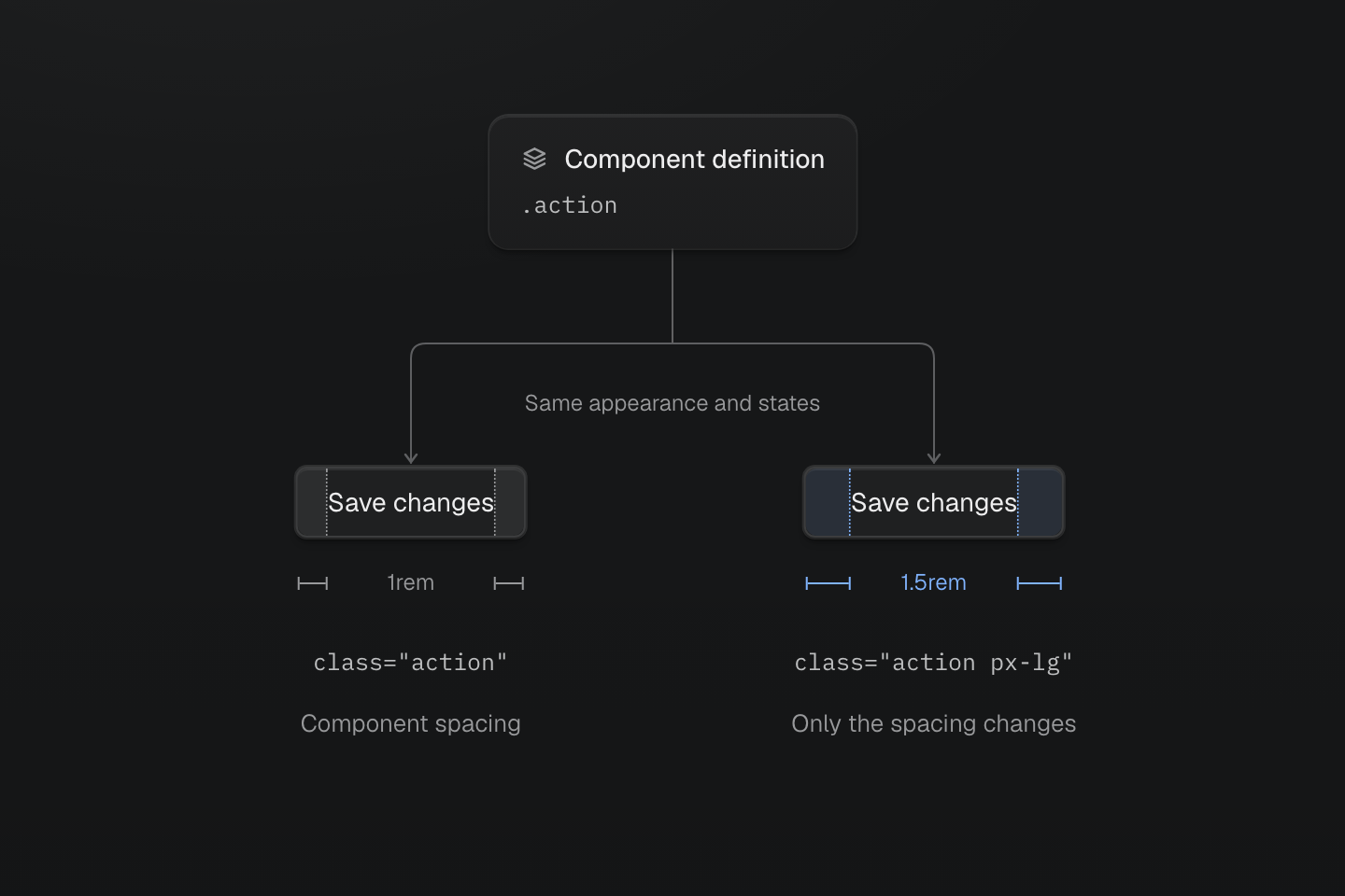
Both buttons share .action. The inspection guides mark horizontal padding: 1rem per side from the component, or 1.5rem with px-lg. The blue guides are annotations, not button styles.
Text description
- Shared definition. The native .action rule in the components layer supplies appearance, interaction states and default padding to both buttons.
- First instance. class="action" uses the component’s horizontal padding of 1rem on each side.
- Second instance. class="action px-lg" requests 1.5rem of horizontal padding on each side. The utilities layer follows components, so px-lg overrides horizontal padding on this instance while the other component styles still apply. The figure’s blue bands and rulers mark this padding; they are inspection annotations, not styles added by the utility.
Native component rules are emitted with their stylesheet by default; native pruning is an explicit opt-in. Write a component's states inside its CSS rule. A native .action definition does not register an action:hover utility.
Shared appearance and shared delivery are different decisions. See Optimizing CSS delivery when a reusable component makes unrelated pages load its rules.
#Choose what should change together
Before extracting a repeated class list, identify the shared decision. Similar-looking elements do not always need to change together.
| Share | Use |
|---|---|
| A value across styles | A theme token |
| A product role and its states | A native component class |
| A capability composed in markup | A utility |
| Declarations or wrappers inside CSS | A mixin |
The first example gives the action color and padding their own tokens. Another component can read --spacing-action-x through var() in CSS or px-action-x in markup, without taking on the button's background, shape or states. Change that token when both consumers should change; use separate tokens when the values happen to match but serve different purposes. Theme tokens covers naming, aliases and scoped overrides.
A repeated component can also keep its class list inside a framework component. Introduce a CSS name when it provides a useful shared styling contract, rather than treating the length of a class attribute as a reason to extract it.
#Register a utility for a styling capability
Suppose several controls need an inline row with centered contents and a small gap, but each keeps its own paint and spacing. Register only the shared layout as an @utility:
The same layout, different controls
@utility action-row { display: inline-flex; align-items: center; justify-content: center; gap: var(--spacing-xs);}<div class="flex flex-wrap items-center gap-md"> <button type="button" class="action-row px-md py-xs text-sm r-md b(1) b-solid b-line-divider bg-surface-raised fg-text-strong shadow-sm shadow-md:hover bg-surface-inset:active"> <span aria-hidden="true">+</span>Add note</button> <a href="/guide/theme" target="_top" class="action-row px-sm py-xs text-sm fg-text-body fg-text-strong:hover underline">Choose tokens <span aria-hidden="true">→</span> </a></div>Generated CSS
@layer theme { :root, :host { --color-zinc-5: oklch(96.5% .0011 265); --color-zinc-30: oklch(78% .0025 265); --color-zinc-70: oklch(39.8% .0028 265); --color-zinc-90: oklch(24.6% .0022 265); --color-zinc-100: oklch(15% .0016 265) } :root, :host { --color-surface-inset: light-dark(var(--color-zinc-5), var(--color-zinc-100)); --color-surface-raised: light-dark(var(--color-white), var(--color-zinc-90)); --color-line-divider: light-dark(oklch(0% 0 none / .12), oklch(100% 0 none / .12)); --color-text-body: light-dark(var(--color-zinc-70), var(--color-zinc-30)); --color-text-strong: light-dark(var(--color-zinc-100), var(--color-white)) } :root, :host { --color-white: oklch(100% 0 none) } :root, :host { --font-size-sm: .875rem; --text-sm: var(--font-size-sm); --text-sm--line-height: 1.5; --text-sm--letter-spacing: 0; --radius-md: .375rem; --spacing-xs: .5rem; --spacing-sm: .75rem; --spacing-md: 1rem } :root, :host { --shadow-sm: 0 0 0 1px light-dark(oklch(0% 0 none / .04), oklch(100% 0 none / .05)), 0 1px 1px -.5px light-dark(oklch(0% 0 none / .045), oklch(0% 0 none / .3)), 0 2px 2px -1px light-dark(oklch(0% 0 none / .04), oklch(0% 0 none / .26)), 0 4px 4px -2px light-dark(oklch(0% 0 none / .04), oklch(0% 0 none / .24)); --shadow-md: 0 0 0 1px light-dark(oklch(0% 0 none / .05), oklch(100% 0 none / .06)), 0 1px 1px -.5px light-dark(oklch(0% 0 none / .045), oklch(0% 0 none / .3)), 0 2px 2px -1px light-dark(oklch(0% 0 none / .04), oklch(0% 0 none / .26)), 0 4px 4px -2px light-dark(oklch(0% 0 none / .04), oklch(0% 0 none / .24)), 0 8px 8px -4px light-dark(oklch(0% 0 none / .045), oklch(0% 0 none / .26)) }}@layer utilities { .text-sm { font-size: var(--text-sm); line-height: var(--text-sm--line-height, normal); letter-spacing: var(--text-sm--letter-spacing, normal) } .action-row { display: inline-flex; align-items: center; justify-content: center; gap: var(--spacing-xs) } .items-center { align-items: center } .bg-surface-raised { background-color: var(--color-surface-raised) } .b-line-divider { border-color: var(--color-line-divider) } .r-md { border-radius: var(--radius-md) } .b-solid { border-style: solid } .b\(1\) { border-width: calc(1 * 1px) } .shadow-sm { box-shadow: var(--shadow-sm) } .fg-text-body { color: var(--color-text-body) } .fg-text-strong { color: var(--color-text-strong) } .flex { display: flex } .flex-wrap { flex-wrap: wrap } .gap-md { gap: var(--spacing-md) } .py-xs { padding-block: var(--spacing-xs) } .px-md { padding-inline: var(--spacing-md) } .px-sm { padding-inline: var(--spacing-sm) } .underline { text-decoration-line: underline } .shadow-md\:hover:hover { box-shadow: var(--shadow-md) } .fg-text-strong\:hover:hover { color: var(--color-text-strong) } .bg-surface-inset\:active:active { background-color: var(--color-surface-inset) }}The utility generates rules when a complete class requests it. It also accepts the same selector and condition suffixes as preset utilities, such as action-row@sm. Its name describes a layout capability; it does not prescribe the whole button.
Use the preset's existing utilities when they already express the shared decision. For example, changing only the gap needs gap-sm or gap(8), not another custom utility. Define a recipe when its declarations form a useful capability that callers should reuse together. The utility contract defines registration and replacement.
#Reuse CSS with a mixin
If native CSS rules need that row layout, define a mixin and expand it with @apply. This example keeps the action and toolbar link as separate component roles while sharing their alignment:
@mixin --action-row { display: inline-flex; align-items: center; justify-content: center; gap: var(--spacing-xs);}@layer components { .action { @apply --action-row; padding: .5rem 1rem; border: 1px solid var(--color-line-divider); border-radius: var(--radius-md); background-color: var(--color-surface-raised); color: var(--color-text-strong); box-shadow: var(--shadow-sm); font: inherit; font-size: var(--font-size-sm); } .toolbar-link { @apply --action-row; color: var(--color-text-body); font: inherit; font-size: var(--font-size-sm); text-decoration-line: underline; }}<button type="button" class="action"><span aria-hidden="true">+</span> Add note</button><a href="/guide/theme" class="toolbar-link">Choose tokens <span aria-hidden="true">→</span></a>Generated CSS
@layer components { .action { display: inline-flex; align-items: center; justify-content: center; gap: var(--spacing-xs); padding: .5rem 1rem; border: 1px solid var(--color-line-divider); border-radius: var(--radius-md); background-color: var(--color-surface-raised); color: var(--color-text-strong); box-shadow: var(--shadow-sm); font: inherit; font-size: var(--font-size-sm) } .toolbar-link { display: inline-flex; align-items: center; justify-content: center; gap: var(--spacing-xs); color: var(--color-text-body); font: inherit; font-size: var(--font-size-sm); text-decoration-line: underline }}@layer theme { :root, :host { --color-zinc-30: oklch(78% .0025 265); --color-zinc-70: oklch(39.8% .0028 265); --color-zinc-90: oklch(24.6% .0022 265); --color-zinc-100: oklch(15% .0016 265) } :root, :host { --color-surface-raised: light-dark(var(--color-white), var(--color-zinc-90)); --color-line-divider: light-dark(oklch(0% 0 none / .12), oklch(100% 0 none / .12)); --color-text-body: light-dark(var(--color-zinc-70), var(--color-zinc-30)); --color-text-strong: light-dark(var(--color-zinc-100), var(--color-white)) } :root, :host { --color-white: oklch(100% 0 none) } :root, :host { --font-size-sm: .875rem; --radius-md: .375rem; --spacing-xs: .5rem } :root, :host { --shadow-sm: 0 0 0 1px light-dark(oklch(0% 0 none / .04), oklch(100% 0 none / .05)), 0 1px 1px -.5px light-dark(oklch(0% 0 none / .045), oklch(0% 0 none / .3)), 0 2px 2px -1px light-dark(oklch(0% 0 none / .04), oklch(0% 0 none / .26)), 0 4px 4px -2px light-dark(oklch(0% 0 none / .04), oklch(0% 0 none / .24)) }}Open Generated CSS: the row declarations appear in both native rules, and each rule keeps its own remaining declarations. Defining --action-row creates no markup class. @apply names a mixin; it does not take a list of utility classes.
When both CSS and markup need the same capability, keep the mixin as its declaration source and add a utility that calls it:
@utility action-row { @apply --action-row;}Add this definition to the mixin example's stylesheet. It replaces the earlier standalone utility body: edits to --action-row now reach the native components and the utility. Use Global styles to organize these definitions in the app's entry graph.
A utility owns a class; a mixin fills a selector
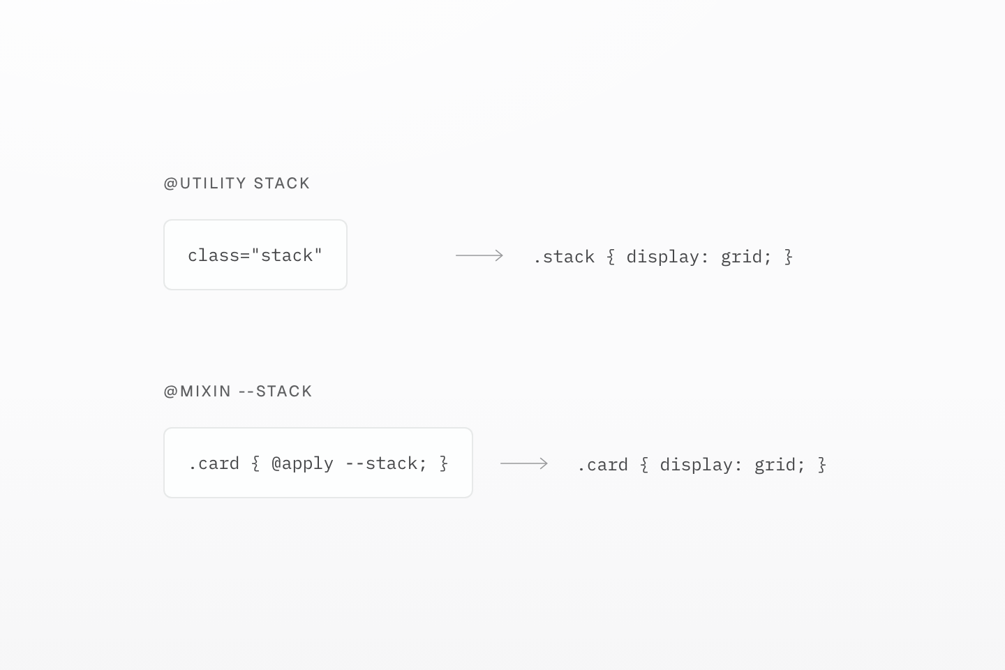
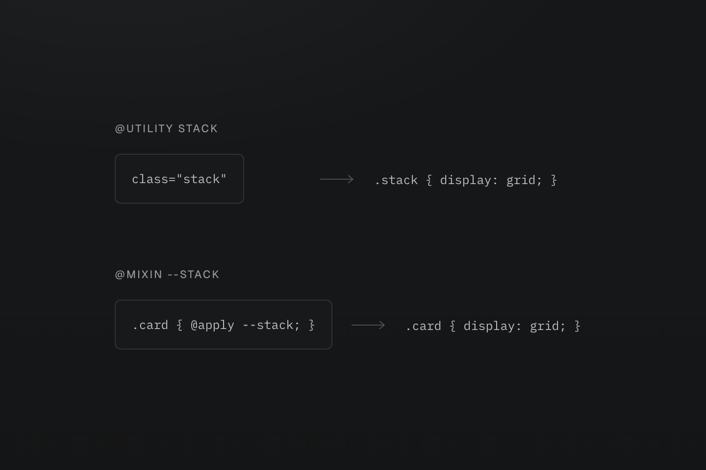
The boxes are CSS artifacts. An @apply expansion does not register another markup class.
Text description
A requested stack utility emits .stack with display:grid. Applying the --stack mixin inside .card emits the same declaration under .card; the caller owns that selector.
#Share a wrapper with contents
Sometimes the repeated part is the condition around different declarations. A hover-and-keyboard-focus mixin can supply the selector while each caller supplies its styles through @contents:
One interaction wrapper, two call sites
@mixin --hocus { &:is(:hover, :focus-visible) { @contents; }}@layer components { .action { @apply --hocus { text-decoration-line: underline; } }}<div class="flex flex-wrap gap-md"> <button type="button" class="action px-md py-xs text-sm r-md b(1) b-solid b-line-divider bg-surface-raised fg-text-strong shadow-sm outline(2):focus-visible outline-solid:focus-visible outline-offset(3)">CSS call site</button> <button type="button" class="px-md py-xs text-sm r-md b(1) b-solid b-line-divider bg-surface-raised fg-text-strong shadow-sm underline@apply(--hocus) outline(2):focus-visible outline-solid:focus-visible outline-offset(3)">Class call site</button></div>Generated CSS
@layer components { .action:is(:hover, :focus-visible) { text-decoration-line: underline }}@layer theme { :root, :host { --color-zinc-90: oklch(24.6% .0022 265); --color-zinc-100: oklch(15% .0016 265) } :root, :host { --color-surface-raised: light-dark(var(--color-white), var(--color-zinc-90)); --color-line-divider: light-dark(oklch(0% 0 none / .12), oklch(100% 0 none / .12)); --color-text-strong: light-dark(var(--color-zinc-100), var(--color-white)) } :root, :host { --color-white: oklch(100% 0 none) } :root, :host { --font-size-sm: .875rem; --text-sm: var(--font-size-sm); --text-sm--line-height: 1.5; --text-sm--letter-spacing: 0; --radius-md: .375rem; --spacing-xs: .5rem; --spacing-md: 1rem } :root, :host { --shadow-sm: 0 0 0 1px light-dark(oklch(0% 0 none / .04), oklch(100% 0 none / .05)), 0 1px 1px -.5px light-dark(oklch(0% 0 none / .045), oklch(0% 0 none / .3)), 0 2px 2px -1px light-dark(oklch(0% 0 none / .04), oklch(0% 0 none / .26)), 0 4px 4px -2px light-dark(oklch(0% 0 none / .04), oklch(0% 0 none / .24)) }}@layer utilities { .text-sm { font-size: var(--text-sm); line-height: var(--text-sm--line-height, normal); letter-spacing: var(--text-sm--letter-spacing, normal) } .underline\@apply\(--hocus\):is(:hover, :focus-visible) { text-decoration-line: underline } .bg-surface-raised { background-color: var(--color-surface-raised) } .b-line-divider { border-color: var(--color-line-divider) } .r-md { border-radius: var(--radius-md) } .b-solid { border-style: solid } .b\(1\) { border-width: calc(1 * 1px) } .shadow-sm { box-shadow: var(--shadow-sm) } .fg-text-strong { color: var(--color-text-strong) } .flex { display: flex } .flex-wrap { flex-wrap: wrap } .gap-md { gap: var(--spacing-md) } .outline-offset\(3\) { outline-offset: calc(3 * 1px) } .py-xs { padding-block: var(--spacing-xs) } .px-md { padding-inline: var(--spacing-md) } .outline-solid\:focus-visible:focus-visible { outline-style: solid } .outline\(2\)\:focus-visible:focus-visible { outline-width: calc(2 * 1px) }}In CSS, the block after @apply --hocus fills @contents. In markup, @apply(--hocus) wraps the declarations generated by that class. The wrapper does not register tokens or gather neighboring classes into its body. To reuse a declaration set, use a utility or a mixin; use contents when the caller needs to choose what goes inside a shared selector or condition. See mixin contents for forwarding and fallback behavior.
#Expose a parameter when callers need one
A shared control size may coordinate several properties. Let a parameter express that relationship when separate preset utilities would require callers to repeat the calculation:
One size controls height and padding
@utility action-size(--height: 2.5rem) { min-height: var(--height); padding-inline: calc(var(--height) / 2);}<div class="flex flex-wrap items-center gap-md"> <button type="button" class="action-size() text-sm r-md b(1) b-solid b-line-divider bg-surface-raised fg-text-strong shadow-sm">Default size</button> <button type="button" class="action-size(3rem) text-sm r-md b(1) b-solid b-line-divider bg-surface-raised fg-text-strong shadow-sm">Larger size</button></div>Generated CSS
@layer theme { :root, :host { --color-zinc-90: oklch(24.6% .0022 265); --color-zinc-100: oklch(15% .0016 265) } :root, :host { --color-surface-raised: light-dark(var(--color-white), var(--color-zinc-90)); --color-line-divider: light-dark(oklch(0% 0 none / .12), oklch(100% 0 none / .12)); --color-text-strong: light-dark(var(--color-zinc-100), var(--color-white)) } :root, :host { --color-white: oklch(100% 0 none) } :root, :host { --font-size-sm: .875rem; --text-sm: var(--font-size-sm); --text-sm--line-height: 1.5; --text-sm--letter-spacing: 0; --radius-md: .375rem; --spacing-md: 1rem } :root, :host { --shadow-sm: 0 0 0 1px light-dark(oklch(0% 0 none / .04), oklch(100% 0 none / .05)), 0 1px 1px -.5px light-dark(oklch(0% 0 none / .045), oklch(0% 0 none / .3)), 0 2px 2px -1px light-dark(oklch(0% 0 none / .04), oklch(0% 0 none / .26)), 0 4px 4px -2px light-dark(oklch(0% 0 none / .04), oklch(0% 0 none / .24)) }}@layer utilities { .text-sm { font-size: var(--text-sm); line-height: var(--text-sm--line-height, normal); letter-spacing: var(--text-sm--letter-spacing, normal) } .action-size\(\) { min-height: 2.5rem; padding-inline: calc(2.5rem / 2) } .action-size\(3rem\) { min-height: 3rem; padding-inline: calc(3rem / 2) } .items-center { align-items: center } .bg-surface-raised { background-color: var(--color-surface-raised) } .b-line-divider { border-color: var(--color-line-divider) } .r-md { border-radius: var(--radius-md) } .b-solid { border-style: solid } .b\(1\) { border-width: calc(1 * 1px) } .shadow-sm { box-shadow: var(--shadow-sm) } .fg-text-strong { color: var(--color-text-strong) } .flex { display: flex } .flex-wrap { flex-wrap: wrap } .gap-md { gap: var(--spacing-md) }}One definition, separate call values
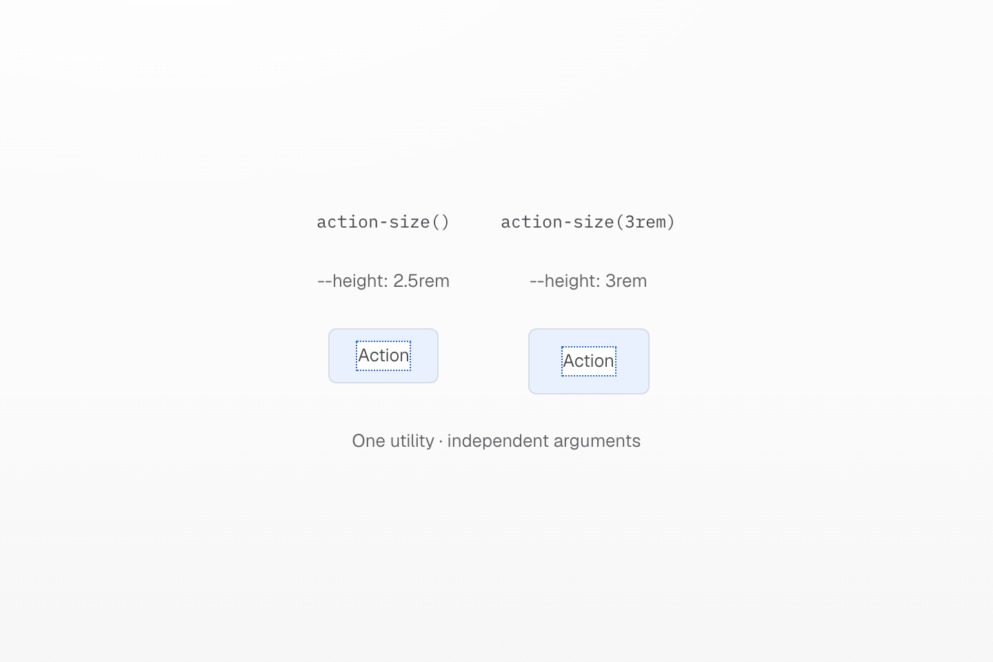
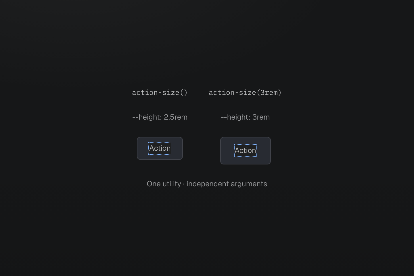
At a 16px root size, the minimum heights are 40px and 48px; padding-inline is half the selected height. The highlighted insets are measurement guides.
Text description
The same action-size utility is called with its 2.5rem default and with 3rem. The second control has more minimum height and horizontal padding, while both keep their own argument.
The empty call uses the declared default. Arguments must be known during compilation; use complete class strings when choosing between sizes. A value that changes continuously in JavaScript belongs in a native CSS custom property instead. The parameter contract covers accepted types and restrictions.
Before changing a shared definition, compare at least two call sites, including one with a local override. Check their hover and keyboard states and inspect the generated CSS. If the callers no longer need the same behavior, separate their definitions rather than adding exceptions to every instance. For sharing a stable vocabulary between projects, continue with Authoring packages.