Responsive design
Choose the right responsive boundary, adapt page columns and reusable summaries, and verify the widths where their layout changes.
On this page
#Overview
A page layout and a reusable card can need different responsive rules. Let the page follow the viewport; let the card follow the space its parent gives it. In Master CSS, append a condition to the class whose style should change.
Complete Installation first. These examples use the default preset and an app stylesheet that loads @import '@master/css';. Each preview includes the controls needed to observe its boundary; Generated CSS shows what the accompanying classes produce.
#Choose what should control the change
Use a viewport condition for page-wide decisions, such as the number of columns in a workspace. Use a container query when the same component can appear in a main column, a sidebar or another constrained region.
| What should decide? | Write | What is measured? |
|---|---|---|
| The page viewport | grid-cols(3)@md | The viewport's width |
| The component's available space | grid-cols(2)@container(--md) | The nearest eligible ancestor container's width |
One viewport, two component widths
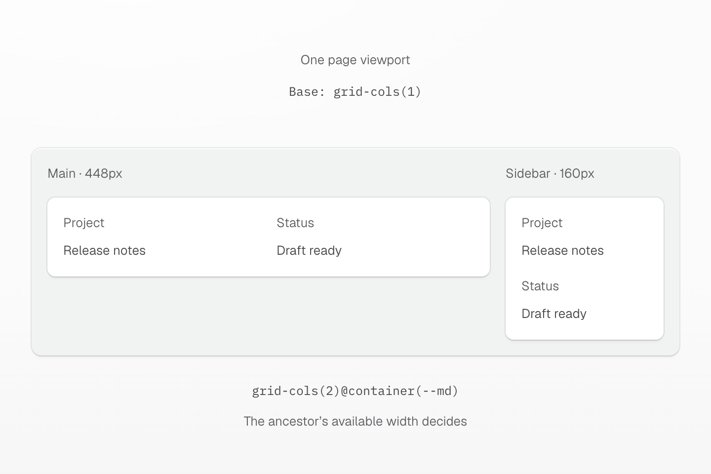
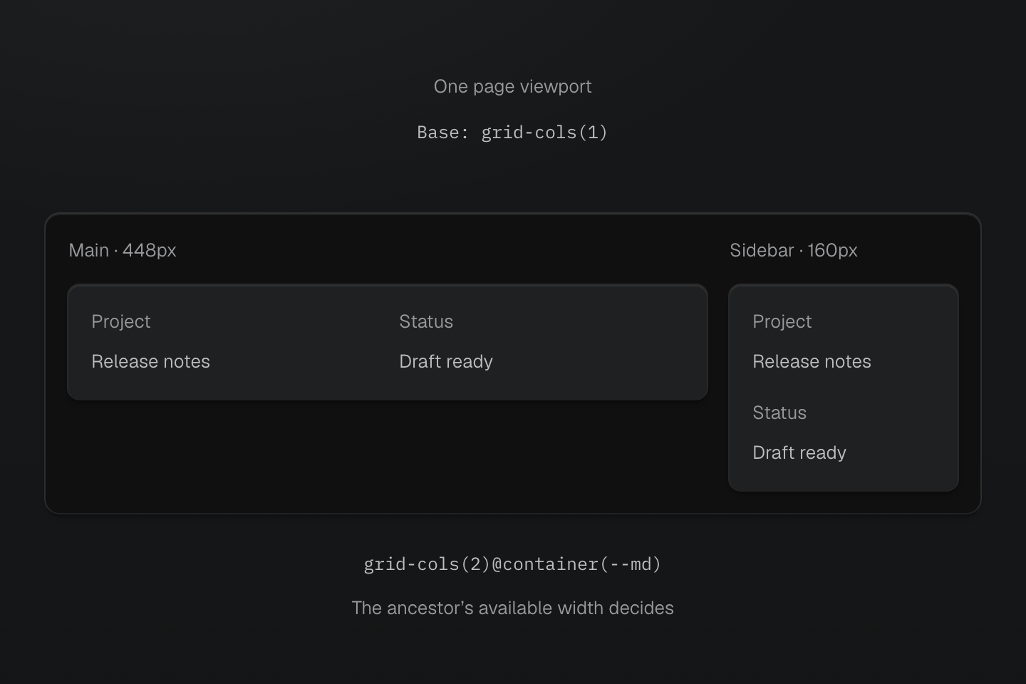
At a 16px root size, 28rem is 448px. These are actual container widths: the wide summary has two tracks, while the narrow summary stacks inside the same viewport.
Text description
- Same viewport. Both cards are in the same page. A viewport breakpoint would see the same width for both.
- Different containers. The main container is 448px wide and the sidebar container is 160px wide.
- Local response. Each ancestor uses container-inline. The descendant card uses grid-cols(1) and grid-cols(2)@container(--md), so only the main card reaches the preset 28rem query.
Both cards in the figure share one viewport, but their parents have different widths. A viewport condition would match for both at once. A container query lets the narrow instance stay stacked while the wide instance splits into columns.
#Adapt a page to its viewport
Start with one column, then add columns where the content has room. This workflow uses the preset's 2xs threshold at 37.5rem and md at 64rem. At the standard 16px initial font size, those boundaries are 600px and 1024px.
Page columns follow the viewport
<section aria-label="Publishing workflow" class="grid-cols(1) gap-md grid-cols(2)@2xs grid-cols(3)@md"> <article class="p-md r-lg b(1) b-solid b-line-divider bg-surface-raised"> <h3 class="m(0) text-sm font-regular fg-text-strong">Draft</h3> <p class="mb(0) mt-xs text-sm fg-text-muted">Collect the changes.</p> </article> <article class="p-md r-lg b(1) b-solid b-line-divider bg-surface-raised"> <h3 class="m(0) text-sm font-regular fg-text-strong">Review</h3> <p class="mb(0) mt-xs text-sm fg-text-muted">Check the examples.</p> </article> <article class="p-md r-lg b(1) b-solid b-line-divider bg-surface-raised"> <h3 class="m(0) text-sm font-regular fg-text-strong">Publish</h3> <p class="mb(0) mt-xs text-sm fg-text-muted">Share the release notes.</p> </article></section>Generated CSS
@layer theme { :root, :host { --color-zinc-40: oklch(68.6% .0028 265); --color-zinc-60: oklch(48.6% .003 265); --color-zinc-90: oklch(24.6% .0022 265); --color-zinc-100: oklch(15% .0016 265) } :root, :host { --color-surface-raised: light-dark(var(--color-white), var(--color-zinc-90)); --color-line-divider: light-dark(oklch(0% 0 none / .12), oklch(100% 0 none / .12)); --color-text-strong: light-dark(var(--color-zinc-100), var(--color-white)); --color-text-muted: light-dark(var(--color-zinc-60), var(--color-zinc-40)) } :root, :host { --color-white: oklch(100% 0 none) } :root, :host { --font-weight-regular: 400; --font-size-sm: .875rem; --text-sm: var(--font-size-sm); --text-sm--line-height: 1.5; --text-sm--letter-spacing: 0; --radius-lg: .5rem; --spacing-xs: .5rem; --spacing-md: 1rem }}@layer utilities { .text-sm { font-size: var(--text-sm); line-height: var(--text-sm--line-height, normal); letter-spacing: var(--text-sm--letter-spacing, normal) } .grid-cols\(1\) { display: grid; grid-template-columns: repeat(1, minmax(0, 1fr)) } .bg-surface-raised { background-color: var(--color-surface-raised) } .b-line-divider { border-color: var(--color-line-divider) } .r-lg { border-radius: var(--radius-lg) } .b-solid { border-style: solid } .b\(1\) { border-width: calc(1 * 1px) } .fg-text-muted { color: var(--color-text-muted) } .fg-text-strong { color: var(--color-text-strong) } .font-regular { font-weight: var(--font-weight-regular) } .gap-md { gap: var(--spacing-md) } .m\(0\) { margin: calc(0 * 1px) } .mt-xs { margin-top: var(--spacing-xs) } .mb\(0\) { margin-bottom: calc(0 * 1px) } .p-md { padding: var(--spacing-md) } @media (width >= 37.5rem) { .grid-cols\(2\)\@2xs { display: grid; grid-template-columns: repeat(2, minmax(0, 1fr)) } } @media (width >= 64rem) { .grid-cols\(3\)\@md { display: grid; grid-template-columns: repeat(3, minmax(0, 1fr)) } }}grid-cols(1) is the base layout. The conditions replace only the column count; content order, spacing and surface styles remain the same. Three columns are useful only while their content fits—try longer labels before adopting a threshold in your app.
@md reads the preset's @custom-media --md definition. It does not read a --breakpoint-md theme variable. To change the threshold for every class using @md, redeclare the custom media in the app CSS entry:
@import '@master/css';@custom-media --md (width >= 48rem);Use a project-specific name when the new boundary belongs to one layout rather than the whole preset:
@custom-media --workspace-wide (width >= 72rem);<section class="grid-cols(1) grid-cols(3)@workspace-wide">…</section>The breakpoint reference lists the preset names and values. Choose a threshold from the content's needs; a name such as md does not identify a particular device.
#Adapt a component to its container
Put container-inline on an ancestor, then give its descendant a container condition. Here the summary and its status stack in a narrow region and become two columns when that ancestor reaches the preset's 28rem --md container threshold.
A summary follows its container
Release notes
Review the changes before publishing.
- Status
- Draft ready
- Next step
- Editorial review
<section class="container-inline"> <article class="grid-cols(1) gap-lg p-md b-solid b(1) b-line-divider r-lg bg-surface-raised grid-cols(2)@container(--md)"> <div class="min-w(0)"> <h3 class="m(0) text-md font-regular fg-text-strong">Release notes</h3> <p class="mb(0) mt-xs text-sm fg-text-muted">Review the changes before publishing.</p> </div> <dl class="grid gap-xs m(0) text-sm"> <div> <dt class="fg-text-muted">Status</dt> <dd class="m(0) fg-text-strong">Draft ready</dd> </div> <div> <dt class="fg-text-muted">Next step</dt> <dd class="m(0) fg-text-strong">Editorial review</dd> </div> </dl> </article></section>Generated CSS
@layer utilities { .grid-cols\(1\) { display: grid; grid-template-columns: repeat(1, minmax(0, 1fr)) } .container-inline { container-type: inline-size } @container (width >= 28rem) { .grid-cols\(2\)\@container\(--md\) { display: grid; grid-template-columns: repeat(2, minmax(0, 1fr)) } }}Move the Container slider while keeping your browser window unchanged. It resizes the ancestor, not the viewport. At a 16px font size, compare 447px and 448px: the second column should appear at 448px. The control stays within the article's available width; widen the browser if the article itself is narrower than that threshold.
The ancestor establishes the query boundary; the descendant changes layout. An element cannot use its own size as the ancestor for its container query. Keep the card's height content-driven so wrapping text can grow naturally.
#Keep the two scales separate
@md and @container(--md) use different definitions:
| Class or value | Meaning in the preset |
|---|---|
@md | A 64rem viewport threshold from custom media |
@container(--md) | A 28rem container threshold from a custom container condition |
max-w-md | A maximum width using the --container-md sizing token |
Changing --container-md changes the width cap, not either query threshold. Define a reusable container condition with @custom-container, or write a local query such as grid-cols(2)@container(width>=30rem). See named container conditions for their definition syntax and complete scale.
#Name an outer container
An unnamed size query measures the nearest eligible ancestor. If a nested layout introduces another container, that inner boundary takes over. Name the outer container with (container-name:outer) and use @container(outer|--md) when the outer width is the one you intend to measure.
Choose the ancestor to measure
<section class="(container-name:outer) container-inline p-md r-lg b(1) b-solid b-line-divider"> <p class="mt(0) text-sm fg-text-muted">Outer container</p> <div class="container-inline (max-width:14rem)"> <p class="text-sm fg-text-muted">Inner container · at most 14rem</p> <div class="p-md r-md bg-line-subtle b-line-divider b(1) b-solid b-text-blue@container(--md)"> <h3 class="m(0) text-sm font-regular">Nearest container</h3> <p class="mb(0) mt-xs text-sm"> <span class="hidden@container(--md)">Below 28rem</span> <span class="hidden inline@container(--md)">At least 28rem</span> </p> </div> <div class="mt-md p-md r-md bg-line-subtle b-line-divider b(1) b-solid b-text-blue@container(outer|--md)"> <h3 class="m(0) text-sm font-regular">Named outer container</h3> <p class="mb(0) mt-xs text-sm"> <span class="hidden@container(outer|--md)">Below 28rem</span> <span class="hidden inline@container(outer|--md)">At least 28rem</span> </p> </div> </div></section>Generated CSS
@layer theme { :root, :host { --color-zinc-40: oklch(68.6% .0028 265); --color-zinc-60: oklch(48.6% .003 265); --color-blue-30: oklch(72.87% .1468 249.3); --color-blue-60: oklch(51.83% .2687 266.1) } :root, :host { --color-line-divider: light-dark(oklch(0% 0 none / .12), oklch(100% 0 none / .12)); --color-line-subtle: light-dark(oklch(0% 0 none / .06), oklch(100% 0 none / .06)); --color-text-muted: light-dark(var(--color-zinc-60), var(--color-zinc-40)); --color-text-blue: light-dark(var(--color-blue-60), var(--color-blue-30)) } :root, :host { --font-weight-regular: 400; --font-size-sm: .875rem; --text-sm: var(--font-size-sm); --text-sm--line-height: 1.5; --text-sm--letter-spacing: 0; --radius-md: .375rem; --radius-lg: .5rem; --spacing-xs: .5rem; --spacing-md: 1rem }}@layer utilities { .text-sm { font-size: var(--text-sm); line-height: var(--text-sm--line-height, normal); letter-spacing: var(--text-sm--letter-spacing, normal) } .bg-line-subtle { background-color: var(--color-line-subtle) } .b-line-divider { border-color: var(--color-line-divider) } .r-lg { border-radius: var(--radius-lg) } .r-md { border-radius: var(--radius-md) } .b-solid { border-style: solid } .b\(1\) { border-width: calc(1 * 1px) } .fg-text-muted { color: var(--color-text-muted) } .container-inline { container-type: inline-size } .hidden { display: none } .font-regular { font-weight: var(--font-weight-regular) } .m\(0\) { margin: calc(0 * 1px) } .mt-md { margin-top: var(--spacing-md) } .mt-xs { margin-top: var(--spacing-xs) } .mb\(0\) { margin-bottom: calc(0 * 1px) } .mt\(0\) { margin-top: calc(0 * 1px) } .p-md { padding: var(--spacing-md) } .\(container-name\:outer\) { container-name: outer } .\(max-width\:14rem\) { max-width: 14rem } @container (width >= 28rem) { .b-text-blue\@container\(--md\) { border-color: var(--color-text-blue) } } @container (width >= 28rem) { .inline\@container\(--md\) { display: inline } } @container (width >= 28rem) { .hidden\@container\(--md\) { display: none } } @container outer (width >= 28rem) { .b-text-blue\@container\(outer\|--md\) { border-color: var(--color-text-blue) } } @container outer (width >= 28rem) { .inline\@container\(outer\|--md\) { display: inline } } @container outer (width >= 28rem) { .hidden\@container\(outer\|--md\) { display: none } }}The two status readouts sit inside the same narrow inner container. Widening the outer boundary changes only the named query's result. Naming a container chooses an ancestor; it does not make the element query itself.
A named query can reach past a nearer container
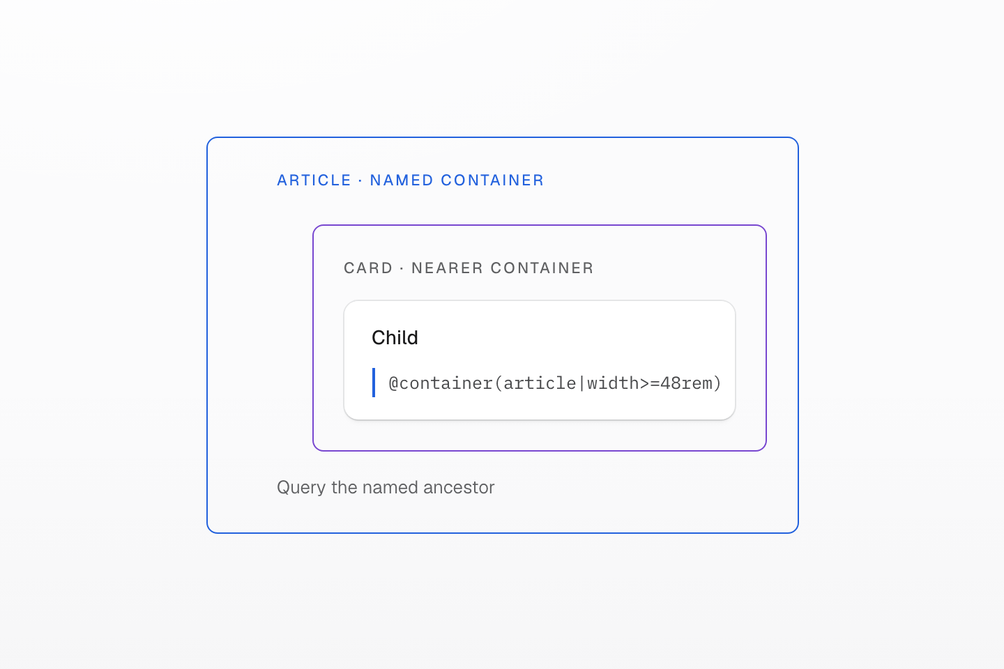
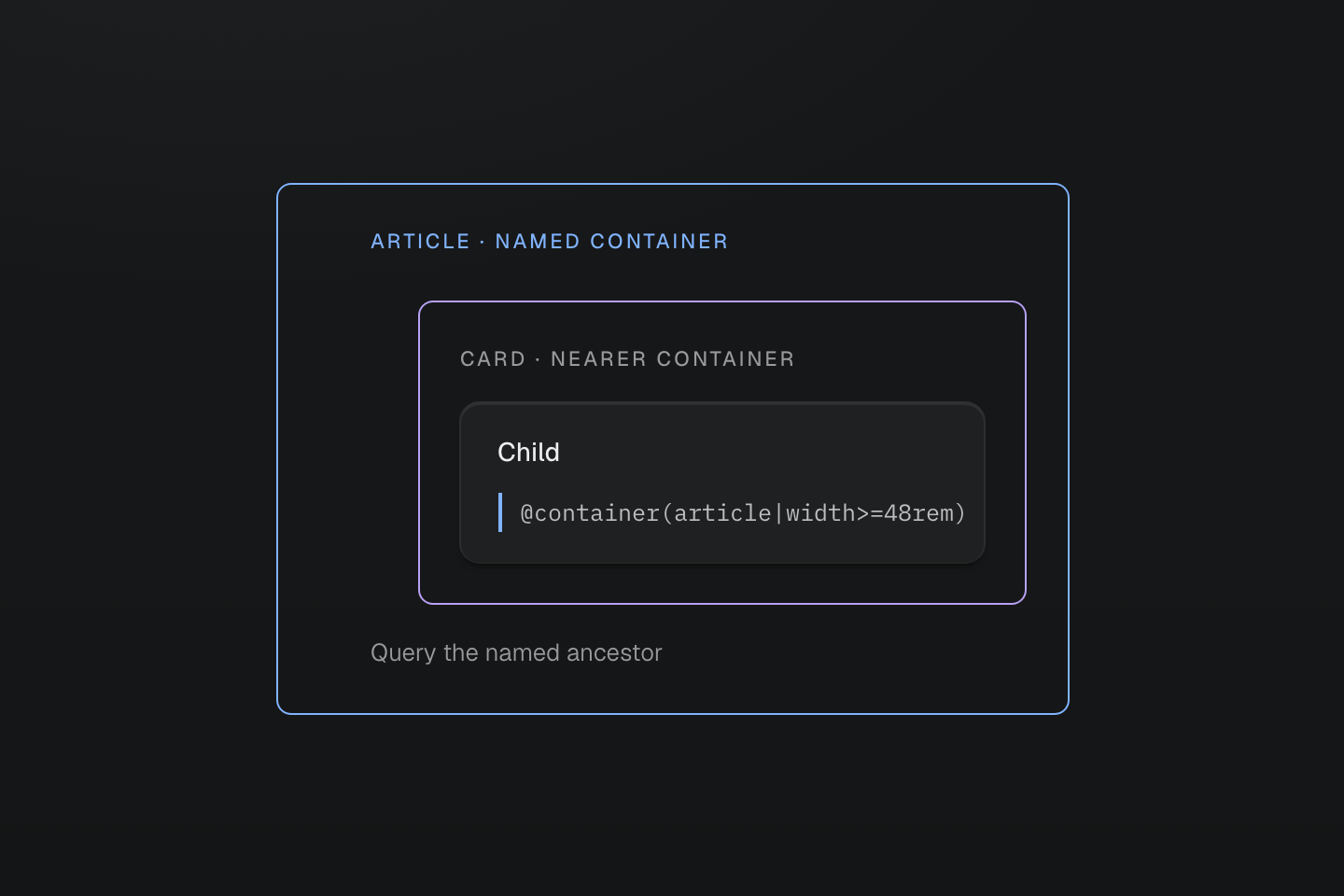
The name selects the eligible ancestor. Keep the queried element inside that ancestor; a container does not query itself.
Text description
Nested article and card container boundaries enclose one child. Matching blue marks pair the child’s article query with the outer named article boundary; the nearer card boundary remains violet.
#Condition only the style that changes
Keep shared styles unconditional. Add a condition only for the property and range that need a different value. For example, an aside can have a raised surface below md without carrying that background into larger layouts:
<aside class="p-md bg-surface-raised@max-md">…</aside>Generated CSS
@layer theme { :root, :host { --color-zinc-90: oklch(24.6% .0022 265) } :root, :host { --color-surface-raised: light-dark(var(--color-white), var(--color-zinc-90)) } :root, :host { --color-white: oklch(100% 0 none) }}@layer utilities { @media not (width >= 64rem) { .bg-surface-raised\@max-md { background-color: var(--color-surface-raised) } }}@max-md is the complement of the preset @md; they do not overlap. Redeclaring --md moves both. A local bounded condition, such as hidden@media(52.125rem<=width<=64rem), can target a specific interval without changing the project's named thresholds. The conditions reference covers that query syntax.
The minimum and its complement meet without overlap
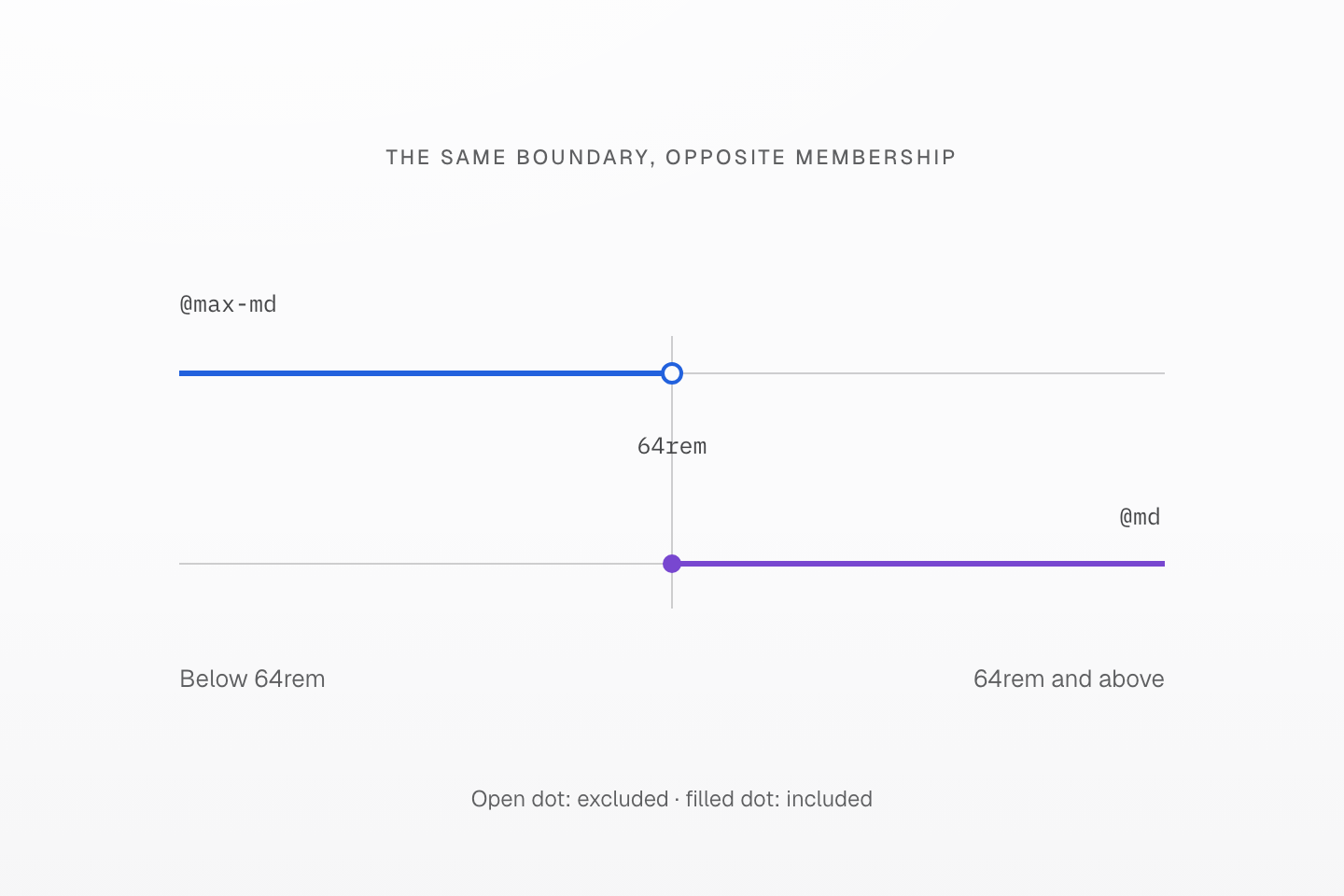
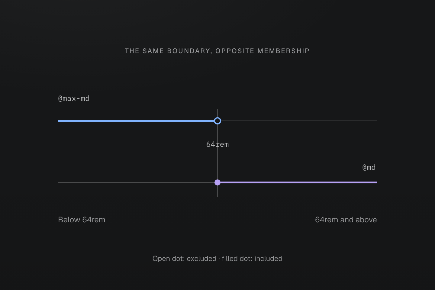
The dots show excluded and included boundaries. The axis is a local view around the preset md threshold, not a device-size chart.
Text description
- The preset @md begins at width >= 64rem. @max-md is its complement and excludes that exact threshold.
- At 63.999rem only max-md matches; at 64rem only md matches. There is no gap or overlapping boundary.
- If replacing an already-expanded manifest definition, redeclare its complement too; changing one compiled definition does not re-expand the other.
Change the layout without restating the surface
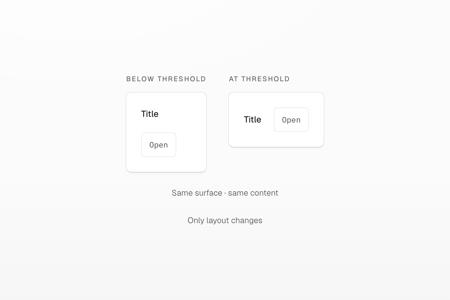
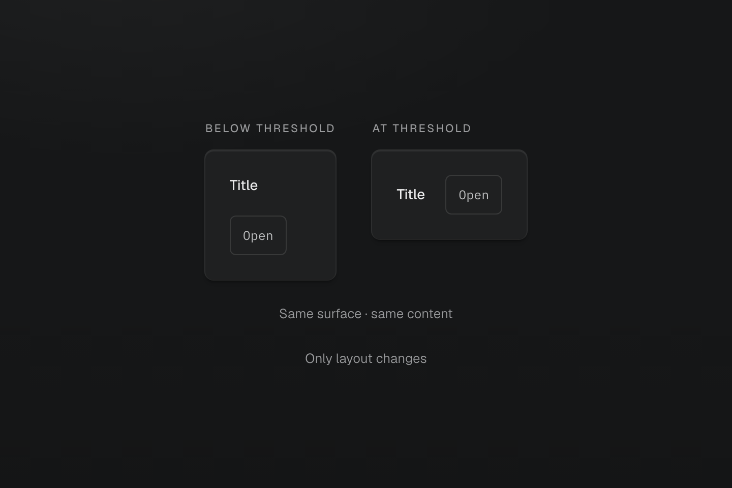
A conditional layout class leaves unrelated declarations in place. This schematic omits nonessential card content.
Text description
Two cards share surface, radius and text. Only their layout changes from stacked to a row when the parent crosses the threshold.
#Verify the boundary, not just the screenshot
Test immediately below and at each threshold. In the page example, check the actual iframe viewport at 599/600px and 1023/1024px. In the component example, hold the page viewport steady and check its ancestor at 447/448px with a 16px font size.
Inspect the descendant's computed grid-template-columns when the result is unexpected. Check that the condition matches, that a container query has the intended eligible ancestor, and that another rule has not won in the cascade.
Finally, try long text, enlarged text and narrow layouts. Keep the reading order useful at every width, allow content to wrap, and avoid fixed card heights. Layout develops the grid and spacing decisions independently of these query boundaries.