Authoring packages
Publish shared CSS source, override public tokens in each app, and verify the packed package in a production consumer.
On this page
#Overview
Share a stable styling vocabulary by publishing its CSS source. Each consuming app imports that source into its own Master CSS entry and compiles the tokens, utilities and native components it needs. Start here after the vocabulary works inside one app; Reusing styles covers that first step.
For this package shape, publish source definitions rather than an app’s generated stylesheet or manifest. Apps can then choose their own class usage, token overrides and delivery mode. A package that also provides a runtime integration has a separate artifact contract.
Share definitions; compile for each app
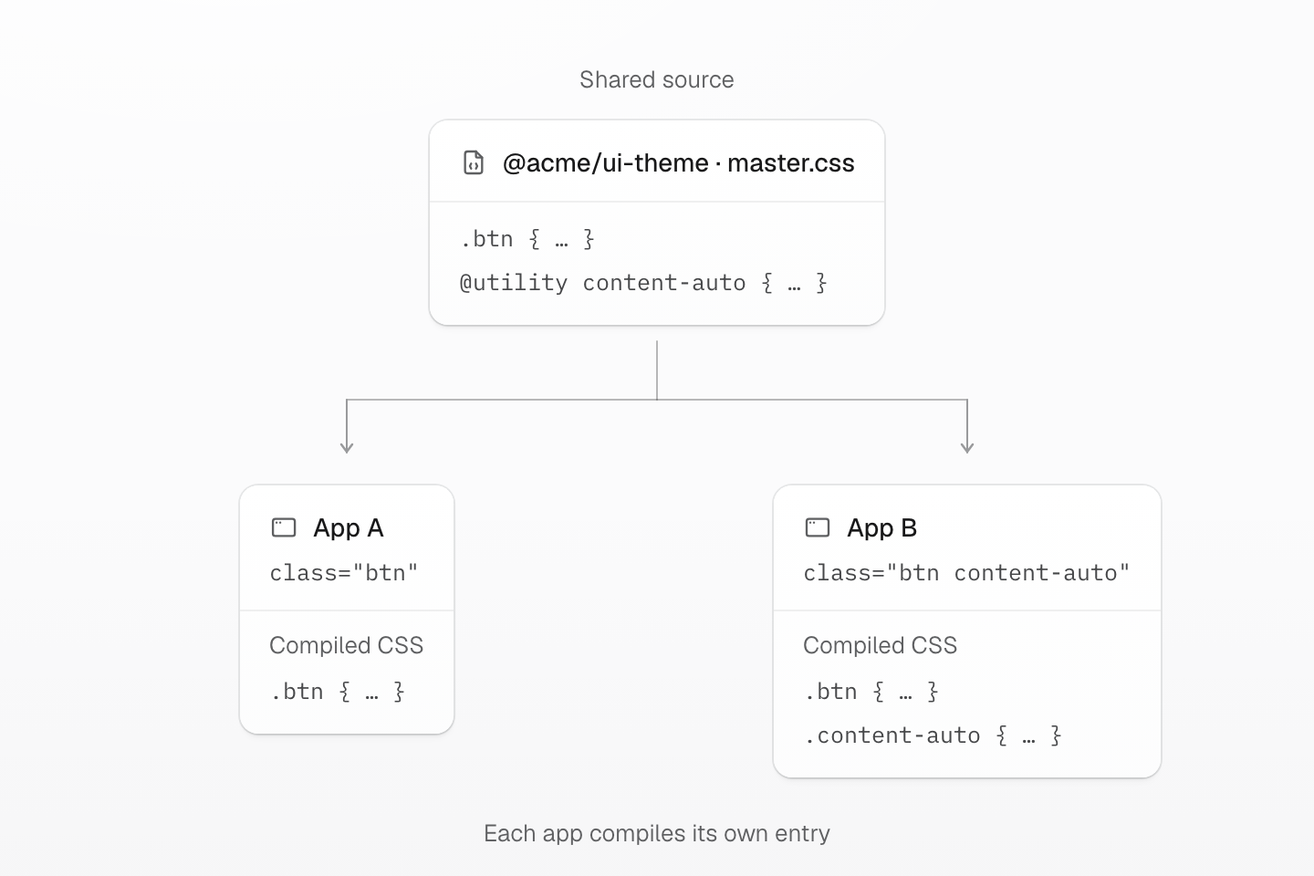
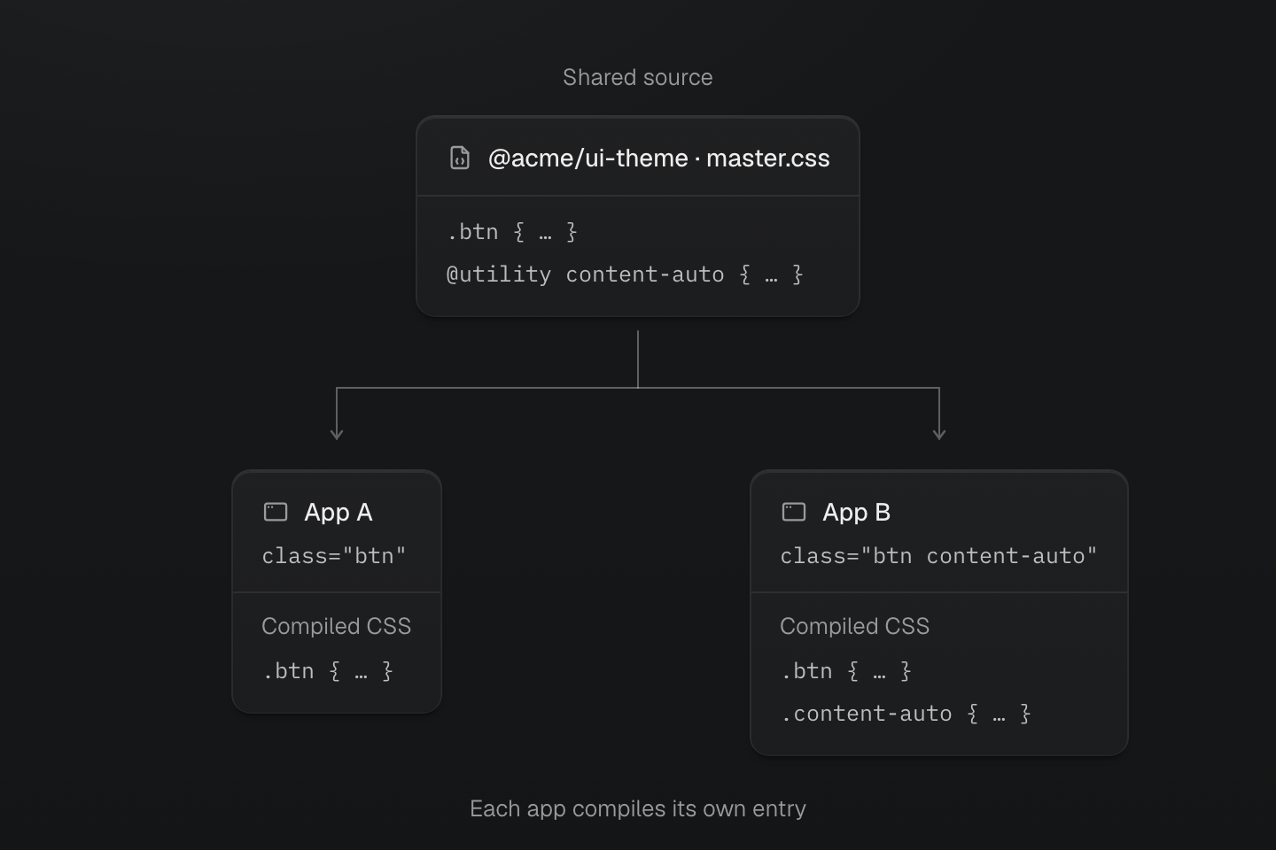
Both apps import the same CSS source. The native component is included by default; each app generates the utilities its own markup requests.
Text description
- Share source. The package defines a native .btn component and an on-demand content-auto utility.
- App A. Its markup uses btn. The native component is included, but the unused content-auto utility is not emitted.
- App B. Its markup uses btn and content-auto. Its output includes the native component and the requested utility.
#Create a package
This example uses @acme/ui-theme; replace the scope with one you own before publishing. Consumers import the package name. Its exported CSS file is master.css.
- my-master-theme
- package.json
- master.css
- README.md
 package.json
 master.css
Point the package root to master.css:
{ "name": "@acme/ui-theme", "version": "0.1.0", "files": ["master.css"], "style": "./master.css", "exports": { ".": { "style": "./master.css", "default": "./master.css" } }, "sideEffects": ["./master.css"]}No bundler, TypeScript build, manifest generation, or compiled CSS output is required for this package shape. The package publishes source CSS that Master CSS-aware projects can compile as part of their own stylesheet graph.
#Write master.css
Use master.css for shared vocabulary that should be available to consuming projects.
@theme { --color-brand: #4f46e5; --color-text-action: var(--color-text-strong); --color-focus-action: var(--color-text-strong); --spacing-action-x: 1rem; --radius-action: 0.375rem;}@custom-media --theme-motion (prefers-reduced-motion: no-preference);@utility content-auto { content-visibility: auto; contain-intrinsic-size: auto 32rem;}@layer components { .btn { display: inline-flex; align-items: center; justify-content: center; gap: var(--spacing-xs); min-height: 2.375rem; max-width: 100%; padding: .5rem var(--spacing-action-x); border: 1px solid var(--color-line-divider); border-radius: var(--radius-action); font-size: var(--font-size-sm); font-weight: 400; line-height: 1.2; background-color: var(--color-surface-raised); color: var(--color-text-action); box-shadow: var(--shadow-sm); &:hover { box-shadow: var(--shadow-md); } &:active { background-color: var(--color-surface-inset); box-shadow: none; } &:focus-visible { outline: 2px solid var(--color-focus-action); outline-offset: 3px; } }}The example provides a color marker, a native .btn component, an on-demand content-auto utility and a named theme-motion condition. The component owns its shared states; the app chooses whether to request a transition. Native component CSS is included by default, while the utility generates a rule only when used.
Choose the smallest public vocabulary the consumers need:
- Use
@themefor shared values such as colors, spacing, radius, typography, shadow, motion, and container tokens. - Use
@custom-mediafor media names and@mixinwith@contentsfor other reusable wrappers. - Use
@utilityfor on-demand classes and@mixinfor reuse inside native CSS. - Use native
@layer componentsonly when the package intentionally owns semantic UI vocabulary such asbtn,field,card, ortoolbar.
See Theme tokens for naming tokens, CSS directives for the directive syntax and Global styles for choosing an abstraction.
#Use the package
After installing the package, import it after the default Master CSS entry:
@import '@master/css';@import '@acme/ui-theme';The imported source becomes part of the project CSS entry graph. Project markup can use the shared vocabulary as utility and native CSS classes:
Shared package vocabulary
<article class="p-lg b-solid b(1) b-line-divider r-lg content-auto"> <p class="flex items-center gap-xs m(0) text-xs fg-text-muted"><span aria-hidden="true" class="h(8) w(8) pill bg-brand"></span>Package brand</p> <h2 class="mb-xs mt-sm text-lg font-regular">Shared vocabulary</h2> <p class="mt(0) mb-md text-sm fg-text-muted">The app supplies the markup; the package supplies the shared action.</p> <button type="button" class="btn (transition-property:box-shadow,background-color)@theme-motion (transition-duration:var(--duration-fast))@theme-motion (transition-timing-function:var(--easing-smooth))@theme-motion">Preview action</button></article>Generated CSS
@layer components { .btn { justify-content: center; align-items: center; gap: var(--spacing-xs); max-width: 100%; min-height: 2.375rem; padding: .5rem var(--spacing-action-x); border: 1px solid var(--color-line-divider); border-radius: var(--radius-action); font-size: var(--font-size-sm); background-color: var(--color-surface-raised); color: var(--color-text-action); box-shadow: var(--shadow-sm); font-weight: 400; line-height: 1.2; display: inline-flex; &:hover { box-shadow: var(--shadow-md); } &:active { background-color: var(--color-surface-inset); box-shadow: none; } &:focus-visible { outline: 2px solid var(--color-focus-action); outline-offset: 3px; } }}@layer theme { :root, :host { --color-zinc-5: oklch(96.5% .0011 265); --color-zinc-40: oklch(68.6% .0028 265); --color-zinc-60: oklch(48.6% .003 265); --color-zinc-90: oklch(24.6% .0022 265); --color-zinc-100: oklch(15% .0016 265) } :root, :host { --color-surface-inset: light-dark(var(--color-zinc-5), var(--color-zinc-100)); --color-surface-raised: light-dark(var(--color-white), var(--color-zinc-90)); --color-line-divider: light-dark(oklch(0% 0 none / .12), oklch(100% 0 none / .12)); --color-text-strong: light-dark(var(--color-zinc-100), var(--color-white)); --color-text-muted: light-dark(var(--color-zinc-60), var(--color-zinc-40)) } :root, :host { --color-white: oklch(100% 0 none) } :root, :host { --font-weight-regular: 400; --font-size-xs: .75rem; --font-size-sm: .875rem; --font-size-lg: 1.125rem; --text-xs: var(--font-size-xs); --text-xs--line-height: 1.5; --text-xs--letter-spacing: 0; --text-sm: var(--font-size-sm); --text-sm--line-height: 1.5; --text-sm--letter-spacing: 0; --text-lg: var(--font-size-lg); --text-lg--line-height: 1.5; --text-lg--letter-spacing: 0; --radius-lg: .5rem; --spacing-xs: .5rem; --spacing-sm: .75rem; --spacing-md: 1rem; --spacing-lg: 1.5rem; --duration-fast: .15s; --easing-smooth: cubic-bezier(.4, 0, .2, 1) } :root, :host { --shadow-sm: 0 0 0 1px light-dark(oklch(0% 0 none / .04), oklch(100% 0 none / .05)), 0 1px 1px -.5px light-dark(oklch(0% 0 none / .045), oklch(0% 0 none / .3)), 0 2px 2px -1px light-dark(oklch(0% 0 none / .04), oklch(0% 0 none / .26)), 0 4px 4px -2px light-dark(oklch(0% 0 none / .04), oklch(0% 0 none / .24)); --shadow-md: 0 0 0 1px light-dark(oklch(0% 0 none / .05), oklch(100% 0 none / .06)), 0 1px 1px -.5px light-dark(oklch(0% 0 none / .045), oklch(0% 0 none / .3)), 0 2px 2px -1px light-dark(oklch(0% 0 none / .04), oklch(0% 0 none / .26)), 0 4px 4px -2px light-dark(oklch(0% 0 none / .04), oklch(0% 0 none / .24)), 0 8px 8px -4px light-dark(oklch(0% 0 none / .045), oklch(0% 0 none / .26)) } :root, :host { --color-brand: #4f46e5; --color-text-action: var(--color-text-strong); --color-focus-action: var(--color-text-strong); --spacing-action-x: 1rem; --radius-action: .375rem }}@layer utilities { .text-lg { font-size: var(--text-lg); line-height: var(--text-lg--line-height, normal); letter-spacing: var(--text-lg--letter-spacing, normal) } .text-sm { font-size: var(--text-sm); line-height: var(--text-sm--line-height, normal); letter-spacing: var(--text-sm--letter-spacing, normal) } .text-xs { font-size: var(--text-xs); line-height: var(--text-xs--line-height, normal); letter-spacing: var(--text-xs--letter-spacing, normal) } .content-auto { content-visibility: auto; contain-intrinsic-size: auto 32rem } .items-center { align-items: center } .bg-brand { background-color: var(--color-brand) } .b-line-divider { border-color: var(--color-line-divider) } .r-lg { border-radius: var(--radius-lg) } .pill { border-radius: calc(infinity * 1px) } .b-solid { border-style: solid } .b\(1\) { border-width: calc(1 * 1px) } .fg-text-muted { color: var(--color-text-muted) } .flex { display: flex } .font-regular { font-weight: var(--font-weight-regular) } .gap-xs { gap: var(--spacing-xs) } .h\(8\) { height: calc(8 * 1px) } .m\(0\) { margin: calc(0 * 1px) } .mb-md { margin-bottom: var(--spacing-md) } .mb-xs { margin-bottom: var(--spacing-xs) } .mt-sm { margin-top: var(--spacing-sm) } .mt\(0\) { margin-top: calc(0 * 1px) } .p-lg { padding: var(--spacing-lg) } .w\(8\) { width: calc(8 * 1px) } @media (prefers-reduced-motion: no-preference) { .\(transition-duration\:var\(--duration-fast\)\)\@theme-motion { transition-duration: var(--duration-fast) } } @media (prefers-reduced-motion: no-preference) { .\(transition-property\:box-shadow\,background-color\)\@theme-motion { transition-property: box-shadow, background-color } } @media (prefers-reduced-motion: no-preference) { .\(transition-timing-function\:var\(--easing-smooth\)\)\@theme-motion { transition-timing-function: var(--easing-smooth) } }}Packages imported by a project entry are already available to local stylesheets. To add a package only to one stylesheet's compile-time context, use @reference:
@reference '@acme/ui-theme';.button { padding-inline: var(--spacing-action-x); border-radius: var(--radius-action); background-color: var(--color-brand);}The local .button consumes the package's spacing, radius and brand tokens. @reference supplies their definitions while compiling this stylesheet, and the output includes the required theme resources. It does not copy the package's native .btn rule or generated utility classes. Load the package's CSS separately when those rules are needed. See Route-level styles for local stylesheet patterns.
#Override a public value in the consumer
Keep app-specific choices after the package import. For example, this app makes the shared action wider without copying its component CSS:
@import '@master/css';@import '@acme/ui-theme';@theme { --spacing-action-x: 1.5rem;}.btn still reads var(--spacing-action-x). The app changes its horizontal padding from 1rem to 1.5rem; other apps keep their own values. Document the token names, component selectors and utility names consumers may rely on. Renaming one of those public names affects their markup or stylesheets, even when the package contains no JavaScript.
Override the value, keep the component
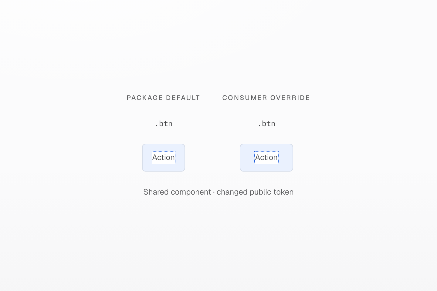
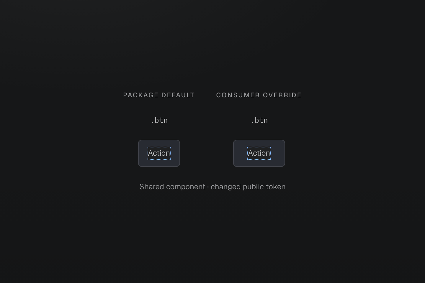
The consumer override follows the package import. The inset guides compare 1rem and 1.5rem at a 16px root; the .btn rule stays shared.
Text description
The package and application share one .btn definition. The application changes --spacing-action-x, increasing horizontal padding while keeping the button identity.
#Keep app policy in the app
A reusable authoring package should not decide how one application scans, filters, or ships its source files.
Keep these in the consuming app:
- App-specific
@sourceand@source notrules. - App-specific
@safelistand@blocklistpolicy. - Route, page, or component one-off classes.
- Generated manifest JSON and compiled generated CSS output.
Use the package for shared vocabulary. Use the app CSS entry for local source boundaries, delivery choices, and application-specific policy.
#Validate with an example
Pack the source from the package directory. npm pack creates a local archive; it does not publish to the registry:
npm packWith the example name and version, the archive is acme-ui-theme-0.1.0.tgz. Check that it contains master.css and the expected package.json export. The files list keeps unrelated source and build artifacts out of the package; npm also includes its standard metadata files.
Install that archive in a small consuming app with Master CSS already integrated:
npm install ../my-master-theme/acme-ui-theme-0.1.0.tgznpm run buildUse the markup above in a scanned source file. In the production output, check the native .btn rule, the requested content-auto utility and the theme resources they need. Then open the app, inspect the button's computed padding, and repeat with the local override. Verify hover, keyboard focus and reduced motion as well as the resting state.
Use the framework integration's build to verify package resolution. In the current standalone CLI, inspection can load the app entry while leaving a third-party bare package import outside its stylesheet graph. Check the listed stylesheet dependencies: an inspection that omits the package's master.css has not verified that vocabulary. The production consumer also verifies files and export paths that a local source-only preview cannot check.