Global styles
Load one app entry, split shared CSS by ownership, and keep document defaults, component rules and route styles in the right scope.
On this page
#Overview
Give the application one place to load the styles every page needs. That entry can import several source files: keep shared values, document defaults and component rules with their owners, then assemble them through the same app stylesheet.
Complete the framework installation first. The examples below extend its existing CSS entry; they do not require a second Master CSS installation.
#Start from one app entry
Keep the default import at the beginning of the stylesheet your app already loads:
@import '@master/css';The import brings in the preset definitions and base styles, including the order theme, base, defaults, components, utilities. The integration uses this entry to deliver the project's generated CSS. Import it from the framework's app root, root layout or build entry as described in its installation guide.
A source file split does not need another full entry. Import your own files from app.css:
@import '@master/css';@import './theme.css';@import './defaults.css';@import './components.css';Several source files, one app entry
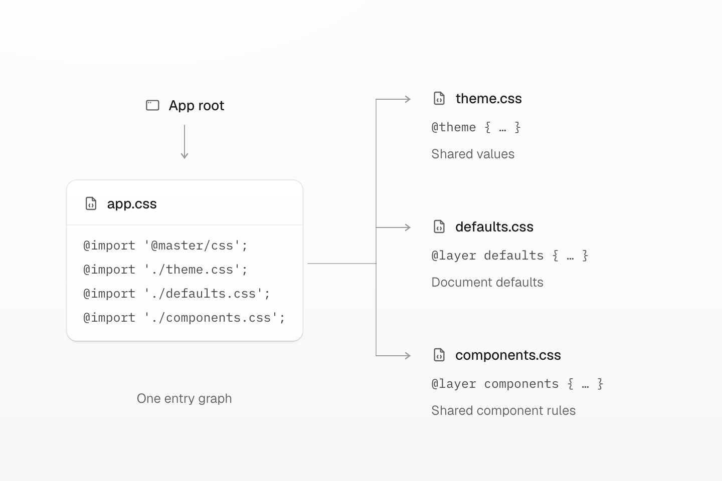
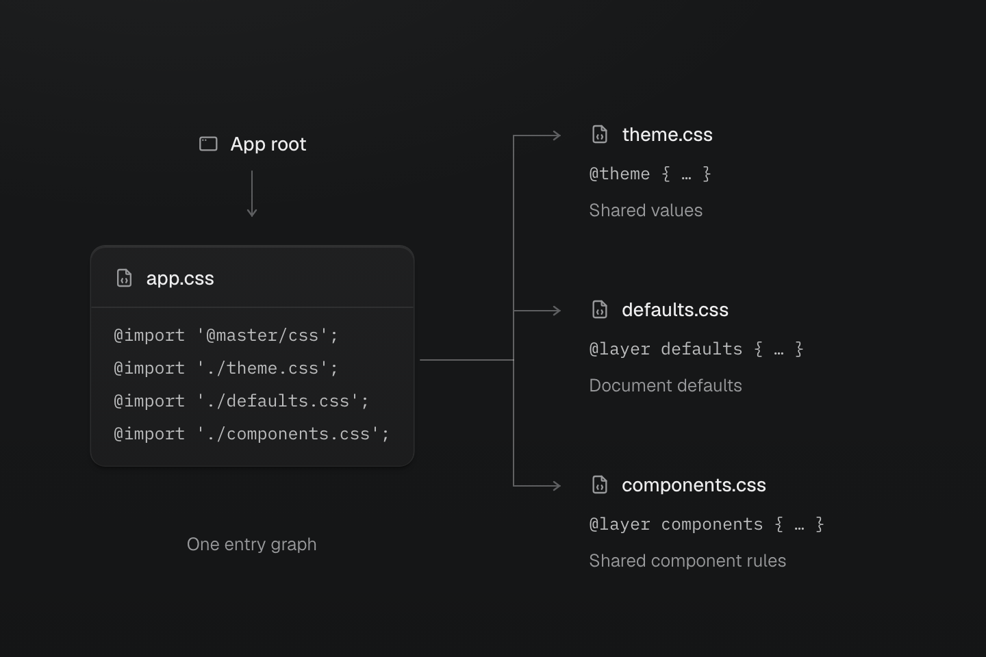
Load the app entry from the application root. Split the source by ownership; each imported file does not need another @import of @master/css.
Text description
- Load once. The application root loads app.css, which starts with the default @import of @master/css.
- Split by ownership. app.css imports theme.css for shared values, defaults.css for native document defaults, and components.css for shared component rules.
- Keep one graph. These imports assemble one entry graph. The three source files do not each need a full Master CSS entry import.
These files form one entry graph. A shared definition remains available whether you write it directly in app.css or in one of its imports. Avoid importing the full Master CSS entry again from every route stylesheet: that makes each file an entry and can repeat global native CSS.
#Set document defaults
Keep the preset reset in base. Put your product's document defaults in defaults, where normal component and utility declarations can override them:
@layer defaults { body { background-color: var(--color-surface-base); color: var(--color-text-body); }}Use native selectors for elements that should receive a default without an extra class. Keep the selector's reach intentional: a global button rule also reaches buttons inside every feature. Use a component class when the rule belongs to one product role.
The preset base styles already apply the font tokens to the document. To choose a typeface, change those tokens as described in Typography. See Cascade layers when declarations compete; loading a rule later does not move it into a stronger layer.
Document defaults flow down the DOM
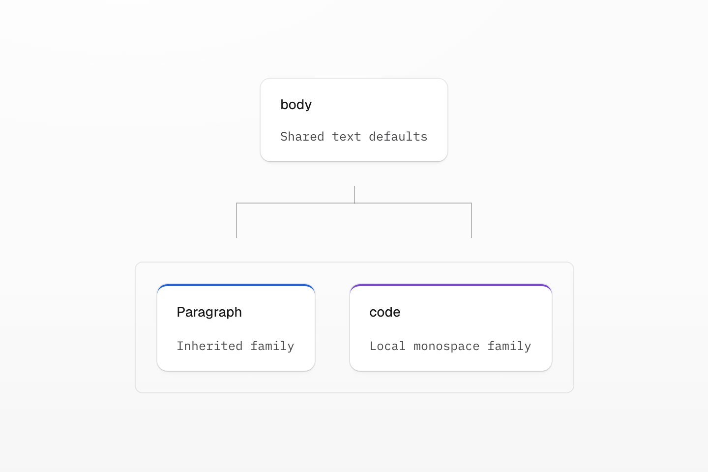
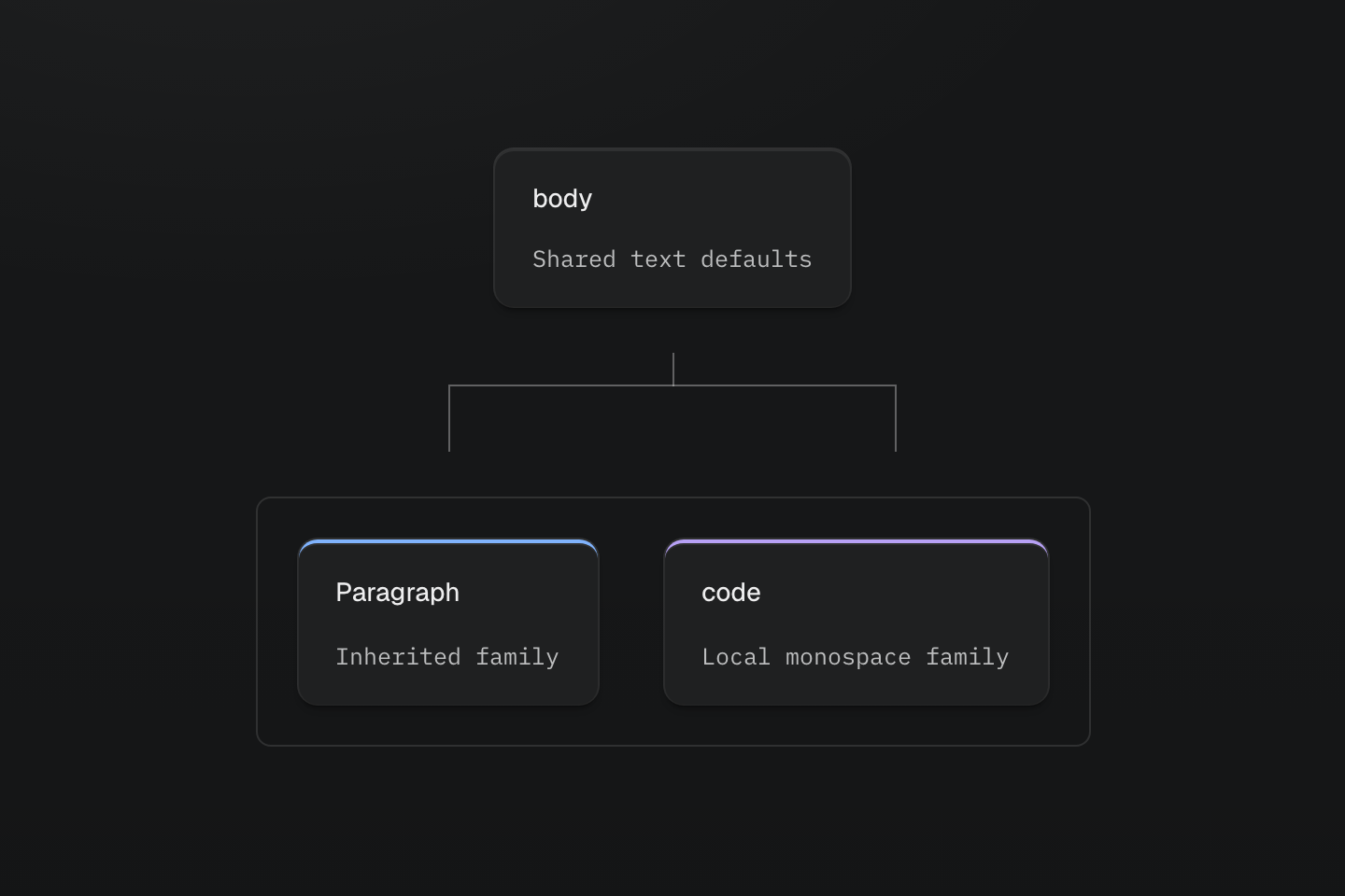
Inheritance follows the document tree. Local declarations replace only the properties they set.
Text description
A body default supplies text to two descendants; a local code font overrides the family only inside the code element.
#Decide what belongs in the shared graph
| Shared decision | Where to define it | Where to continue |
|---|---|---|
| A value whose consumers should change together | @theme in theme.css | Theme tokens |
| A default every page needs | Native selectors in @layer defaults | The example above |
| A recurring product element | A native class in @layer components | Reusing styles |
| A class capability generated when used | @utility in an imported stylesheet | The helper example below |
| Repeated CSS declarations or nested styles | @mixin, expanded with @apply | CSS reuse |
| A named viewport or container condition | @custom-media or @custom-container | Responsive design |
For the imported theme.css, start with a value your project needs:
@theme { --spacing-card: 1.5rem;}The token registers p-card, gap-card and the other spacing families that accept the key. Its declaration is emitted when the project needs it; placing it in the entry graph does not make an ordinary token static.
Share a definition because its meaning is shared. Two features using the same number today can still need separate tokens; one element using several classes does not by itself need a component abstraction.
#Keep component ownership explicit
A shared notification, for example, can live in components.css:
@layer components { .notice { padding: var(--spacing-md); border: 1px solid var(--color-line-divider); border-radius: var(--radius-md); background-color: var(--color-surface-raised); color: var(--color-text-body); }}<aside class="notice">Your changes are saved locally.</aside>This native selector styles .notice; it does not register a utility named notice. Write shared states and conditions in the component rule. For a class recipe that accepts Master CSS modifiers, use @utility instead. Reusing styles compares those choices with working examples.
Native CSS in the entry graph is emitted by default, including unused component rules. Native pruning is an explicit choice; see native pruning. Do not move a large route-only stylesheet into the global graph simply to make its definitions visible.
#Add a shared helper
A global definition can describe behavior needed in several features without generating a rule for every possible class. These helpers arrange related links, allow off-screen content to skip rendering work, and exclude the group from print:
Shared helpers, one group of links
@utility flow { display: grid; gap: var(--spacing-md);}@utility content-auto { content-visibility: auto; contain-intrinsic-size: auto 32rem;}@utility print-hidden { @media print { display: none; }}<section class="content-auto flow print-hidden p-md b-solid b(1) b-line-divider r-md bg-surface-raised"> <h2 class="m(0) text-lg font-regular">Related guides</h2> <a class="text-sm fg-text-body underline" href="/guide/theme" target="_top">Choose shared theme values</a> <a class="text-sm fg-text-body underline" href="/guide/responsive-design" target="_top">Adapt a layout to its available space</a></section>Generated CSS
@layer theme { :root, :host { --color-zinc-30: oklch(78% .0025 265); --color-zinc-70: oklch(39.8% .0028 265); --color-zinc-90: oklch(24.6% .0022 265) } :root, :host { --color-surface-raised: light-dark(var(--color-white), var(--color-zinc-90)); --color-line-divider: light-dark(oklch(0% 0 none / .12), oklch(100% 0 none / .12)); --color-text-body: light-dark(var(--color-zinc-70), var(--color-zinc-30)) } :root, :host { --color-white: oklch(100% 0 none) } :root, :host { --font-weight-regular: 400; --font-size-sm: .875rem; --font-size-lg: 1.125rem; --text-sm: var(--font-size-sm); --text-sm--line-height: 1.5; --text-sm--letter-spacing: 0; --text-lg: var(--font-size-lg); --text-lg--line-height: 1.5; --text-lg--letter-spacing: 0; --radius-md: .375rem; --spacing-md: 1rem }}@layer utilities { .text-lg { font-size: var(--text-lg); line-height: var(--text-lg--line-height, normal); letter-spacing: var(--text-lg--letter-spacing, normal) } .text-sm { font-size: var(--text-sm); line-height: var(--text-sm--line-height, normal); letter-spacing: var(--text-sm--letter-spacing, normal) } .content-auto { content-visibility: auto; contain-intrinsic-size: auto 32rem } .flow { display: grid; gap: var(--spacing-md) } @media print { .print-hidden { display: none } } .bg-surface-raised { background-color: var(--color-surface-raised) } .b-line-divider { border-color: var(--color-line-divider) } .r-md { border-radius: var(--radius-md) } .b-solid { border-style: solid } .b\(1\) { border-width: calc(1 * 1px) } .fg-text-body { color: var(--color-text-body) } .font-regular { font-weight: var(--font-weight-regular) } .m\(0\) { margin: calc(0 * 1px) } .p-md { padding: var(--spacing-md) } .underline { text-decoration-line: underline }}Put these definitions after the existing Master CSS import, or import a utilities.css file from the app entry. The classes generate CSS when discovered in markup. In your app, open print preview to check print-hidden; remove the class when the links should appear in print too. Choose the intrinsic-size estimate for the content in your own layout.
For a cross-page audit and an output-based optimization sequence, see Optimizing CSS delivery.
#Keep local delivery local
Keep the app entry focused on styles shared across pages. The integration supplies project definitions to a route stylesheet without another full Master CSS import. Use @reference for additional definitions outside that graph; it does not deliver the referenced native CSS. The route's loader still owns delivery of its local rules.
Use Route-level styles for that setup and Monorepo when separate apps need separate entry graphs. After splitting a global file, check a page that consumes its definitions and one that does not: shared styles should still arrive through the app entry, and route-only rules should retain their local owner.