Route-level styles
Keep route CSS locally delivered while using shared definitions; distinguish reference context, native rules and selector scope.
On this page
#Overview
Keep a page's layout and one-off styles beside that page, and let its route or component load the stylesheet. Shared tokens can still supply the values; sharing definitions does not require delivering every native rule globally.
Complete your framework’s installation guide first. The Vite, Next.js and Webpack integrations let these local styles use your project tokens, mixins and custom media:
- app
- globals.css
- home
- page.tsx
- home.css
 globals.css
 page.tsx
Write ordinary selectors and declarations. Reference a shared token when the value should stay consistent across pages:
.home-section { padding-block: var(--spacing-5xl);}Load the route stylesheet from the route, page module, or component entry that owns it:
import "./home.css"Keep the global stylesheet loaded from your app shell for the layer order and shared styles. It starts with the existing @import '@master/css'; do not add that full import to home.css.
A route import controls delivery, not selector scope. Once loaded, .home-section can match any element with that class in the document. Choose names that express ownership, or use your framework's CSS Modules support when you need locally scoped class names. The framework also determines when route CSS loads and whether it remains after navigation.
Loading a route stylesheet does not scope its selector
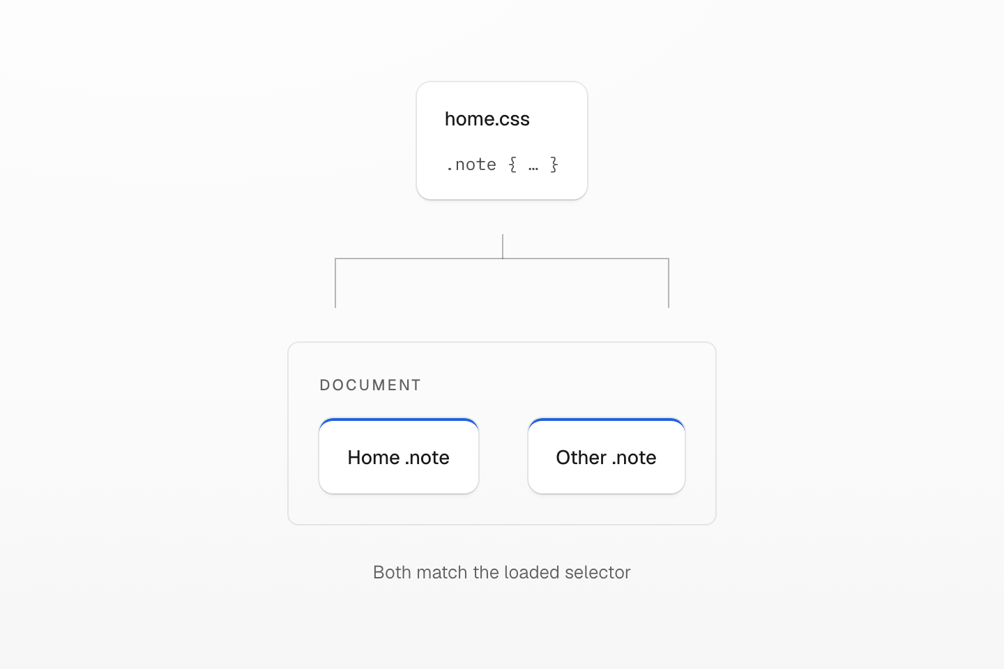
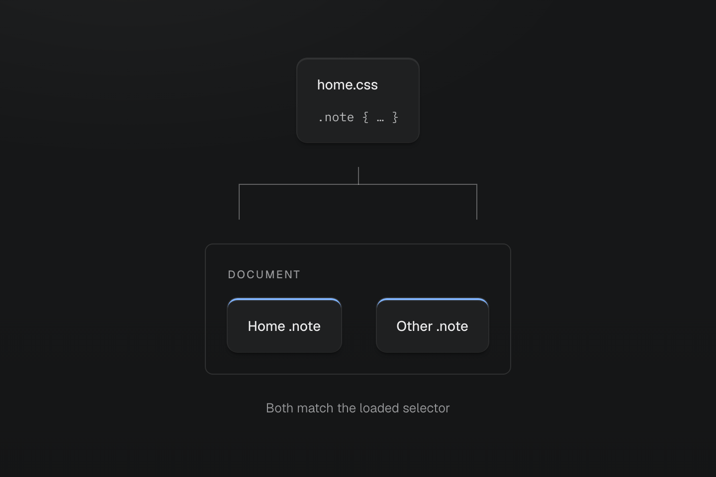
The import controls when CSS is delivered. Native class selectors can match throughout the document after loading.
Text description
A route file loads a .note rule. The document contains matching .note elements in two regions, both highlighted.
#Use project definitions
Shared definitions, local CSS delivery
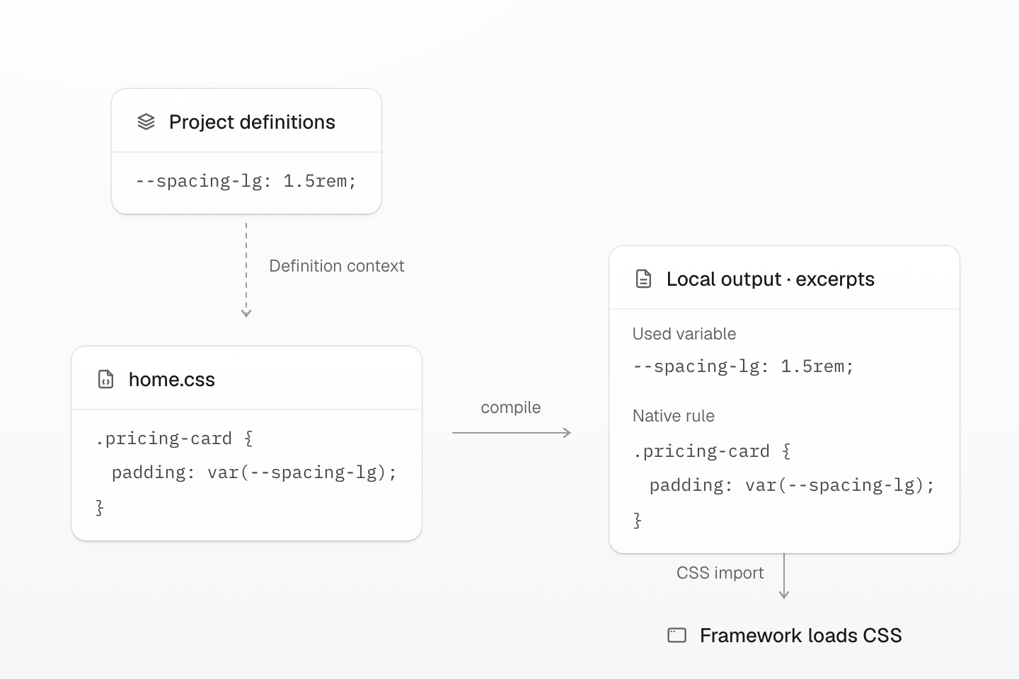
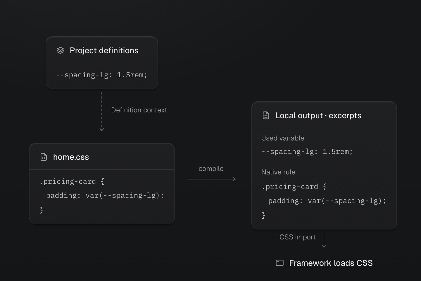
Definition context does not load global native rules. The framework delivers route CSS; its import does not isolate selectors.
Text description
- Reference. Read project tokens and shared vocabulary at compile time.
- Compile. Emit the route’s native rules and the variables or managed keyframes they use; do not copy unrelated global native rules.
- Load. Let the framework or bundler deliver the route’s CSS output.
The integration gives the local stylesheet its project definition context. Use those tokens, mixins and named conditions in ordinary native CSS; the framework keeps ownership of loading the resulting stylesheet.
.pricing-card { padding: var(--spacing-lg); border-radius: var(--radius-lg); background-color: var(--color-surface-raised);}The route output includes these native rules and the theme variables or managed keyframes they use. It stays self-contained even when another entry also uses those resources. Global native rules and utility classes are not copied into it.
#Reference definitions without loading their native rules
Use @reference when definitions live outside the app's entry graph. For example, a local marketing stylesheet can provide a color token as well as its own component:
@theme { --color-campaign: var(--color-blue-60);}@layer components { .campaign-root { color: var(--color-campaign); }}Reference that file from the route stylesheet, then use its token in a rule the route owns:
@reference "../../styles/marketing.css";@layer components { .campaign-banner { border-color: var(--color-campaign); }}The route output contains .campaign-banner and the color resources it needs. It does not contain .campaign-root. Load the marketing stylesheet through the appropriate app or route import if you also need that native component. The same distinction applies to a stylesheet exported by a package. See the reference directive for its definition-only behavior.
#Write native selectors
Write the route's native rules in app/home/home.css, then use their classes in the route markup. Keep them in @layer components when utility classes should be able to override individual choices.
Loading a native rule does not register a new Master CSS utility. Both cards below use the same native class. The second adds p-md, so its utility overrides the component's var(--spacing-lg) padding. The class name does not need an @utility registration.
Route CSS with a local utility adjustment
@layer components { .home-bento { display: grid; gap: var(--spacing-md); grid-template-columns: minmax(0, 1fr); overflow-wrap: anywhere; } .home-bento-card { border-radius: var(--radius-lg); padding: var(--spacing-lg); border: 1px solid var(--color-line-divider); background-color: var(--color-surface-raised); color: var(--color-text-body); } .home-bento-card > h2 { font-size: var(--font-size-lg); line-height: 1.4; font-weight: var(--font-weight-regular); margin-block: 0 0.5rem; } .home-bento-card > p { color: var(--color-text-muted); line-height: var(--leading-lg); margin: 0; }}<section class="home-bento" aria-label="Workspace options"> <article class="home-bento-card"> <h2>Team workspace</h2> <p>Shared route styles set the card's surface, typography and spacing.</p> </article> <article class="home-bento-card p-md"> <h2>Compact workspace</h2> <p>A utility adjusts padding without another native class.</p> </article></section>Generated CSS
@layer components { .home-bento { gap: var(--spacing-md); overflow-wrap: anywhere; grid-template-columns: minmax(0, 1fr); display: grid; } .home-bento-card { border-radius: var(--radius-lg); padding: var(--spacing-lg); border: 1px solid var(--color-line-divider); background-color: var(--color-surface-raised); color: var(--color-text-body); } .home-bento-card > h2 { font-size: var(--font-size-lg); line-height: 1.4; font-weight: var(--font-weight-regular); margin-block: 0 .5rem; } .home-bento-card > p { color: var(--color-text-muted); line-height: var(--leading-lg); margin: 0; }}@layer theme { :root, :host { --color-zinc-30: oklch(78% .0025 265); --color-zinc-40: oklch(68.6% .0028 265); --color-zinc-60: oklch(48.6% .003 265); --color-zinc-70: oklch(39.8% .0028 265); --color-zinc-90: oklch(24.6% .0022 265) } :root, :host { --color-surface-raised: light-dark(var(--color-white), var(--color-zinc-90)); --color-line-divider: light-dark(oklch(0% 0 none / .12), oklch(100% 0 none / .12)); --color-text-body: light-dark(var(--color-zinc-70), var(--color-zinc-30)); --color-text-muted: light-dark(var(--color-zinc-60), var(--color-zinc-40)) } :root, :host { --color-white: oklch(100% 0 none) } :root, :host { --leading-lg: 1.8; --font-weight-regular: 400; --font-size-lg: 1.125rem; --radius-lg: .5rem; --spacing-md: 1rem; --spacing-lg: 1.5rem }}@layer utilities { .p-md { padding: var(--spacing-md) }}Keeping the rules in @layer components lets classes override them; see Cascade layers.
These native rules are emitted with their stylesheet by default. If that source opts into native CSS pruning, its detected class usage determines which rules remain. If a selector becomes reused across multiple pages, move the shared role to Global styles.
#Use variants locally
Project custom media work inside native rules, beside ordinary media queries:
.home-note { color: var(--color-blue-60); @media (--dark) { color: var(--color-blue-40); } @media (width < 52.125rem) { width: 100%; }}--dark follows the system’s prefers-color-scheme preference. A manual data-theme attribute does not change that query; use adaptive color tokens for surfaces that should follow a manually selected scheme.
#Verify route delivery
Open the route directly, then navigate to it from another page. Check that its stylesheet loads, the native selectors match and the expected token values are present. Inspect a shared page as well: local source ownership should not accidentally move route-only CSS into the app entry.
If the output is missing, check the route's CSS import and the integration's project context. If the rule is present but the result differs, inspect the matching selector, layer and computed value. Adding another full @master/css import does not fix a selector or cascade problem.
For before/after measurements across pages, selective pruning and project budgets, continue with Optimizing CSS delivery.