Layout
Compose a page from a capped wrapper, spacing tokens, column grids and explicit tracks.
On this page
#Overview
Compose a page from three decisions: a wrapper that caps the width, spacing tokens for gutters and margins, and a column grid for the regions. Native Grid and Flexbox do the layout; Master CSS names the values.
Adjust the viewport with the slider or arrow keys to see the surface move from a compact stacked layout to an 8-column composition.
Workspace layout
<main class="w-full max-w-3xl mx-auto p-md"> <section class="grid-cols(4) gap-sm grid-cols(8)@2xs gap-md@2xs"> <header class="grid-col-span(4) grid-col-span(8)@2xs"><h1>Project overview</h1></header> <article class="grid-col-span(4)"><h2>Revenue</h2><p>$128.4k</p></article> <article class="grid-col-span(4)"><h2>Activation</h2><p>64.2%</p></article> <article class="grid-col-span(4) grid-col-span(5)@2xs"><h2>Weekly demand</h2></article> <aside class="grid-col-span(4) grid-col-span(3)@2xs"><h2>Launch tasks</h2></aside> </section></main>Generated CSS
@layer theme { :root, :host { --spacing-md: 1rem; --container-3xl: 48rem }}@layer utilities { .grid-cols\(4\) { display: grid; grid-template-columns: repeat(4, minmax(0, 1fr)) } .max-w-3xl { max-width: var(--container-3xl) } .p-md { padding: var(--spacing-md) } @media (width >= 37.5rem) { .grid-cols\(8\)\@2xs { display: grid; grid-template-columns: repeat(8, minmax(0, 1fr)) } } @media (width >= 37.5rem) { .gap-md\@2xs { gap: var(--spacing-md) } } @media (width >= 37.5rem) { .grid-col-span\(5\)\@2xs { grid-column: span 5/span 5 } }}Coordinate item spans with the grid
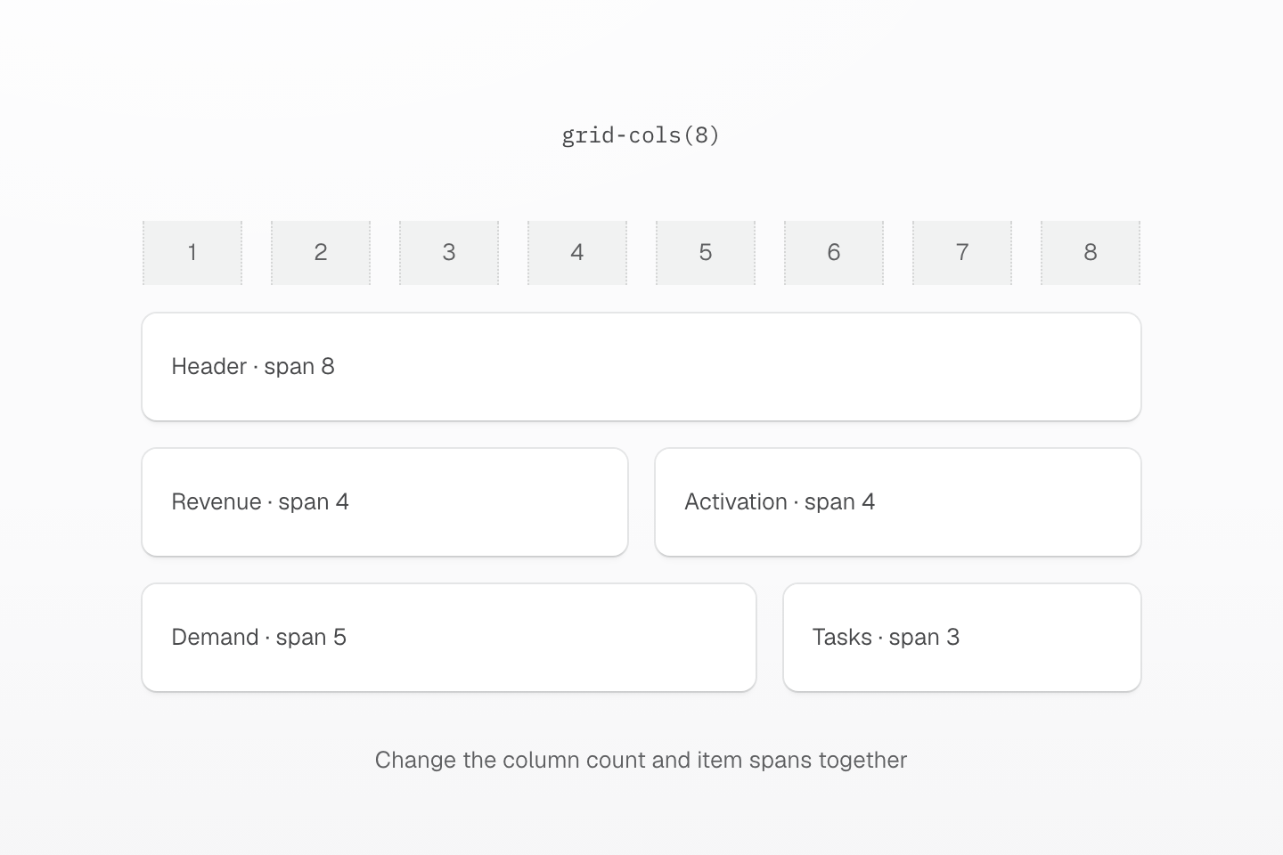
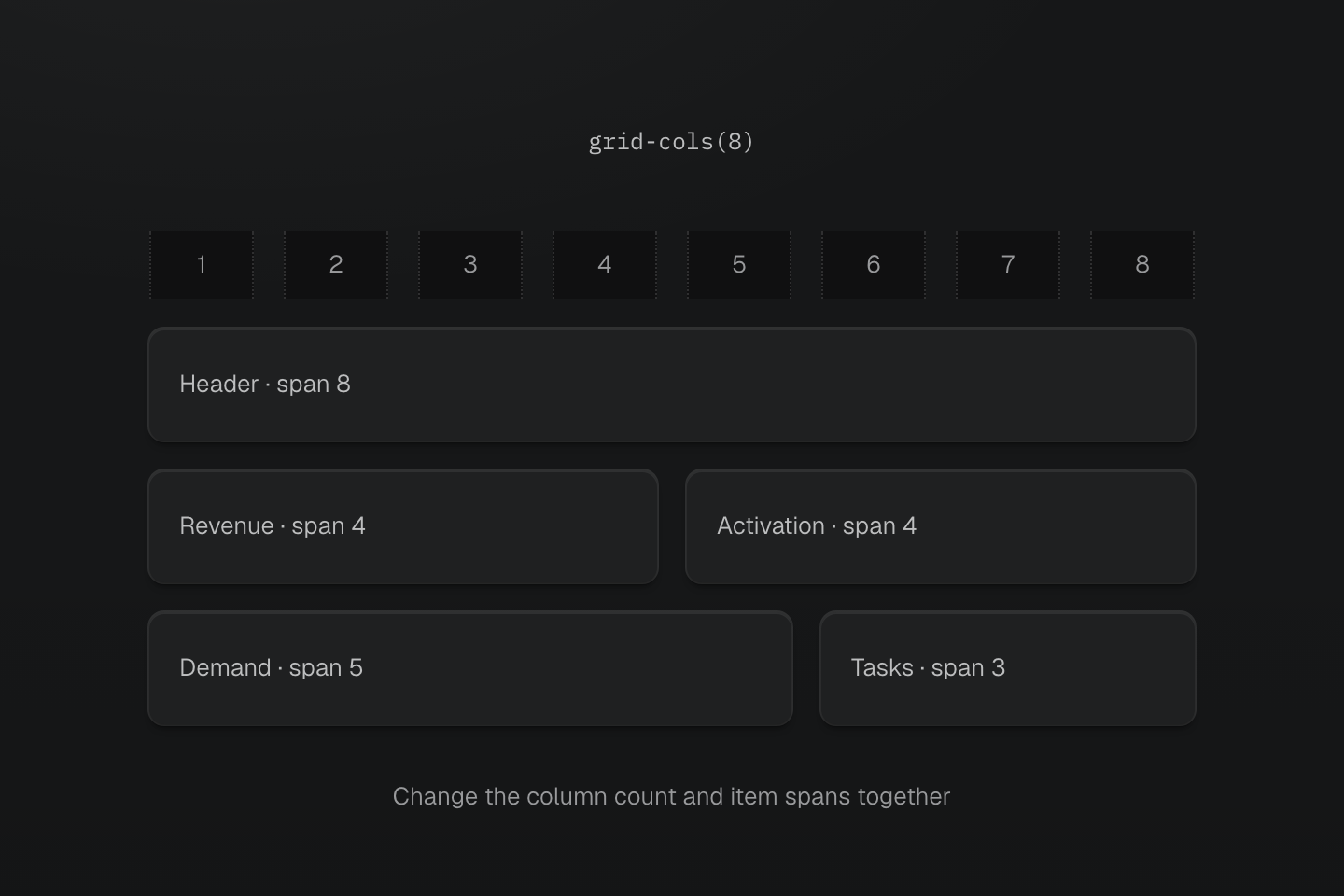
The wide layout uses eight equal tracks. Each row accounts for those tracks: 8, 4 + 4, then 5 + 3. Gutters sit between the tracks.
Text description
- One grid. The wide composition uses grid-cols(8), with the same gap between each pair of tracks.
- Full and shared rows. The header spans eight tracks. Each metric spans four. The demand and task regions span five and three.
- Adapt together. When a breakpoint changes the grid’s column count, update the spans that depend on it at the same breakpoint.
Below 2xs, each region spans all four columns. At 2xs, the header spans eight, the two metrics share a row, and the demand and task regions split the next row five to three.
#Choose a spacing value
Spacing classes such as p-, m- and gap- accept three forms:
| Form | Class | Generates |
|---|---|---|
| Spacing token | p-md | padding: var(--spacing-md) |
| Direct value | p(1) | padding: calc(1 * 1px) |
| Native length | (padding:0.5rem) | padding: 0.5rem |
Generated CSS
@layer theme { :root, :host { --spacing-md: 1rem }}@layer utilities { .p-md { padding: var(--spacing-md) } .p\(1\) { padding: calc(1 * 1px) } .\(padding\:0\.5rem\) { padding: 0.5rem }}Use tokens for the rhythm a page shares: gutters, padding and section spacing. A direct-value length is expressed in pixels, so p(1) is a one-pixel padding, not one step of a scale; use it for hairlines and resets such as m(0). Write other units as a native declaration. See Spacing for the scale and Direct values for every function.
When a distance becomes a repeated decision, name it by its role. A numeric key such as --spacing-1 would read like the direct value p(1).
@theme { --spacing-section: 6rem;}<section class="py-section">…</section>px-* and py-* set logical inline and block padding. Their physical direction follows the element's writing mode:
Inline padding follows the writing mode
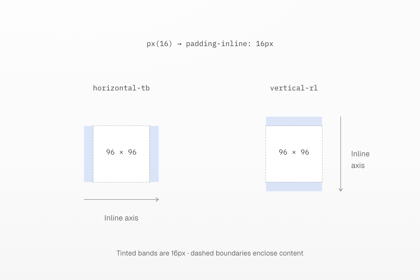
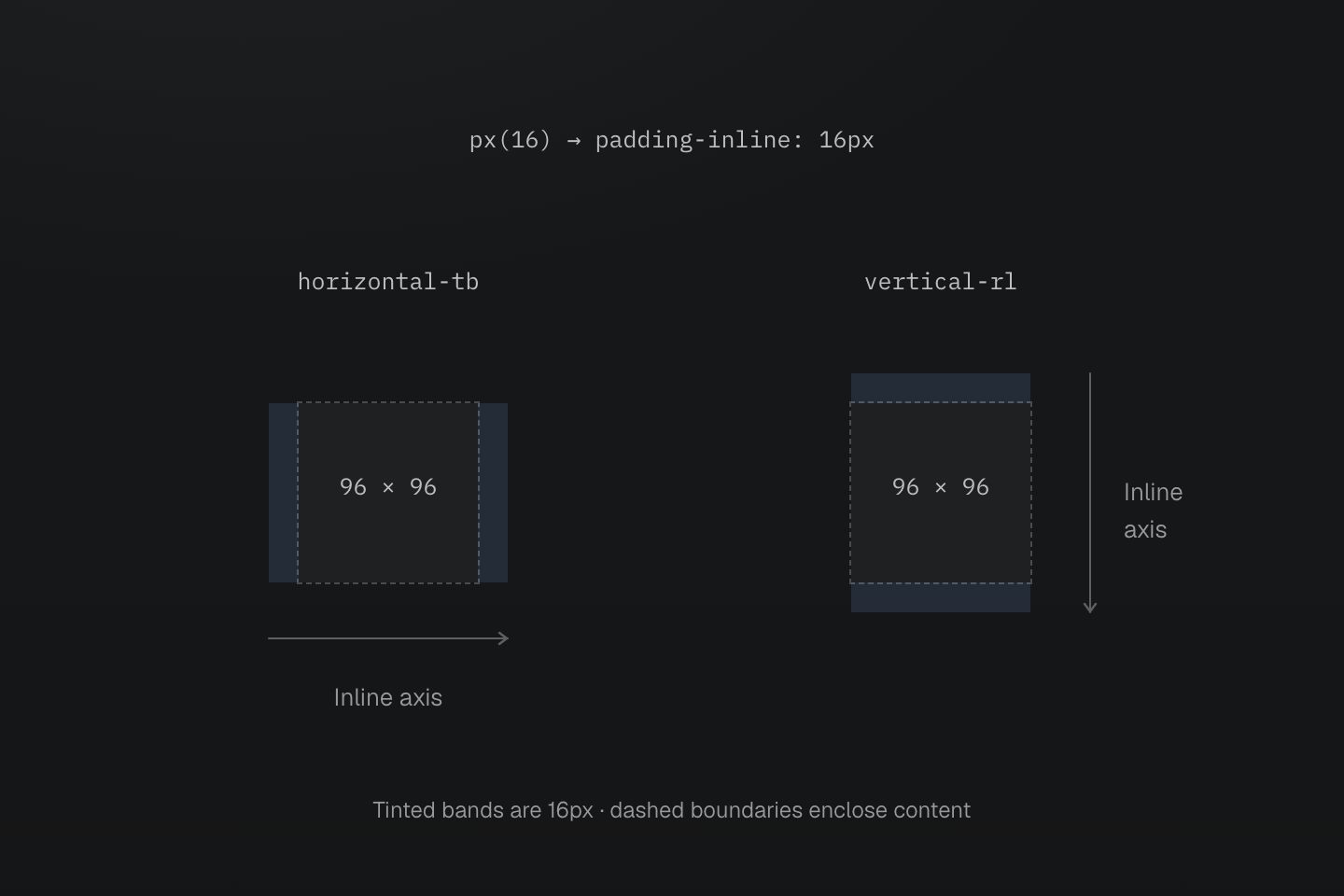
The two square content boxes have the same dimensions. Tinted bands identify the actual 16px padding-inline regions.
Text description
- px(16) emits padding-inline: calc(16 * 1px). In horizontal-tb, its two insets are on the left and right.
- In vertical-rl, the inline axis runs vertically, so the same class puts padding on the top and bottom.
- Master CSS x and y names refer to inline and block axes. Physical t, r, b and l names keep their physical sides.
p-* sets all four sides. Add a side-specific class when just one inset should differ:
A side override changes only that side
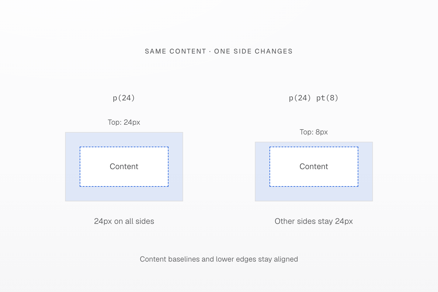
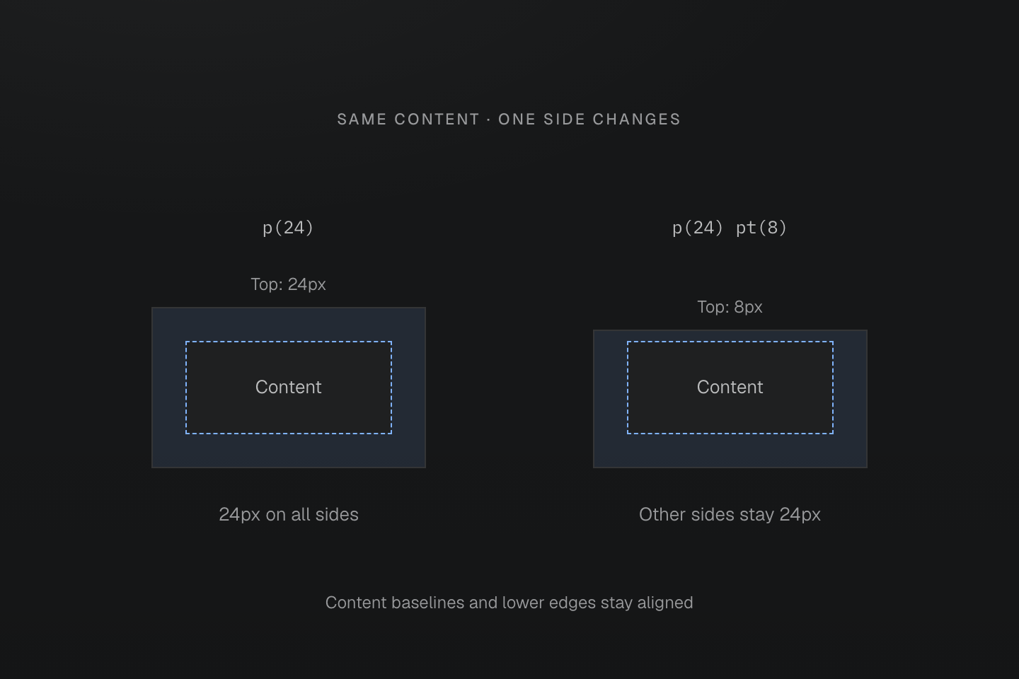
The bands are inspection guides, not generated background colors. Both specimens use real preset CSS and identical content dimensions.
Text description
- p(24) gives the content 24px of padding on all four sides.
- Adding pt(8) changes the top padding to 8px. The other three sides remain 24px, independent of the order of the two HTML classes under the same conditions.
#Cap widths with container sizes
w-, max-w-, h-, min-w- and basis- read --container-* tokens, so max-w-5xl is max-width: var(--container-5xl). The full and intrinsic sizes are fixed utilities instead: w-full, w-fit, w-max and w-min always set 100%, fit-content, max-content and min-content, and a project --container-full token does not change them.
Generated CSS
@layer theme { :root, :host { --container-5xl: 64rem }}@layer utilities { .max-w-5xl { max-width: var(--container-5xl) } .w-full { width: 100% } .w-fit { width: fit-content }}Container tokens set lengths only; they do not move a container query threshold. See Container sizes for the scale.
A width cap leaves room for smaller parents
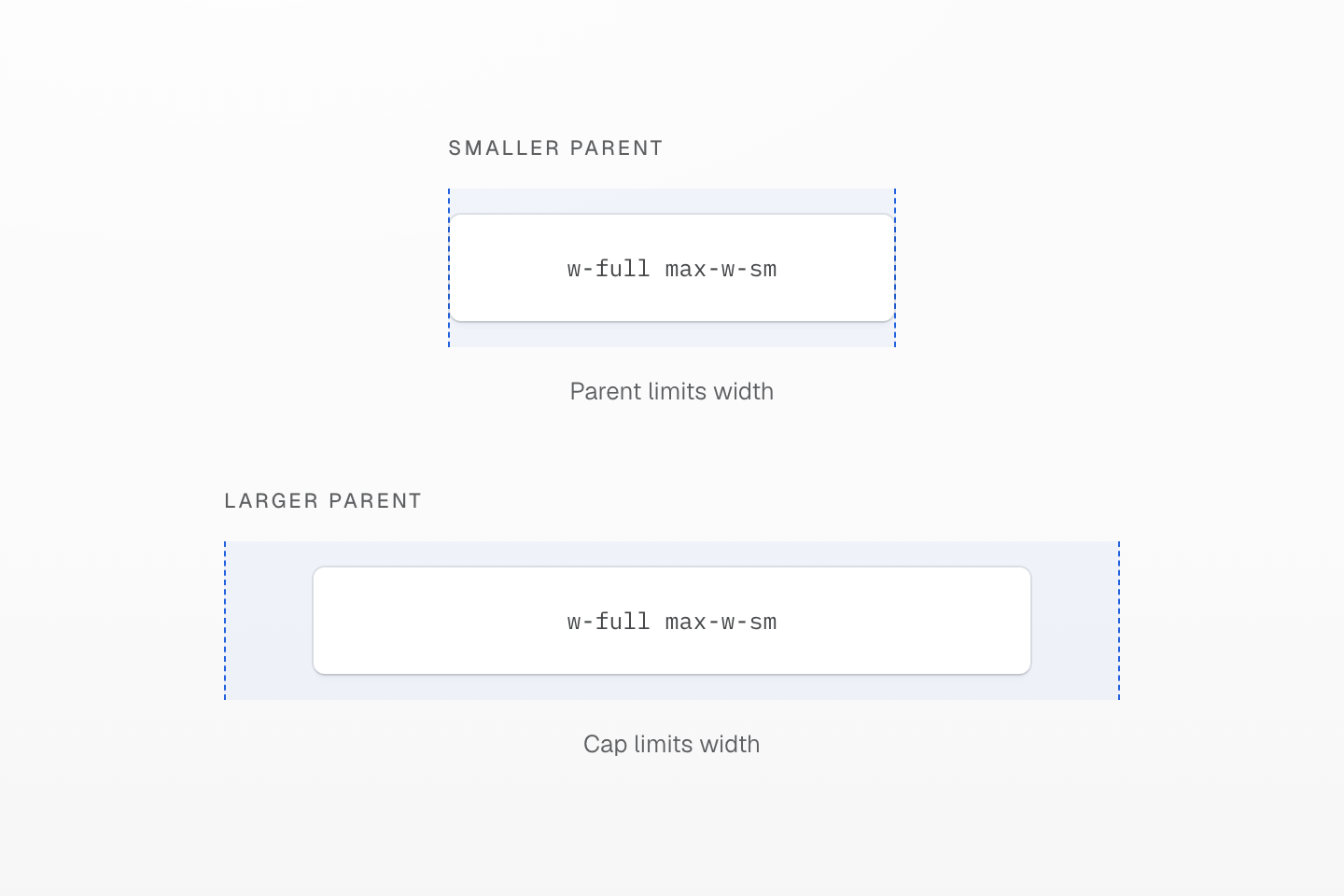
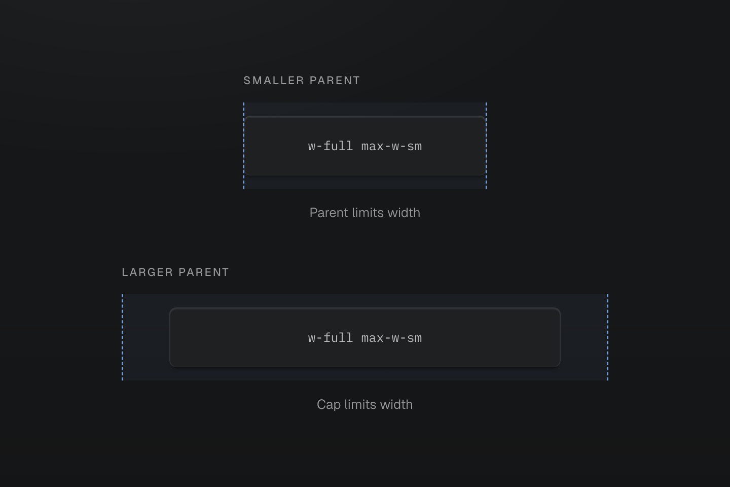
The cap is a maximum, not a fixed width. Drawn widths share one scale; the labels describe the constraint rather than viewport pixels.
Text description
Two parents contain the same capped content box. The smaller parent constrains it; the larger parent leaves free space around a box at its maximum width.
#Start with a page wrapper
Let the wrapper fill its parent, cap it with a container size, center it and give its content side gutters from the spacing scale:
<main class="w-full max-w-7xl mx-auto px-md px-xl@md">…</main>Generated CSS
@layer theme { :root, :host { --spacing-md: 1rem; --spacing-xl: 2rem; --container-7xl: 80rem }}@layer utilities { .mx-auto { margin-inline: auto } .max-w-7xl { max-width: var(--container-7xl) } .px-md { padding-inline: var(--spacing-md) } .w-full { width: 100% } @media (width >= 64rem) { .px-xl\@md { padding-inline: var(--spacing-xl) } }}Keep page alignment on the wrapper and content relationships on the grids inside it.
#Build column grids
grid-cols(<count>) creates a grid of equal columns, and grid-col-span(<count>) places an item across several of them. When a breakpoint changes the column count, change the spans at the same breakpoint.
The grid grows to 12 columns, but the article keeps its four-column span and leaves four columns empty.
<section class="grid-cols(4) gap-lg grid-cols(12)@md"> <article class="grid-col-span(4)">…</article> <aside class="grid-col-span(4)">…</aside></section>The article spans eight columns at the same breakpoint.
<section class="grid-cols(4) gap-lg grid-cols(12)@md"> <article class="grid-col-span(4) grid-col-span(8)@md">…</article> <aside class="grid-col-span(4)">…</aside></section>Generated CSS
@layer utilities { .grid-cols\(4\) { display: grid; grid-template-columns: repeat(4, minmax(0, 1fr)) } @media (width >= 64rem) { .grid-cols\(12\)\@md { display: grid; grid-template-columns: repeat(12, minmax(0, 1fr)) } } @media (width >= 64rem) { .grid-col-span\(8\)\@md { grid-column: span 8/span 8 } }}A spanning item covers the gap between its tracks
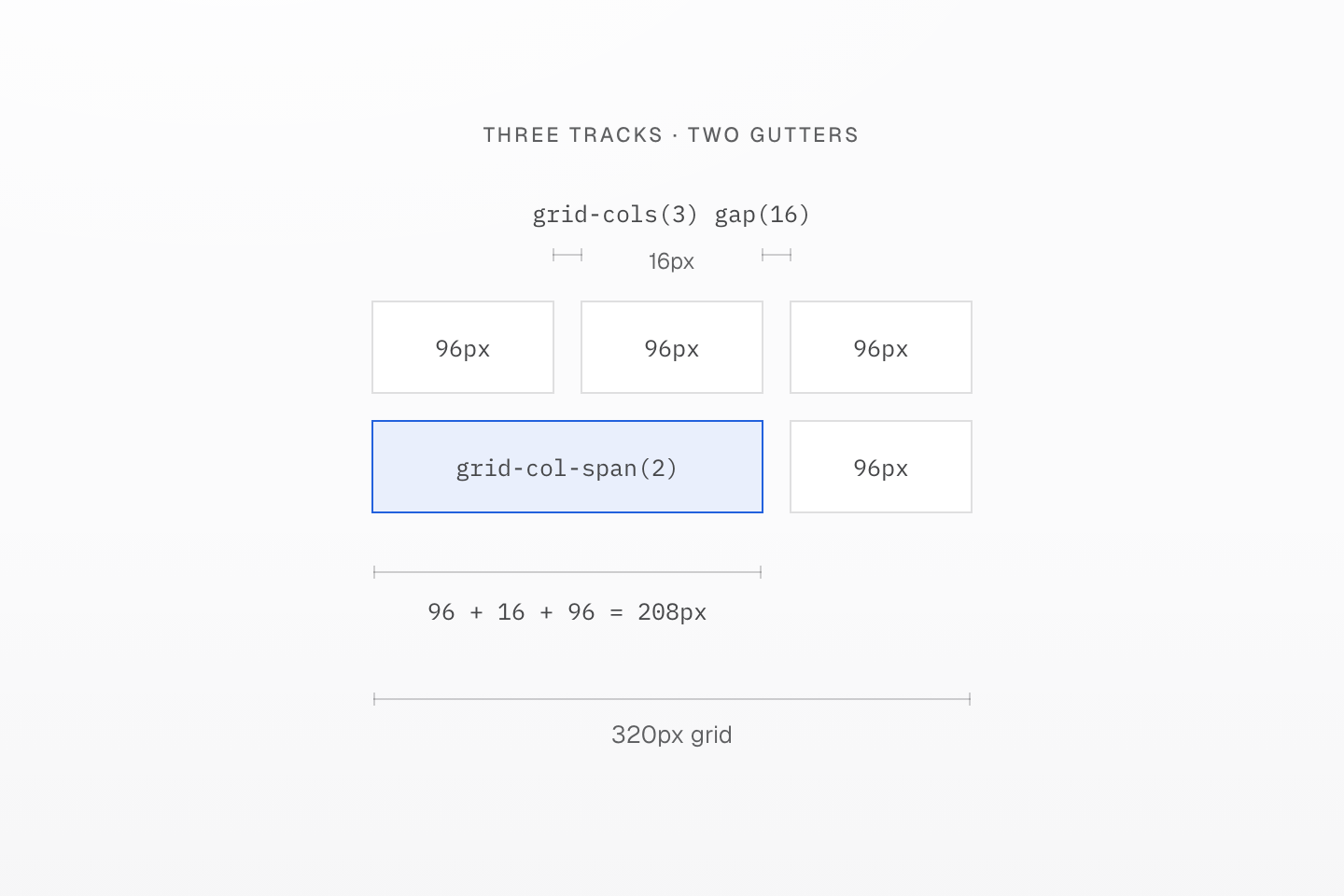
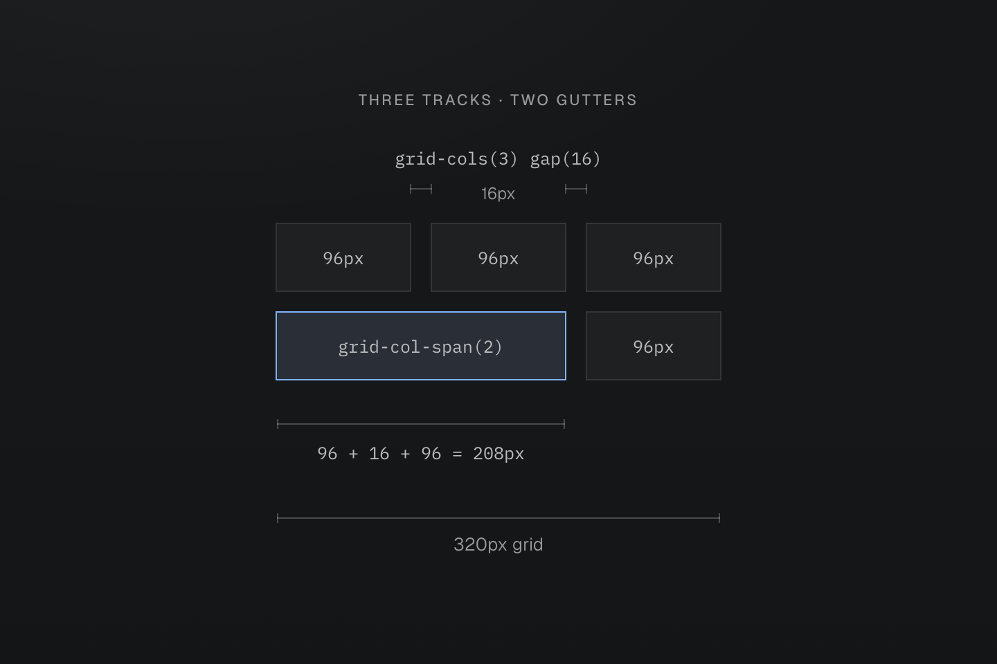
The 320px grid uses grid-cols(3), gap(16) and grid-col-span(2). Rulers show actual CSS geometry, not an arbitrary scale.
Text description
- The available width is 320px. Two 16px gaps leave 288px for three equal 96px tracks.
- An item spanning two tracks covers 96px + 16px + 96px, or 208px. The next 16px gap remains between it and the third track.
- Changing the column count can change track widths; update related spans at the same breakpoint.
Use col-gap-* and row-gap-* when the two axes need different spacing tokens. See Grid tracks.
#Add explicit tracks
For fixed or mixed tracks, write the native grid-template-columns value. Separate its tracks with |, which becomes a space in the generated CSS:
<section class="grid (grid-template-columns:4.5rem|minmax(0,1fr)) gap-md"> <nav>…</nav> <main class="min-w(0)">…</main></section>Generated CSS
@layer utilities { .min-w\(0\) { min-width: calc(0 * 1px) } .\(grid-template-columns\:4\.5rem\|minmax\(0\,1fr\)\) { grid-template-columns: 4.5rem minmax(0, 1fr) }}min-w(0) lets the main region shrink below the width of its content. Keep equal columns and spans for ordinary content; use explicit tracks for app shells and split panes.
A shrinking track still needs wrapping text
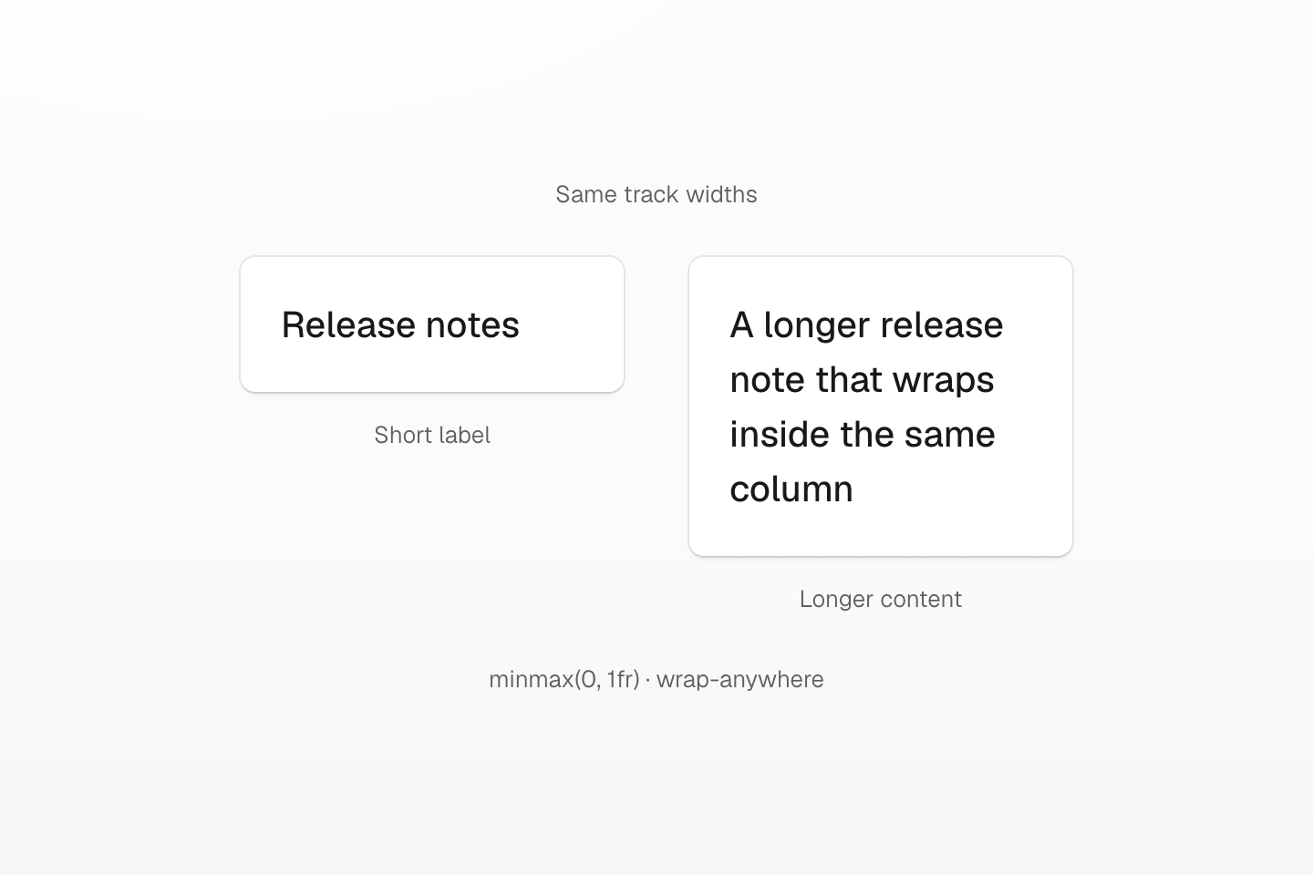
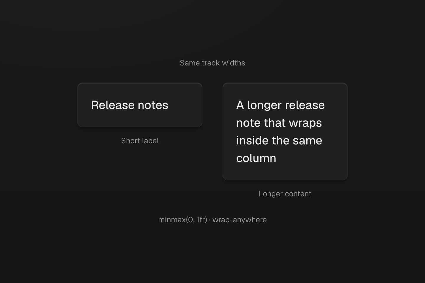
minmax(0,1fr) lets the track shrink; text still needs an appropriate wrapping policy. Heights follow the content.
Text description
Two equal grid tracks compare a short label with a long wrapping label. The second row grows while track boundaries stay aligned.
#Verify the layout with longer content
Resize across each breakpoint and check both the grid count and its children's spans. Use a longer heading and task label to make sure the content can grow vertically. Keep fixed dimensions for measured objects or intentional viewports; page cards usually need only padding and a width constraint.
Try the preview's task checkboxes with a keyboard, and follow its section links. The layout should remain usable when the content wraps; shrinking the type to force it into a fixed-height card would hide the underlying constraint.