Syntax tutorial
Read and compose Master CSS classes, add interaction states and conditions, and build a guide card that responds to its available space.
On this page
A guide card needs spacing, readable text and a link that responds to interaction. Master CSS lets you make those decisions in HTML: choose a style, then add a selector or condition where that style should apply.
Complete Installation first. These examples use the default preset, with no custom utility definitions. Keep the markup in a source file your integration scans and load your app stylesheet:
@import '@master/css';Each Generated CSS disclosure shows output compiled from the accompanying classes. Open one to check what reaches the browser; you do not need to copy that output into your stylesheet.
#Read a class
Start with a link that turns blue on hover, but only when the viewport matches the preset's sm query:
<a href="/guide/reusing-styles" class="fg-blue-60:hover@sm"> Read the guide</a>The class has three parts. fg-blue-60 selects the style, :hover selects a state, and @sm adds a condition. The style applies only when both the selector and the condition match. Without those suffixes, fg-blue-60 applies regardless of hover or viewport width.
Read the style, selector and condition
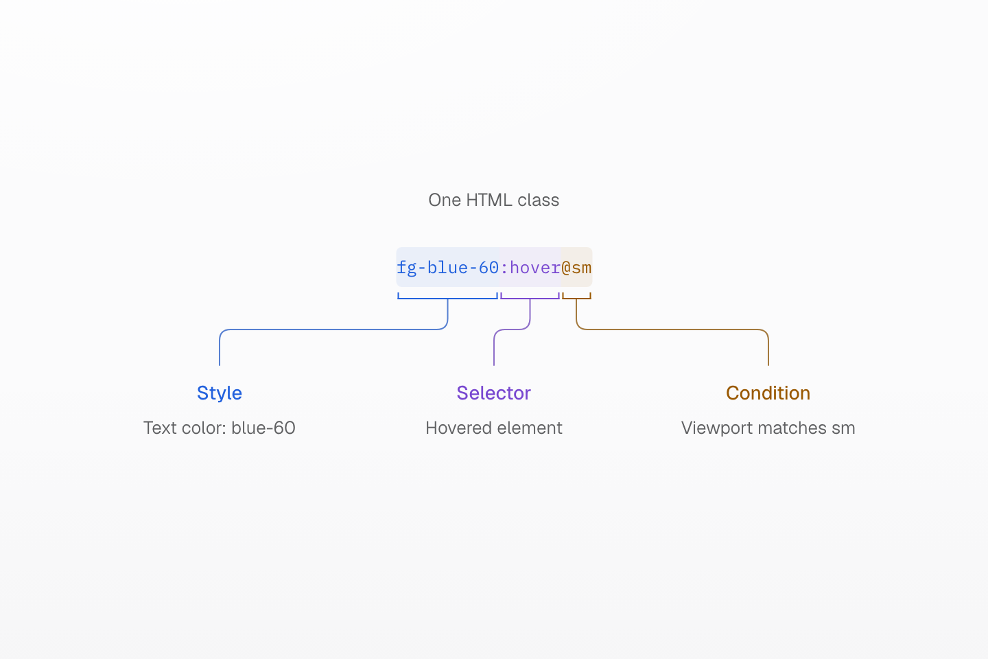
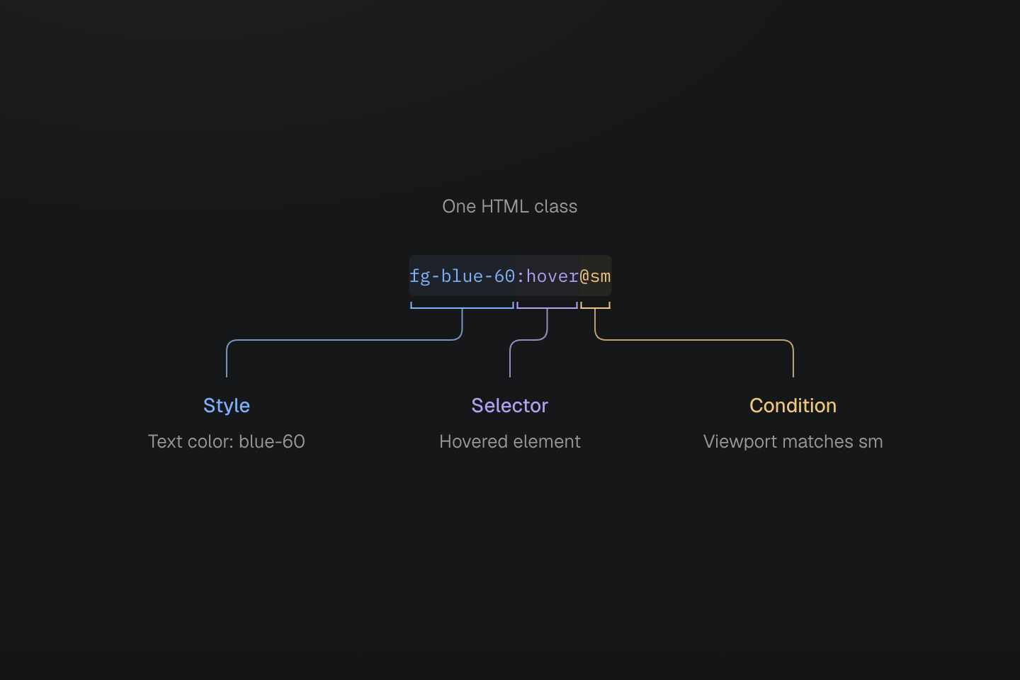
The color applies to the hovered element only while the viewport matches sm. Both suffixes belong to this class.
Text description
- Style. fg-blue-60 sets color to var(--color-blue-60).
- Selector. :hover matches the class-bearing element while it is hovered.
- Condition. @sm wraps the rule in the preset’s named sm media query. The selector and condition must both match for this class to apply.
Generated CSS
@layer theme { :root, :host { --color-blue-60: oklch(51.83% .2687 266.1) }}@layer utilities { @media (width >= 52.125rem) { .fg-blue-60\:hover\@sm:hover { color: var(--color-blue-60) } }}The generated rule sets color through a CSS variable and sits inside a media query. Its selector escapes punctuation to match the literal HTML class name. Write the readable form in HTML; escaped CSS selectors belong in the generated output.
A suffix belongs to one complete class
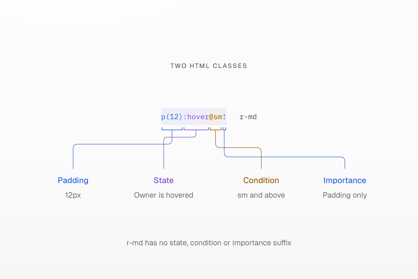
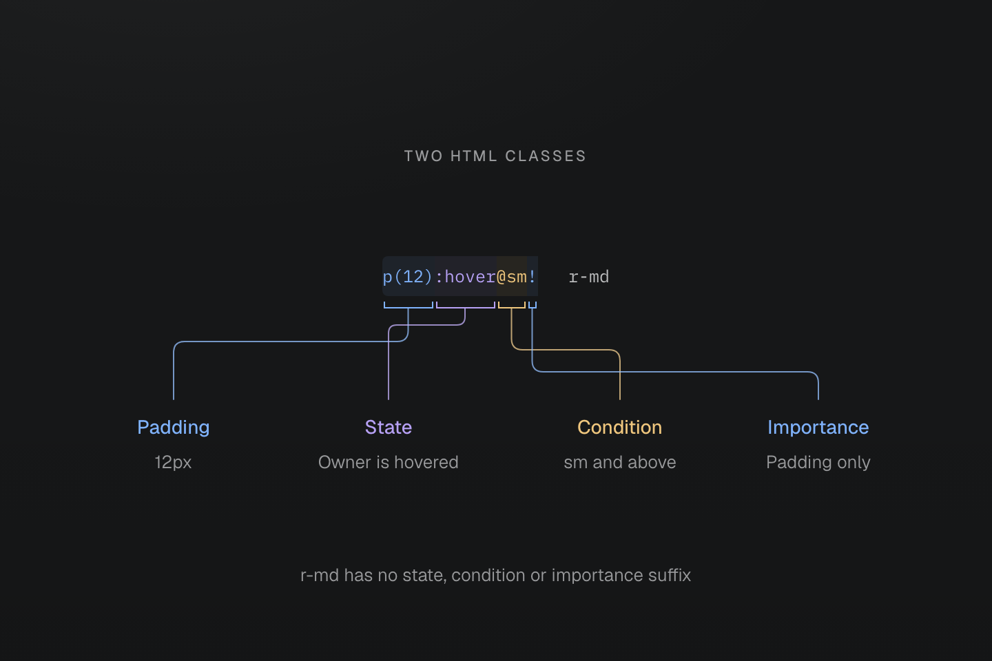
The brackets attach to exact character ranges. The space ends the first class; its state, condition and importance do not extend to r-md.
Text description
- p(12) supplies padding. :hover tests the class-bearing element, @sm limits the rule to the named media condition, and the final ! marks its declaration important.
- The separate r-md class has none of those suffixes. It can apply without hover or the sm condition and its declaration is not important.
#Choose how to supply a value
Use the preset's names for common decisions. When you need an exact local value, pass a number to a supported function or write a native declaration:
| Write | Decision |
|---|---|
flex | A fixed utility for display: flex |
p-md | A token class for named spacing |
p(12) | A direct value: 12 pixels of padding |
(max-width:32rem) | A native declaration with a full CSS property and value |
text-sm | A recipe coordinating text size, line height and tracking |
Generated CSS
@layer theme { :root, :host { --font-size-sm: .875rem; --text-sm: var(--font-size-sm); --text-sm--line-height: 1.5; --text-sm--letter-spacing: 0; --spacing-md: 1rem }}@layer utilities { .text-sm { font-size: var(--text-sm); line-height: var(--text-sm--line-height, normal); letter-spacing: var(--text-sm--letter-spacing, normal) } .flex { display: flex } .p-md { padding: var(--spacing-md) } .p\(12\) { padding: calc(12 * 1px) } .\(max-width\:32rem\) { max-width: 32rem }}Fixed utilities such as items-center and text-center cover common declarations. Direct-value functions such as m(4), b(1) and grow(1) take a number; length functions use pixels, while grow(1) supplies a unitless flex factor. Native declarations keep the full property name inside parentheses. A recipe such as text-sm or grid-cols(2) can coordinate several declarations. All these forms accept selector and condition suffixes.
#Keep spaces inside one class
HTML separates classes at whitespace. Outside quoted strings, write | where a CSS value needs a space, keeping commas, slashes and parentheses in place:
<div class="(transform:translate(0,1rem)) (color:rgb(30|60|90/80%))"> <span class="(content:'New|collection')::before"></span></div>Generated CSS
@layer utilities { .\(color\:rgb\(30\|60\|90\/80\%\)\) { color: rgb(30 60 90/80%) } .\(transform\:translate\(0\,1rem\)\) { transform: translate(0, 1rem) } .\(content\:\'New\|collection\'\)\:\:before::before { content: 'New|collection' }}The color becomes rgb(30 60 90 / 80%). Inside the quoted content string, the pipe stays literal: the text is New|collection. Master CSS also normalizes operator spacing in expressions such as calc(100%-2rem); the browser evaluates the expression. See Declarations and values for native declaration boundaries, quoted values and escaping.
A pipe changes meaning inside quotes
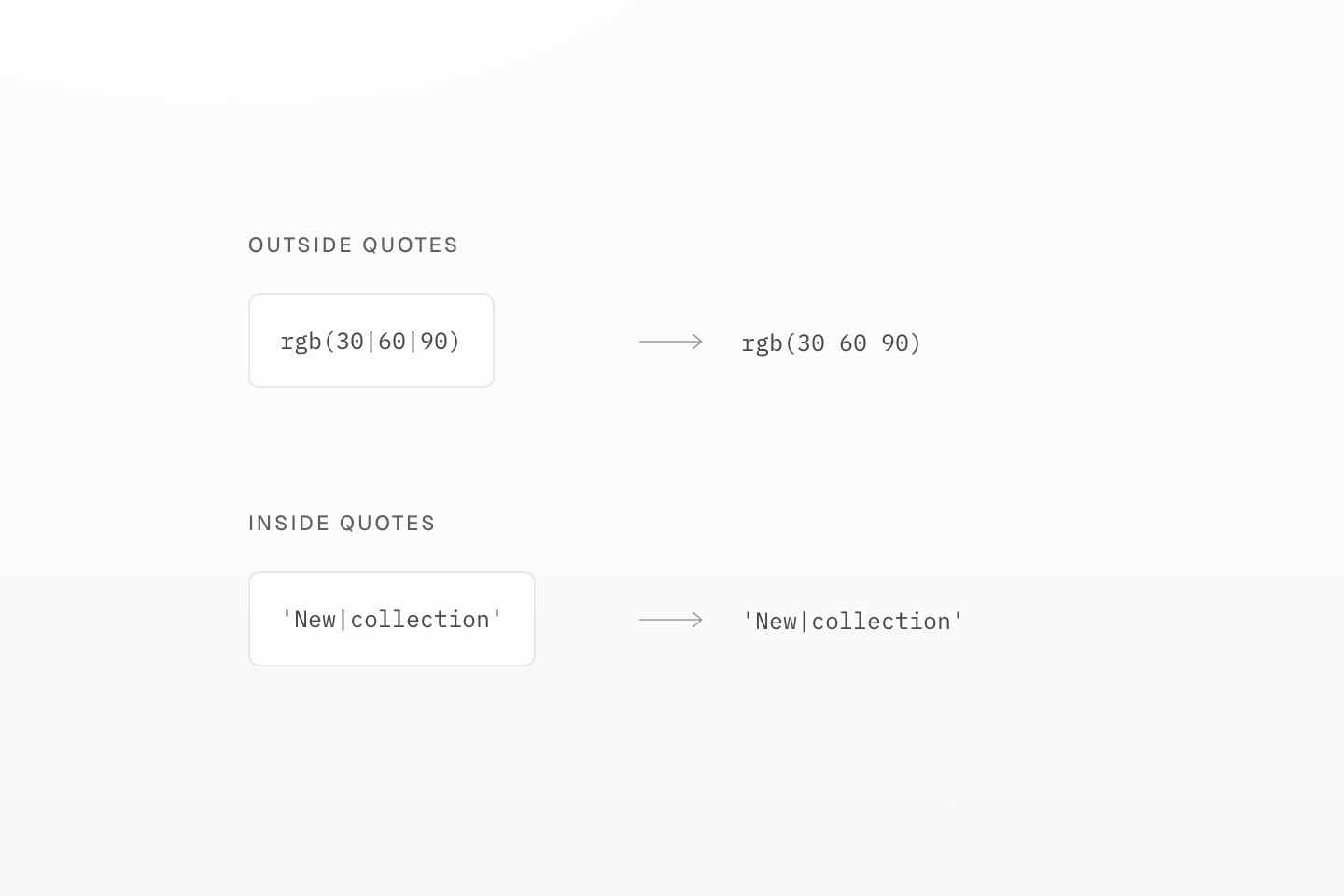
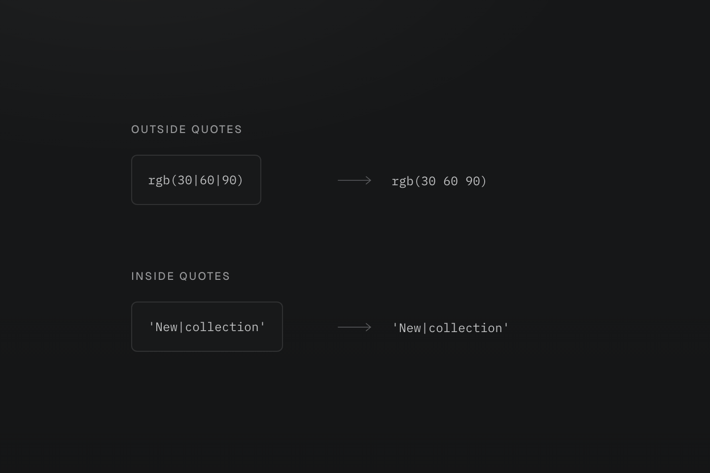
Whitespace decoding applies outside quoted strings. The output string is still one literal value.
Text description
Two literal inputs map to outputs. rgb(30|60|90) becomes rgb(30 60 90); the quoted string New|collection retains its pipe.
#Use tokens for shared values
A token class connects a prefix to a named value. p-md and gap-md both read the spacing token --spacing-md, but set different properties:
| Class | Declaration |
|---|---|
p-md | padding: var(--spacing-md) |
gap-md | gap: var(--spacing-md) |
fg-text-muted | color: var(--color-text-muted) |
Generated CSS
@layer theme { :root, :host { --color-zinc-40: oklch(68.6% .0028 265); --color-zinc-60: oklch(48.6% .003 265) } :root, :host { --color-text-muted: light-dark(var(--color-zinc-60), var(--color-zinc-40)) } :root, :host { --spacing-md: 1rem }}@layer utilities { .fg-text-muted { color: var(--color-text-muted) } .gap-md { gap: var(--spacing-md) } .p-md { padding: var(--spacing-md) }}These selected spacing values come directly from the preset:
--spacing-sm:.75rem(:root,:host)--spacing-md:1rem(:root,:host)--spacing-lg:1.5rem(:root,:host)
p-md and (padding:1rem) can look identical, but they express different decisions. Changing --spacing-md changes the token-based padding; the literal stays at 1rem. Use tokens when styles should follow a shared value. Theme tokens explains how to define and scope your own values; the family index lists prefixes and namespaces.
#Compose independent decisions
Build a small surface by giving each decision its own class:
<article class="p-md r-lg b(1) b-solid b-line-divider bg-surface-raised"> <h2 class="m(0) text-lg fg-text-strong">Field notes</h2> <p class="mt-sm mb(0) text-sm fg-text-muted">Keep useful ideas close.</p></article>Generated CSS
@layer theme { :root, :host { --color-zinc-40: oklch(68.6% .0028 265); --color-zinc-60: oklch(48.6% .003 265); --color-zinc-90: oklch(24.6% .0022 265); --color-zinc-100: oklch(15% .0016 265) } :root, :host { --color-surface-raised: light-dark(var(--color-white), var(--color-zinc-90)); --color-line-divider: light-dark(oklch(0% 0 none / .12), oklch(100% 0 none / .12)); --color-text-strong: light-dark(var(--color-zinc-100), var(--color-white)); --color-text-muted: light-dark(var(--color-zinc-60), var(--color-zinc-40)) } :root, :host { --color-white: oklch(100% 0 none) } :root, :host { --font-size-sm: .875rem; --font-size-lg: 1.125rem; --text-sm: var(--font-size-sm); --text-sm--line-height: 1.5; --text-sm--letter-spacing: 0; --text-lg: var(--font-size-lg); --text-lg--line-height: 1.5; --text-lg--letter-spacing: 0; --radius-lg: .5rem; --spacing-sm: .75rem; --spacing-md: 1rem }}@layer utilities { .text-lg { font-size: var(--text-lg); line-height: var(--text-lg--line-height, normal); letter-spacing: var(--text-lg--letter-spacing, normal) } .text-sm { font-size: var(--text-sm); line-height: var(--text-sm--line-height, normal); letter-spacing: var(--text-sm--letter-spacing, normal) } .bg-surface-raised { background-color: var(--color-surface-raised) } .b-line-divider { border-color: var(--color-line-divider) } .r-lg { border-radius: var(--radius-lg) } .b-solid { border-style: solid } .b\(1\) { border-width: calc(1 * 1px) } .fg-text-muted { color: var(--color-text-muted) } .fg-text-strong { color: var(--color-text-strong) } .m\(0\) { margin: calc(0 * 1px) } .mt-sm { margin-top: var(--spacing-sm) } .mb\(0\) { margin-bottom: calc(0 * 1px) } .p-md { padding: var(--spacing-md) }}Here b(1) sets the border width, b-solid its style, and b-line-divider its color. Change one without restating the others. The padding, corner radius and text treatment stay independent too. This makes a later variation small: a wider layout can change padding while keeping the same surface and text.
#Class order does not set priority
If you write p-md p(12), the direct value wins over the token for this property. Reversing the HTML class order produces the same CSS:
Generated CSS
@layer theme { :root, :host { --spacing-md: 1rem }}@layer utilities { .p-md { padding: var(--spacing-md) } .p\(12\) { padding: calc(12 * 1px) }}Choose one base padding unless an override is intentional. When combining native component CSS and utilities, layer order matters as well: the preset places normal utilities declarations after components. Cascade layers covers competing rules; Reusing styles shows how to keep a component's shared appearance while changing one instance.
#Add states and selector relationships
Attach a selector to the class whose behavior changes. This button changes its surface on hover and gains an outline when reached with the keyboard:
A surface change and a focus outline
<button type="button" class="px-md py-xs text-sm r-md b(1) b-solid b-line-divider bg-surface-raised fg-text-strong shadow-sm bg-surface-inset:hover outline-offset(3) outline(2):focus-visible outline-solid:focus-visible">Save changes</button>Generated CSS
@layer theme { :root, :host { --color-zinc-5: oklch(96.5% .0011 265); --color-zinc-90: oklch(24.6% .0022 265); --color-zinc-100: oklch(15% .0016 265) } :root, :host { --color-surface-inset: light-dark(var(--color-zinc-5), var(--color-zinc-100)); --color-surface-raised: light-dark(var(--color-white), var(--color-zinc-90)); --color-line-divider: light-dark(oklch(0% 0 none / .12), oklch(100% 0 none / .12)); --color-text-strong: light-dark(var(--color-zinc-100), var(--color-white)) } :root, :host { --color-white: oklch(100% 0 none) } :root, :host { --font-size-sm: .875rem; --text-sm: var(--font-size-sm); --text-sm--line-height: 1.5; --text-sm--letter-spacing: 0; --radius-md: .375rem; --spacing-xs: .5rem; --spacing-md: 1rem } :root, :host { --shadow-sm: 0 0 0 1px light-dark(oklch(0% 0 none / .04), oklch(100% 0 none / .05)), 0 1px 1px -.5px light-dark(oklch(0% 0 none / .045), oklch(0% 0 none / .3)), 0 2px 2px -1px light-dark(oklch(0% 0 none / .04), oklch(0% 0 none / .26)), 0 4px 4px -2px light-dark(oklch(0% 0 none / .04), oklch(0% 0 none / .24)) }}@layer utilities { .text-sm { font-size: var(--text-sm); line-height: var(--text-sm--line-height, normal); letter-spacing: var(--text-sm--letter-spacing, normal) } .bg-surface-raised { background-color: var(--color-surface-raised) } .b-line-divider { border-color: var(--color-line-divider) } .r-md { border-radius: var(--radius-md) } .b-solid { border-style: solid } .b\(1\) { border-width: calc(1 * 1px) } .shadow-sm { box-shadow: var(--shadow-sm) } .fg-text-strong { color: var(--color-text-strong) } .outline-offset\(3\) { outline-offset: calc(3 * 1px) } .py-xs { padding-block: var(--spacing-xs) } .px-md { padding-inline: var(--spacing-md) } .bg-surface-inset\:hover:hover { background-color: var(--color-surface-inset) } .outline-solid\:focus-visible:focus-visible { outline-style: solid } .outline\(2\)\:focus-visible:focus-visible { outline-width: calc(2 * 1px) }}The hover suffix belongs only to bg-surface-inset:hover; it does not make neighboring classes conditional. Native pseudo-classes and pseudo-elements work here, including :disabled, :nth-child(2) and ::before. Selector functions work too: fg-blue-60:is(:hover,:focus-visible) uses either state.
A selector can target another element. In this example the article owns the class, but its direct child link receives the color while the article is hovered:
<article class="fg-blue-60:hover>a"> <h3>Field notes</h3> <a href="/guide/reusing-styles">Read the guide</a></article>Generated CSS
@layer theme { :root, :host { --color-blue-60: oklch(51.83% .2687 266.1) }}@layer utilities { .fg-blue-60\:hover\>a:hover > a { color: var(--color-blue-60) }}Use > for a direct child and _ for a descendant: fg-blue-60_a reaches descendant links. The class-bearing element remains the anchor for the suffix. Selectors covers sibling combinators, attributes, selector lists and specificity.
#Add conditions
A condition controls when a class applies. Add @sm to change a style only while the viewport matches that named query. This preview makes the opening example observable:
Hover color depends on viewport width
<div class="p-sm p-lg@sm"> <a href="/guide/responsive-design" target="_top" class="inline-flex py-xs text-sm fg-text-body underline fg-blue-60:hover@sm">Explore responsive design</a></div>Generated CSS
@layer theme { :root, :host { --color-zinc-30: oklch(78% .0025 265); --color-zinc-70: oklch(39.8% .0028 265); --color-blue-60: oklch(51.83% .2687 266.1) } :root, :host { --color-text-body: light-dark(var(--color-zinc-70), var(--color-zinc-30)) } :root, :host { --font-size-sm: .875rem; --text-sm: var(--font-size-sm); --text-sm--line-height: 1.5; --text-sm--letter-spacing: 0; --spacing-xs: .5rem; --spacing-sm: .75rem; --spacing-lg: 1.5rem }}@layer utilities { .text-sm { font-size: var(--text-sm); line-height: var(--text-sm--line-height, normal); letter-spacing: var(--text-sm--letter-spacing, normal) } .fg-text-body { color: var(--color-text-body) } .inline-flex { display: inline-flex } .p-sm { padding: var(--spacing-sm) } .py-xs { padding-block: var(--spacing-xs) } .underline { text-decoration-line: underline } @media (width >= 52.125rem) { .p-lg\@sm { padding: var(--spacing-lg) } } @media (width >= 52.125rem) { .fg-blue-60\:hover\@sm:hover { color: var(--color-blue-60) } }}@sm refers to the preset's custom media query. For a one-off viewport threshold, write a native query such as p-lg@media(width>=48rem). Other condition forms follow the same pattern:
| Class | Condition |
|---|---|
hidden@media(print) | Printing |
grid@supports(display:grid) | Support for the declaration |
grid@sm@supports(display:grid) | Both the named viewport query and declaration support |
Generated CSS
@layer theme { :root, :host { --spacing-lg: 1.5rem }}@layer utilities { @media print { .hidden\@media\(print\) { display: none } } @supports (display:grid) { .grid\@supports\(display\:grid\) { display: grid } } @media (width >= 52.125rem) { @supports (display:grid) { .grid\@sm\@supports\(display\:grid\) { display: grid } } } @media (width >= 48rem) { .p-lg\@media\(width\>\=48rem\) { padding: var(--spacing-lg) } }}Several conditions nest from left to right, so every wrapper must match. See Conditions for custom media and the other wrappers.
Both conditions must match
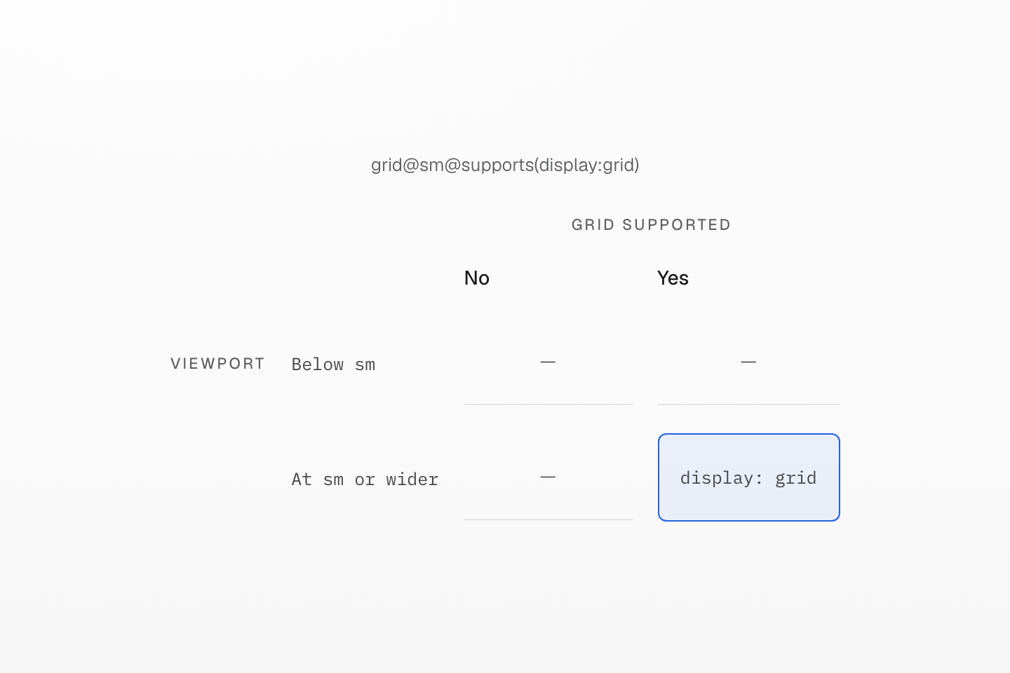
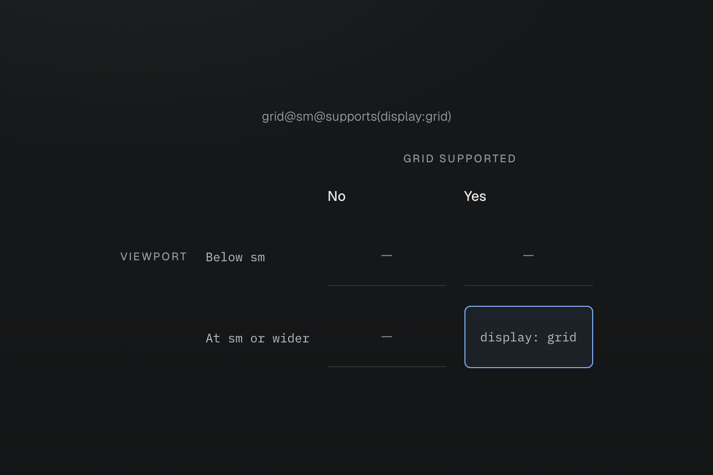
For grid@sm@supports(display:grid), neither condition alone enables the declaration.
Text description
A two-by-two matrix highlights only the intersection where the viewport matches sm and display:grid is supported.
#Follow a component's available space
A card in a sidebar has less room than a card in the main content area, even at the same viewport width. Give its parent container-inline, then put a container condition on the card's layout class. The final example uses (container-name:card) to name that parent and @container(card|width>=28rem) to query it.
The parent establishes the container; the child changes layout. The 28rem threshold is an explicit query value, separate from sizing tokens such as --container-md. Responsive design develops this distinction with named and nested containers.
#Put it together
This card combines the decisions above. It starts in one column; when its named parent reaches 28rem, the link moves beside the text and the padding grows. The link's hover and focus styles remain independent of the layout.
A guide card that fits its space
<section class="container-inline (container-name:card)"> <article class="grid gap-lg p-md r-lg b(1) b-solid b-line-divider bg-surface-raised shadow-sm (grid-template-columns:1fr|auto)@container(card|width>=28rem) p-lg@container(card|width>=28rem)"> <div> <h3 class="m(0) text-lg font-regular fg-text-strong">Reusable styles</h3> <p class="mt-sm mb(0) text-sm fg-text-muted (max-width:38ch)">Keep shared appearance together and local choices in markup.</p> </div> <a href="/guide/reusing-styles" target="_top" class="inline-flex items-center justify-center self-start self-center@container(card|width>=28rem) gap-xs px-md py-xs text-sm (text-decoration-line:none) r-md b(1) b-solid b-line-divider bg-surface-raised fg-text-strong shadow-sm bg-surface-inset:hover outline-offset(3) outline(2):focus-visible outline-solid:focus-visible">Read the guide <span aria-hidden="true">→</span> </a> </article></section>Generated CSS
@layer theme { :root, :host { --color-zinc-5: oklch(96.5% .0011 265); --color-zinc-40: oklch(68.6% .0028 265); --color-zinc-60: oklch(48.6% .003 265); --color-zinc-90: oklch(24.6% .0022 265); --color-zinc-100: oklch(15% .0016 265) } :root, :host { --color-surface-inset: light-dark(var(--color-zinc-5), var(--color-zinc-100)); --color-surface-raised: light-dark(var(--color-white), var(--color-zinc-90)); --color-line-divider: light-dark(oklch(0% 0 none / .12), oklch(100% 0 none / .12)); --color-text-strong: light-dark(var(--color-zinc-100), var(--color-white)); --color-text-muted: light-dark(var(--color-zinc-60), var(--color-zinc-40)) } :root, :host { --color-white: oklch(100% 0 none) } :root, :host { --font-weight-regular: 400; --font-size-sm: .875rem; --font-size-lg: 1.125rem; --text-sm: var(--font-size-sm); --text-sm--line-height: 1.5; --text-sm--letter-spacing: 0; --text-lg: var(--font-size-lg); --text-lg--line-height: 1.5; --text-lg--letter-spacing: 0; --radius-md: .375rem; --radius-lg: .5rem; --spacing-xs: .5rem; --spacing-sm: .75rem; --spacing-md: 1rem; --spacing-lg: 1.5rem } :root, :host { --shadow-sm: 0 0 0 1px light-dark(oklch(0% 0 none / .04), oklch(100% 0 none / .05)), 0 1px 1px -.5px light-dark(oklch(0% 0 none / .045), oklch(0% 0 none / .3)), 0 2px 2px -1px light-dark(oklch(0% 0 none / .04), oklch(0% 0 none / .26)), 0 4px 4px -2px light-dark(oklch(0% 0 none / .04), oklch(0% 0 none / .24)) }}@layer utilities { .text-lg { font-size: var(--text-lg); line-height: var(--text-lg--line-height, normal); letter-spacing: var(--text-lg--letter-spacing, normal) } .text-sm { font-size: var(--text-sm); line-height: var(--text-sm--line-height, normal); letter-spacing: var(--text-sm--letter-spacing, normal) } .items-center { align-items: center } .self-start { align-self: start } .bg-surface-raised { background-color: var(--color-surface-raised) } .b-line-divider { border-color: var(--color-line-divider) } .r-lg { border-radius: var(--radius-lg) } .r-md { border-radius: var(--radius-md) } .b-solid { border-style: solid } .b\(1\) { border-width: calc(1 * 1px) } .shadow-sm { box-shadow: var(--shadow-sm) } .fg-text-muted { color: var(--color-text-muted) } .fg-text-strong { color: var(--color-text-strong) } .container-inline { container-type: inline-size } .grid { display: grid } .inline-flex { display: inline-flex } .font-regular { font-weight: var(--font-weight-regular) } .gap-lg { gap: var(--spacing-lg) } .gap-xs { gap: var(--spacing-xs) } .justify-center { justify-content: center } .m\(0\) { margin: calc(0 * 1px) } .mt-sm { margin-top: var(--spacing-sm) } .mb\(0\) { margin-bottom: calc(0 * 1px) } .outline-offset\(3\) { outline-offset: calc(3 * 1px) } .p-md { padding: var(--spacing-md) } .py-xs { padding-block: var(--spacing-xs) } .px-md { padding-inline: var(--spacing-md) } .\(container-name\:card\) { container-name: card } .\(max-width\:38ch\) { max-width: 38ch } .\(text-decoration-line\:none\) { text-decoration-line: none } .bg-surface-inset\:hover:hover { background-color: var(--color-surface-inset) } .outline-solid\:focus-visible:focus-visible { outline-style: solid } .outline\(2\)\:focus-visible:focus-visible { outline-width: calc(2 * 1px) } @container card (width >= 28rem) { .self-center\@container\(card\|width\>\=28rem\) { align-self: center } } @container card (width >= 28rem) { .p-lg\@container\(card\|width\>\=28rem\) { padding: var(--spacing-lg) } } @container card (width >= 28rem) { .\(grid-template-columns\:1fr\|auto\)\@container\(card\|width\>\=28rem\) { grid-template-columns: 1fr auto } }}Keep complete class names in your source when choosing variants, such as 'p-md' and 'p-lg'. Building a class from fragments such as 'p-' + size does not give a source scanner the complete name. For continuous values, use a native custom property with a fixed class such as (width:var(--progress)). Scanning class names explains source discovery; Rendering modes covers when CSS is generated.
If an expected style is missing, open Generated CSS and check the class first. Then check which element its selector targets, whether its conditions match, the resolved custom properties, and competing rules in the browser. Reordering classes in HTML is not a fix for the cascade.
Continue with Theme tokens to define shared values or Reusing styles to choose between component classes, utilities and mixins. Their complete contracts remain in Reference.