Migrating from Sass
Move Sass variables, maps, mixins, placeholders, and nested component styles toward Master CSS without losing useful CSS structure.
On this page
Sass and Master CSS can coexist. Keep Sass for vendor imports, generated selectors, complex nesting, and styles that read better as CSS. Move repeated visual values and markup-owned component styles into Master CSS when the result is easier to maintain.
This guide covers .scss and .sass projects that use variables, maps, mixins, functions, placeholders, partials, and nested selectors.
CSS @mixin and Sass @mixin share a keyword. Keep Master CSS definitions in .css files, or use the SCSS interpolation pattern when emitting them from Sass. The Sass mixin grammar rejects mixin names beginning with --; a Master CSS definition must reach the Master compiler without being interpreted as a Sass mixin.
#Migration strategy
Start from the Sass entry files the app already builds. Follow the shared migration workflow, and separate compile-time work from values the browser should receive.
| Existing Sass responsibility | Keep or move |
|---|---|
| Product colors, spacing and radii | Move shared values to @theme when their consumers are ready. |
| Loops, generated selectors, vendor imports and functions | Keep Sass as their compiler until there is a deliberate replacement. |
| A repeated declaration group | Use native component CSS or a Master CSS mixin, depending on where it is consumed. |
| Local visual rules | Use markup classes when the result is easier to read. |
| Structural nesting, print rules and complex animations | Keep useful native CSS. |
A Sass variable is resolved during preprocessing; a CSS custom property participates in the browser’s cascade. Moving a value between them changes when and where it can vary, so inspect every use before replacing it.
Let each compiler read its own language
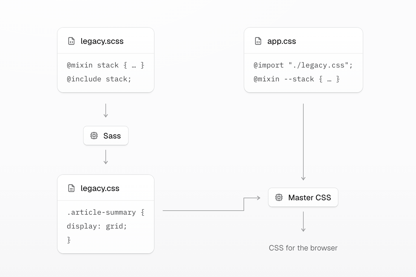
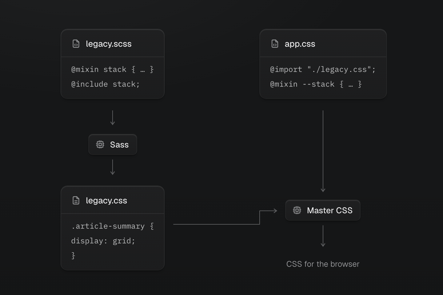
Keep Master CSS definitions in the .css entry. Import Sass’s compiled result, and preserve the same build order during development and production.
Text description
- Preprocess Sass. The Sass compiler expands @mixin stack and @include stack into ordinary CSS.
- Import the output. app.css imports legacy.css after that generated file exists.
- Compile the app entry. Master CSS reads its own definitions in app.css and preserves the imported native rules.
#Add Master CSS beside Sass
Import Master CSS from the stylesheet your app already loads. Keep Sass compilation in place.
@import "@master/css";@import "./legacy.css";Compile the existing Sass entry to legacy.css before Master CSS resolves this import graph. Keep Sass syntax in its own input; the imported result must be ordinary CSS. In a watch setup, keep that ordering too: a Sass edit must update legacy.css before the app CSS is rebuilt. Do not edit the generated file by hand.
Default source discovery is enough for ordinary app files. Add explicit source directives only when the app needs custom include, exclude, safelist, or blocklist behavior.
If Sass currently emits global resets, vendor CSS, or generated selectors, keep those imports while the migration is in progress. Compile-time Sass variables and runtime CSS custom properties have different behavior: keep Sass values used by loops, selector construction or calculations until those uses have a replacement.
#Move variables and maps into @theme
Sass variables and maps that define product values usually become Master CSS theme tokens.
$color-primary: #2563eb;$color-body: #172033;$space-card: 1.5rem;$radius-card: .75rem;@import "@master/css";@theme { --color-primary: #2563eb; --color-body: #172033; --spacing-card: 1.5rem; --radius-card: .75rem;}<article class="b(1) b-solid b-line-divider r-card bg-white fg-body p-card"> ...</article>Use token names that describe the product role. Do not preserve Sass variable names when they were only implementation details.
#Convert local component styles
Move local visual rules into markup when the style belongs to one element or one component instance.
.card { display: grid; gap: 1rem; padding: 1.5rem; border-radius: .75rem; background: #fff; color: #172033;}export function Card({ children }: { children: React.ReactNode }) { return ( <section className="grid gap-md r-card bg-white fg-body p-card"> {children} </section> )}Keep Sass or regular CSS when the selector describes document structure, generated content, print rules, complex animation timelines, or third-party markup.
#Replace placeholders and mixins intentionally
Sass placeholders and mixins often represent either product roles or low-level primitives. Choose the Master CSS target based on ownership.
Use @layer components for product roles. Keep the @theme values from the previous example in the same project entry:
@import "@master/css";@layer components { .card { display: grid; border-radius: var(--radius-card); gap: var(--spacing-md); padding: var(--spacing-card); border: 1px solid var(--color-line-divider); background-color: oklch(100% 0 none); color: var(--color-body); box-shadow: var(--shadow-sm); } .btn { display: inline-flex; align-items: center; justify-content: center; border-radius: var(--radius-md); gap: var(--spacing-xs); padding-inline: var(--spacing-md); background-color: var(--color-primary); color: oklch(100% 0 none); min-height: 2.5rem; }}<article class="card">...</article><button type="button" class="btn">Save</button>Use @utility for reusable class recipes; use @mixin when declarations need reuse inside CSS rules:
@utility content-auto { content-visibility: auto; contain-intrinsic-size: auto 32rem;}<section class="content-auto">...</section>For a repeated declaration group that should stay in CSS, replace @include with a Master CSS mixin application:
@mixin stack { display: grid; gap: 1rem;}.article-summary { @include stack;}@mixin --stack { display: grid; gap: var(--spacing-md);}.article-summary { @apply --stack;}Keep this definition in the Master CSS .css entry. It does not create a stack utility class; @utility owns that separate job.
Keep Sass mixins when they generate many selectors, encode browser workarounds, or produce CSS that would be harder to understand as classes.
#Keep useful nesting as CSS
Nested Sass can map cleanly to Master CSS states when the target is a single element.
<button type="button" class="bg-blue-60 fg-white bg-blue-70:hover (opacity:.5):disabled"> Save</button>Keep nested selectors in CSS when they express internal structure:
.article-content { h2 { margin-top: 2rem; } pre code { white-space: pre; }}Project theme variables are available automatically after Sass preprocessing in the Vite, Next.js, and Webpack integrations.
.article { display: grid; gap: var(--spacing-lg);}#Validate the migration
- Run the Sass compiler, formatter, linter, type check, tests, and production build after each batch.
- Compare converted pages in responsive breakpoints, dark mode, hover, focus-visible, disabled, and print states.
- Keep Sass for vendor imports, generated CSS, complex nesting, mixins with browser workarounds, and one-off rules that are clearer as CSS.
- Remove Sass packages and build configuration only after no imported stylesheet, component, or package still depends on Sass.
#Useful references
- Installation for adding Master CSS.
- Rendering modes for choosing static, runtime, or progressive rendering.
- Style declarations for class syntax.
- Theme tokens for tokens, Variables and modes for modes, and Conditions for query syntax.
- CSS directives for
@theme,@mixinand@reference; Cascade layers for native component layers. - Route-level styles for local CSS files that use project definitions and native declarations.
- Global styles for deciding between markup classes, theme tokens, custom utilities, and component classes.