Migrating from CSS and CSS Modules
Move global CSS and CSS Modules toward Master CSS where class strings, tokens, or composition make the result easier to maintain.
On this page
Regular CSS and CSS Modules can coexist with Master CSS for as long as the project needs. Treat migration as a cleanup pass, not a rule that every declaration must become a class.
Move repeated, visual, markup-owned styles into Master CSS classes. Keep global resets, vendor styles, complex selectors, generated CSS, and hard-to-read one-off rules in regular CSS.
#Migration strategy
Choose a small component whose original CSS and rendered states you can inspect. Follow the shared migration workflow for the baseline and batch checks; this guide focuses on deciding which declarations belong in markup and which local CSS contracts should remain.
A useful first batch has stable visual declarations and no vendor selectors. Keep a module when its local class name is an API, when it targets internal structure, or when replacing it would spread complicated selectors across call sites.
Change the authoring, preserve the result
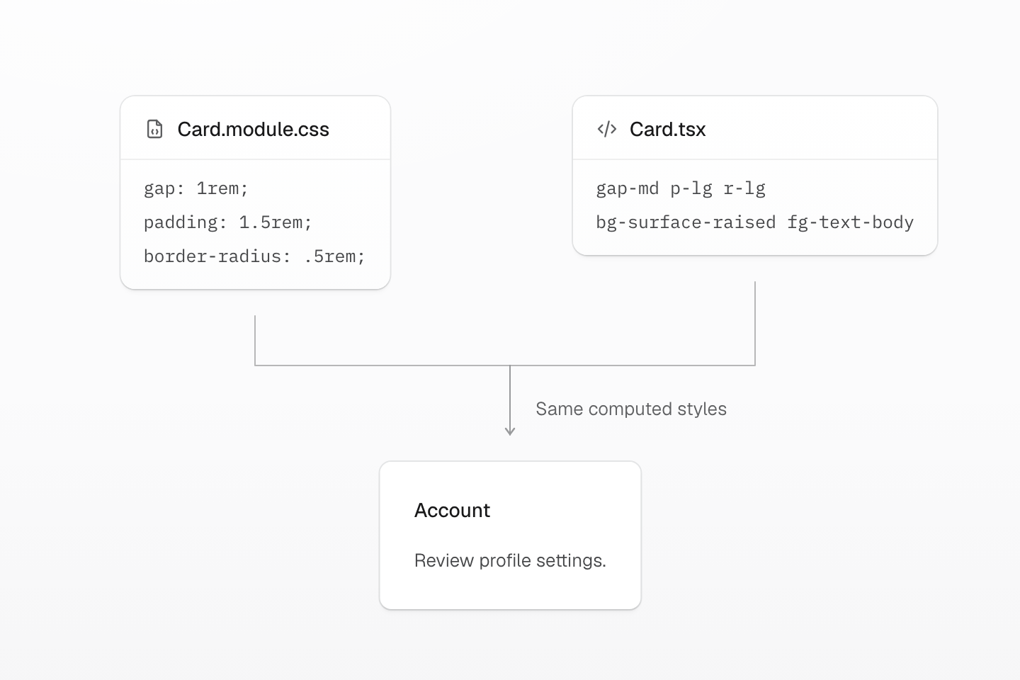
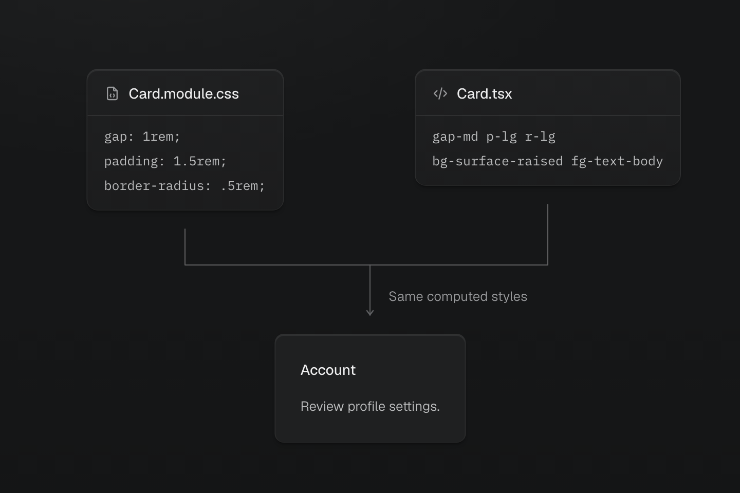
Compare the declarations and computed result. A similarly named token is not enough: the value, scheme and interaction state must match.
Text description
- Start from values. The CSS rule supplies 1rem gap, 1.5rem padding and 0.5rem radius.
- Match the preset. gap-md, p-lg and r-lg supply those values. Both versions use the same surface and text roles.
- Preserve the result. The card keeps its layout, content and colors. Only the location of its styling decisions changes.
#Add Master CSS beside existing CSS
Keep the current CSS files loaded while Master CSS starts generating rules for new or converted markup. Check the cascade before deleting a local rule: unlayered legacy declarations outrank normal layered utilities, even when the Master CSS import appears later. Retaining both selectors on the same element can therefore mask the conversion.
@import "@master/css";Default source discovery is enough for most projects. Add @source, @source not, @safelist, or @blocklist only when the migration needs explicit scan boundaries or classes that are not present as complete source strings.
Use Rendering modes to decide whether the project should use static rendering, runtime rendering, or progressive rendering before converting many files.
#Convert local CSS to markup classes
Move local visual declarations into markup when the class list is easier to review than a separate selector. This example already uses the shared surface and text roles from the installed preset; the conversion keeps them unchanged.
.card { display: grid; gap: 1rem; padding: 1.5rem; border-radius: .5rem; background: var(--color-surface-raised); color: var(--color-text-body);}export function Card({ children }: { children: React.ReactNode }) { return ( <section className="grid gap-md p-lg r-lg bg-surface-raised fg-text-body"> {children} </section> )}The same card with two styling approaches
Prefer named theme tokens such as bg-surface-card, p-card, or r-card when the value is a product decision. Prefer direct native declaration classes such as (scroll-margin-top:4rem) when the CSS property is clearer than inventing a new abstraction.
#Keep CSS Modules when they are the component API
CSS Modules are still useful when a component exposes a stable local class name, needs selectors that target internal structure, or uses project tokens in local variants.
Vite, Next.js, and Webpack supply project theme definitions to local stylesheets automatically. Native declarations emit their required variables without importing the app CSS output again.
.button { display: inline-flex; align-items: center; justify-content: center; border-radius: var(--radius-md); gap: var(--spacing-xs); padding-inline: var(--spacing-md); background-color: var(--color-blue-60); color: oklch(100% 0 none); min-height: 2.5rem;}.button:disabled { opacity: 0.5; pointer-events: none;}import styles from './Button.module.css'export function Button(props: React.ButtonHTMLAttributes<HTMLButtonElement>) { const { className, type = 'button', ...buttonProps } = props return <button className={[styles.button, className].filter(Boolean).join(' ')} type={type} {...buttonProps} />}Use this pattern when removing the module would force too many call sites to change at once. Convert the module away later if the local class stops adding value.
The module above is unlayered, so its normal declarations outrank layered utilities passed through className. If callers should override a component default with utilities, place those defaults in @layer components and verify the resulting cascade.
This wrapper defaults to type="button"; pass type="submit" for form submission. Preserve an existing component's ref forwarding and event contract when adopting the wrapper.
#Move shared values into @theme
Project-owned custom properties usually belong in @theme before large-scale class conversion. That lets markup use token names instead of hard-coded values.
@import "@master/css";@theme { --color-surface-card: var(--color-surface-raised); --color-body: var(--color-text-body); --spacing-card: 1.5rem; --radius-card: .5rem;}<article class="grid r-card fg-body grid-cols(3)@md bg-surface-card p-card"> ...</article>Keep plain CSS custom properties when the value is runtime-owned, component-private, or intentionally outside the design system.
<div className="(width:var(--progress)) bg-blue-60" style={{ '--progress': `${value}%` } as React.CSSProperties} />#Validate the migration
Review each batch as both code and UI.
- Run the project's formatter, linter, type check, tests, and production build.
- Use Code linting to validate Master CSS class strings.
- Compare migrated screens in light mode, dark mode, responsive breakpoints, hover and focus states.
- Keep CSS for selectors, animations, and vendor output that would become harder to understand as class strings.
- Remove old CSS only after no component or page still depends on it.
#Useful references
- Installation for adding Master CSS to a project.
- Rendering modes for choosing static, runtime, or progressive rendering.
- Style declarations for class syntax.
- Theme tokens for
@themetokens, Variables and modes for modes, and Conditions for query syntax. - CSS directives for
@reference,@source,@safelist, and@blocklist. - Route-level styles for local CSS Modules and route styles that compose project context.
- Global styles for deciding between markup utilities, theme tokens, custom utilities, and component classes.