Migrating from Bootstrap
Move Bootstrap-styled screens toward Master CSS while preserving vendor CSS, JavaScript-driven components, and cascade-dependent overrides.
On this page
Bootstrap and Master CSS can run side by side. Keep Bootstrap loaded while existing markup still depends on its grid, utilities, components, JavaScript behavior, Sass variables, or selector overrides. Convert one screen or component family at a time, then remove Bootstrap only after the product no longer relies on it.
This guide focuses on app-owned Bootstrap usage. Vendor markup, third-party plugins, generated HTML, and Bootstrap JavaScript components can stay on Bootstrap until the project has a deliberate replacement.
#Migration strategy
Follow the shared migration workflow, starting with app-owned layout around existing widgets. Keep Bootstrap CSS, JavaScript and Sass output while any remaining component depends on them.
Before converting a screen, identify three boundaries:
- Values: inspect customized
$spacers,$grid-breakpointsand container widths. A matching scale name does not imply a matching value. - Selectors: keep vendor markup and overrides tied to Bootstrap internals together until that component is replaced.
- Behavior: leave modals, dropdowns and collapse regions on Bootstrap until focus handling, ARIA state and events have an explicit replacement.
The first useful result is a converted layout around working components. Removing the dependency comes after those components have a replacement.
Preserve the threshold, not its name
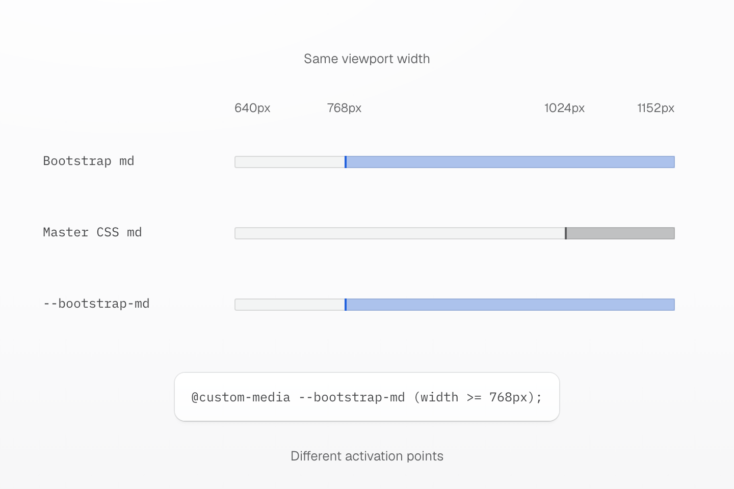
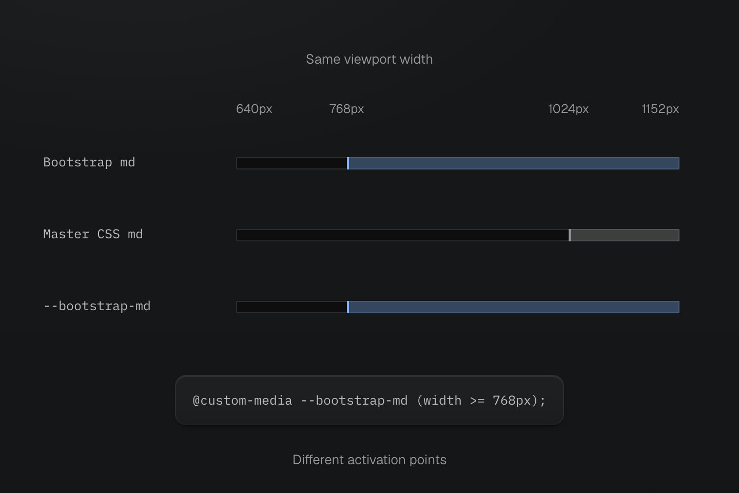
This comparison uses Bootstrap 5.3 defaults and a 16px initial font size. Read the installed theme before translating a breakpoint name.
Text description
- Original threshold. Bootstrap 5.3 md starts at 768px unless the Sass configuration changes it.
- Different preset. Master CSS md starts at 64rem, shown as 1024px here. Reusing the name would change the layout boundary.
- Explicit migration condition. Define --bootstrap-md at 768px and use grid-cols(3)@bootstrap-md to keep the original threshold.
#Add Master CSS beside Bootstrap
Import Master CSS from the stylesheet your app already loads. Do not remove Bootstrap imports yet.
@import "bootstrap/dist/css/bootstrap.css";@import "@master/css";Default source discovery is enough for ordinary app files. Add explicit source directives only when the app needs custom include, exclude, safelist, or blocklist behavior.
Import order alone does not put unlayered Bootstrap rules below normal layered utilities. To give Master CSS components and utilities precedence, declare the layer order before importing Bootstrap into defaults:
@layer theme, base, defaults, components, utilities;@import "bootstrap/dist/css/bootstrap.css" layer(defaults);@import "@master/css";This changes cascade behavior. Compare existing overrides in the browser before adopting it across the application. Bootstrap utilities may also use !important; normal Master CSS declarations do not override those merely because they are in a later layer.
#Move Bootstrap Sass values into @theme
Bootstrap Sass variables often contain product decisions. Move those decisions into Master CSS tokens when they should be used by markup outside Bootstrap components.
$primary: #2563eb;$body-color: #172033;$border-radius: .5rem;$spacer: 1rem;@import "@master/css";@theme { --color-primary: #2563eb; --color-body: #172033; --radius-control: .5rem; --spacing-page: 1rem;}<section class="bg-white fg-body p-page r-control"> ...</section>Do not assume Bootstrap's scale names match the Master CSS preset. Move the values that matter to the product, then choose Master CSS token names that describe their role.
#Convert grid and utility classes
Start with layout wrappers and simple utility-only markup.
Instead of preserving Bootstrap class spelling, preserve layout intent:
<!-- Before: container py-5 --><!-- Before: row g-4 --><!-- Before: col-md-4 -->Bootstrap's default md breakpoint starts at 768px; Master CSS's preset md starts at 64rem. Keep the original column threshold with a named condition in the app CSS entry:
@custom-media --bootstrap-md (width >= 768px);<section class="w-full max-w-6xl mx-auto px-md py-2xl"> <div class="grid gap-lg grid-cols(3)@bootstrap-md"> <article class="p-lg b(1) b-solid b-line-divider r-lg bg-white fg-body"> ... </article> </div></section>This preserves the three-column threshold while choosing a new container width and grid gap. Check 767px and 768px with three real items; copying @md would leave them stacked until 64rem in the preset. Compare those dimensions before replacing Bootstrap's container and gutter rules. The explicit fg-body keeps the fixed white card paired with the product's dark text color.
Use native declaration syntax when it is clearer than a utility alias:
<div class="(scroll-margin-top:4rem) contents@md"> ...</div>Keep Bootstrap layout classes in templates that still need Bootstrap's container widths, gutter assumptions, or component internals.
#Convert simple components
Buttons, cards, alerts, and badges are often app-owned visual patterns. Convert them to markup classes or Master CSS component classes when the project owns the behavior. Use a new class name during coexistence so the replacement does not change untouched Bootstrap buttons. Keep the theme tokens defined above.
@import "@master/css";@layer components { .action-button { display: inline-flex; align-items: center; justify-content: center; border-radius: var(--radius-control); gap: var(--spacing-xs); padding-inline: var(--spacing-md); background-color: var(--color-primary); color: oklch(100% 0 none); min-height: 2.5rem; &:hover { background-color: var(--color-blue-70); } &:disabled { opacity: 0.5; } } .panel { border-radius: var(--radius-lg); padding: var(--spacing-lg); border: 1px solid var(--color-line-divider); background-color: oklch(100% 0 none); box-shadow: var(--shadow-sm); color: var(--color-body); }}<button type="button" class="action-button">Save</button><article class="panel">...</article>Keep Bootstrap components when they still provide behavior, accessibility, or internal structure, such as dropdowns, modals, tabs, carousels, and collapse regions. You can still add a small Master CSS class to a Bootstrap root element when the component forwards the class and the cascade is clear.
#Preserve JavaScript-driven components
Bootstrap JavaScript components are not just CSS. Depending on the component, they manage focus, ARIA attributes, transitions, body scroll locks, Popper positioning and events. Use the component’s JavaScript API to inventory the behavior that must survive.
Keep markup with data-bs-* attributes on Bootstrap until the replacement behavior has been implemented and tested. Convert only the surrounding layout or product-owned wrappers first.
<section class="grid gap-md"> <!-- Bootstrap modal trigger and modal markup can remain unchanged here. --></section>When a component is replaced, remove its Bootstrap JavaScript import and related data attributes in the same reviewable batch.
#Handle overrides and vendor CSS
Many Bootstrap projects rely on selector overrides such as component state classes, nested markup selectors, or specificity fixes. Do not translate those blindly.
Keep the override as CSS when it targets Bootstrap internals:
.navbar .dropdown-menu { min-width: 16rem;}Move the override to Master CSS only after the markup is app-owned:
<nav class="flex items-center gap-md"> <div class="min-w-3xs">...</div></nav>Vendor CSS and third-party Bootstrap themes should remain regular CSS until the project replaces the vendor contract.
#Validate the migration
- Run the project's formatter, linter, type check, tests, and production build after each batch.
- Compare pages that used Bootstrap grid, container, form, modal, dropdown, collapse, tooltip, popover, and responsive utilities.
- Test hover, focus-visible, disabled, expanded, selected, validation, and dark-mode states if the project supports them.
- Keep Bootstrap loaded until no remaining template, component, plugin, or override depends on it.
- Remove Bootstrap Sass, CSS, JavaScript imports, and packages only after the full validation suite passes.
#Useful references
- Installation for adding Master CSS.
- Rendering modes for choosing static, runtime, or progressive rendering.
- Style declarations for class syntax.
- Theme tokens for tokens, Variables and modes for modes, and Conditions for query syntax.
- Global styles for deciding between markup classes, theme tokens, custom utilities, and component classes.
- Code linting for validating class strings during migration.