Migrating from Material UI
Move Material UI projects toward Master CSS by migrating app-owned layout, sx styles, theme tokens, and overrides without breaking component behavior.
On this page
Material UI and Master CSS can coexist. Most projects should migrate app-owned layout, product surfaces, and repeated sx styles first, while keeping Material UI components where their accessibility, state management, slots, and JavaScript behavior still provide value.
Do not treat this as a component-for-component rewrite. A good migration often keeps Button, Dialog, Menu, Select, DataGrid, or theme-driven component overrides until the product has a deliberate replacement.
#Migration strategy
Use the shared migration workflow for each app-owned surface. Keep ThemeProvider, CssBaseline, Emotion cache and SSR setup while Material UI still needs them.
Choose the boundary before translating sx:
| Styling belongs to… | Migrate or retain |
|---|---|
| An app-owned layout wrapper | Convert static sx values after resolving the actual theme scale. |
| A repeated product surface | Define shared tokens and, if useful, a native component class. |
| A MUI slot or owner-state variant | Keep slotProps, classes, styleOverrides or the existing wrapper with its component. |
| A dialog, menu, select or data grid | Preserve its component behavior and test focus, keyboard and state before considering a replacement. |
Many projects stop at coexistence: Master CSS owns app layout and custom surfaces, while Material UI continues to own interactive widgets.
Resolve the theme before choosing a token
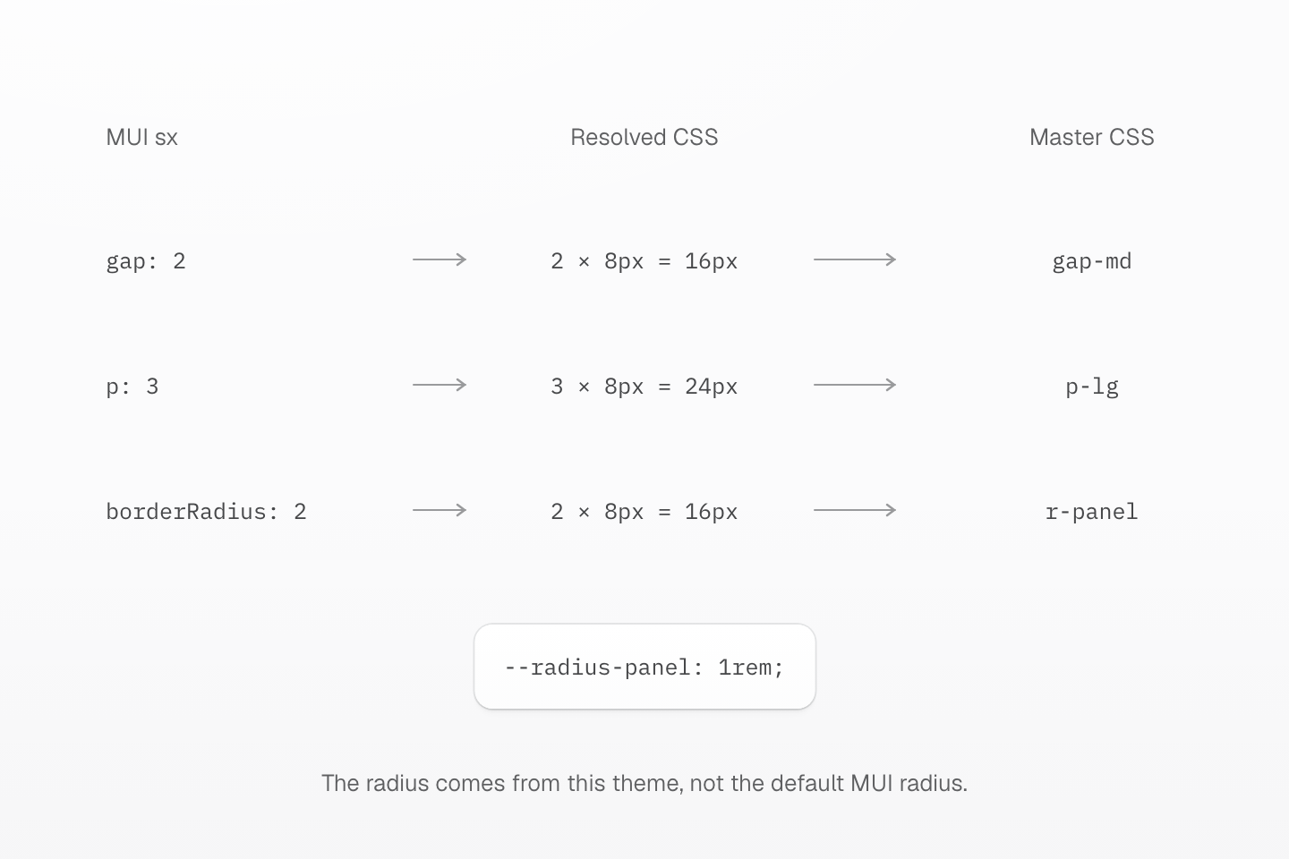
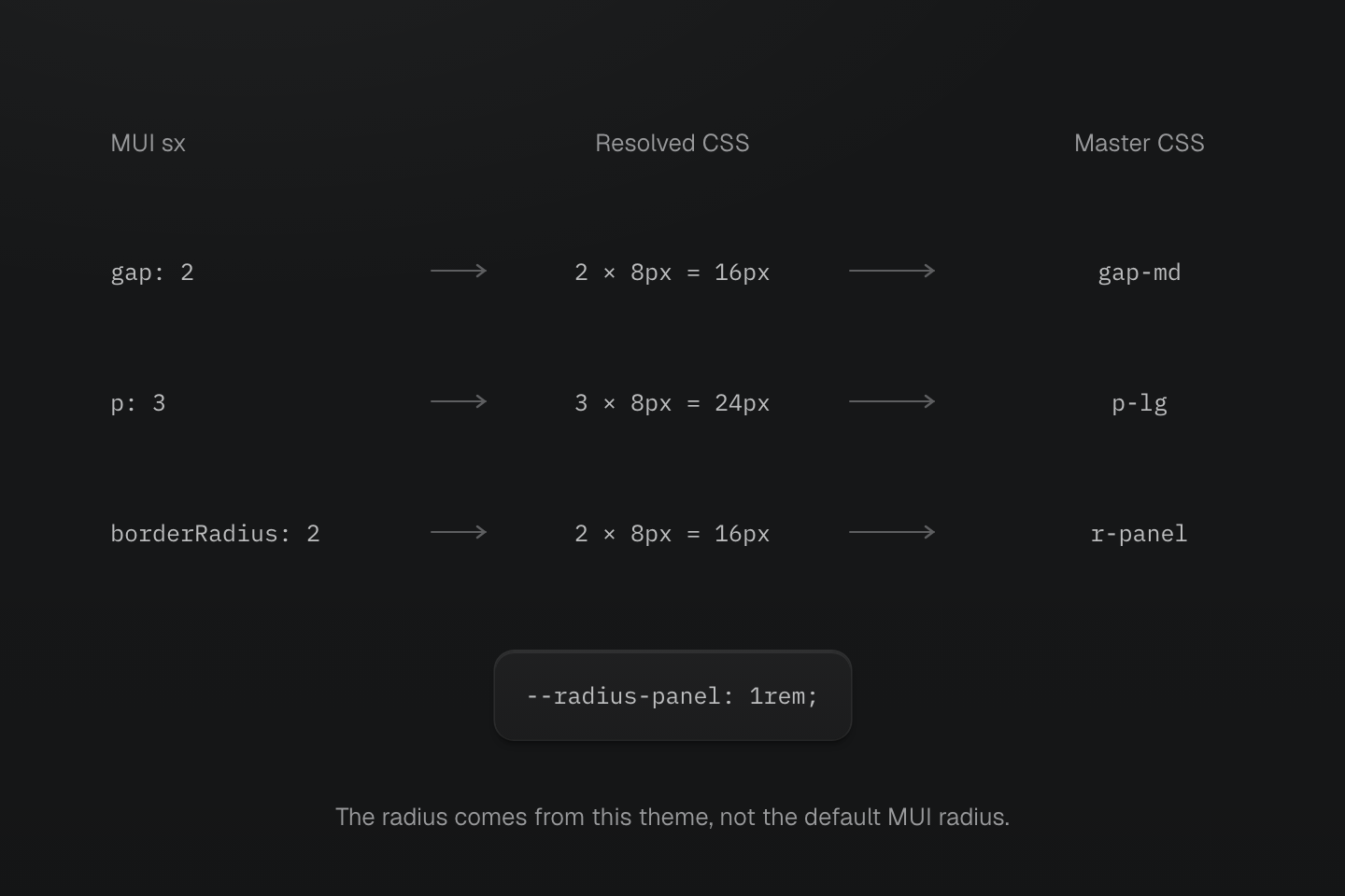
The example uses default 8px spacing, an explicit 8px base radius and a 16px root font size. The same number in sx does not always mean the same CSS length.
Text description
- Resolve spacing. With the default spacing function, gap: 2 is 16px and p: 3 is 24px.
- Resolve shape. The article sets theme.shape.borderRadius to 8px, so borderRadius: 2 produces 16px.
- Choose matching tokens. gap-md and p-lg match the spacing at a 16px root size. A custom --radius-panel: 1rem supplies r-panel.
#Add Master CSS beside Material UI
Import Master CSS from the app stylesheet and keep the current Material UI providers in place.
@import "@master/css";Default source discovery is enough for most projects. Add explicit source directives only when the app needs custom include, exclude, safelist, or blocklist behavior.
Use Rendering modes before a large migration. Start with the default static rendering: write complete class strings in components, toggle known classes for state, and pass changing values through CSS variables. Choose runtime or progressive rendering only when the app creates new class names in the browser.
#Move theme values into @theme
Start with product-owned values that should be shared outside Material UI components.
import { createTheme } from '@mui/material/styles'export const theme = createTheme({ palette: { primary: { main: '#2563eb' }, background: { paper: '#ffffff' }, text: { primary: '#172033' } }, shape: { borderRadius: 8 }})@import "@master/css";@theme { --color-primary: #2563eb; --color-surface: #ffffff; --color-body: #172033; --radius-control: .5rem; --radius-panel: 1rem;}<section class="b(1) b-solid b-line-divider fg-body bg-surface r-control"> ...</section>Do not assume Material UI spacing, breakpoint, radius, or palette scales match the Master CSS preset. Move product tokens intentionally, then review any default-token substitutions.
#Convert app-owned sx
Start with sx blocks that style layout wrappers, cards, sections, and simple product UI.
import Box from '@mui/material/Box'export function DashboardPanel({ children }: { children: React.ReactNode }) { return ( <Box component="section" sx={{ display: 'grid', gap: 2, p: 3, borderRadius: 2, bgcolor: 'background.paper', color: 'text.primary' }}> {children} </Box> )}export function DashboardPanel({ children }: { children: React.ReactNode }) { return ( <section className="grid gap-md p-lg bg-surface fg-body r-panel"> {children} </section> )}With the default spacing function, gap: 2 resolves to 16px and p: 3 to 24px. The converted preset values match at a 16px root font size. With the theme above, MUI’s borderRadius: 2 multiplies the 8px base radius to 16px. r-panel expresses that panel role as 1rem; compare the result at the application’s root font size. A customized spacing function needs its own mapping. The example keeps the same section element and explicit surface/text pair so these changes do not obscure the scale comparison.
Keep Material UI components for their behavior and style app-owned wrappers first:
<div className="flex justify-flex-end"> <Button variant="contained">Save</Button></div>Normal unlayered Material UI/Emotion rules outrank layered Master CSS utilities, regardless of import order. Forwarding className alone does not guarantee an override. Keep sx, slotProps, or classes for component internals until the project has deliberately configured and verified its cascade layers.
#Convert repeated patterns to component classes
When many sx blocks encode the same product role, move that role into a Master CSS component class. Keep the product tokens defined above in the same CSS entry.
@import "@master/css";@layer components { .panel { border-radius: var(--radius-panel); padding: var(--spacing-lg); border: 1px solid var(--color-line-divider); background-color: var(--color-surface); box-shadow: var(--shadow-sm); color: var(--color-body); } .toolbar { display: flex; align-items: center; gap: var(--spacing-sm); min-height: 3rem; }}<section className="panel"> <div className="toolbar"> ... </div></section>Prefer component classes for project-owned roles. Keep Material UI theme variants for Material UI components that remain part of the design system.
#Handle responsive and state styles
Translate static responsive sx into conditions with the same threshold. The default Material UI md starts at 900px; Master CSS’s preset md starts at 64rem. Define a condition for the original threshold rather than copying the name.
<Box sx={{ display: 'grid', gridTemplateColumns: { xs: '1fr', md: 'repeat(3, 1fr)' }, gap: 2 }} />@custom-media --mui-md (width >= 900px);<section class="grid (grid-template-columns:1fr) gap-md (grid-template-columns:repeat(3,1fr))@mui-md"> ...</section>For component state, prefer the native state or attribute when it belongs to your markup.
<button type="button" class="bg-blue-60 fg-white bg-blue-70:hover (opacity:.5):disabled"> Save</button>Keep MUI state classes such as selected, expanded, focused, or error styling in MUI overrides when they target internal slots or behavior that the app does not own.
#Validate the migration
- Run formatter, lint, type check, tests, and production build after each batch.
- Compare important screens in light mode, dark mode, responsive breakpoints, hover, focus-visible, disabled, selected, and loading states.
- Test dialogs, menus, selects, popovers, portals, transitions, and focus traps before removing any Material UI component.
- Keep Emotion cache and SSR setup until no remaining Material UI or Emotion path needs it.
- Remove Material UI packages only after replacing both visual styling and component behavior.
#Useful references
- Installation for adding Master CSS.
- Rendering modes for choosing CSS delivery.
- Style declarations for class syntax.
- Theme tokens for shared values, Responsive design for breakpoints, and Variables and modes for modes.
- Global styles for markup utilities, component classes, and custom utilities.