Migrating from CSS-in-JS
Move styled-components and Emotion styles to Master CSS by converting static styles, preserving dynamic values, and keeping reusable component contracts explicit.
On this page
CSS-in-JS migrations are most successful when static visual styles move first and runtime behavior moves last. Styled Components and Emotion can stay in the project while Master CSS takes over class-based styling one component family at a time.
This guide covers styled-components, @emotion/react, and @emotion/styled. It does not require deleting CSS-in-JS from components that still need runtime-generated selectors or values.
#Migration strategy
Use the shared migration workflow to establish a baseline, then separate the jobs currently mixed into each styled wrapper:
| Input | Destination | What stays in the component |
|---|---|---|
| Static declarations | Complete markup classes or @layer components | DOM structure and event handlers |
| A finite visual variant | A map of complete class strings | The public variant prop and its default |
| A continuously changing value | A CSS custom property passed through style | Measurement, validation and state |
| Generated selectors or keyframes | Existing CSS-in-JS until a clear replacement exists | The runtime logic that creates them |
Inspect as, refs, prop filtering and SSR setup before replacing a wrapper. A component with a small style block can still have a large public contract.
One class, changing values
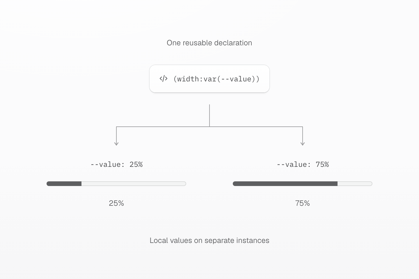
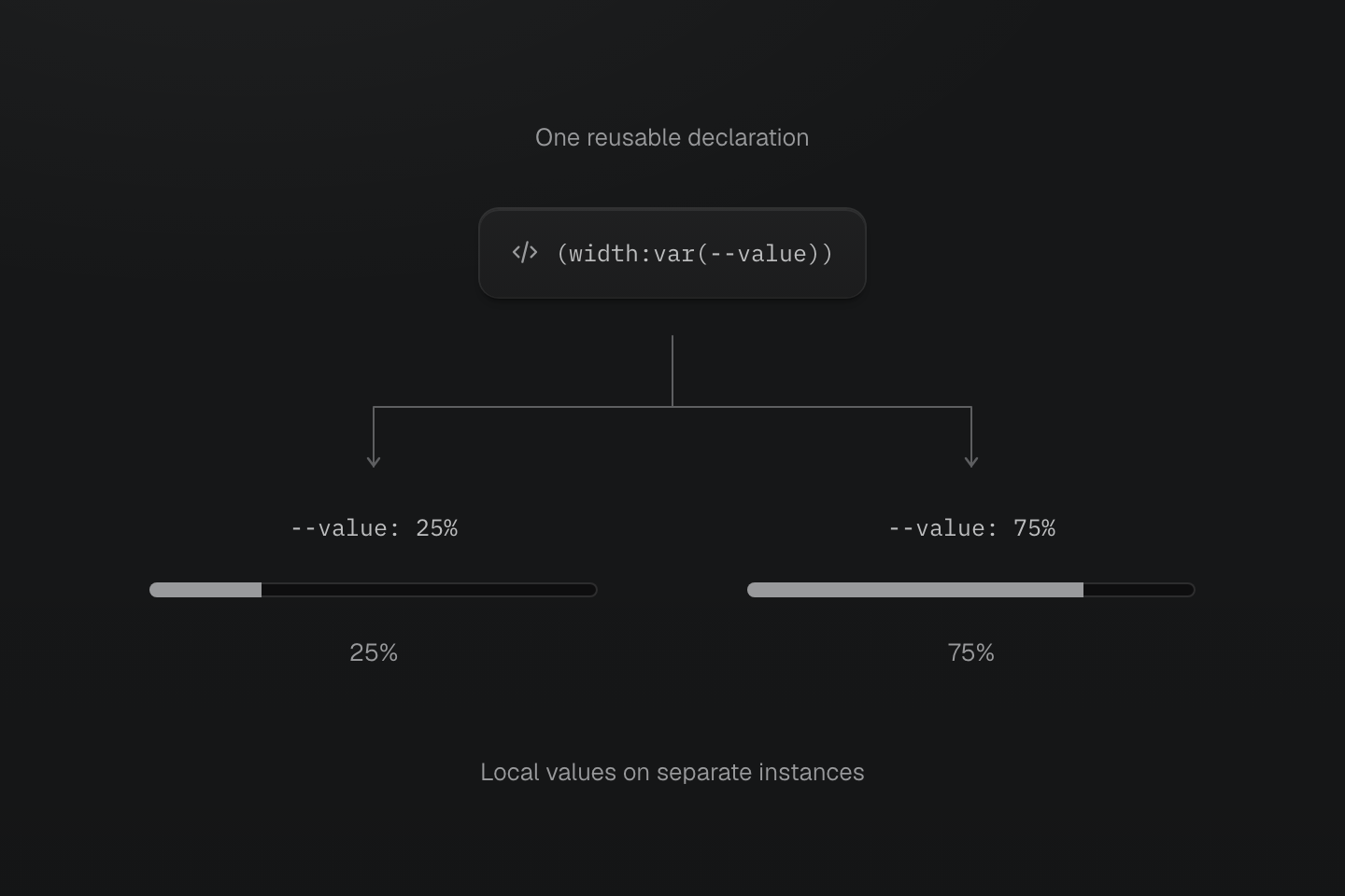
Pass changing data through a custom property. Keep the complete class string visible to the scanner and keep state validation in the component.
Text description
- Stable class. Both instances request (width:var(--value)). No percentage is interpolated into a class name.
- Local data. Each instance sets --value on its own element, so the same declaration produces a different width.
- Preserved behavior. The component still clamps the value and supplies the matching aria-valuenow.
#Convert static styled components
Start with wrappers that only apply stable visual styles.
import styled from 'styled-components'const Button = styled.button` display: inline-flex; align-items: center; gap: .5rem; min-height: 2.5rem; padding: 0 1rem; border-radius: .5rem; background: ${({ theme }) => theme.colors.primary}; color: white;`Move the reusable value into @theme, then use a class string where the button is rendered.
@import "@master/css";@theme { --color-primary: #2563eb;}export function Button(props: React.ButtonHTMLAttributes<HTMLButtonElement>) { const { className, type = 'button', ...buttonProps } = props return ( <button className={['inline-flex items-center gap-xs (min-height:2.5rem) py(0) px-md r-lg bg-primary fg-white', className].filter(Boolean).join(' ')} type={type} {...buttonProps} /> )}The original .5rem radius maps to the preset r-lg, not r-md. Compare computed values when replacing literals with named tokens. This wrapper defaults to type="button"; pass type="submit" when it submits a form. Check existing form call sites because a native button without a type defaults to submission.
This example replaces a visual wrapper. Preserve any existing ref forwarding, polymorphic as prop, or event behavior separately before replacing a component with a wider contract.
If the project needs a named component class, keep the @theme block above and add a component layer below it:
@import "@master/css";@layer components { .btn { display: inline-flex; align-items: center; justify-content: center; border-radius: var(--radius-lg); gap: var(--spacing-xs); padding-block: 0; padding-inline: var(--spacing-md); background-color: var(--color-primary); color: oklch(100% 0 none); min-height: 2.5rem; &:hover { background-color: var(--color-blue-70); } &:disabled { opacity: 0.5; } }}<button type="button" class="btn">Save</button>#Convert variants to class maps
Avoid building Master CSS class names from string fragments. Static rendering and linting work best with complete class strings.
const toneClasses = { neutral: 'bg-surface-base fg-text-body b-line-divider b-solid b(1)', primary: 'bg-blue-60 fg-white bg-blue-70:hover', danger: 'bg-red-70 fg-white bg-red-80:hover'}const sizeClasses = { sm: '(min-height:2rem) px-sm font-sm', md: '(min-height:2.5rem) px-md font-sm', lg: '(min-height:3rem) px-lg font-md'}type ButtonProps = React.ButtonHTMLAttributes<HTMLButtonElement> & { tone?: keyof typeof toneClasses size?: keyof typeof sizeClasses}export function Button({ tone = 'neutral', size = 'md', className, type = 'button', ...props }: ButtonProps) { return ( <button className={['inline-flex items-center r-md', sizeClasses[size], toneClasses[tone], className].filter(Boolean).join(' ')} type={type} {...props} /> )}The wrapper consumes tone and size before spreading the remaining native props. Preserve this filtering when replacing styled-components transient props or shouldForwardProp: style-only props should not leak onto a native element. If the old public API uses $tone, retain that spelling until call sites are deliberately migrated.
When a variant controls more than visual styles, keep the prop and only migrate the visual declarations. Minimum heights let labels wrap or enlarge without forcing the control into a fixed-height box.
Appending className preserves the caller's classes; it does not make them win over conflicting utilities. HTML class order does not decide the cascade. Use the variant props to select one value, or put overridable defaults in @layer components so caller utilities can override them.
#Use CSS variables for dynamic values
Runtime values should not become generated class names. Keep the class static and pass the changing value through a CSS variable. This follows the same separation described in Emotion’s guidance for dynamic styles: the changing value belongs to the element, while the reusable declaration stays stable.
export function Meter({ value }: { value: number }) { const percent = Number.isFinite(value) ? Math.max(0, Math.min(100, value)) : 0 return ( <div role="progressbar" aria-label="Progress" aria-valuemin={0} aria-valuemax={100} aria-valuenow={percent} className="overflow-hidden (height:0.5rem) pill bg-surface-inset"> <div className="h-full (width:var(--value)) bg-text-muted (transition-property:width) (transition-duration:var(--duration-fast))@motion-safe (transition-timing-function:var(--easing-smooth))" style={{ '--value': `${percent}%` } as React.CSSProperties} /> </div> )}At 25% and 75%, the inner element still uses (width:var(--value)); only --value changes. The clamped number also feeds aria-valuenow, so the visual and accessible values agree.
Keep CSS-in-JS for cases where the component must create selectors, keyframes, or style blocks from runtime data that cannot be represented clearly with CSS variables.
#Move global styles carefully
Global styles often contain real app infrastructure. Move them in small groups.
import { Global, css } from '@emotion/react'export function GlobalStyles() { return <Global styles={css` body { margin: 0; background: var(--color-surface-base); } `} />}@import "@master/css";@layer base { body { margin: 0; }}@layer defaults { body { background: var(--color-surface-base); }}Keep CSS-in-JS global styles until the replacement CSS entry is loaded in every route, shell, and server-rendered path that previously received them.
#Validate the migration
- Run formatter, lint, type check, tests, and production build after each batch.
- Compare server-rendered output if the CSS-in-JS setup had SSR extraction or hydration logic.
- Check dark mode, responsive breakpoints, hover, focus-visible, disabled, selected, and polymorphic
asstates. - Remove Babel plugins, Emotion cache setup, styled-components SSR wiring, and package dependencies only after no remaining component needs them.
#Useful references
- Installation for adding Master CSS to a project.
- Rendering modes for static, runtime, and progressive rendering.
- Style declarations for class syntax.
- Theme tokens for design tokens and Variables and modes for modes.
- Scanning class names for class maps and static extraction.
- Global styles for choosing markup classes, theme tokens, custom utilities, and components.