Migrating from shadcn/ui
Move shadcn/ui components to Master CSS while their primitives keep behavior, the theme variables stay shared, and caller overrides resolve through cascade layers.
On this page
shadcn/ui copies component source into your project. Each component combines Tailwind CSS classes, cva variants, a cn() helper built on tailwind-merge, theme variables in :root and .dark, and a primitive from Radix UI, Base UI or React Aria. Master CSS can take over the styling while the primitive keeps its focus management, keyboard handling, ARIA attributes and state.
Master CSS does not read Tailwind class syntax, so the components are rewritten rather than reused as they are. Keep Tailwind building the components you have not converted, convert one component at a time, and remove Tailwind after the last one. This guide covers the parts specific to shadcn/ui; Migrating from Tailwind CSS covers utilities, variants and theme values in general.
#Migration strategy
Use the shared migration workflow for baselines, batches and removal checks. A shadcn/ui component has these parts:
| Part | Migrate or keep |
|---|---|
| Radix UI, Base UI or React Aria primitive | Keep it. It owns focus, keyboard behavior, ARIA and the state attributes your styles select. |
Theme variables in :root and .dark | Keep the variables and map them to Master CSS tokens with @theme inline. |
cva base classes and variants | Move them into @layer components, selected by the component's data-* attributes. |
cn() and tailwind-merge | Let the cascade layer resolve caller overrides; cn() no longer needs to remove classes. |
tw-animate-css classes | Replace them with native keyframes selected by the primitive's open and closed states. |
| Components added by the shadcn CLI | Treat new output as unconverted Tailwind source until you convert it. |
A Button is a useful first component. Its variants, sizes and states cover most of the patterns in the other components, and other components reuse it.
#Load Master CSS beside the shadcn/ui build
Keep the shadcn/ui stylesheet as Tailwind's entry and build it to ordinary CSS. Master CSS should not compile Tailwind directives such as @theme, @custom-variant or @apply; both systems use some of those names with different contracts.
Exclude every component you have converted from Tailwind's scan:
@import "tailwindcss";@import "tw-animate-css";@source not "./components/ui/button.tsx";@custom-variant dark (&:is(.dark *));@theme inline { --color-background: var(--background); --color-primary: var(--primary); /* …the rest of the shadcn/ui color and radius mappings */}Create the Master CSS entry and declare the layer order before anything else:
@layer properties, theme, base, defaults, components, utilities;@import "@master/css";@import "./components/ui/button.css";The statement must come first. Tailwind's output declares properties and theme, base, components, utilities without defaults. A layer that first appears in a later statement goes to the end of the order. Without this statement, defaults would outrank utilities, and so would Tailwind's properties fallbacks for older Safari and Firefox.
Import the Tailwind output after the Master CSS entry, from the app root:
import './app.css'import './shadcn-tailwind.generated.css'Master CSS scans every application file, including unconverted components. Where it recognizes a Tailwind class name, such as text-sm, shadow-xs or inline-flex, it generates its own rule for that name in the same utilities layer. The two systems also define some of the same theme variables, such as --text-sm--line-height. Loading Tailwind's output later gives Tailwind's rules and variables precedence, so unconverted components keep their appearance. Until Tailwind is removed, a converted element that uses one of those names also receives Tailwind's value. To list the names Master CSS recognizes in a component, run npx master-css inspect src/components/ui/card.tsx and read scanner.classes.valid.
Finally, compare Master CSS base styles with Tailwind's Preflight. Master CSS sets font-family and line-height: 1.2 on body, while Preflight sets the font and line-height: 1.5 on html. To keep the existing document typography while both are loaded, let body inherit them:
@layer defaults { body { font-family: inherit; line-height: inherit; }}Remove this rule when you remove Tailwind, and choose the document typography deliberately.
#Map the theme variables
Move the :root and .dark blocks from the shadcn/ui stylesheet into the Master CSS entry unchanged. Both compilers then read the same variables. Map them to Master CSS tokens with the same @theme inline block that shadcn/ui gives Tailwind:
:root { --radius: 0.625rem; --background: oklch(1 0 0); --foreground: oklch(0.145 0 0); --primary: oklch(0.205 0 0); --primary-foreground: oklch(0.985 0 0); --accent: oklch(0.97 0 0); --accent-foreground: oklch(0.205 0 0); --destructive: oklch(0.577 0.245 27.325); --border: oklch(0.922 0 0); --input: oklch(0.922 0 0); --ring: oklch(0.708 0 0);}.dark { --background: oklch(0.145 0 0); --foreground: oklch(0.985 0 0); --primary: oklch(0.922 0 0); --primary-foreground: oklch(0.205 0 0); --accent: oklch(0.269 0 0); --accent-foreground: oklch(0.985 0 0); --destructive: oklch(0.704 0.191 22.216); --border: oklch(1 0 0 / 10%); --input: oklch(1 0 0 / 15%); --ring: oklch(0.556 0 0);}@theme inline { --color-background: var(--background); --color-foreground: var(--foreground); --color-primary: var(--primary); --color-primary-foreground: var(--primary-foreground); --color-accent: var(--accent); --color-accent-foreground: var(--accent-foreground); --color-destructive: var(--destructive); --color-border: var(--border); --color-input: var(--input); --color-ring: var(--ring); --radius-sm: calc(var(--radius) * 0.6); --radius-md: calc(var(--radius) * 0.8); --radius-lg: var(--radius);}Classes such as bg-primary, fg-primary-foreground, b-input and r-md now generate var(--primary), var(--primary-foreground), var(--input) and calc(var(--radius) * 0.8). Color opacity works as usual: bg-primary/.9 mixes the variable with transparency.
Keep the inline modifier. Without it, Master CSS would define --color-primary: var(--primary) on :root, where the browser resolves var(--primary) once. A .dark class on a nested element would then change --primary but not --color-primary. Inline tokens put var(--primary) in each declaration, so the nearest .dark ancestor applies.
The example's radius tokens replace the preset's sm, md and lg radii. Map the rest of the shadcn/ui variables, such as card, popover, muted, chart-* and sidebar-*, the same way. Move shadcn/ui's @layer base rules into the Master CSS entry as native CSS too:
@layer defaults { * { border-color: var(--border); outline-color: color-mix(in oklab, var(--ring) 50%, transparent); } body { background-color: var(--background); color: var(--foreground); }}#Move component defaults into @layer components
A shadcn/ui component lets callers adjust it: <Button className="px-6"> passes px-6 to cn(), and tailwind-merge removes the Button's own px-4 from the string. Master CSS does not merge class strings. Put the component's own styles in @layer components instead. A caller's utility is generated in @layer utilities, which comes later in the layer order, so it applies without removing anything.
Let the layer decide the override
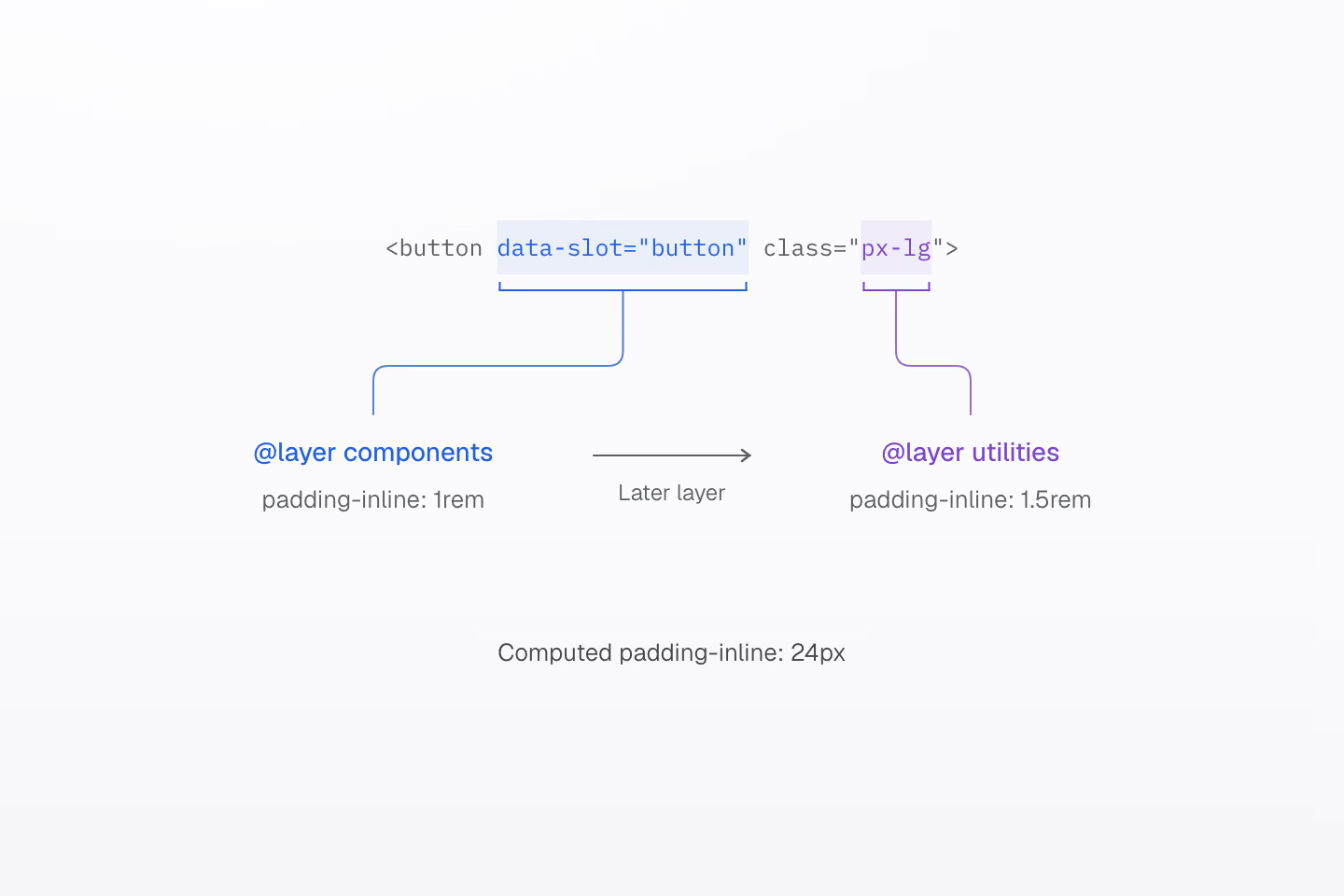
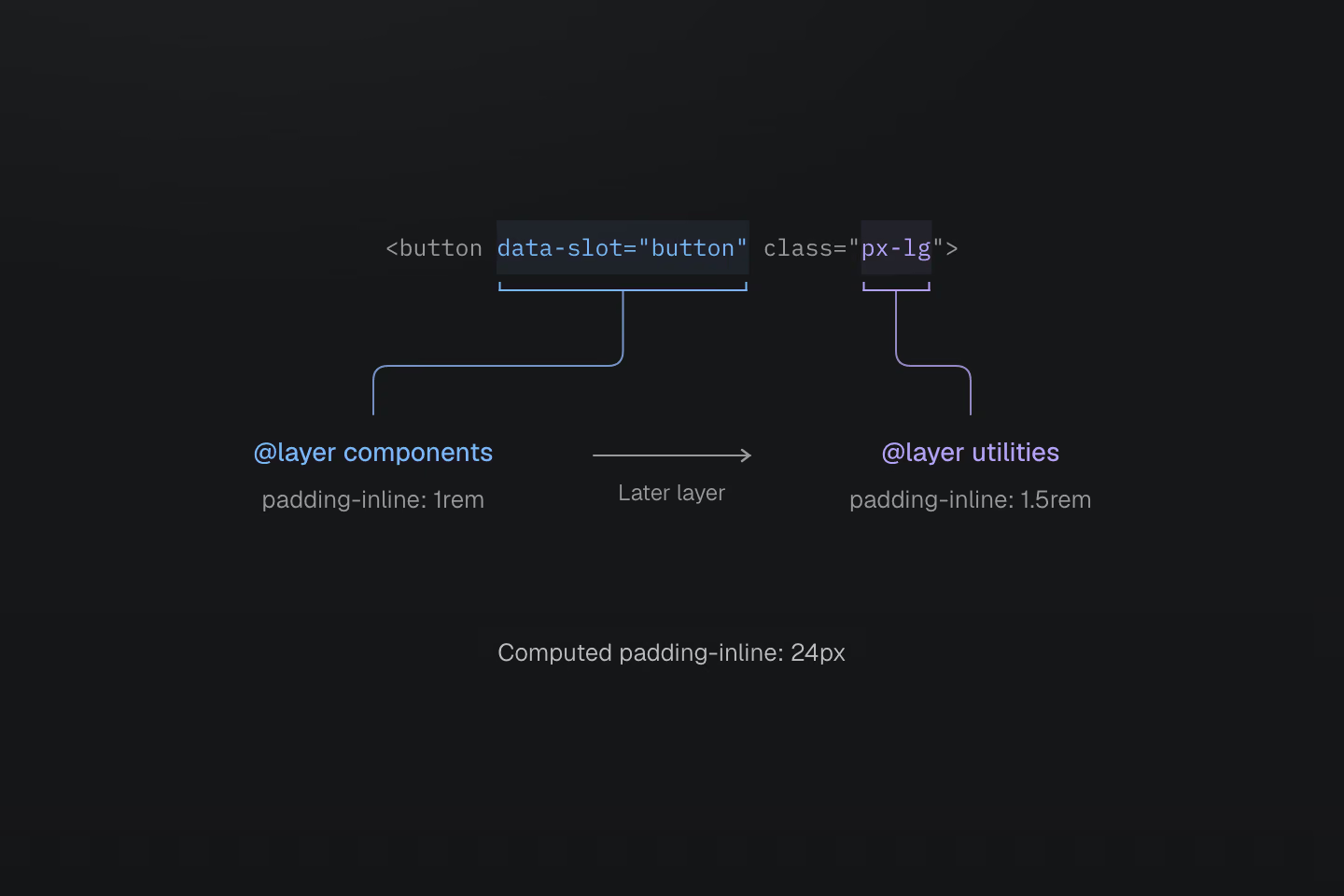
Both rules stay in the stylesheet and both match the button. Utilities follow components in the layer order, so the caller's padding applies without removing the component's class.
Text description
- Component defaults. The Button's own styles select [data-slot=button] inside @layer components and set padding-inline: 1rem.
- Caller adjustment. The caller passes px-lg through className. Master CSS generates it in @layer utilities with padding-inline: 1.5rem.
- Layer order. Utilities come after components, so the button computes 24px at a 16px root size. No class is removed from the string.
The Radix UI Button already renders data-slot, data-variant and data-size. Select those attributes in a native stylesheet next to the component. These rules reproduce the Button's base styles, its default size and its default and outline variants:
@layer components { [data-slot="button"] { display: inline-flex; flex-shrink: 0; align-items: center; justify-content: center; gap: 0.5rem; border-radius: calc(var(--radius) * 0.8); font-size: 0.875rem; line-height: calc(1.25 / 0.875); font-weight: 500; white-space: nowrap; outline: none; transition: all 150ms cubic-bezier(0.4, 0, 0.2, 1); &:focus-visible { border-color: var(--ring); outline: 3px solid color-mix(in oklab, var(--ring) 50%, transparent); } &[aria-invalid="true"] { border-color: var(--destructive); outline-color: color-mix(in oklab, var(--destructive) 20%, transparent); .dark & { outline-color: color-mix(in oklab, var(--destructive) 40%, transparent); } } &:disabled { pointer-events: none; opacity: 0.5; } & svg { width: 1rem; height: 1rem; flex-shrink: 0; pointer-events: none; } } [data-slot="button"][data-size="default"] { height: 2.25rem; padding: 0.5rem 1rem; &:has(> svg) { padding-inline: 0.75rem; } } [data-slot="button"][data-variant="default"] { background-color: var(--primary); color: var(--primary-foreground); @media (hover: hover) { &:hover { background-color: color-mix(in oklab, var(--primary) 90%, transparent); } } } [data-slot="button"][data-variant="outline"] { border-width: 1px; border-style: solid; background-color: var(--background); box-shadow: 0 1px 2px 0 rgb(0 0 0 / 0.05); @media (hover: hover) { &:hover { background-color: var(--accent); color: var(--accent-foreground); } } .dark & { border-color: var(--input); background-color: color-mix(in oklab, var(--input) 30%, transparent); @media (hover: hover) { &:hover { background-color: color-mix(in oklab, var(--input) 50%, transparent); } } } }}The other sizes and variants follow the same pattern. The outline variant sets only the border width and style; its color comes from the * rule in defaults, so the focus and aria-invalid colors can replace it. The focus ring uses outline rather than Tailwind's box-shadow ring, so it does not need to be combined with the variant's shadow.
The component no longer needs cva or cn(). It renders its attributes and passes className through with the other props:
import * as React from 'react'import { Slot } from 'radix-ui'type ButtonProps = React.ComponentProps<'button'> & { variant?: 'default' | 'destructive' | 'outline' | 'secondary' | 'ghost' | 'link' size?: 'default' | 'xs' | 'sm' | 'lg' | 'icon' | 'icon-xs' | 'icon-sm' | 'icon-lg' asChild?: boolean}export function Button({ variant = 'default', size = 'default', asChild = false, ...props }: ButtonProps) { const Comp = asChild ? Slot.Root : 'button' return <Comp data-slot="button" data-variant={variant} data-size={size} {...props} />}A caller adjusts the Button with Master CSS classes, in any order:
<Button variant="outline" className="px-lg r-lg"> Edit profile</Button>px-lg and r-lg win over the component's padding and radius; the variant's border and colors stay. A caller cannot remove a component declaration by omitting a class, so give a component a variant, size or attribute for alternatives that remove or reset its styles.
Some components render only data-slot. The Base UI Button, for example, does not render its variant. Add the attributes your styles need; the component source is yours to change. Other components call buttonVariants() to style a link or trigger as a button. Render data-slot="button" and the matching data-variant and data-size on those elements instead.
cn() can stay as a plain clsx call where a component still joins conditional classes. Code linting and the language service check classes inside cn() calls by default.
#Translate shadcn/ui variants
Inside a component stylesheet, write a shadcn/ui variant as a native selector or condition. In markup, use the matching Master CSS suffix. The selector column shows component CSS; the class column shows the same idea in markup.
| shadcn/ui pattern | Component CSS | Master CSS class |
|---|---|---|
data-[state=open]:bg-accent | &[data-state="open"] | bg-accent[data-state=open] |
data-open:bg-accent (Base UI) | &[data-open] | bg-accent[data-open] |
aria-invalid:border-destructive | &[aria-invalid="true"] | b-destructive[aria-invalid=true] |
has-[>svg]:px-3 | &:has(> svg) | (padding-inline:.75rem):has(>svg) |
[&_svg]:pointer-events-none | & svg | (pointer-events:none)_svg |
*:[a]:underline | & > a | underline>a |
hover:bg-primary/90 | @media (hover: hover) { &:hover } | bg-primary/.9:hover@media(hover:hover) |
focus-visible:ring-[3px] ring-ring/50 | &:focus-visible with outline | outline(3):focus-visible outline-solid:focus-visible outline-ring/.5:focus-visible |
dark:bg-input/30 | .dark & | bg-input/.3@apply(--manual-dark) |
group-data-[collapsible=icon]:hidden | [data-collapsible="icon"] & | hidden@apply(--sidebar-icon) |
sm:max-w-lg | @media (width >= 40rem) | (max-width:32rem)@tailwind-sm |
size-4 | width: 1rem; height: 1rem | w(16) h(16) |
The @apply(...) and @tailwind-sm suffixes need definitions in the Master CSS entry:
@mixin --manual-dark { &:where(.dark, .dark *) { @contents; } }@mixin --sidebar-icon { [data-collapsible="icon"] & { @contents; } }@custom-media --tailwind-sm (width >= 40rem);Tailwind's sm starts at 40rem; the Master CSS preset's @sm starts at a different width. Keep the original threshold with a named condition. Master CSS has no group-* or peer-* variants: a selector mixin like --sidebar-icon tests the ancestor's attribute directly, without a group class.
#Replace tw-animate-css animations
Dialogs, popovers, menus and sheets animate with tw-animate-css classes such as data-[state=open]:animate-in and data-[state=closed]:zoom-out-95. Replace them with native keyframes selected by the same state attributes:
@keyframes dialog-overlay-in { from { opacity: 0; } }@keyframes dialog-overlay-out { to { opacity: 0; } }@keyframes dialog-content-in { from { opacity: 0; scale: 0.95; } }@keyframes dialog-content-out { to { opacity: 0; scale: 0.95; } }@layer components { [data-slot="dialog-overlay"] { position: fixed; inset: 0; z-index: 50; background-color: rgb(0 0 0 / 0.5); &[data-state="open"] { animation: dialog-overlay-in 150ms; } &[data-state="closed"] { animation: dialog-overlay-out 150ms; } } [data-slot="dialog-content"] { &[data-state="open"] { animation: dialog-content-in 200ms; } &[data-state="closed"] { animation: dialog-content-out 200ms; } } @media (prefers-reduced-motion: reduce) { [data-slot="dialog-overlay"], [data-slot="dialog-content"] { animation-duration: 1ms; } }}The closing animation is part of the behavior. Radix UI keeps a closing element mounted until the animation that data-state="closed" starts has ended, and Base UI waits for the element's animations in the same way. Without an exit animation, the element disappears at once. The Base UI components select [data-open] and [data-closed] instead of data-state.
Keep the keyframe names specific to the component: Master CSS keeps native keyframes as written and does not rename them.
#Keep the shadcn CLI output reviewable
npx shadcn add keeps working during the migration. It writes new components in Tailwind syntax and reads components.json for the path of the Tailwind stylesheet. Point tailwind.css at src/shadcn-tailwind.css, so theme variables added by the CLI arrive in Tailwind's entry; move them to the Master CSS entry as you would the existing ones.
A new component is unconverted source: Tailwind builds it, and it keeps working beside converted components. Adding a component you have already converted again replaces your file with the Tailwind version when you accept the overwrite. Review that change as a diff, port the intended differences and keep your conversion.
#Validate and remove Tailwind
Check each converted component against the version you started from:
- Compare light and dark themes, each variant and size, and the hover, focus-visible, disabled and
aria-invalidstates. - Open and close dialogs, menus and popovers with the keyboard and pointer. Confirm that focus moves and returns, and that exit animations finish.
- Pass
classNameadjustments from callers and confirm the component's other declarations remain. - Check computed values in browser DevTools for elements that use a class name both systems generate.
After the last component is converted, remove the Tailwind import from the app root, then src/shadcn-tailwind.css, the @source not list and the Tailwind packages. Remove tw-animate-css, tailwind-merge and class-variance-authority when no component imports them. Delete the body inheritance rule from the coexistence step and recheck pages, since Preflight no longer supplies their reset. Follow Remove Tailwind for the remaining steps.
#Useful references
- Migrating from Tailwind CSS for utilities, variants and theme values.
- Cascade layers for the layer order that resolves component overrides.
- Theme tokens for
@themeand theinlinemodifier. - Reusing styles for choosing between component classes, utilities and mixins.
- Code linting for checking classes in
cn(),clsx()andcva()calls. - shadcn/ui theming and
components.jsonfor the variables and CLI configuration this guide preserves.