Overview
The float CSS property places an element on the left:0 or right side of its container, allowing text and inline elements to wrap around it. The element is removed from the normal flow of the page, though still remaining a part of the flow (in contrast to absolute positioning).
<div class="">
Using Master CSS loading, interaction, performance and productivity are upgraded to an incredible dimension.
<div>
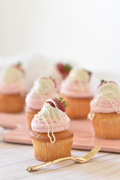
    <img class="float:left max-w:180 r:8 mb:16 aspect:1/1 object:cover mr:16" src="/images/foods/strawberry-cupcakes.jpg" >
    <div class="f:48 font-weight:900">World's First Virtual CSS Library</div>
    <p class="text-align:justify">
        Using Master CSS loading, interaction, performance and productivity are upgraded to an incredible dimension.
    </p>
</div>
Applying with functions
<div class="float:$(direction)">...</div>Master supports native CSS variables and functions, just add var(--key) or use shorthand$(key) for variables.
You can also use calc(expression), env(expression) and other CSS functions if the property supports it.
To learn more, see the Functions documentation.
Conditionally apply
States and selectors
<div class="float:left:hover">...</div>Master supports all native CSS selectors, just add :hover, :disabled, chaining, combinators and other CSS selectors as usual.
To learn more, see the Selectors documentation.
Responsive breakpoints
<div class="float:left@sm">...</div>Responsive breakpoints can be applied to all styles. Some available breakpoints are 3xs, 2xs, xs, sm,md, lg, xl, 2xl, 3xl, 4xl. Arbitrary breakpoints can be specified through comparison operators >, >=, <, <=.
To learn more, see the Breakpoints documentation.
Print format and media queries
<div class="float:left@print">...</div>Master supports media types like print, screen, speech, all, and other media queries.
To learn more, see the Media Queries documentation.
Dark mode and color schemes
<div class="float:left@dark">...</div>Master uses the selector html.dark to support color schemes. Now, you can easily fine-tune your style for the color schemes.
To learn more, see the Color Schemes documentation.