Columns


Overview
The columns CSS property sets the number of columns to use when drawing an element’s contents, as well as those columns’ widths.
<div class="">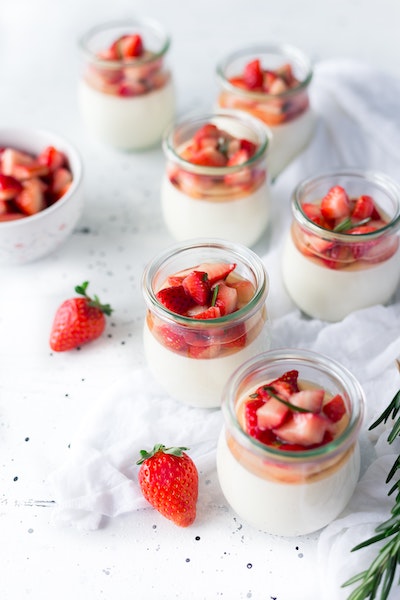


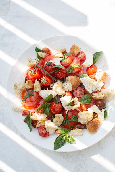
<div class="gap:20 undefined">
    <img class="w:full object:cover">
    <img class="w:full object:cover">
</div>
Applying with functions
<div class="columns:$(value)">...</div>Master supports native CSS variables and functions, just add var(--key) or use shorthand$(key) for variables.
You can also use calc(expression), env(expression) and other CSS functions if the property supports it.
To learn more, see the Functions documentation.
Conditionally apply
States and selectors
<div class="columns:5:hover">...</div>Master supports all native CSS selectors, just add :hover, :disabled, chaining, combinators and other CSS selectors as usual.
To learn more, see the Selectors documentation.
Responsive breakpoints
<div class="columns:5@sm">...</div>Responsive breakpoints can be applied to all styles. Some available breakpoints are 3xs, 2xs, xs, sm,md, lg, xl, 2xl, 3xl, 4xl. Arbitrary breakpoints can be specified through comparison operators >, >=, <, <=.
To learn more, see the Breakpoints documentation.
Print format and media queries
<div class="columns:5@print">...</div>Master supports media types like print, screen, speech, all, and other media queries.
To learn more, see the Media Queries documentation.
Dark mode and color schemes
<div class="columns:5@dark">...</div>Master uses the selector html.dark to support color schemes. Now, you can easily fine-tune your style for the color schemes.
To learn more, see the Color Schemes documentation.

