Build your design with a whole new CSS language instead of utilities/libraries.
This article goes through the concepts behind Master CSS, and offers our solutions to common issues.
Virtual CSS engine
Master CSS's Virtual CSS engine allows you to style without the complexities of existing approaches —— You can style inside HTML with our enhanced syntax.
Virtual CSS is the concept of expressing real CSS rules through enhanced syntax. ——Master


The above conceptual illustration describes the processes Master CSS goes through:
- Observe all class names in the DOM
- A diffing algorithm detects class name changes
- Create its corresponding style instance after matching the class name.
- Parsing of style code into core section/types, such as selectors, media queries,...
- Creation of CSS rules
- Intelligently order generated rules according to selectors and breakpoints
- Insertion of CSS rules into the DOM
- Removal of appropriate CSS rules
Automatically generate rules
How do we style without writing CSS? Let's go through an example of a familiar situation:
"Let's create a section with background, interactive effects, and increase its padding when width >=1024."
<section>...</section>A minute passes... "Ok, Let's name it home-section."
<section class="home-section">...</section>Open/create the corresponding home.css file or style tag. Finally we can start writing some CSS:
.home-section { background-color: blue; padding: 2rem; text-align: center;}.home-section:hover { background-color: red;}@media (min-width: 1024px) { .home-section { padding: 3rem; }}"What's wrong with this process? It's quite typical." Yes, the result is fine, but productivity optimization is a core tenent of Master CSS.
Let us use Master CSS to achieve the same result. It's a one-liner and no separate file needed.↓ 86% code
<section class="bg:blue bg:red:hover p:32 p:48@md text:center">...</section>Using Master CSS we can write less code to achieve the same result, and avoid the overhead of naming things.
What about the actual CSS? It's been injected onto the DOM:
/* Actual output would be minified. This output is formatted. */
.p\:32 {
    padding: 2rem
}

.text\:center {
    text-align: center
}

.bg\:blue {
    background-color: #175fe9
}

.bg\:red\:hover:hover {
    background-color: #d11a1e
}

@media (min-width:1024px) {
    .p\:48\@md {
        padding: 3rem
    }
}
This output appears to be longer than the hand-coded home.css example above? That's right, but the overall output would be less. We will show this later.
With Master, writing CSS directly is "pure overhead." Instead, it's auto-generated for you. ——Master
Intelligent rule sorting
So how is CSS rule order and priority handled? Let's see a common example:
"Center-align the homepage headline when screen width >=1280px, and align right when >=1024px."
@media (min-width:1280px) {
    h1 {
        text-align: center;
    }
}

@media (min-width:1024px) {
    h1 {
        text-align: right;
    }
}
The CSS above is incorrect. Because due to CSS priority, when the screen width >=1024px or >=1280px, @media (min-width:1024px) gets applied, but @media (min-width:1280px) never gets applied.
This seemingly simple CSS behavior is the source of common mistakes. When there are many such behaviors, unexpected complexities arise.
Simplify by letting Master CSS handle the priority order for you.
<h1 class="text:right@md text:center@lg">...</h1>
<!-- or -->
<h1 class="text:center@lg text:right@md">...</h1>
No matter how you order rules in our syntax, the correct ordering is generated in the output:
@media (min-width:1024px) {
    .text\:right\@md {
        text-align: right
    }
}

@media (min-width:1280px) {
    .text\:center\@lg {
        text-align: center
    }
}
Not only that. When you use selectors :disabled, :active, :focus, :hover, :where(),... or breakpoints @lg, @sm&<lg,... Master would order rules matching your expectations. So you would rarely, if ever, need to use !important.
An example of this can be seen in the animation on our front page.
Common unit conversions
When engineering UI, pixel is the common unit to consider. It's not as simple for the browser and CSS.
For example, to find the optimal rem value for the text size of 24px, We'd need to calculate: 24/16=1.5rem
<h1 class="font:1.5rem">...</h1>You might say that this process is fine. But one may need to go through this process tens or hundreds of times.
When you use Master CSS's enhanced syntax, it does what you'd expect it to do. E.g. 24 (px).
<h1 class="font:24">...</h1>Master converts to rem and generates:
.font:24 {
    font-size: 1.5rem
}
Master outputs the optimal unit/conversion accordingly. This increases productivity and reduces clutter inside class="" attributes.
Experience-oriented original design
"But I'd need to learn a new language to use Master CSS?"
The Master CSS enhanced syntax language is built on native CSS, similar to SASS. You can start with writing native-ish CSS, and progress towards using our enhancements and syntactic sugar gradually.
Structured syntax
Our intent is not to have native CSS in class="" attributes, but to reasonably simplify and optimize the styling of elements in an elegant manner.
All styles/rules follow the same grammar, minimizing the need to check docs. As an example, to set 1rem you can do:
<div class="font-size:1rem">Similar to native CSS</div>
<div class="font:1rem">Shorthand example</div>
<div class="font:16">No unit specified implies 16px to 1rem</div>
<div class="f:16">Shortest shorthand</div>
Let's see more examples:
<div class="bg:blue-60/.5">Set a color of blue-60, with an opacity of .5</div>
<div class="scale(1.5)">Magnify to 1.5x</div>
<div class="~transform|.3s|ease">Transition with a delay of 0.3s and timing-function "ease"</div>
<div class="block">Use a semantic class that translates to "display: block"</div>
...
Built-in selector syntax. Setting the background as an example:
<div class="bg:pink:hover">Set a pink background on hover</div>
<div class="bg:pink~*">Set a pink background for all subsequent sibling elements</div>
<div class="bg:pink+div">All subsequent div siblings</div>
<div class="bg:pink_:where(p)">All descendant p elements</div>
<div class="bg:pink:first">Use simplified :first instead of :nth-child to set pink background</div>
...
Built-in media query syntax examples:
<div class="width:800@>=1024">Set width to 50rem, when screen width >=1024. Arbitrary values are supported at runtime</div>
<div class="width:800@sm">Similar to previous example, using a built-in breakpoint</div>
<div class="top:1@xs&<lg">Screen width >= 600px & < 1279.98px margin-top at 0.0625rem</div>
<div class="bg:gray-20@dark">Set background to gray-20 when in dark mode</div>
<div class="hide@print">Hide element for print</div>
<div class="@fade|.2s@motion">Fade with a 0.2s delay, when low motion is not speficied by client</div>
...
These examples are only the tip of the iceburg. Please see our Syntax Tutorial for more.
Cutting-edge technology
You think that's it? We've designed even more powerful ways to optimize your code!
Grouping feature ✨
We often see repetitive selectors & media queries:
<ul class="block>li:hover@md p:16>li:hover@md w:full>li:hover@md text:center>li:hover@md font:blue/.5>li:hover@md"></ul>Using Master's grouping feature ↓ 45% code
<ul class="{block;p:16;w:full;text:center;font:blue/.5}>li:hover@md"></ul>Reactive Styles✨
"Putting styles meant for a specific element on another element feels strange, and doesn't get update dynamically." For example:
<label class="inline-flex center-content">
    <input class="text:line-through:checked+span cursor:pointer h:16 mr:8 w:16" type="checkbox" checked />
    <span>½ teaspoon red chili powder (adjust to taste)</span>
</label>
Using Master's Reactive Styles, you can put the style on the target element instead:
<label class="inline-flex center-content">
    <input class="cursor:pointer h:16 mr:8 w:16" type="checkbox" checked />
    <span class=":checked+{text:line-through}">½ teaspoon red chili powder (adjust to taste)</span>
</label>
To learn more, check out our Syntax Tutoral.
A forerunner to syntax highlighting
You might have notices that in our docs class="..." is syntax-highlighted. We can do this thanks to Master CSS's structure and its positioning as a programming language.

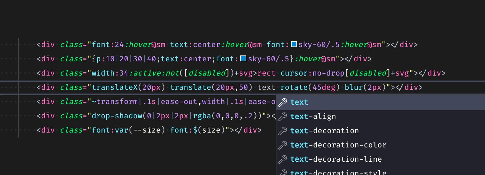
Syntax highlighting improves your development experience:
- Improves aesthetics of longer code in class attributes
Improves readability, so It's easier to parse and find relevant code
- Helps with error detection
A study by PPIG finds that syntax highlighting significantly helps comprehension and reduces time to internalize a language.
Why don't other CSS frameworks/libraries have this feature? Because others don't have a structure consistent enough to support syntax-highlighting.
Master CSS also features autocompletion and CSS preview: developer tools.
Framework-agnostic out-of-the-box
Master CSS uses the familiar class="" attribute, so it doesn't need additional integrations. Additionally, all the features such as selectors, media queries, breakpoints, color codes,... work out-of-the-box.
With one line of code, JIT mode can be enabled for any framework/platform.
<script src="https://cdn.master.co/css"></script>We officially provide JIT mode because of the portability it enables. We also provide server-side and client-side hybrid rendering, using hydration techniques. In the near future we'll be releasing full support and tools for AOT.
Even though Master CSS is framework-agnostic, we have a setup guide to help you get started.
If you aren't yet familiar with CSS, you can get started with our syntax tutorial.
Avoiding premature abstraction
Writing CSS tends to involve naming things.
Traditionally, naming an element first has become standard practice. Or you might be forced to do so in order to implement selectors/breakpoints. These both result from premature abstration. For example:

<div class="card">
<img class="card-image" src="/images/mountain.jpg" />
<div class="card-body">
<div class="card-title">Mountain</div>
<div class="card-text">A mountain is an elevated portion of the Earth's crust, generally with steep sides that show significant exposed bedrock.</div>
</div>
</div>Yes, this looks reasonable. But, aside from having to write a lot of code in card.css, a lot of decisions had to be made:
- What do we call this card?
.cardhas this class name been used?- Is there a convention being used that arrives at the name
.card-text? Has it been accepted by everyone? - Do other cards use the same style? Is code-sharing working for
.card? - If we need to make small adjustments to this card, would we need to create another name?
- The styling of this card might not be reusable?
- What do we call the card on the homepage? how about on other pages?
- Do we adjust
.carditself for those cards mentioned previously? - There are other elements that look like
.card, but they aren't cards! .cardmaybe ought be extended, its style is used it many places.- Switching back and forth between HTML and CSS
- Is this really following best practices?
Wait, what would the rest of the team go through when maintaning this code?
- Where is the CSS file for this card?
- Is there another CSS file with rules that affect this card?
- Are there media queries or selectors for this card that I don't know about?
- How does the computed styles of this card look? Do I need to use
!important? - If I modify this
.card, would the modifications leak? - This card needs to be extended. Looks like we need to create another class name.
- We don't need this card anymore. It should have been removed, so why is it still here?
- Whoever named this card did a poor job...
If you can think of other issues, please share them with us.
All these considerations were involved in a single card style. Imagine the number of considerations for an entire application.
Traditional approaches lead to imprecise code, due to uncertainties & incomplete information. When styling elements, you have to speculate what the final end-product might look like. CSS priorities/specificity consequences make the process more complex and harder to predict. The project can grow out of hand, severely affecting productivity.
With Master CSS, you can apply styles on elements in a "flat" manner, avoid getting intertwined in complex CSS, and allow teammembers to ramp up more quickly.
<div class="flex@xs translateY(-5):hover ~transform|.2s overflow:hidden bg:white bg:gray-22@dark r:10 shadow:demo">
<img class="object:cover w:144@xs" src="/images/mountain.jpg" />
<div class="p:25">
<div class="font:bold font:fade-30@light text:20">Mountain</div>
<div class="font:fade font:gray-60@dark text:14 lines:3 mt:8">A mountain is an elevated portion of the Earth's crust, generally with steep sides that show significant exposed bedrock.</div>
</div>
</div>Using Master CSS, the card's structure (HTML) and style (CSS) become concise and condensed. It's easy to add/remove styles for a given element. The more complex a style, the simpler it is to use Master CSS language, relative to other methods and tools.
In conclusion, Master rejects the abstraction approach of naming .card and then styling through it? No, we still recommend such abstractions. It's just difficult to abstract well, so we recommend —— A syntax-first, semantic-assist approach.
To learn more about abstracting, read our official guide —— reusing design.
Scalability reduces CSS


More to come... 🚧
Code portability
Traditionally, designers have to be comfortable with working in front-end frameworks. React, Vue, Angular, et al. all have complex build environments that often become barriers.
Now with Master CSS, All of the design can be implemented in HTML or HTML-like templates. Anyone with a basic knowledge of HTML/CSS can leverage Master CSS.
The portability is such that anyone can implement full-fledged designs through copying & pasting alone. ——Master
Try it out in our Sandbox!
The obsession with separation of concerns
Many folks believe that HTML and CSS should conform to the design principle of separation of concerns (SoC). We believe that applying SoC to HTML & CSS, is more a matter of cultural momentum, and over-interpretation of SoC.
JavaScript aside, web UI consists of HTML structure, and CSS for styling. CSS takes up a significant portion of time spent working on HTML and its related business logic. This implies that HTML and CSS are highly integrated and almost always used together.Separating the two introduces a layer of abstraction where the cost usually outweigh the benefit, leading to premature abstraction.
For instance when the most popular frontend framework React et al. introdued JSX, it was highly controversial because it was throught to be violating SoC, through mixing HTML, CSS, and JS. For details on how not adhering to SoC benefits a React environment check out React and separation of concerns.
Ultimately, It's about how you structure your application and its design. JSX and similar tools may very well help to separate/mix concerns optimal to your application structure.
In frontend engineering, separation of concerns should focus on your structure, how you compartmentalize/componentize, rather than separating by language. ——Master
Not a utility-first framework, but a language
Every library/framework has its own style of naming and constraints. Projects usually follow their own design systems. Problems occur when projects adopt the constraints and styles of a library/framework.
More to come... 🚧
Mainstream frameworks comparison
Master CSS | Tailwind CSS | Bootstrap | |
|---|---|---|---|
Type | CSS Language | CSS Utility | CSS Library/Utility |
Setup | 🟢 Zero-configuration | 🔴 PostCSS, Autoprefixer, Build Tools | 🟢 Zero-configuration |
| Compile Mode | |||
Ahead of time | 🚧 | 🟢 | 🟢 |
Production at runtime | 🟢 | 🔴 | 🔴 |
Server-side rendering | 🟢 | 🔴 | 🔴 |
Hybrid rendering | 🟢 | 🔴 | 🔴 |
| Output Size | |||
Fixed cost of runtime | ~14KB | - | - |
Fixed cost of static output | 🟢 0KB | 🟢 0KB | 🔴 ~24KB |
Source | 🟢 Current page | 🟠 All files | 🔴 Whole lib |
| Rendering | |||
Render-blocking resources | 🟢 Internal CSS | 🔴 External CSS | 🔴 External CSS |
First contentful paint | 🟢 Fastest | Fast | 🟠 Normal |
| Loading | |||
Page-loaded CSS size | 🟢 Smallest | 🟠 Large | 🔴 Largest |
Cache target | HTML file | CSS file | CSS file |
| Developer Tools | |||
Code-completion | 🟢 | 🟢 | 🔴 |
Syntax highlighting for class names | 🟢 | 🔴 | 🔴 |
CSS generate preview | 🟢 | 🟢 | 🔴 |
Linting | 🚧 | 🟢 | 🔴 |
More to come... 🚧
FAQs
We've collected common questions and concerns about Master CSS. If you have other questions, issues, or suggestions, you can go to our Discord channel or Discussions.
Why not just write inline styles?
I want the button to be bigger at viewport width >=1024px and then fade when disabled.
<button style="font-size: .875rem; text-align: center; height: 2.5rem;" disabled>Oops...</button>Inline styles cannot apply selectors, media queries, and many CSS features. With Master CSS, you can now implement them with the most succinct syntax.
<button class="font:14 text:center height:40 height:56@md opacity:.5[disabled]" disabled>Yeah!</button>
