An enhanced and structured CSS syntax for class names.
A complete tutorial and feature overview of style variants, states, selectors, media queries and use cases for Master CSS syntax.
Introduction
To help you shorten and speed up your code output in an intuitive way, we've designed a structured syntax close to native CSS.
Composability of styles
Compose styles like Lego without the burden of naming, instead of constraining the flexibility of styles through abstract class names at the outset.

Hello, World!
<div class="rel">
    <img class="aspect:480/319 untouchable" src="/images/landscape-mobile-screen.png" alt='hello world' />
    <h1 class="abs blend:overlay text:center font:7vw font:40@xs font:heavy font:white inset:0 m:auto h:fit @flash|3s|infinite ">
        Hello, World!
    </h1>
</div>
Multi-state style variants
All styles and properties in Master support selectors and media queries. You can specify multiple conditions and states at the same time.
<div class="bg:gray-90:hover@dark@md hidden@print left:16@sm&<md">...</div>Attaching states is like making a sentence.
Fill the button background with blue on hover at viewport width
>=1024px.
After keeping only the underlined parts:
button bg blue hover viewport width
>=1024px
Transform above to HTML sequentially:
<button class="bg:blue:hover@md"></button>
and auto-generated CSS looks like:
@media (min-width:1024px) {
    .bg\:blue\:hover\@md:hover {
        background-color: #175fe9
    }
}
That's it. You have almost learned how to use Master CSS!
Basic usage
To let you rapidly style elements with semantics, shorthands, acronyms, symbols, and even group styles, we've created a succinct and near-native syntax.
Semantic styles
We've carefully crafted semantics for some properties and styles. It's not our intention to let you write CSS directly, but you can still do so.
<p class="text-transform:capitalize position:absolute display:block border-radius:50%">...</p>Try using the built-in semantic classes. We've covered the naming cost for you. ↓ 65% code
<p class="capitalize abs block round">...</p>When a native CSS rule's value alone sufficiently expresses its modification, we make that value available as a semantic class.
E.g., we do display:block -> block but don't do font-weight:lighter -> lighter, since it's not explicit that the class applies to font-weight.
In this way, markup complexity is reduced and readability is improved, while preserving semantics.
Acronym styles
For some styles we provide acronym syntax. Writing in native CSS looks like:
<p class="font-size:1rem z-index:100 order:2">...</p>Try using acronyms. ( 1rem = 16 ) ↓ 59% code
<p class="f:16 z:100 o:2">...</p>CSS shorthand properties
Using no shorthand, padding and border would look like this:
<p class="padding-top:1rem padding-bottom:1rem padding-left:2rem padding-right:2rem border-width:.0625rem border-color:red border-style:solid">...</p>Try using CSS shorthand. ↓ 76% code
<p class="padding:16|32 border:1|solid|red">...</p>Or use CSS shorthand with acronyms. ↓ 84% code
<p class="p:16|32 b:1|solid|red">...</p>To keep the delimiter visually unobtrusive, our syntax highlighting make it the color of comments ── gray.
Shorthand styles
Some shorthands in Master might be ambigious. In this situation we cross-reference the property value and names to find the appropriate style to use.
Some examples to clarify how this works. Starting from native CSS:
<p class="filter:blur(20) border-color:#101 font-size:32 font-weight:bold"></p>Try using shorthand. ↓ 40% code
<p class="blur(20) border:#101 font:32 font:bold">...</p>Through the above evolution, you can observe:
- Omitting
filter:and just typingblur(20)still maps correctly to thefilterproperty. - Omitting
-colorand just typingborder:#101still maps correctly to theborder-colorproperty. - Omitting
-sizeand just typingfont:32still maps correctly to thefont-sizeproperty. - Omitting
-weightand just typingfont:boldstill maps correctly to thefont-weightproperty.
For other style shorthands, see their respective documentation.
Symbolic styles
Of all styles, only animation and transition can be represented by symbols. The native(ish) CSS would look like:
<p class="animation:fade|1s|ease transition:opacity|3s"></p>Try using symbols to make them elegant. ↓ 43% code
<p class="@fade|1s|ease ~opacity|3s">...</p>Styles with units
For units or numerical styles, we provide practical default units and conversion behaviors according to their characteristics.
For native CSS such as:
<p class="font-size:3rem transform:rotate(30deg)">...</p>Let's convert and preset the units for you. ↓ 13% code
<p class="font-size:48 transform:rotate(30)">...</p>Try using shorthand to simplify further. ↓ 53% code
<p class="font:48 rotate(30)">...</p>In the above example, the font size has no specified unit so it is determined as a pixel value and converted to rem for you; the rotate() value is automatically preset to deg.
Styles with colors
Some styles like color, fill, background-color, etc. are colorable, the preset will match our color system.
Up to 48 brightness levels are available for each color, with ranges of 2, 4, 6 ... 98.
<p class="color:blue-60">Use the tint 60 of blue</p>To alter the opacity of the color with arbitrary numbers or decimals.
<p class="fill:pink/.5">Use the tint 50 of pink with opacity 50%</p>Supports the HEX arbitrary value format.
<p class="bg:#121">Use arbitrary hex color codes</p>Apply color functions such as rgb, rgba, hsl, hsla, etc.
<p class="b:rgb(100,150,200)">Use CSS color functions</p>You can observe that the above example can apply native CSS APIs such as opacity, #hex, rgb() and even hsl() in addition to our colors.
Each color is provided with fifty tints. This is one of our key features. In most cases, you will never need to adjust the colors yourself.
Make styles !important
Add a ! suffix to the value.
<p class="hide block! text:underline!@sm font:cyan-30!:hover">...</p>Arbitrary CSS properties
Our built-in optimized CSS property coverage has surpassed all other CSS frameworks.
In addition, we proviode syntax for arbitrary properties, allowing you to use some non-standard or not yet supported CSS properties on demand.
<p class="{block-size:5rem}">...</p>Why use {}? Read on.
Group styles ✨
The Group is one of our key features since ^1.15.0. It helps you to group styles with the same suffixes of selectors, media queries, etc., preventing class names from growing in length and quantity.
Without grouping, your code would look like:
<ul class="block>li:hover@md width:fit>li:hover@md text:center>li:hover@md font:24>li:hover@md font:blue/.5>li:hover@md"></ul>Now group. ↓ 43% code
<ul class="{block;width:fit;text:center;font:24;font:blue/.5}>li:hover@md"></ul>If you care about output sizes, you have to consider whether the target styles you're grouping are highly reused elsewhere. If this is the case, the final CSS rule size will be slightly higher.
We recommend that you prioritize the development experience, as the differences won't be significant and you can optimize them later.
Pseudo-classes
Hover, active, and focus
<button class="bg:indigo bg:indigo-54:hover bg:indigo-58:active outline:indigo-80|3|solid:focus ...">
    Submit
</button>
First, last, and Nth
Select and style elements using :first, :last, :odd, :even, and :nth(N) shorthands.
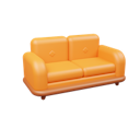
- Dressing Table$980A dress-up space.
- Double Bed$1,820A sweet moment for everyone.
- Sofa$4,850A place to be lazy all day.
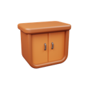
- Cabinet$1,250Secrets are hidden here.
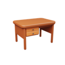
- Desk$2,580A good partner in the office.
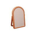
- Mirror$530Discover your own beauty.


<ul class="list-style:none ...">
    {furnitures.map((furniture, index) =>
        <li class="bb:0:last bg:fade-94:even bb:1|solid|fade-88 ..." key={index}>
            <img class="round object:cover" src={furniture.url} layout="fixed" width="56" height="56" alt="avatar" quality={'0'} />
            <div class="flex flex:col flex:1 py:10">
                <div class="flex align-items:center">
                    <div class="text:14 capitalize ...">{furniture.name}</div>
                    <div class="text:14 ml:auto">${furniture.price}</div>
                </div>
                <div class="text:14 m:0 font:fade font:gray-60@dark">{furniture.intro}</div>
            </div>
        </li>
    )}
</ul>
For more details and a complete list, check out the Selector Reference.
Form validations and states
Select and style form elements using :disabled, :invalid, :required, etc.
<div class="font:14 font:medium">Email</div>
<input type="email" value="aron@master..."/>
<div class="font:14 font:medium mt:20">Password</div>
<input class="opacity:..." disabled type="password" value="1234567890" autoComplete="off" />
For more details and a complete list, check out the Selector Reference.
Pseudo-elements
Before and after
Attach pseudo-elements to an element using :before and :after.
<span class="content:'$':before content:'USD':after ls:-.3 font:medium">
    <strong class="font:32 font:bold mx:4">2,000</strong>
</span>
For more details and a complete list, check out the Selector Reference.
Placeholder and text selection
Change the placeholder and selection color of elements using ::placeholder and ::selection.
<input class="font:fade-60::placeholder font:gray-40::placeholder@dark b:1|solid|fade-88 bg:white r:5 mt:5 w:full h:48 px:16 b:gray-28@dark bg:gray-22@dark" type="email" placeholder="Enter your email" />
<div class="bg:red::selection font:white::selection font:fade-40 font:gray-70@dark font:12 mt:10">Enter the correct Email, the verification code will be sent here.</div>
For more details and a complete list, check out the Selector Reference.
Beautify your scrollbar
Style the scrollbar of an element using ::scrollbar, ::scrollbar-thumb, ::scrollbar-track, ::scrollbar-button, ::scrollbar-corner and ::scrollbar-track-piece shorthand. We've automatically prefix them with -webkit- for you.


<div class="
    {w:6;h:6;rounded}::scrollbar
    bg:fade-86::scrollbar-thumb
    bg:fade-76::scrollbar-thumb:hover
    bg:fade-66::scrollbar-thumb:active
    bg:gray-30::scrollbar-thumb@dark
    bg:gray-40::scrollbar-thumb:hover@dark
    bg:gray-50::scrollbar-thumb:active@dark
    bg:transparent::scrollbar-corner
    rounded::scrollbar-thumb
    overflow-x:auto p:40
">
    <div class='flex w:max'>
        {animals.map((animal) =>
            <div class="flex:0|0|156" key={animal.name}>
                <img src={animal.url} width={156} height={156} alt={animal.name} />
            </div>
        )}
    </div>
</div>
For more details and a complete list, check out the Selector Reference.
State selectors
Apply styles on .active
Style elements based on .active, .disabled and other custom class states.
<nav class="flex bb:1|solid|fade-88 ...">
    <a class="{color:indigo!;bb:2|solid}.active ...">Home</a>
    <a class="{color:indigo!;bb:2|solid}.active ... active">Product</a>
    <a class="{color:indigo!;bb:2|solid}.active ...">Team</a>
    <a class="{color:indigo!;bb:2|solid}.active ...">About</a>
    <a class="{color:indigo!;bb:2|solid}.active ...">Contact</a>
</nav>
For more details and a complete list, check out the Selector Reference.
Apply styles on [open]
Style elements based on [open], [type=date] and other custom attribute states.
Why not inline styles?
Inline styles cannot apply selectors, media queries, and many CSS features. With Master CSS, you can now implement them with the most succinct syntax.
<details open class="outline:1|solid|fade-88[open] bg:white[open] bg:gray-22[open]@dark outline:gray-28[open]@dark max-w:480 r:5 w:full">
    <summary class="cursor:pointer font:medium p:20">
        Why not inline styles?
    </summary>
    <div class="p:0|35|20 mt:-10">
        <p class="font:14 my:0">
            Inline styles cannot apply selectors, media queries, and many CSS features. With Master CSS, you can now implement them with the most succinct syntax.
        </p>
    </div>
</details>
For more details and a complete list, check out the Selector Reference.
Relationship selectors
Style all descendants at once
Deeply style all descendant elements/nodes at once. This is useful for typography, de-duplication styles, and dynamic content, etc.
Style all descendants at once
Heavy boxes perform quick waltzes and jigs. Heavy boxes perform quick waltzes and jigs.
Heavy boxes perform quick waltzes and jigs. Heavy boxes perform quick waltzes and jigs.
Heavy boxes perform quick waltzes and jigs. Heavy boxes perform quick waltzes and jigs.
<article class="font:30_h1 font:18!_:where(p) text-decoration-color:indigo!_u mb:0_p:last ...">
    <h1>Style all descendants at once</h1>
    <p>Heavy boxes <u>perform</u> quick waltzes and jigs. Heavy boxes <u>perform</u> quick waltzes and jigs.</p>
    <blockquote>
        <p>Heavy boxes perform quick waltzes and jigs. Heavy boxes perform quick waltzes and jigs.</p>
    </blockquote>
    <p>Heavy boxes perform quick waltzes and jigs. Heavy boxes perform quick waltzes and jigs.</p>
</article>
Selecting the style of descendant elements and presetting the style with :where() CSS pseudo-class reduces the priority of selected descendants. This can solve specificity issues, such as subsequent styling of child elements/nodes must rely on !important .
For more details and a complete list, check out the Selector Reference.
Style the following children
Only style the next-level child elements.
L1
-
L2
-
L2
-
-
L1
<ul class="font:crimson-60!>li>p font:heavy ...">
    <li>
        <p>L1</p>
        <ul>
            <li> <p>L2</p> </li>
            <li> <p>L2</p> </li>
        </ul>
    </li>
    <li> <p>L1</p> </li>
</ul>
For more details and a complete list, check out the Selector Reference.
Style a sibling behind
Use + to style an element after a specific element.
<label class="inline-flex center-content">
    <input class="text:line-through:checked+span cursor:pointer h:16 mr:8 w:16" type="checkbox" checked />
    <span>½ teaspoon red chili powder (adjust to taste)</span>
</label>
For more details and a complete list, check out the Selector Reference.
Style all siblings behind
Use ~ to style all elements after a specific element.


<div class="overflow-x:auto p:40">
    <div class='width:64>*~div flex w:max gap:20 align-items:end'>
        {fruits.map((animal) =>
            <div class="flex:0|0|156" key={animal.name}>
                <img src={animal.url} width={96} height={96} alt={animal.name} />
            </div>
        )}
    </div>
</div>
For more details and a complete list, check out the Selector Reference.
Style an element based on target state
Reactive Styles is one of our key features. You can style not only based on parent state but also sibling state, when it is more sensible to attach styles to the reactive target itself.
<label class="inline-flex center-content">
    <input class="cursor:pointer h:16 mr:8 w:16" type="checkbox" checked />
    <span class=":checked+{text:line-through}">½ teaspoon red chili powder (adjust to taste)</span>
</label>
Here is another example based on parent state.
Why not inline styles?
Inline styles cannot apply selectors, media queries, and many CSS features. With Master CSS, you can now implement them with the most succinct syntax.
<details open class="outline:1|solid|fade-88 bg:white bg:gray-22@dark outline:gray-28@dark max-w:480 r:5 w:full">
    <summary class="[open]_{font:20;font:bold} cursor:pointer p:20">
        Why not inline styles?
    </summary>
    <div class="p:0|35|20 mt:-10">
        <p class="font:14 my:0">
            Inline styles cannot apply selectors, media queries, and many CSS features. With Master CSS, you can now implement them with the most succinct syntax.
        </p>
    </div>
</details>
Media queries
Responsive breakpoints
Style elements using specific breakpoints. In addition to the preset ten breakpoints @3xs~@4xl, you can also specify arbitrary ranges through comparison operators. E.g. text:center@<1234 or hide@768&<1024.
<div class="grid-cols:2 grid-cols:4@xs grid-cols:5@sm grid-cols:8@md grid-cols:12@lg grid-cols:16@xl gap:10 p:50"> <div class="grid-col-span:2@xs box">1</div> {[2, 3, 4, 5, 6, 7, 8, 9, 10, 11, 12].map((item) => <div class="box" key={item}>{item}</div>) }</div>Dark mode and color schemes
Use @light, @dark to style elements for different themes.

<div class="bg:gray-22@dark bg:white flex flex:col@<xs max-w:480 r:10 mx:auto overflow:hidden shadow:demo"> <img class="order:1@dark object:cover w:144@xs" src="/images/mountain.jpg" /> <div class="p:25"> <div class="font:fade-30@light text:20 font:bold">Mountain</div> <div class="font:gray-60@dark font:fade text:14 lines:3 mt:8">A mountain is an elevated portion of the Earth's crust, generally with steep sides that show significant exposed bedrock.</div> </div></div>Print format
Use @print to style an element in print mode.
<header class="hide@print">...</header><aside class="hide@print">...</aside><main>...</main><aside class="hide@print">...</aside>Viewport orientation
Use @landscape / @portrait to style an element based on a specific orientation.
<img class="aspect:2/1@landscape aspect:1/1@portrait max-w:600 mx:auto object:cover" width="100%" alt="mountain" src="/images/mountain.jpg" />Motion preference
Use @motion / @reduced-motion to style an element based on user specific motion preferences.
prefers-reduced-motion: reduce<svg class="@fade|ease-in|1s|infinite|alternate@motion" width="90" height="90"> <circle class="stroke:blue-60 fill:blue-60/.2" cx="45" cy="45" r="44"></circle></svg>Arbitrary media queries
In Master, we provide shorthands for most commonly used media queries, but you can also enter any media query you want.
<button class="bg:blue:hover@media(any-hover:hover)"></button>