主題 token
定義共用設計值、觀察 token 變更如何影響使用端,並選擇區域覆寫、靜態傳遞與 inline 替換。
本頁目錄
#概覽
多個元素應一同改變時,就定義 token,例如卡片間距、操作顏色或閱讀欄寬。將它放進應用程式樣式表既有 @import '@master/css' 之後的 @theme,再於標記使用相符類別。
三個共用值,一張卡片
@theme { --color-brand: #4f46e5; --spacing-card: 1.5rem; --radius-card: 0.5rem;}<article class="max-w-sm mx-auto p-card r-card bg-surface-raised fg-text-body shadow-sm"> <p class="flex items-center gap-xs m(0) text-xs fg-text-muted"> <span aria-hidden="true" class="h(8) w(8) pill bg-brand"></span>Brand color</p> <h2 class="mt-sm mb-xs text-lg font-regular">Field notes</h2> <p class="m(0) text-sm fg-text-muted">Keep the details that matter.</p></article>產生的 CSS
@layer theme { :root, :host { --color-zinc-30: oklch(78% .0025 265); --color-zinc-40: oklch(68.6% .0028 265); --color-zinc-60: oklch(48.6% .003 265); --color-zinc-70: oklch(39.8% .0028 265); --color-zinc-90: oklch(24.6% .0022 265) } :root, :host { --color-surface-raised: light-dark(var(--color-white), var(--color-zinc-90)); --color-text-body: light-dark(var(--color-zinc-70), var(--color-zinc-30)); --color-text-muted: light-dark(var(--color-zinc-60), var(--color-zinc-40)) } :root, :host { --color-white: oklch(100% 0 none) } :root, :host { --font-weight-regular: 400; --font-size-xs: .75rem; --font-size-sm: .875rem; --font-size-lg: 1.125rem; --text-xs: var(--font-size-xs); --text-xs--line-height: 1.5; --text-xs--letter-spacing: 0; --text-sm: var(--font-size-sm); --text-sm--line-height: 1.5; --text-sm--letter-spacing: 0; --text-lg: var(--font-size-lg); --text-lg--line-height: 1.5; --text-lg--letter-spacing: 0; --spacing-xs: .5rem; --spacing-sm: .75rem; --container-sm: 24rem } :root, :host { --shadow-sm: 0 0 0 1px light-dark(oklch(0% 0 none / .04), oklch(100% 0 none / .05)), 0 1px 1px -.5px light-dark(oklch(0% 0 none / .045), oklch(0% 0 none / .3)), 0 2px 2px -1px light-dark(oklch(0% 0 none / .04), oklch(0% 0 none / .26)), 0 4px 4px -2px light-dark(oklch(0% 0 none / .04), oklch(0% 0 none / .24)) } :root, :host { --color-brand: #4f46e5; --spacing-card: 1.5rem; --radius-card: .5rem }}@layer utilities { .text-lg { font-size: var(--text-lg); line-height: var(--text-lg--line-height, normal); letter-spacing: var(--text-lg--letter-spacing, normal) } .text-sm { font-size: var(--text-sm); line-height: var(--text-sm--line-height, normal); letter-spacing: var(--text-sm--letter-spacing, normal) } .text-xs { font-size: var(--text-xs); line-height: var(--text-xs--line-height, normal); letter-spacing: var(--text-xs--letter-spacing, normal) } .items-center { align-items: center } .bg-brand { background-color: var(--color-brand) } .bg-surface-raised { background-color: var(--color-surface-raised) } .r-card { border-radius: var(--radius-card) } .pill { border-radius: calc(infinity * 1px) } .shadow-sm { box-shadow: var(--shadow-sm) } .fg-text-body { color: var(--color-text-body) } .fg-text-muted { color: var(--color-text-muted) } .flex { display: flex } .font-regular { font-weight: var(--font-weight-regular) } .gap-xs { gap: var(--spacing-xs) } .h\(8\) { height: calc(8 * 1px) } .m\(0\) { margin: calc(0 * 1px) } .mx-auto { margin-inline: auto } .mb-xs { margin-bottom: var(--spacing-xs) } .mt-sm { margin-top: var(--spacing-sm) } .max-w-sm { max-width: var(--container-sm) } .p-card { padding: var(--spacing-card) } .w\(8\) { width: calc(8 * 1px) }}p-card 會產生 padding: var(--spacing-card);瀏覽器在卡片元素上解析自訂屬性。所有使用端應一起改變時,就修改 token;變更只屬於單一元素時,則使用區域值。
#改變一個值,更新所有使用端
--spacing-card 可同時提供卡片內距與清單間隔。將值從 1.5rem 改為 2rem,兩處用途都會改變,無須編輯標記:
<article class="p-card">Field notes</article><ul class="flex gap-card"> <li>Draft</li> <li>Ready</li></ul>一個共用值,同時改變內距與間隔
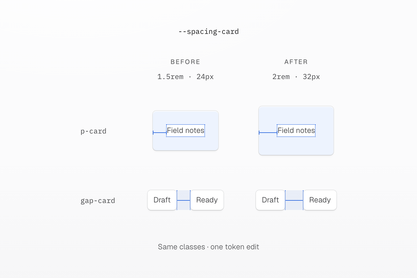
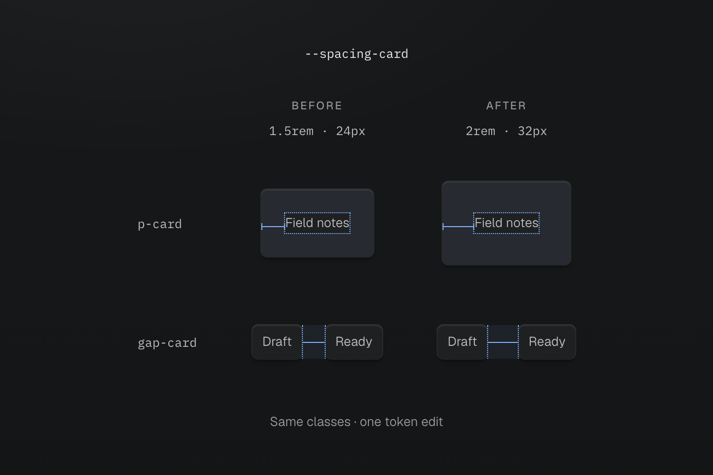
兩欄的標記完全相同。量測假設根字型大小為 16px;醒目區域以實際相對尺寸呈現內距與間隔。
文字說明
- 變更前. 根字型為 16px 時,--spacing-card: 1.5rem 透過 p-card 提供 24px 內距,並透過 gap-card 提供 24px 間隔。
- 變更後. 將 token 改為 2rem,兩個量測值都增至 32px,無須編輯類別。
- 選擇連動關係. 只有這些間距應一起改變時,才共用一個 token。不同設計決策需要不同 token,即使目前數值相同也一樣。
這種連動是設計決策。若卡片應更寬鬆、清單間隔卻要維持不變,請為兩者使用不同 token。今天共用同一數值,不代表介面的兩個部分永遠都應一起改變。
#依命名空間命名 token
token 前綴決定命名空間,各類別家族讀取自己支援的命名空間。--spacing-card 提供給 p-card、m-card 與 gap-card;--radius-card 提供給 r-card;--container-panel 提供給 max-w-panel。相同鍵名在不同家族可代表不同值:p-lg 讀取間距,r-lg 讀取圓角。
@theme { --color-text-action: var(--color-brand); --font-family-sans: Geist, ui-sans-serif, system-ui, sans-serif; --container-panel: 28rem;}只有 @theme 宣告會註冊類別 token;其他位置的原生自訂屬性不會。依共用的設計決策命名,例如 brand 或 card,不要依首次使用它的元件命名。重新定義 --spacing-lg 等預設集鍵名,即可改變整個專案的值。家族索引列出各類別讀取的命名空間;解析方式請參閱變數與模式。
#token 別名與覆寫
需要讓一個 token 跟隨另一個時,使用 var()。別名會先解析,再繼承:若 --color-text-action 宣告在根元素,於後代覆寫 --color-brand,不會重新綁定繼承的別名。請在該作用範圍重新宣告別名。
區域品牌色與繼承的別名
@theme { --color-brand: light-dark(#1d4ed8, #93c5fd); --color-text-action: var(--color-brand);}@layer components { [data-brand="plum"] { --color-brand: light-dark(#86198f, #f0abfc); } [data-rebind-action] { --color-text-action: var(--color-brand); }}<section data-brand="plum" class="p-lg r-lg bg-surface-raised"> <h2 class="m(0) text-lg font-regular fg-brand">Plum brand scope</h2> <p class="mt-md mb(0) text-sm font-regular fg-text-action">Inherited action: blue</p> <p data-rebind-action class="mt-sm mb(0) text-sm font-regular fg-text-action">Rebound action: plum</p></section>產生的 CSS
@layer components { [data-brand="plum"] { --color-brand: light-dark(#86198f, #f0abfc); } [data-rebind-action] { --color-text-action: var(--color-brand); }}@layer theme { :root, :host { --color-zinc-90: oklch(24.6% .0022 265) } :root, :host { --color-surface-raised: light-dark(var(--color-white), var(--color-zinc-90)) } :root, :host { --color-white: oklch(100% 0 none) } :root, :host { --font-weight-regular: 400; --font-size-sm: .875rem; --font-size-lg: 1.125rem; --text-sm: var(--font-size-sm); --text-sm--line-height: 1.5; --text-sm--letter-spacing: 0; --text-lg: var(--font-size-lg); --text-lg--line-height: 1.5; --text-lg--letter-spacing: 0; --radius-lg: .5rem; --spacing-sm: .75rem; --spacing-md: 1rem; --spacing-lg: 1.5rem } :root, :host { --color-brand: light-dark(#1d4ed8, #93c5fd); --color-text-action: var(--color-brand) }}@layer utilities { .text-lg { font-size: var(--text-lg); line-height: var(--text-lg--line-height, normal); letter-spacing: var(--text-lg--letter-spacing, normal) } .text-sm { font-size: var(--text-sm); line-height: var(--text-sm--line-height, normal); letter-spacing: var(--text-sm--letter-spacing, normal) } .bg-surface-raised { background-color: var(--color-surface-raised) } .r-lg { border-radius: var(--radius-lg) } .fg-brand { color: var(--color-brand) } .fg-text-action { color: var(--color-text-action) } .font-regular { font-weight: var(--font-weight-regular) } .m\(0\) { margin: calc(0 * 1px) } .mt-md { margin-top: var(--spacing-md) } .mt-sm { margin-top: var(--spacing-sm) } .mb\(0\) { margin-bottom: calc(0 * 1px) } .p-lg { padding: var(--spacing-lg) }}繼承的別名保留其計算值
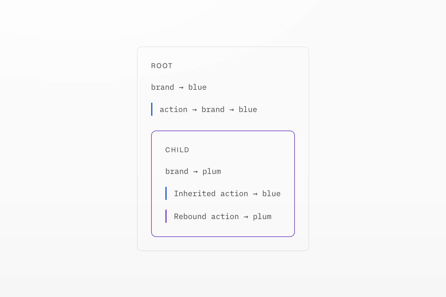
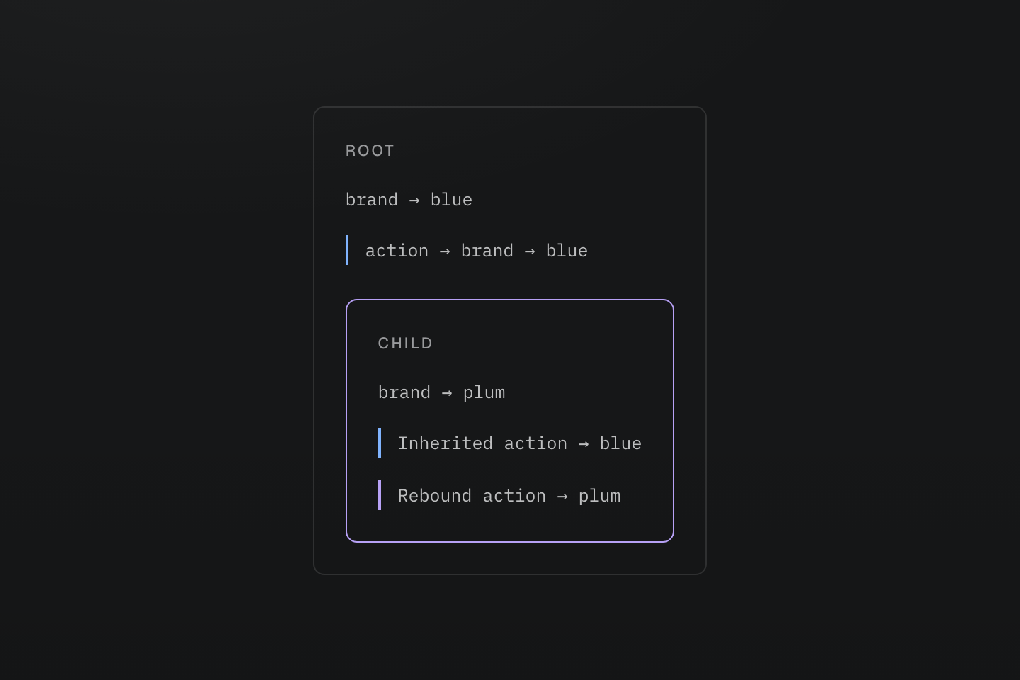
藍色與紫色標記指出兩條值解析路徑。這是作用範圍圖,不是額外的主題切換。
文字說明
根元素將 action 別名解析為藍色。子元素把 brand 改為梅紫色:繼承的別名仍是藍色,直到在該子元素重新宣告。
需要跟隨淺色與深色模式的顏色時,讓 token 使用 light-dark() 值,並保留不指向特定模式的名稱,例如 --color-surface-card。啟用模式請參閱色彩。
#選擇 token 傳遞與值替換方式
這兩個修飾詞回答的是不同問題:
| 需求 | 選擇 | 結果 |
|---|---|---|
| 專案使用時才輸出值 | 一般 @theme | 隨需輸出宣告;類別保留 token 參照。 |
| 即使未發現使用端也保留值 | @theme static | token 宣告仍可供外部整合等用途使用。 |
| 在每個套用樣式的元素上解析參照變數 | @theme inline | 在產生的宣告中替換一次 token 值。 |
整合讀取的值若無法被靜態探索發現,請使用 static:
@theme static { --color-integration-brand: #4f46e5; }需要在使用類別的元素上解析原生變數時,可使用 inline 建立銜接:
@theme inline { --color-brand: var(--app-brand); }:root { --app-brand: #4f46e5; }[data-theme="ocean"] { --app-brand: #0369a1; }<section data-theme="ocean"> <div class="bg-brand">Ocean background</div></section>此處 bg-brand 會輸出 background-color: var(--app-brand),因此內層元素會讀取從 section 繼承的 ocean 值。替換移除了中間的 --color-brand 參照,並非將固定顏色複製到每個元素。
兩種行為都需要時,使用 @theme static inline 組合修飾詞。Inline 替換適用於類別與 @apply;手寫原生 CSS 會保留原本的參照。請參閱主題契約。
分別選擇保留與替換
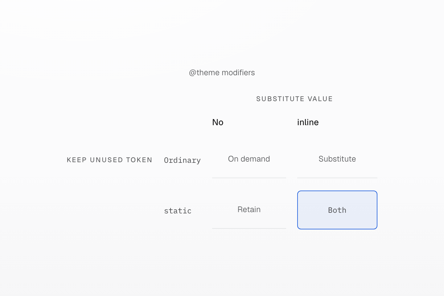
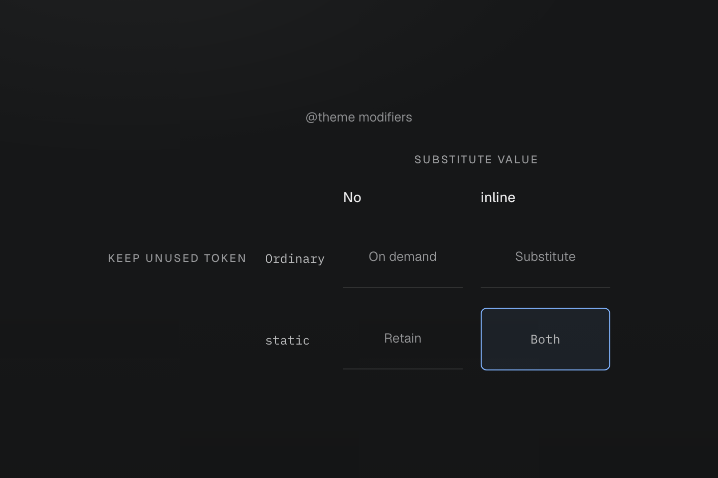
static 控制保留;inline 控制替換。使用其中一種,不代表同時啟用另一種。
文字說明
兩條互相垂直的軸,區分沒有使用端時保留 token,以及將 token 值替換至產生的宣告。
#定義動態效果 token
--animate-* token 是完整的 animation 簡寫,因此可組合關鍵影格名稱、持續時間與緩動 token。在旁邊以原生 CSS 撰寫關鍵影格:
動態效果由實際操作觸發
@theme { --duration-enter: 180ms; --easing-emphasized: cubic-bezier(.16, 1, .3, 1); --animate-dialog-in: dialog-in var(--duration-enter) var(--easing-emphasized) both;}@keyframes dialog-in { from { translate: 0 0.5rem; opacity: 0; }}<dialog class="animate-dialog-in@motion-safe">…</dialog>此 token 未指定重複次數,因此進場只執行一次;預設集的 animate-* token 則會重複。使用者要求減少動態效果時,@motion-safe 會讓對話方塊保持靜止。關鍵影格預設保留在樣式表中;使用 @prune native 時,被參照的動畫 token 會保留其關鍵影格。若名稱只由 JavaScript 套用,請加入 @safelist keyframes "dialog-in";。參閱動態效果與關鍵影格契約。