Master CSS 入門
以 class 建立介面,追查對應的 CSS,並定義專案共用的值。
本頁目錄
Master CSS 是 CSS 框架,讓你在標記中設定介面樣式,並以 CSS 定義共用樣式。建立元素時,直接在該處撰寫 class;整個專案共用的值與模式,則放在樣式表中。Master 會生成這些 class 所需的 CSS。
可以先從內建的色彩、間距與排版設定開始。建立第一個元件之前,不必先設計完整的主題。
#以 CSS 與 utility 建立介面
這張卡片結合了原生元件 class 與 utility。.action 在 CSS 中定義按鈕的基礎樣式;w-full、mt-md 與 bg-blue-60 則為這張卡片選擇按鈕的寬度、外距與顏色。其餘標記使用預設 utility 處理版面、間距與排版。
完成安裝後,將範例的 CSS 加到應用程式樣式表的預設樣式集匯入之後,並將 HTML 放進整合工具會掃描的原始檔:
@import '@master/css';以 CSS 與 utility 製作的卡片
@layer components { .action { display: flex; align-items: center; justify-content: center; min-height: 2.75rem; padding: var(--spacing-xs) var(--spacing-md); border-radius: var(--radius-md); font-size: var(--text-sm); font-weight: var(--font-weight-regular); line-height: var(--text-sm--line-height, normal); letter-spacing: var(--text-sm--letter-spacing, normal); text-decoration-line: none; outline-offset: 3px; &:focus-visible { outline: 2px solid; } }}<article class="overflow-hidden w-full (max-width:22.5rem) mx-auto r-lg bg-surface-raised shadow-sm"> <img src="/building.jpg" width="640" height="360" alt="Sunlit facade of a contemporary building" class="block w-full h-auto (aspect-ratio:16/9) object-cover"> <div class="p-lg"> <p class="m(0) text-2xs font-regular tracking-widest uppercase fg-text-blue">Launch panel</p> <h2 class="mt-xs mb(0) text-md font-regular fg-text-strong">Build the first screen in markup</h2> <p class="mt-xs mb(0) text-sm leading-lg fg-text-muted">Start with local classes, then promote repeated values into your project theme when the interface settles.</p> <a class="action w-full mt-md bg-blue-60 fg-white bg-blue-70:hover bg-blue-80:active outline-blue-60:focus-visible" href="/guide/installation" target="_top">Start building</a> </div></article>產生的 CSS
@layer components { .action { min-height: 2.75rem; padding: var(--spacing-xs) var(--spacing-md); border-radius: var(--radius-md); font-size: var(--text-sm); font-weight: var(--font-weight-regular); line-height: var(--text-sm--line-height, normal); letter-spacing: var(--text-sm--letter-spacing, normal); outline-offset: 3px; justify-content: center; align-items: center; text-decoration-line: none; display: flex; &:focus-visible { outline: 2px solid; } }}@layer theme { :root, :host { --color-zinc-40: oklch(68.6% .0028 265); --color-zinc-60: oklch(48.6% .003 265); --color-zinc-90: oklch(24.6% .0022 265); --color-zinc-100: oklch(15% .0016 265); --color-blue-30: oklch(72.87% .1468 249.3); --color-blue-60: oklch(51.83% .2687 266.1); --color-blue-70: oklch(46.26% .3057 266.7); --color-blue-80: oklch(42.89% .2907 266.3) } :root, :host { --color-surface-raised: light-dark(var(--color-white), var(--color-zinc-90)); --color-text-strong: light-dark(var(--color-zinc-100), var(--color-white)); --color-text-muted: light-dark(var(--color-zinc-60), var(--color-zinc-40)); --color-text-blue: light-dark(var(--color-blue-60), var(--color-blue-30)) } :root, :host { --color-white: oklch(100% 0 none) } :root, :host { --tracking-widest: .12em; --leading-lg: 1.8; --font-weight-regular: 400; --font-size-2xs: .625rem; --font-size-sm: .875rem; --font-size-md: 1rem; --text-2xs: var(--font-size-2xs); --text-2xs--line-height: 1.5; --text-2xs--letter-spacing: 0; --text-sm: var(--font-size-sm); --text-sm--line-height: 1.5; --text-sm--letter-spacing: 0; --text-md: var(--font-size-md); --text-md--line-height: 1.6; --text-md--letter-spacing: 0; --radius-md: .375rem; --radius-lg: .5rem; --spacing-xs: .5rem; --spacing-md: 1rem; --spacing-lg: 1.5rem } :root, :host { --shadow-sm: 0 0 0 1px light-dark(oklch(0% 0 none / .04), oklch(100% 0 none / .05)), 0 1px 1px -.5px light-dark(oklch(0% 0 none / .045), oklch(0% 0 none / .3)), 0 2px 2px -1px light-dark(oklch(0% 0 none / .04), oklch(0% 0 none / .26)), 0 4px 4px -2px light-dark(oklch(0% 0 none / .04), oklch(0% 0 none / .24)) }}@layer utilities { .text-2xs { font-size: var(--text-2xs); line-height: var(--text-2xs--line-height, normal); letter-spacing: var(--text-2xs--letter-spacing, normal) } .text-md { font-size: var(--text-md); line-height: var(--text-md--line-height, normal); letter-spacing: var(--text-md--letter-spacing, normal) } .text-sm { font-size: var(--text-sm); line-height: var(--text-sm--line-height, normal); letter-spacing: var(--text-sm--letter-spacing, normal) } .bg-blue-60 { background-color: var(--color-blue-60) } .bg-surface-raised { background-color: var(--color-surface-raised) } .r-lg { border-radius: var(--radius-lg) } .shadow-sm { box-shadow: var(--shadow-sm) } .fg-text-blue { color: var(--color-text-blue) } .fg-text-muted { color: var(--color-text-muted) } .fg-text-strong { color: var(--color-text-strong) } .fg-white { color: var(--color-white) } .block { display: block } .font-regular { font-weight: var(--font-weight-regular) } .h-auto { height: auto } .tracking-widest { letter-spacing: var(--tracking-widest) } .leading-lg { line-height: var(--leading-lg) } .m\(0\) { margin: calc(0 * 1px) } .mx-auto { margin-inline: auto } .mt-md { margin-top: var(--spacing-md) } .mt-xs { margin-top: var(--spacing-xs) } .mb\(0\) { margin-bottom: calc(0 * 1px) } .object-cover { object-fit: cover } .overflow-hidden { overflow: hidden } .p-lg { padding: var(--spacing-lg) } .uppercase { text-transform: uppercase } .w-full { width: 100% } .\(aspect-ratio\:16\/9\) { aspect-ratio: 16/9 } .\(max-width\:22\.5rem\) { max-width: 22.5rem } .bg-blue-70\:hover:hover { background-color: var(--color-blue-70) } .outline-blue-60\:focus-visible:focus-visible { outline-color: var(--color-blue-60) } .bg-blue-80\:active:active { background-color: var(--color-blue-80) }}預覽會一起使用畫面中顯示的 CSS 與 HTML。此範例在 @layer components 中定義 .action;Master 則依標記中的 class 生成 utility 規則。將按鈕共用的尺寸與焦點樣式留在 .action,這個實例所需的藍色與全寬設定則留在標記中。
試著將 p-lg 改成 p-md:卡片內容的內距會縮小,但按鈕的基礎樣式不會改變。
圖片網址假設應用程式會提供 /building.jpg。請替換成自己的圖片與替代文字,並將連結指向應用程式中的頁面。
#從 class 追到 CSS
以卡片中的 p-lg 為例。預設樣式集將 p- 連到內距,將 lg 連到間距 token --spacing-lg。Master 會生成 class 選擇器,其宣告參照這個 CSS 變數。
class 選擇樣式,token 提供值
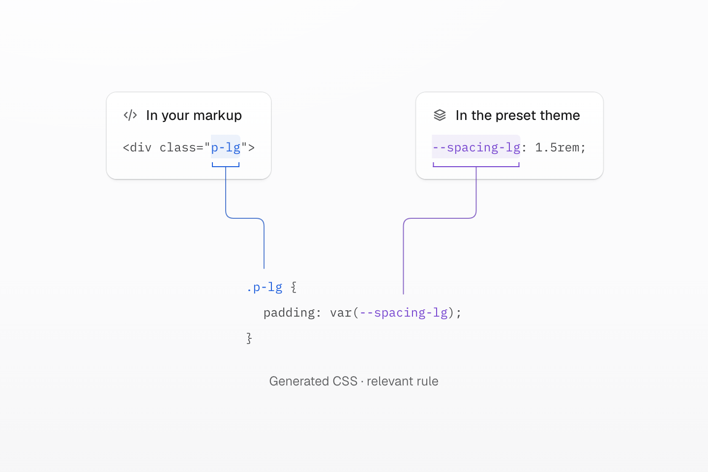
名稱將各個部分連在一起:p-lg 選中規則,var(--spacing-lg) 讀取共用值。圖中只顯示相關宣告;下方的完整輸出也包含所屬的層。
文字說明
- class 比對. HTML 中的 p-lg class 會符合生成的 .p-lg 選擇器。藍色括號與連線將這兩處對應起來。
- 共用值. 預設樣式集將 --spacing-lg 定義為 1.5rem。紫色括號與連線將這個定義連到 padding: var(--spacing-lg) 中的參照。
- 瀏覽器結果. 瀏覽器解析 CSS 變數後,在四邊套用 1.5rem 內距。生成的規則保留變數參照,不會將值複製進宣告。
產生的 CSS
@layer theme { :root, :host { --spacing-lg: 1.5rem }}@layer utilities { .p-lg { padding: var(--spacing-lg) }}瀏覽器會對符合的元素套用 padding: var(--spacing-lg)。依預設值,四邊的內距都是 1.5rem。即使在主題中修改共用值,class 也不必改名。
其他 class 則表達不同的設定:w-full 是對應 width: 100% 的固定 utility,bg-blue-70:hover 則加上懸停狀態。語法教學會透過可運作的範例,介紹值、選擇器與條件。
#定義哪些部分應該一起改變
當多個元素應該共用某個專案設定時,就新增主題 token。以主要操作的顏色為例,在應用程式樣式表的匯入之後定義 --color-brand,再於標記中使用 bg-brand:
@theme { --color-brand: #2563eb;}<a class="inline-flex px-md py-xs r-md bg-brand fg-white" href="/guide/installation">Start building</a>產生的 CSS
@layer theme { :root, :host { --color-white: oklch(100% 0 none) } :root, :host { --radius-md: .375rem; --spacing-xs: .5rem; --spacing-md: 1rem } :root, :host { --color-brand: #2563eb }}@layer utilities { .bg-brand { background-color: var(--color-brand) } .r-md { border-radius: var(--radius-md) } .fg-white { color: var(--color-white) } .inline-flex { display: inline-flex } .py-xs { padding-block: var(--spacing-xs) } .px-md { padding-inline: var(--spacing-md) }}修改 --color-brand,使用它的元素就會一起更新。共用 token 的理由,應該是這些元素需要一起改變;兩個互不相關的顏色,即使目前數值相同,也不必使用同一個名稱。主題 token會說明如何定義與覆寫共用值。
多個元素需要共用樣式規則時,可使用 .action 這類元件 class;需要共用標記時,則使用 UI 元件。單純因為 class 清單很長,不代表就需要另取一個 CSS 名稱。重用樣式會協助判斷何時適合共用 token、元件 class 或自訂 utility。
交付方式改變,class 詞彙不變
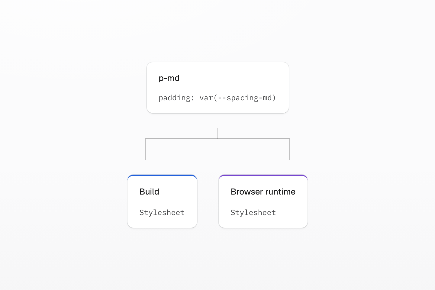
語法表達要求的樣式;渲染模式則決定何時、在哪裡生成對應的 CSS。
文字說明
同一個 class 與其宣告,在圖中分成兩條交付路徑:建置時生成的樣式表,以及瀏覽器生成的樣式表。
#從靜態 CSS 開始
使用框架建議的靜態整合方式。它會在建置階段從原始檔找出完整 class 名稱,交付一般 CSS,不需要在瀏覽器載入 Master 執行階段或引擎。
互動介面仍可正常運作:切換已知的 class、使用 :hover 這類選擇器,或透過 CSS 自訂屬性更新進度、座標等數值。當演練場、視覺化編輯器或已部署的內容帶入先前未知的 class 名稱時,執行階段就能派上用場。渲染模式會說明各種交付方式。
依安裝指南將 Master CSS 接入應用程式,再跟著語法教學建立具有互動狀態與響應式條件的卡片。若需要撰寫時的補全與診斷,請設定語言服務。