宣言と値
利用可能なクラス形式、ネイティブ値の解析、単位、重要度、固定ユーティリティ。
このページの内容
クラスは登録済みユーティリティまたはネイティブ宣言から始まり、任意でセレクター、条件、重要度が続きます。このページは宣言の形式、値の解析、拒否の規則を定義します。実例に沿った説明は構文チュートリアルを、ネイティブプロパティの意味は CSS リファレンスを参照してください。
以下の名前付き形式は、@import '@master/css' で既定のプリセットを読み込んでいることを前提とします。プロジェクト定義でユーティリティを追加・置換できます。ネイティブ宣言に登録済みユーティリティは不要です。
利用できる形式
| 形式 | 例 | 意味 |
|---|---|---|
| 静的ユーティリティ | flex | 登録済みの名前。ここでは display: flex |
| トークンユーティリティ | p-md | 登録済みの接頭辞とトークンキー。ここでは padding: var(--spacing-md) |
| 関数ユーティリティ | p(12) | 引数を取る登録済み関数。ここでは padding: calc(12 * 1px) |
| ネイティブ宣言 | (padding:1rem) | 完全な CSS プロパティと値を 1 つ指定 |
これらは構文の形であり、同じ意味で置き換えられる表記ではありません。静的、トークン、関数のユーティリティはいずれも複数の宣言を持てます。truncate、text-sm、grid-cols(2) は組み合わせスタイルです。ネイティブの先頭部分はちょうど 1 つの宣言を持ち、CSS ショートハンドも使えます。
生成された CSS
@layer theme { :root, :host { --spacing-md: 1rem }}@layer utilities { .flex { display: flex } .p-md { padding: var(--spacing-md) } .p\(12\) { padding: calc(12 * 1px) } .\(padding\:1rem\) { padding: 1rem }}どの形式も接尾辞を受け付けます。p(12):hover@sm! では、先頭が p(12)、セレクターが :hover、条件が @sm で、! が重要度を示します。接尾辞は自身のクラスだけに作用します。完全な仕様はセレクターと条件を参照してください。
ネイティブ宣言
完全なプロパティ名で (property:value) を書きます。Master CSS は括弧の釣り合った先頭部分を読み取ってから、接尾辞を解析します。単独の名前の後のコロンはセレクターの開始です。flex:hover は登録済みの flex ユーティリティを選び、display:block は (display:block) の代わりにはなりません。
閉じる境界
文字列、コメント、エスケープ、入れ子の丸括弧と角括弧、引用符なしの url() トークンは、CSS のコンポーネント値の境界に従います。引用符付き文字列内の ) は先頭部分を閉じません。
<span class="(content:')')::before"></span>引用符内の括弧は値の一部
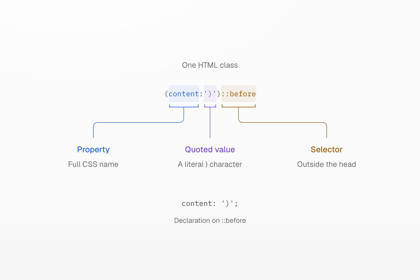
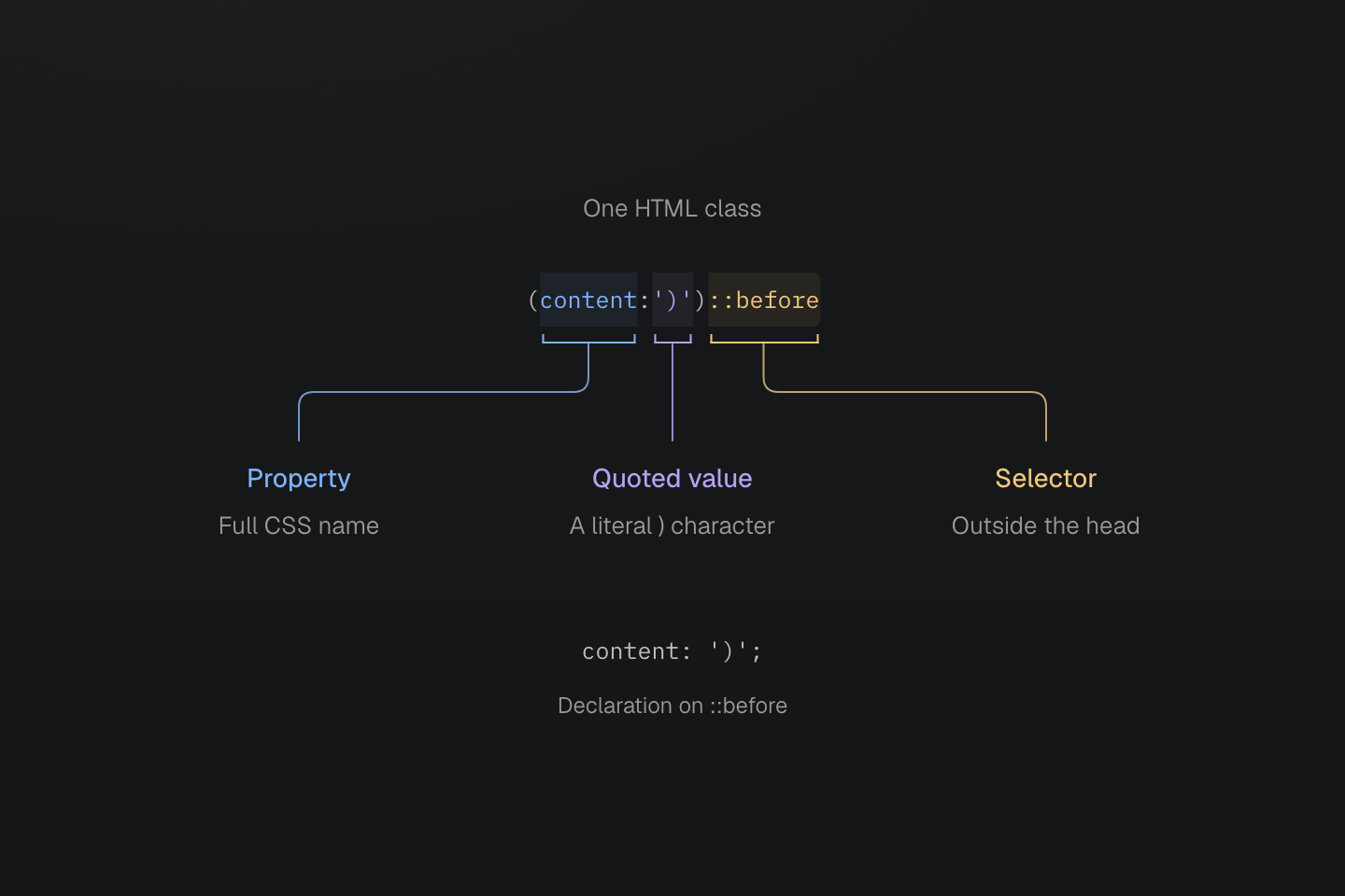
最初の閉じ括弧は引用符内の値です。次の括弧が宣言を閉じ、::before はその外側から始まります。
テキストによる説明
- (content:')')::before では、content がプロパティ、')' が引用符付きの値です。
- 文字列内の ) は保持され、次の ) がネイティブ宣言の先頭部分を閉じます。
- ::before の接尾辞は疑似要素を対象にし、content: ')'; という宣言を生成します。
先頭部分の内側でも、ほかの CSS 構造はそれぞれの境界を保ちます。
| クラス | 値の境界 |
|---|---|
(width:calc(1px+(2px*3))) | 入れ子の括弧は計算式に属する |
(grid-template-columns:[start]|1fr|[end]) | 角括弧は Grid のライン名を囲む |
(background-image:url(/ | 波括弧は引用符なしの URL トークンに属する |
生成された CSS
@layer utilities { .\(background-image\:url\(\/a\{b\.svg\)\) { background-image:url(/a{b.svg) } .\(grid-template-columns\:\[start\]\|1fr\|\[end\]\) { grid-template-columns: [start] 1fr [end] } .\(width\:calc\(1px\+\(2px\*3\)\)\) { width: calc(1px + (2px * 3)) } .\(content\:\'\)\'\)\:\:before::before { content: ')' }}値の内部にも CSS エスケープが適用されます。引用符なしの URL に括弧がある場合は、引用符で囲むか CSS エスケープを使い、トークンを有効に保ちます。
不正な先頭部分
不正な先頭部分はルールを生成せず、ユーティリティや別のクラス形式として再試行もしません。
| 拒否されるクラス | 理由 |
|---|---|
(display:block | 閉じ括弧がない |
(color:red)(display:block) | 1 クラスに先頭部分が 2 つある |
(color:red;display:block) | 宣言が 1 つを超える |
(display:block;) | 末尾でもトップレベルのセミコロンは不可 |
(width:calc(1px]) | 区切り記号が対応しない |
(width:) | 通常のプロパティの値が空 |
(color:{red}) | 波括弧のブロックを通常のプロパティ値に指定 |
(width:calc(((…1px…)))) を 65 段入れ子にする | 括弧の入れ子が 64 段を超える |
カスタムプロパティは空の値や釣り合った波括弧ブロックを持てるため、(--slot:) と (--state:{open}) は有効です。(--slot:!important) は値が空の重要なカスタムプロパティですが、(width:!important) は無効です。
出力とブラウザー上の有効性
構文が有効なプロパティ名は、ツールの一覧になくても宣言を出力できます。ネイティブ値はプリセットに限定されませんが、対象ブラウザーでそのプロパティに有効な値でなければなりません。たとえば (font-size:48) は font-size: 48 を出力し、px は付きません。このゼロでない単位なしの長さは無効な CSS です。その長さには (font-size:48px) を使います。(field-sizing:content) などのネイティブプロパティにユーティリティの登録は不要です。
生成された CSS
@layer utilities { .\(field-sizing\:content\) { field-sizing: content } .\(font-size\:48px\) { font-size: 48px }}Master CSS は、backdrop-filter とともに -webkit-backdrop-filter を出すなど、一部の互換宣言を出力します。ただしベンダー固有セレクターの追加や、ブラウザー機能の polyfill は行いません。生成 CSS を確認し、ブラウザー要件とフォールバック設計は互換性を参照してください。
生成された CSS
@layer utilities { .\(backdrop-filter\:blur\(16px\)\) { -webkit-backdrop-filter: blur(16px); backdrop-filter: blur(16px) } .\(background-color\:\#000\)\:\:-webkit-scrollbar::-webkit-scrollbar { background-color: #000 }}値のエンコード
空白・文字列・アンダースコア
値に CSS の引用符があっても、HTML の空白はクラスを区切ります。クラスの値内で、引用符の外の | は空白を表し、引用符付き文字列内ではリテラルのままです。カンマやスラッシュなどの CSS 記号はそのまま残します。
<div class="(color:rgb(30|60|90/80%)) (content:'a|b')::before"></div>生成された CSS
@layer utilities { .\(animation-name\:slide_in\) { animation-name: slide_in } .\(color\:rgb\(30\|60\|90\/80\%\)\) { color: rgb(30 60 90/80%) } .\(color\:red\)_a a { color: red } .\(content\:\'a\|b\'\)\:\:before::before { content: 'a|b' }}色の値は rgb(30 60 90 / 80%) になり、content の文字列は 'a|b' のままです。CSS 文字列の中に実際の空白が必要なら、\000020 などの CSS エスケープを使います。(content:'New\000020collection')::before は「New collection」を生成します。6 桁のエスケープなら、HTML のクラス内に終端の空白を入れずに済みます。
ネイティブの先頭部分内のアンダースコアは、slide_in のようにリテラルです。閉じた後の _ は子孫セレクターを開始し、(color:red)_a は子孫リンクを対象にします。登録済みユーティリティ名に _ は使えませんが、含むトークンキーは var(--name) で参照できます。
関数と明示的な変数
CSS 関数はネイティブプロパティの値のままです。Master CSS は calc(100%-2rem) の演算の空白を、最大 64 段の入れ子の括弧や 1px-2px-3px などの連続する減算まで正規化し、それより深い部分はそのまま残します。計算はブラウザーが評価します。Master CSS は単独の語からトークンを推論したり CSS 関数をユーティリティ呼び出しとして評価したりはしません。
生成された CSS
@layer theme { :root, :host { --color-red-60: oklch(60.94% .2501 29.2) } :root, :host { --color-red: var(--color-red-60) }}@layer utilities { .\(color\:var\(--color-red\)\) { color: var(--color-red) } .\(width\:calc\(100\%-2rem\)\) { width: calc(100% - 2rem) } .\(width\:calc\(100\%-var\(--spacing-md\)\)\) { width: calc(100%-var(--spacing-md)) }}ネイティブの色の値は意味を保ちます。(color:red)、(color:#175fe9)、(color:rgb(23,95,233)) は CSS 値を指定し、fg-red はテーマトークンを選びます。var() 参照は明示的です。(font-family:mono) は CSS ファミリーの mono を指定し、--font-mono ではありません。トークンの解決、モード、派生値は変数とモードを参照してください。
数値と単位
ネイティブ宣言は単位を保持し、rem をピクセルに変換したりプロパティから単位を推論したりしません。小数の先頭のゼロは省略でき、(opacity:.5) と (opacity:0.5) は同じ数値を指定します。
| ネイティブ値 | 解釈 |
|---|---|
(margin:1rem) | ルートのフォントサイズを基準とする長さ |
(width:50%) | プロパティの文脈で解決されるパーセント値 |
(rotate:30deg) | 明示的な角度 |
(animation-duration:200ms) | 明示的な時間。.2s も同じ長さを表す |
(opacity:.5) | 単位なしの数値 |
(background-image:image-set(url(a.png)|1x,url(b.png)|2x)) | CSS ピクセル当たりのドット数によるネイティブ画像の解像度 |
プロパティが数値、長さ、パーセント値などのどの型を受け付けるかは、CSS の値と単位の規則で決まります。p(12) は異なり、プリセットの関数が引数に 1px を明示的に掛けます。
負の値
ネイティブの負の値は (margin-top:-2rem) のように値の中に書きます。直接数値の引数には mt(-8) を使います。負のトークンクラスはクラス全体の前に - を付け、-mt-sm とします。この形式には数値トークンと負の値に対応したユーティリティが必要です。padding は対応しないため -p-sm は拒否されます。
生成された CSS
@layer theme { :root, :host { --spacing-sm: .75rem }}@layer utilities { .-mt-sm { margin-top: calc(var(--spacing-sm) * -1) } .mt\(-8\) { margin-top: calc(-8 * 1px) } .\(margin-top\:-2rem\) { margin-top: -2rem }}引数の検証によって CSS プロパティの値の制約が変わるわけではありません。
登録済みユーティリティ
トークン名
トークンの接頭辞はユーティリティ定義で登録され、プロパティの略称からは推論されません。p-md は --spacing-md を読み、fg-red と bg-red はともに --color-red を読みますが、設定するプロパティは異なります。padding-md のような完全なプロパティ名の形式や、p-4 のような暗黙の数値スケールはありません。選択された名前空間にそのキーが必要です。
同じ綴りのトークンクラスより静的な名前が優先されます。たとえばプロジェクトが --container-full を定義しても w-full は width: 100% のままです。--radius-pill があっても pill は完全に丸い角の半径です。同名の静的ユーティリティと関数は独立して登録されます。
接頭辞と名前空間の完全な対応表はトークンファミリー一覧、登録と置換の規則はユーティリティ定義を参照してください。プロジェクトの値の定義とスコープ設定はテーマトークンで説明します。
固定の綴りは自身の定義を保つ
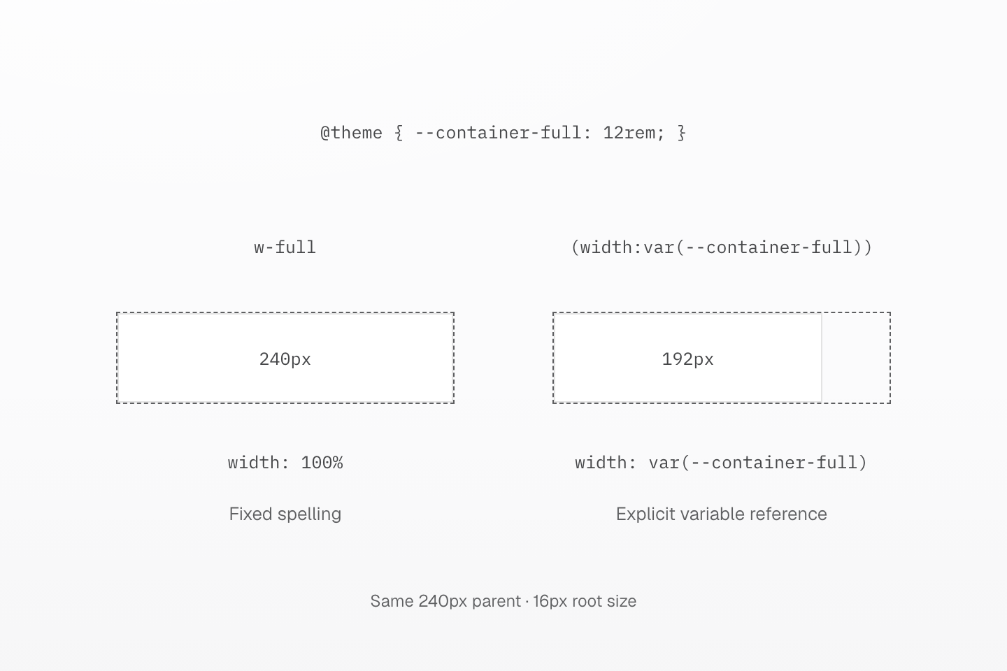
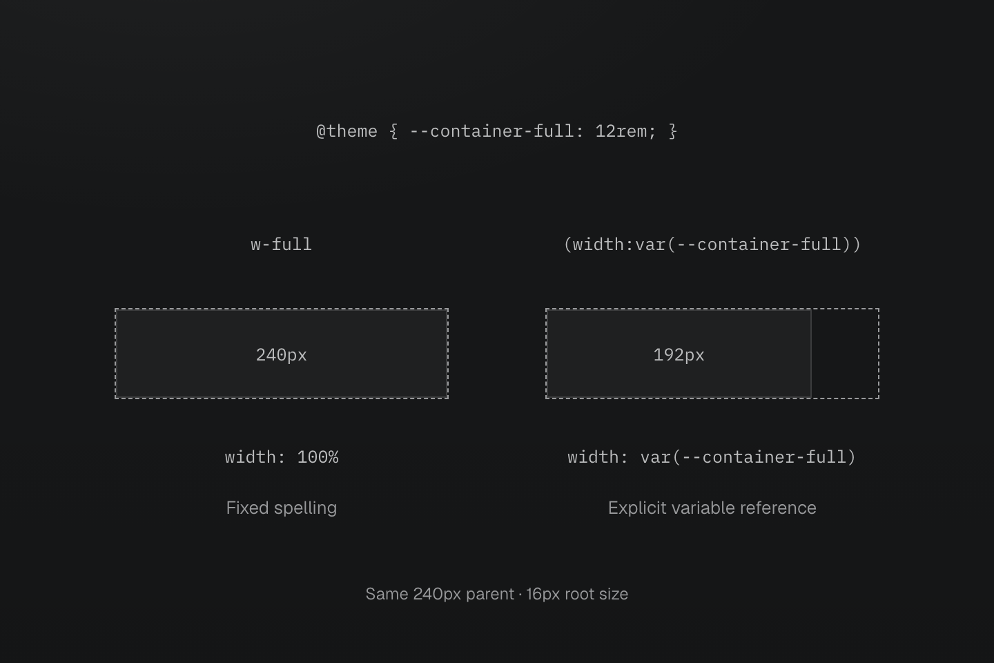
両方の親の幅は 240px です。独自の --container-full は 12rem(ルートのフォントサイズが 16px なら 192px)ですが、w-full は固定の 100% ユーティリティのままです。
テキストによる説明
- 設定は @theme { --container-full: 12rem; } を定義します。プリセットはすでに完全な固定名 w-full を width: 100% として登録しています。
- そのため w-full は幅 240px の親を満たします。明示的な (width:var(--container-full)) クラスは --container-full を読み、2 番目のブロックを幅 192px にします。
- トークンは明示的な var() 参照で引き続き使えます。定義しても固定の w-full 登録は置き換わりません。
直接数値
m(4)、b(1)、grow(1) などのプリセット関数は静的な数値を 1 つ受け取ります。長さの関数は 1px を掛ける式を出力し、grow()、shrink()、order() は数値をそのまま渡します。order() は整数が必要です。ゼロ、小数、負の引数は各パラメーターに宣言された型に従います。
単位や動的な式は数値引数ではないため、m(1px) と b(var(--x)) は規則を生成しません。それらの値には (margin:1rem) や (border-width:var(--x)) を使います。関数一覧、パラメーター型、生成される宣言は直接数値を参照してください。
レシピは複数のプロパティや補助値をまとめられます。text-sm はサイズ、行の高さ、字間を含み、animate-fade はアニメーションの一括指定を提供します。参照と上書きの規則はテキストトークンとモーショントークンを参照してください。
カスタムプロパティ
(--name:value) という先頭部分は、一致する要素に CSS カスタムプロパティを宣言します。他の宣言と同じセレクターや条件を付けられますが、ユーティリティやテーマトークンは登録しません。
<div class="(--progress:40%) (--progress:60%):hover (width:var(--progress))">Progress</div>生成された CSS
@layer utilities { .\(--progress\:40\%\) { --progress: 40% } .\(width\:var\(--progress\)\) { width: var(--progress) } .\(--progress\:60\%\)\:hover:hover { --progress: 60% }}var(--progress) は通常の CSS の解決と継承を使います。未解決の変数や互換性のない置換値により、参照する宣言が無効になる場合があります。必要に応じて CSS 変数の代替値を使ってください。固定クラスに動的な値を渡す方法は構文チュートリアルで説明します。
組み合わせと重要度
b(1) b-solid b-line-control のように、別々のクラスで独立した判断を表します。ネイティブの一括指定も使用でき、この書き方の推奨で CSS の文法は変わりません。セレクターや条件が必要な各クラスに、それぞれ接尾辞を付けてください。
<ul class="block>li:hover@md (font-size:14px)>li:hover@md text-center>li:hover@md">…</ul>同じレイヤー、条件、セレクター内では、レシピ、単一宣言のユーティリティ、ネイティブ宣言の順に並びます。単一宣言のユーティリティは値の出所より先にプロパティの系統と適用範囲で並び、同じプロパティではトークンが固定値や直接数値より前になります。HTML のクラス順序で結果は決まりません。
生成された CSS
@layer theme { :root, :host { --spacing-md: 1rem }}@layer utilities { .m-md { margin: var(--spacing-md) } .mx-auto { margin-inline: auto } .mt\(0\) { margin-top: calc(0 * 1px) } .p-md { padding: var(--spacing-md) } .p\(12\) { padding: calc(12 * 1px) } .\(padding\:1rem\) { padding: 1rem }}ここではネイティブの padding が両ユーティリティの後に来て、mt(0) と mx-auto が m-md の対応する部分を上書きします。並び順の完全な契約はカスケードレイヤー、コンポーネントクラス、@utility レシピ、CSS ミックスイン の選び方はスタイルの再利用を参照してください。
重要度
末尾の ! はクラスの宣言を重要にします。括弧内の値の末尾にあるネイティブの !important も同じ効果で、両方書いても出力は 1 回です。文字列内の '!important' は内容のままです。
生成された CSS
@layer utilities { .text-center\! { text-align: center !important } .\(color\:red\!important\) { color: red !important } .\(color\:red\!important\)\! { color: red !important } .\(content\:\'\!important\'\)\:\:before::before { content: '!important' }}重要度はレシピの全宣言に適用
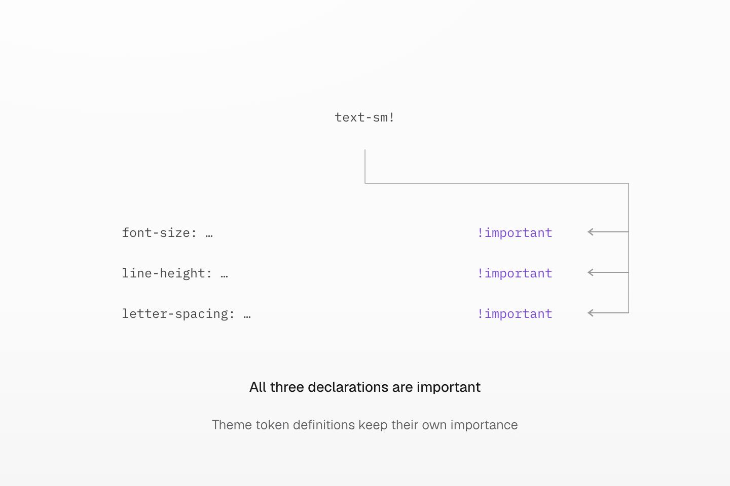
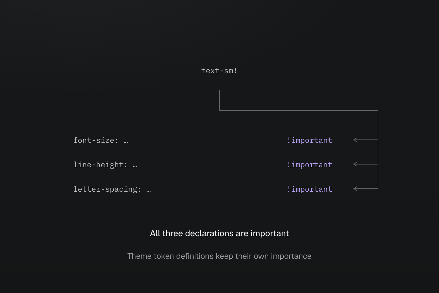
末尾の ! 1 つで 3 つの宣言すべてを重要にします。省略記号はトークン参照の省略です。隣の HTML クラスやテーマトークン定義を重要にするものではありません。
テキストによる説明
- text-sm は主トークンと補助参照を使い、font-size、line-height、letter-spacing を書き込みます。
- text-sm! は生成された 3 つの宣言すべてを !important にします。依存先の宣言は通常のテーマトークンのままです。
固定ユーティリティ一覧
プリセットには固定の単一宣言ユーティリティが 292 個あります。それぞれ一覧のプロパティだけを設定し、flex-col は flex レイアウトを有効にせず、b-none は枠線の太さをリセットせず、pill はサイズを設定しません。複数宣言の truncate レシピは切り詰めに別途掲載しています。
| クラス, 宣言 | CSS |
|---|---|
block | display: block |
inline | display: inline |
inline-block | display: inline-block |
flow-root | display: flow-root |
flex | display: flex |
inline-flex | display: inline-flex |
grid | display: grid |
inline-grid | display: inline-grid |
contents | display: contents |
list-item | display: list-item |
table | display: table |
inline-table | display: inline-table |
table-caption | display: table-caption |
table-cell | display: table-cell |
table-column | display: table-column |
table-column-group | display: table-column-group |
table-header-group | display: table-header-group |
table-footer-group | display: table-footer-group |
table-row | display: table-row |
table-row-group | display: table-row-group |
hidden | display: none |
static | position: static |
relative | position: relative |
absolute | position: absolute |
fixed | position: fixed |
sticky | position: sticky |
visible | visibility: visible |
invisible | visibility: hidden |
isolate | isolation: isolate |
box-border | box-sizing: border-box |
box-content | box-sizing: content-box |
italic | font-style: italic |
oblique | font-style: oblique |
uppercase | text-transform: uppercase |
lowercase | text-transform: lowercase |
capitalize | text-transform: capitalize |
underline | text-decoration-line: underline |
overline | text-decoration-line: overline |
line-through | text-decoration-line: line-through |
flex-row | flex-direction: row |
flex-row-reverse | flex-direction: row-reverse |
flex-col | flex-direction: column |
flex-col-reverse | flex-direction: column-reverse |
flex-wrap | flex-wrap: wrap |
flex-nowrap | flex-wrap: nowrap |
flex-wrap-reverse | flex-wrap: wrap-reverse |
items-normal | align-items: normal |
items-start | align-items: start |
items-end | align-items: end |
items-flex-start | align-items: flex-start |
items-flex-end | align-items: flex-end |
items-center | align-items: center |
items-baseline | align-items: baseline |
items-stretch | align-items: stretch |
content-normal | align-content: normal |
content-start | align-content: start |
content-end | align-content: end |
content-flex-start | align-content: flex-start |
content-flex-end | align-content: flex-end |
content-center | align-content: center |
content-baseline | align-content: baseline |
content-stretch | align-content: stretch |
content-between | align-content: space-between |
content-around | align-content: space-around |
content-evenly | align-content: space-evenly |
self-auto | align-self: auto |
self-normal | align-self: normal |
self-start | align-self: start |
self-end | align-self: end |
self-flex-start | align-self: flex-start |
self-flex-end | align-self: flex-end |
self-center | align-self: center |
self-baseline | align-self: baseline |
self-stretch | align-self: stretch |
justify-normal | justify-content: normal |
justify-start | justify-content: start |
justify-end | justify-content: end |
justify-flex-start | justify-content: flex-start |
justify-flex-end | justify-content: flex-end |
justify-center | justify-content: center |
justify-between | justify-content: space-between |
justify-around | justify-content: space-around |
justify-evenly | justify-content: space-evenly |
justify-stretch | justify-content: stretch |
object-cover | object-fit: cover |
object-contain | object-fit: contain |
object-fill | object-fit: fill |
object-none | object-fit: none |
object-scale-down | object-fit: scale-down |
object-center | object-position: center |
object-top | object-position: top |
object-bottom | object-position: bottom |
object-left | object-position: left |
object-right | object-position: right |
m-auto | margin: auto |
mt-auto | margin-top: auto |
mr-auto | margin-right: auto |
mb-auto | margin-bottom: auto |
ml-auto | margin-left: auto |
mx-auto | margin-inline: auto |
mxs-auto | margin-inline-start: auto |
mxe-auto | margin-inline-end: auto |
my-auto | margin-block: auto |
mys-auto | margin-block-start: auto |
mye-auto | margin-block-end: auto |
top-auto | top: auto |
right-auto | right: auto |
bottom-auto | bottom: auto |
left-auto | left: auto |
inset-auto | inset: auto |
ix-auto | inset-inline: auto |
ixs-auto | inset-inline-start: auto |
ixe-auto | inset-inline-end: auto |
iy-auto | inset-block: auto |
iys-auto | inset-block-start: auto |
iye-auto | inset-block-end: auto |
w-auto | width: auto |
h-auto | height: auto |
size-x-auto | inline-size: auto |
size-y-auto | block-size: auto |
min-w-auto | min-width: auto |
min-h-auto | min-height: auto |
min-size-x-auto | min-inline-size: auto |
min-size-y-auto | min-block-size: auto |
basis-auto | flex-basis: auto |
max-w-none | max-width: none |
max-h-none | max-height: none |
max-size-x-none | max-inline-size: none |
max-size-y-none | max-block-size: none |
w-full | width: 100% |
w-fit | width: fit-content |
w-max | width: max-content |
w-min | width: min-content |
h-full | height: 100% |
h-fit | height: fit-content |
h-max | height: max-content |
h-min | height: min-content |
size-x-full | inline-size: 100% |
size-x-fit | inline-size: fit-content |
size-x-max | inline-size: max-content |
size-x-min | inline-size: min-content |
size-y-full | block-size: 100% |
size-y-fit | block-size: fit-content |
size-y-max | block-size: max-content |
size-y-min | block-size: min-content |
min-w-full | min-width: 100% |
min-w-fit | min-width: fit-content |
min-w-max | min-width: max-content |
min-w-min | min-width: min-content |
min-h-full | min-height: 100% |
min-h-fit | min-height: fit-content |
min-h-max | min-height: max-content |
min-h-min | min-height: min-content |
min-size-x-full | min-inline-size: 100% |
min-size-x-fit | min-inline-size: fit-content |
min-size-x-max | min-inline-size: max-content |
min-size-x-min | min-inline-size: min-content |
min-size-y-full | min-block-size: 100% |
min-size-y-fit | min-block-size: fit-content |
min-size-y-max | min-block-size: max-content |
min-size-y-min | min-block-size: min-content |
max-w-full | max-width: 100% |
max-w-fit | max-width: fit-content |
max-w-max | max-width: max-content |
max-w-min | max-width: min-content |
max-h-full | max-height: 100% |
max-h-fit | max-height: fit-content |
max-h-max | max-height: max-content |
max-h-min | max-height: min-content |
max-size-x-full | max-inline-size: 100% |
max-size-x-fit | max-inline-size: fit-content |
max-size-x-max | max-inline-size: max-content |
max-size-x-min | max-inline-size: min-content |
max-size-y-full | max-block-size: 100% |
max-size-y-fit | max-block-size: fit-content |
max-size-y-max | max-block-size: max-content |
max-size-y-min | max-block-size: min-content |
basis-full | flex-basis: 100% |
basis-fit | flex-basis: fit-content |
basis-max | flex-basis: max-content |
basis-min | flex-basis: min-content |
order-first | order: -999999 |
order-last | order: 999999 |
pill | border-radius: calc(infinity*1px) |
b-solid | border-style: solid |
b-dashed | border-style: dashed |
b-dotted | border-style: dotted |
b-double | border-style: double |
b-none | border-style: none |
bt-solid | border-top-style: solid |
bt-dashed | border-top-style: dashed |
bt-dotted | border-top-style: dotted |
bt-double | border-top-style: double |
bt-none | border-top-style: none |
br-solid | border-right-style: solid |
br-dashed | border-right-style: dashed |
br-dotted | border-right-style: dotted |
br-double | border-right-style: double |
br-none | border-right-style: none |
bb-solid | border-bottom-style: solid |
bb-dashed | border-bottom-style: dashed |
bb-dotted | border-bottom-style: dotted |
bb-double | border-bottom-style: double |
bb-none | border-bottom-style: none |
bl-solid | border-left-style: solid |
bl-dashed | border-left-style: dashed |
bl-dotted | border-left-style: dotted |
bl-double | border-left-style: double |
bl-none | border-left-style: none |
bx-solid | border-inline-style: solid |
bx-dashed | border-inline-style: dashed |
bx-dotted | border-inline-style: dotted |
bx-double | border-inline-style: double |
bx-none | border-inline-style: none |
bxs-solid | border-inline-start-style: solid |
bxs-dashed | border-inline-start-style: dashed |
bxs-dotted | border-inline-start-style: dotted |
bxs-double | border-inline-start-style: double |
bxs-none | border-inline-start-style: none |
bxe-solid | border-inline-end-style: solid |
bxe-dashed | border-inline-end-style: dashed |
bxe-dotted | border-inline-end-style: dotted |
bxe-double | border-inline-end-style: double |
bxe-none | border-inline-end-style: none |
by-solid | border-block-style: solid |
by-dashed | border-block-style: dashed |
by-dotted | border-block-style: dotted |
by-double | border-block-style: double |
by-none | border-block-style: none |
bys-solid | border-block-start-style: solid |
bys-dashed | border-block-start-style: dashed |
bys-dotted | border-block-start-style: dotted |
bys-double | border-block-start-style: double |
bys-none | border-block-start-style: none |
bye-solid | border-block-end-style: solid |
bye-dashed | border-block-end-style: dashed |
bye-dotted | border-block-end-style: dotted |
bye-double | border-block-end-style: double |
bye-none | border-block-end-style: none |
outline-solid | outline-style: solid |
outline-dashed | outline-style: dashed |
outline-dotted | outline-style: dotted |
outline-double | outline-style: double |
outline-none | outline-style: none |
text-left | text-align: left |
text-center | text-align: center |
text-right | text-align: right |
text-start | text-align: start |
text-end | text-align: end |
text-justify | text-align: justify |
overflow-auto | overflow: auto |
overflow-hidden | overflow: hidden |
overflow-clip | overflow: clip |
overflow-visible | overflow: visible |
overflow-scroll | overflow: scroll |
overflow-x-auto | overflow-x: auto |
overflow-x-hidden | overflow-x: hidden |
overflow-x-clip | overflow-x: clip |
overflow-x-visible | overflow-x: visible |
overflow-x-scroll | overflow-x: scroll |
overflow-y-auto | overflow-y: auto |
overflow-y-hidden | overflow-y: hidden |
overflow-y-clip | overflow-y: clip |
overflow-y-visible | overflow-y: visible |
overflow-y-scroll | overflow-y: scroll |
whitespace-normal | white-space: normal |
whitespace-nowrap | white-space: nowrap |
whitespace-pre | white-space: pre |
whitespace-pre-wrap | white-space: pre-wrap |
whitespace-pre-line | white-space: pre-line |
whitespace-break-spaces | white-space: break-spaces |
select-none | user-select: none |
select-text | user-select: text |
select-all | user-select: all |
select-auto | user-select: auto |
pointer-none | pointer-events: none |
pointer-auto | pointer-events: auto |
vertical-baseline | vertical-align: baseline |
vertical-top | vertical-align: top |
vertical-middle | vertical-align: middle |
vertical-bottom | vertical-align: bottom |
vertical-text-top | vertical-align: text-top |
vertical-text-bottom | vertical-align: text-bottom |
vertical-sub | vertical-align: sub |
vertical-super | vertical-align: super |
container-inline | container-type: inline-size |
container-size | container-type: size |
container-normal | container-type: normal |
wrap-anywhere | overflow-wrap: anywhere |
wrap-break-word | overflow-wrap: break-word |
wrap-normal | overflow-wrap: normal |
ellipsis | text-overflow: ellipsis |
start と end はネイティブの意味を保ち、flex-start と flex-end とは異なります。論理軸では x がインライン軸、y がブロック軸で、t、r、b、l は物理的な辺です。固定ユーティリティにはセレクター、条件、! を付けられ、使用時に CSS を出力します。