テーマトークン
共通のデザイン値を定義し、トークン変更の影響を確認して、ローカルな上書き、静的配信、インライン置換を選びます。
このページの内容
#概要
カードの間隔、操作の色、本文カラムの幅など、複数の要素をまとめて変えたいときにトークンを定義します。アプリのスタイルシートの既存の @import '@master/css' の後の @theme に置き、マークアップで対応するクラスを使います。
三つの共通値、一枚のカード
@theme { --color-brand: #4f46e5; --spacing-card: 1.5rem; --radius-card: 0.5rem;}<article class="max-w-sm mx-auto p-card r-card bg-surface-raised fg-text-body shadow-sm"> <p class="flex items-center gap-xs m(0) text-xs fg-text-muted"> <span aria-hidden="true" class="h(8) w(8) pill bg-brand"></span>Brand color</p> <h2 class="mt-sm mb-xs text-lg font-regular">Field notes</h2> <p class="m(0) text-sm fg-text-muted">Keep the details that matter.</p></article>生成された CSS
@layer theme { :root, :host { --color-zinc-30: oklch(78% .0025 265); --color-zinc-40: oklch(68.6% .0028 265); --color-zinc-60: oklch(48.6% .003 265); --color-zinc-70: oklch(39.8% .0028 265); --color-zinc-90: oklch(24.6% .0022 265) } :root, :host { --color-surface-raised: light-dark(var(--color-white), var(--color-zinc-90)); --color-text-body: light-dark(var(--color-zinc-70), var(--color-zinc-30)); --color-text-muted: light-dark(var(--color-zinc-60), var(--color-zinc-40)) } :root, :host { --color-white: oklch(100% 0 none) } :root, :host { --font-weight-regular: 400; --font-size-xs: .75rem; --font-size-sm: .875rem; --font-size-lg: 1.125rem; --text-xs: var(--font-size-xs); --text-xs--line-height: 1.5; --text-xs--letter-spacing: 0; --text-sm: var(--font-size-sm); --text-sm--line-height: 1.5; --text-sm--letter-spacing: 0; --text-lg: var(--font-size-lg); --text-lg--line-height: 1.5; --text-lg--letter-spacing: 0; --spacing-xs: .5rem; --spacing-sm: .75rem; --container-sm: 24rem } :root, :host { --shadow-sm: 0 0 0 1px light-dark(oklch(0% 0 none / .04), oklch(100% 0 none / .05)), 0 1px 1px -.5px light-dark(oklch(0% 0 none / .045), oklch(0% 0 none / .3)), 0 2px 2px -1px light-dark(oklch(0% 0 none / .04), oklch(0% 0 none / .26)), 0 4px 4px -2px light-dark(oklch(0% 0 none / .04), oklch(0% 0 none / .24)) } :root, :host { --color-brand: #4f46e5; --spacing-card: 1.5rem; --radius-card: .5rem }}@layer utilities { .text-lg { font-size: var(--text-lg); line-height: var(--text-lg--line-height, normal); letter-spacing: var(--text-lg--letter-spacing, normal) } .text-sm { font-size: var(--text-sm); line-height: var(--text-sm--line-height, normal); letter-spacing: var(--text-sm--letter-spacing, normal) } .text-xs { font-size: var(--text-xs); line-height: var(--text-xs--line-height, normal); letter-spacing: var(--text-xs--letter-spacing, normal) } .items-center { align-items: center } .bg-brand { background-color: var(--color-brand) } .bg-surface-raised { background-color: var(--color-surface-raised) } .r-card { border-radius: var(--radius-card) } .pill { border-radius: calc(infinity * 1px) } .shadow-sm { box-shadow: var(--shadow-sm) } .fg-text-body { color: var(--color-text-body) } .fg-text-muted { color: var(--color-text-muted) } .flex { display: flex } .font-regular { font-weight: var(--font-weight-regular) } .gap-xs { gap: var(--spacing-xs) } .h\(8\) { height: calc(8 * 1px) } .m\(0\) { margin: calc(0 * 1px) } .mx-auto { margin-inline: auto } .mb-xs { margin-bottom: var(--spacing-xs) } .mt-sm { margin-top: var(--spacing-sm) } .max-w-sm { max-width: var(--container-sm) } .p-card { padding: var(--spacing-card) } .w\(8\) { width: calc(8 * 1px) }}p-card は padding: var(--spacing-card) を生成し、ブラウザーがカード上でカスタムプロパティを解決します。すべての利用箇所を一緒に変えるならトークンを、一つの要素だけを変えるならローカル値を使ってください。
#一つの値ですべての利用箇所を変える
--spacing-card はカードのパディングとリストの間隔の両方に使えます。値を 1.5rem から 2rem に変えると、マークアップを編集せず両方が変わります:
<article class="p-card">Field notes</article><ul class="flex gap-card"> <li>Draft</li> <li>Ready</li></ul>一つの共通値でパディングと間隔を一緒に変える
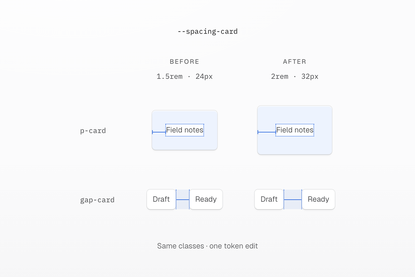
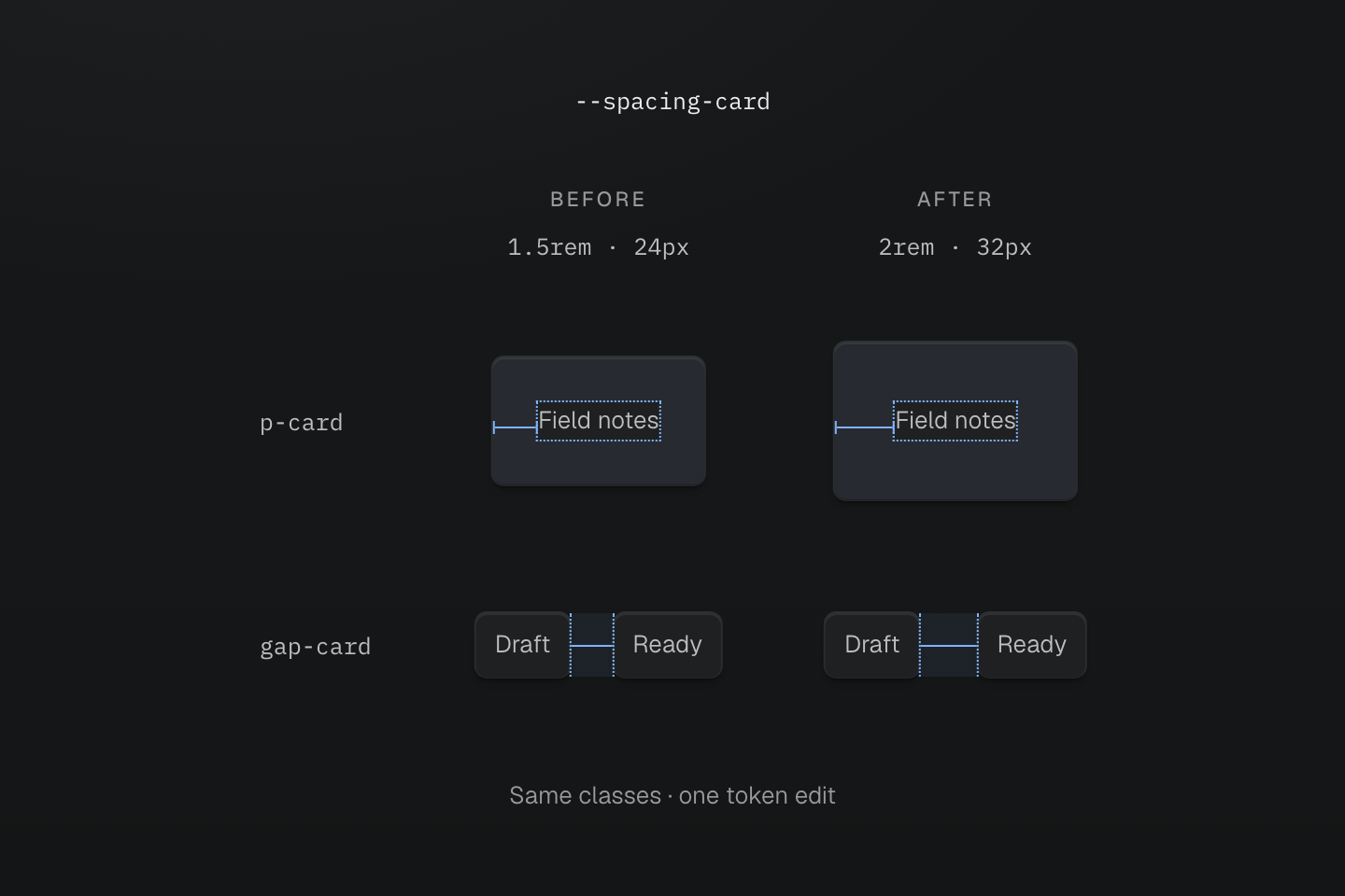
両列のマークアップは同じです。計測はルートフォント 16px を前提とし、強調領域はパディングと間隔の実際の相対サイズを示します。
テキストによる説明
- 変更前. ルートフォントが 16px のとき、--spacing-card: 1.5rem は p-card で 24px のパディング、gap-card で 24px の間隔を供給します。
- 変更後. トークンを 2rem に変えると、クラスを編集せず両方の寸法が 32px に増えます。
- 連動を選ぶ. これらの間隔を一緒に変える場合だけ、一つのトークンを使います。現在の値が同じでも、別々のデザイン判断には別々のトークンが必要です。
この連動自体がデザイン上の判断です。カードを広くしてもリストの間隔は保ちたいなら、別々のトークンにしてください。今同じ数値であることは、二つの部分を常に一緒に変える理由にはなりません。
#名前空間でトークンを命名する
トークンの接頭辞が名前空間を選び、各クラスファミリーは対応する名前空間を読みます。--spacing-card は p-card、m-card、gap-card、--radius-card は r-card、--container-panel は max-w-panel に使われます。同じキーでもファミリーによって値が異なり、p-lg は間隔、r-lg は半径を読みます。
@theme { --color-text-action: var(--color-brand); --font-family-sans: Geist, ui-sans-serif, system-ui, sans-serif; --container-panel: 28rem;}クラス用トークンを登録するのは @theme の宣言だけで、ほかの場所のネイティブなカスタムプロパティは登録しません。最初に使ったコンポーネントではなく、brand や card のような共通の判断で命名してください。--spacing-lg などプリセットのキーを再定義すると、プロジェクト全体で変えられます。各クラスが読む名前空間はファミリー索引、解決方法は変数とモードを参照してください。
#トークンの別名と上書き
一つのトークンを別のトークンに追従させるには var() を使います。別名は継承前に解決されます。ルートで --color-text-action を宣言した場合、子孫の --color-brand を上書きしても、継承済みの別名は再結合されません。そのスコープで別名を再宣言してください。
ローカルのブランド色と継承した別名
@theme { --color-brand: light-dark(#1d4ed8, #93c5fd); --color-text-action: var(--color-brand);}@layer components { [data-brand="plum"] { --color-brand: light-dark(#86198f, #f0abfc); } [data-rebind-action] { --color-text-action: var(--color-brand); }}<section data-brand="plum" class="p-lg r-lg bg-surface-raised"> <h2 class="m(0) text-lg font-regular fg-brand">Plum brand scope</h2> <p class="mt-md mb(0) text-sm font-regular fg-text-action">Inherited action: blue</p> <p data-rebind-action class="mt-sm mb(0) text-sm font-regular fg-text-action">Rebound action: plum</p></section>生成された CSS
@layer components { [data-brand="plum"] { --color-brand: light-dark(#86198f, #f0abfc); } [data-rebind-action] { --color-text-action: var(--color-brand); }}@layer theme { :root, :host { --color-zinc-90: oklch(24.6% .0022 265) } :root, :host { --color-surface-raised: light-dark(var(--color-white), var(--color-zinc-90)) } :root, :host { --color-white: oklch(100% 0 none) } :root, :host { --font-weight-regular: 400; --font-size-sm: .875rem; --font-size-lg: 1.125rem; --text-sm: var(--font-size-sm); --text-sm--line-height: 1.5; --text-sm--letter-spacing: 0; --text-lg: var(--font-size-lg); --text-lg--line-height: 1.5; --text-lg--letter-spacing: 0; --radius-lg: .5rem; --spacing-sm: .75rem; --spacing-md: 1rem; --spacing-lg: 1.5rem } :root, :host { --color-brand: light-dark(#1d4ed8, #93c5fd); --color-text-action: var(--color-brand) }}@layer utilities { .text-lg { font-size: var(--text-lg); line-height: var(--text-lg--line-height, normal); letter-spacing: var(--text-lg--letter-spacing, normal) } .text-sm { font-size: var(--text-sm); line-height: var(--text-sm--line-height, normal); letter-spacing: var(--text-sm--letter-spacing, normal) } .bg-surface-raised { background-color: var(--color-surface-raised) } .r-lg { border-radius: var(--radius-lg) } .fg-brand { color: var(--color-brand) } .fg-text-action { color: var(--color-text-action) } .font-regular { font-weight: var(--font-weight-regular) } .m\(0\) { margin: calc(0 * 1px) } .mt-md { margin-top: var(--spacing-md) } .mt-sm { margin-top: var(--spacing-sm) } .mb\(0\) { margin-bottom: calc(0 * 1px) } .p-lg { padding: var(--spacing-lg) }}継承した別名は計算済みの値を保つ
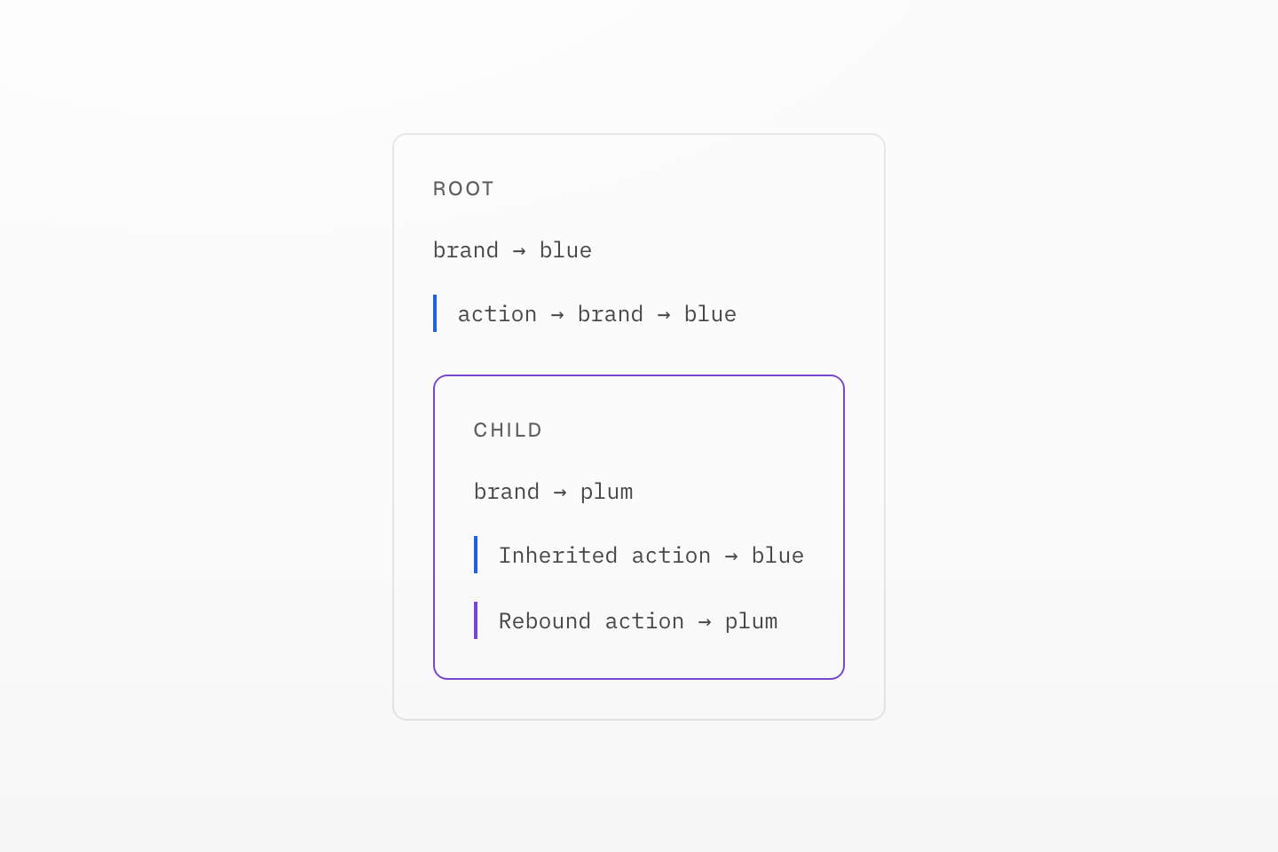
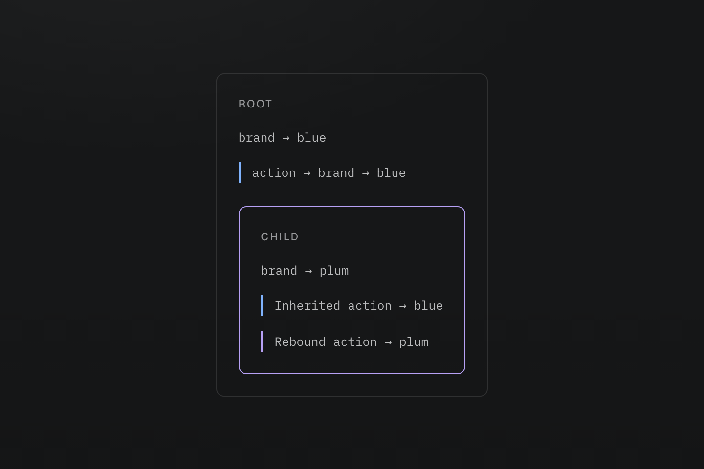
青と紫の印が二つの値の経路を示します。これはスコープの図で、追加のテーマ切り替えではありません。
テキストによる説明
ルートが action の別名を青に解決する。子が brand をプラム色に変えても、継承した別名はその子で再宣言するまで青のまま。
ライト・ダークのモードに追従する色には、トークンの値を light-dark() にし、--color-surface-card のようにモードに依存しない名前を付けます。モードの有効化は色を参照してください。
#トークンの配信と値の置換を選ぶ
二つの修飾子は別々の問いに答えます:
| 必要なこと | 選択 | 結果 |
|---|---|---|
| プロジェクトが使うときに値を出力 | 通常の @theme | 必要時に宣言し、クラスはトークン参照を保持。 |
| 利用箇所が見つからなくても値を保持 | @theme static | 外部インテグレーションなどにトークン宣言を残す。 |
| スタイルを付ける各要素上で参照変数を解決 | @theme inline | 生成宣言にトークンの値を一度置換。 |
静的な検出では見つからないインテグレーションが読む値には、static を使います:
@theme static { --color-integration-brand: #4f46e5; }クラスを使う要素上で解決すべきネイティブ変数との橋渡しには、inline を使います:
@theme inline { --color-brand: var(--app-brand); }:root { --app-brand: #4f46e5; }[data-theme="ocean"] { --app-brand: #0369a1; }<section data-theme="ocean"> <div class="bg-brand">Ocean background</div></section>ここで bg-brand は background-color: var(--app-brand) を出力するため、内側の要素は section から継承する ocean の値を読みます。置換は中間の --color-brand 参照を取り除くもので、各要素へ固定の色をコピーするものではありません。
両方が必要なら @theme static inline で修飾子を組み合わせます。インライン置換はクラスと @apply に適用され、手書きのネイティブ CSS は記述した参照を保持します。テーマの仕様を参照してください。
保持と置換を独立に選ぶ
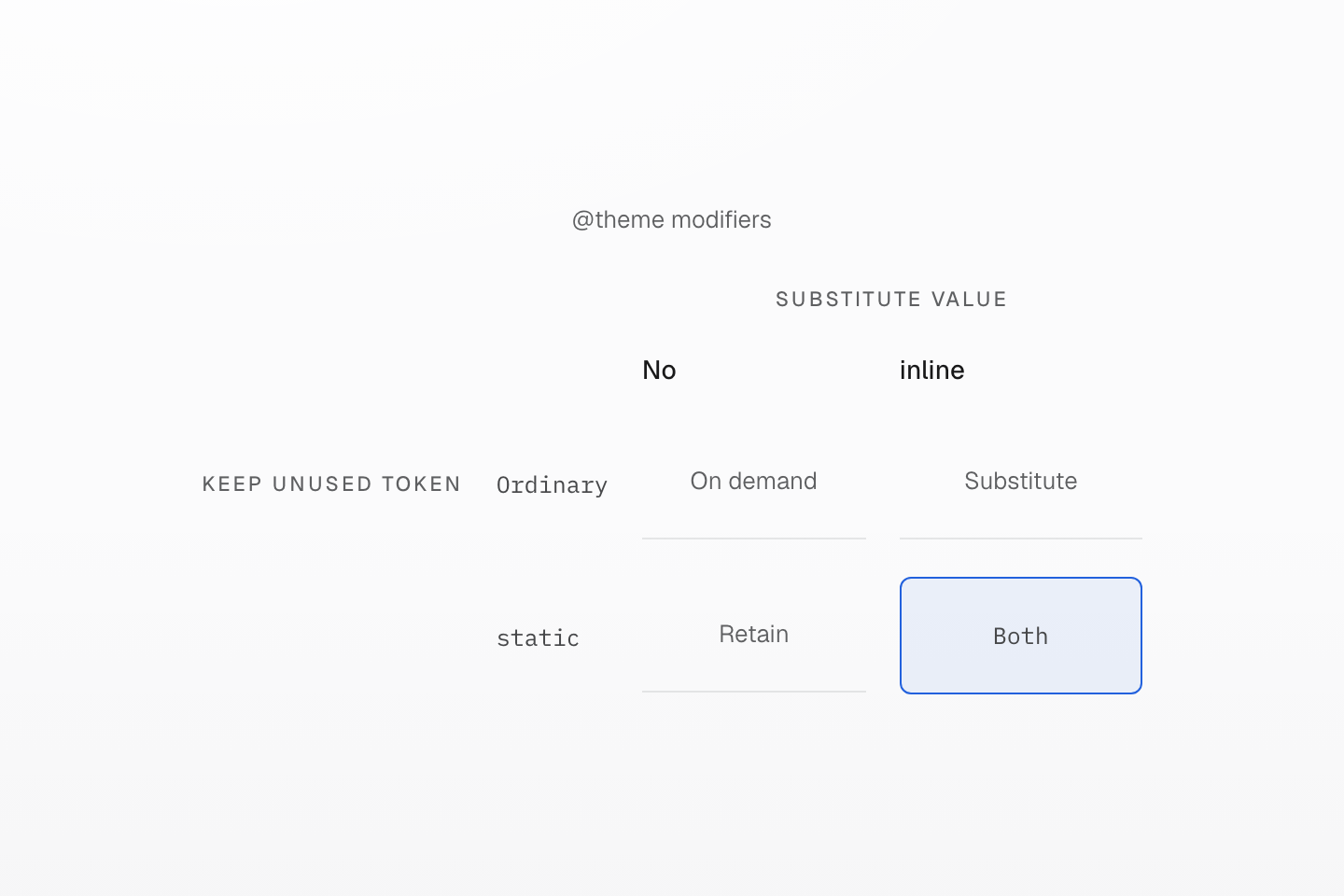
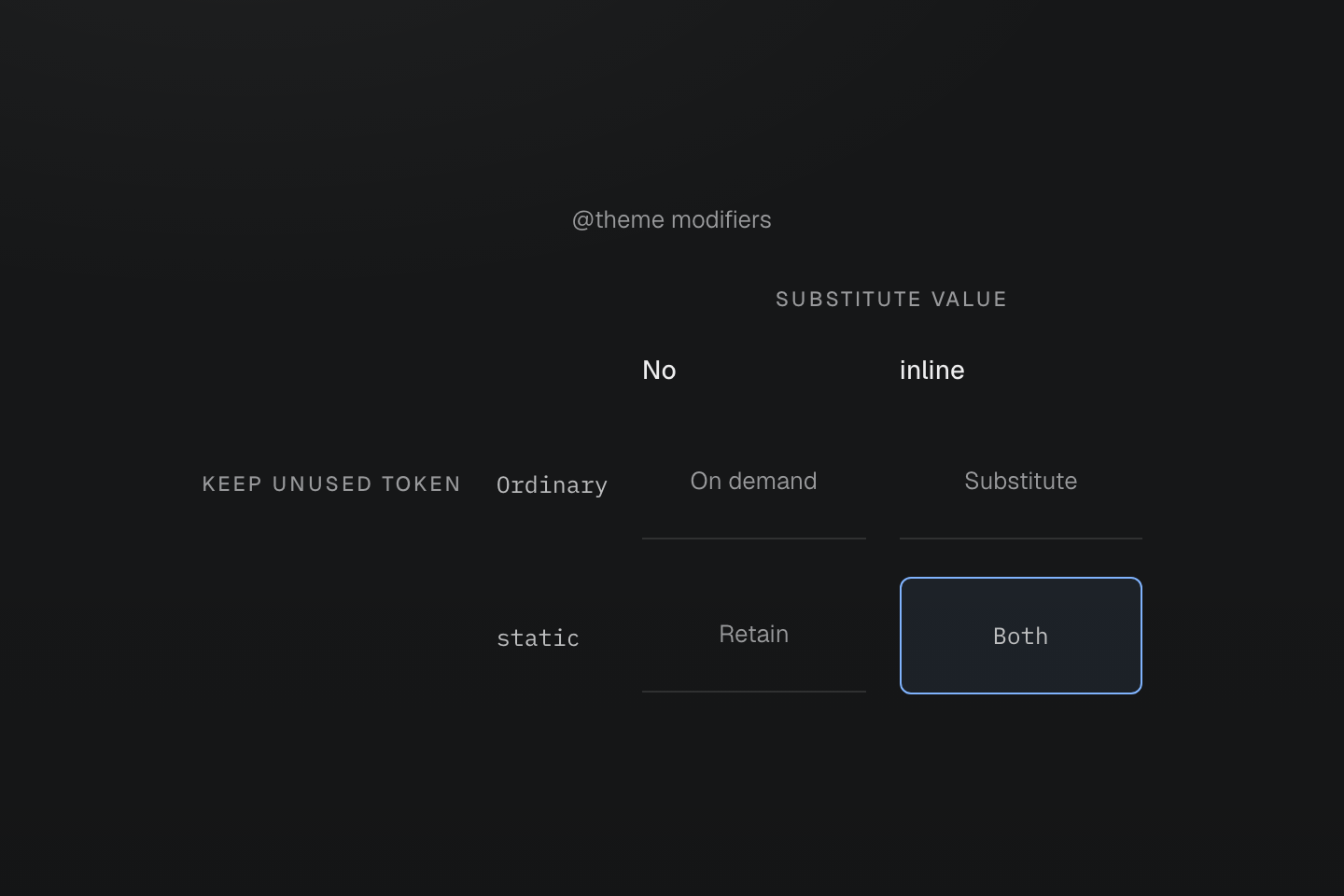
static は保持、inline は置換を制御します。一方を使っても他方が有効になるわけではありません。
テキストによる説明
利用箇所がなくてもトークンを保持することと、生成宣言へ値を置換することを、直交する二軸で分ける。
#モーションのトークンを定義する
--animate-* トークンは完全な animation ショートハンドなので、キーフレーム名、時間、イージングのトークンを組み合わせられます。キーフレームはその隣にネイティブ CSS として書きます:
実際の操作に続くモーション
@theme { --duration-enter: 180ms; --easing-emphasized: cubic-bezier(.16, 1, .3, 1); --animate-dialog-in: dialog-in var(--duration-enter) var(--easing-emphasized) both;}@keyframes dialog-in { from { translate: 0 0.5rem; opacity: 0; }}<dialog class="animate-dialog-in@motion-safe">…</dialog>このトークンは反復回数を指定しないため、登場は一回です。プリセットの animate-* トークンは繰り返します。動きを抑える設定では、@motion-safe がダイアログを静止させます。キーフレームは既定でスタイルシート内に残り、@prune native でも参照されたアニメーショントークンは自身のキーフレームを保持します。JavaScript だけが適用する名前には @safelist keyframes "dialog-in"; を加えてください。モーションとキーフレームの仕様を参照します。