文本截断
将文本限制为一行或指定行数,并以省略号结尾。
本页内容
类
| 类 | 声明 |
|---|---|
truncate | overflow: hidden;text-overflow: ellipsis;white-space: nowrap; |
clamp-lines(<integer>) | display: -webkit-box;-webkit-box-orient: vertical;-webkit-line-clamp: <integer>;overflow: hidden;overflow-wrap: break-word;text-overflow: ellipsis; |
两种形式都需要受限的宽度。在 Flex 或 Grid 项目内,请为该项目设置 min-w(0),使其能够缩小。
限制可见文本,同时保留阅读全文的方式
truncate 结合隐藏溢出、省略号和不换行设置。它需要具有有限行内宽度的块容器,才会产生溢出;应用到宽度未受限的行内 span 上,不会形成单行预览。
相同文本可显示全部、一行或两行
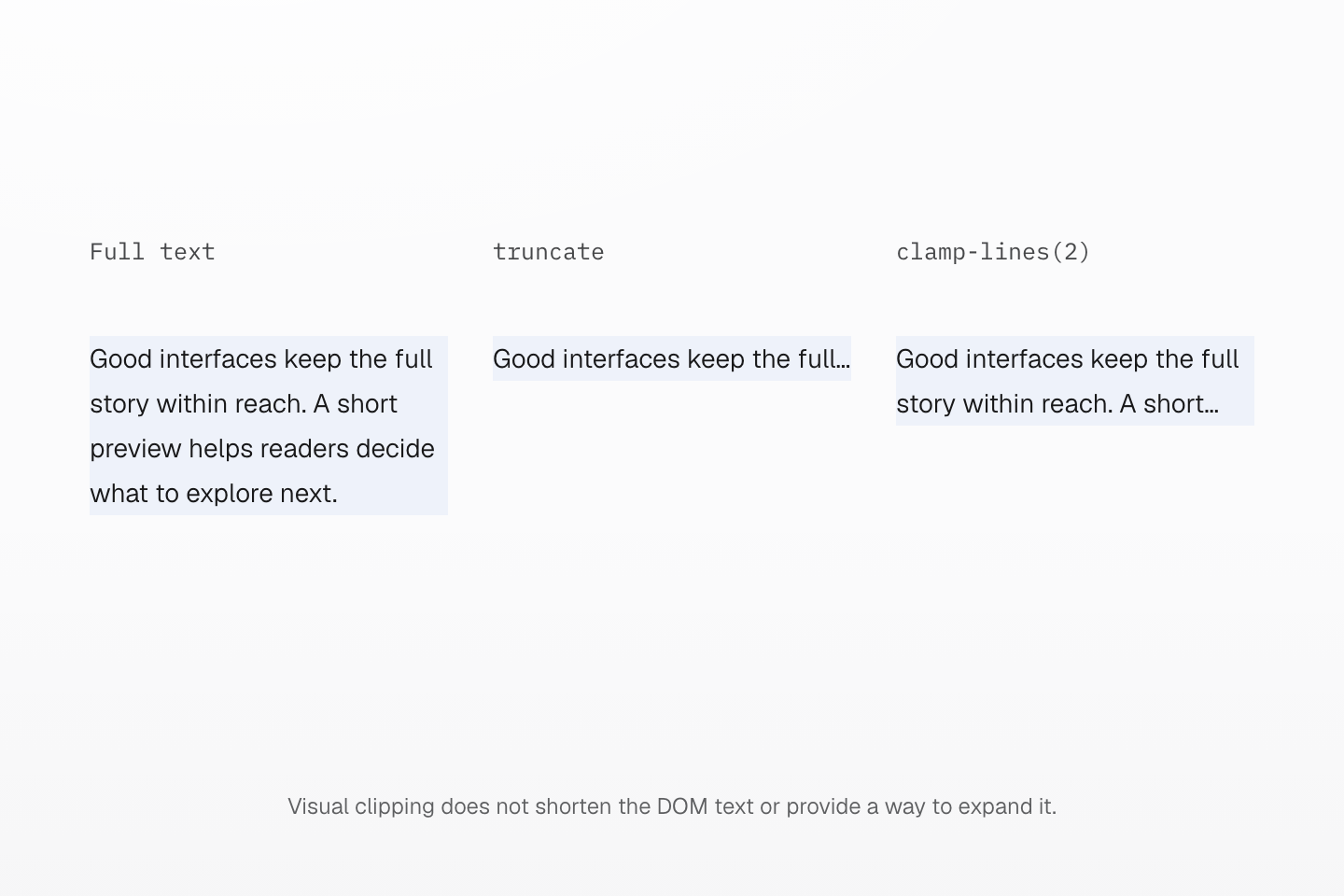
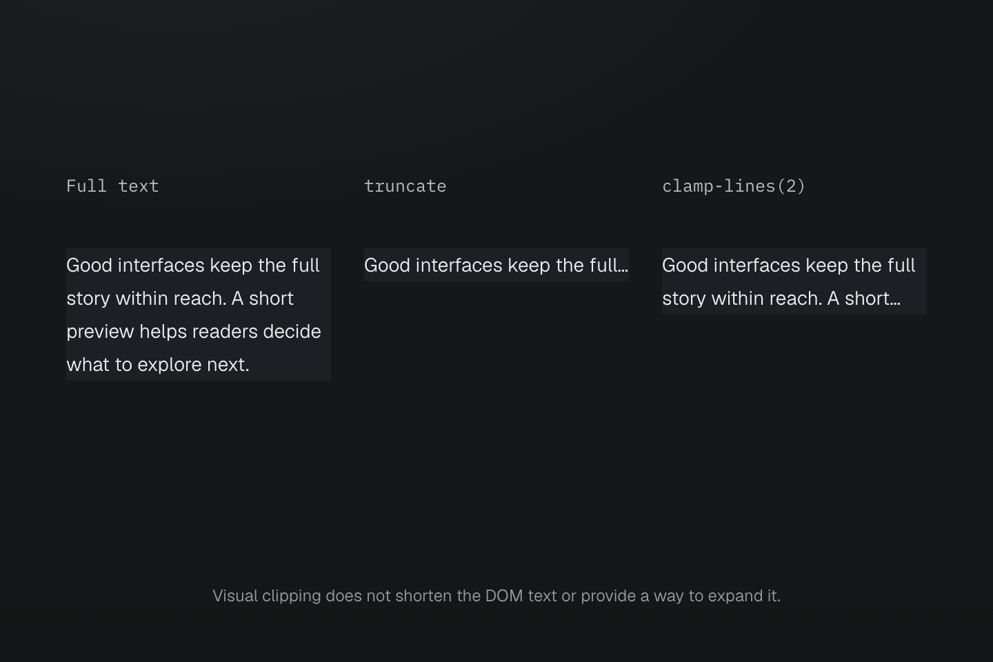
字体、宽度与文本都相同,只改变截断类。省略号由浏览器原生绘制,每个元素仍保有完整字符串。
文字说明
- 每份文本宽 192px,字号 14px,行高 24px。
- 第一份文本自由换行,并增高以容纳所有行。truncate 让第二份保持一行,并以省略号隐藏溢出。
- clamp-lines(2) 让第三份文本换行,再通过带前缀的 line-clamp 组合,将可见内容限制为两行。
- 三个元素都包含相同完整字符串。读者需要阅读全文时,必须另外提供展开控件或链接。
clamp-lines(2) 使用带前缀的 line-clamp 组合:display: -webkit-box、垂直盒子方向、两行限制和隐藏溢出。行数必须是正整数。此形式允许换行,因此不要与 truncate 及其 white-space: nowrap 合并使用。
文本仍保留在 DOM 中。裁剪只是视觉限制,不会缩短字符串,也不是展开内容的机制。请通过实际链接或可展开的全文视图保留重要信息的访问方式;不要只依赖鼠标悬停时才显示的 title。
Flex 或 Grid 项目的自动最小尺寸可能使它比可用空间更宽。请在需要缩小的项目上设置 min-w(0),再限制其内部文本。使用多行截断时,请将 padding 放在外层容器,避免内边距让已裁剪的行露出。
这个组合样式会设置自己的 display 和 overflow 声明。用 flex、grid 或可见溢出覆盖它们,可能破坏行数限制。需要自定义截断规则时,请明确使用原生属性。
用法
让文件名保持一行、摘要限制为两行,并可展开详细内容阅读全文。
field-notes-autumn-collection-final-v03.fig
Good interfaces make space for the details: a short preview helps readers decide what to explore next while a clear link keeps the complete story within reach, so the summary works as an invitation and the full article carries everything else.
Read full details
field-notes-autumn-collection-final-v03.fig
Good interfaces make space for the details: a short preview helps readers decide what to explore next while a clear link keeps the complete story within reach, so the summary works as an invitation and the full article carries everything else.
<article class="… max-w-3xs"> <p class="… truncate">field-notes-autumn-collection-final-v03.fig</p> <p class="… clamp-lines(2)">Good interfaces make space for…</p> <details><summary>Read full details</summary><p>field-notes-autumn-collection-final-v03.fig</p><p>Good interfaces make space for…</p></details></article>生成的 CSS
@layer theme { :root, :host { --container-3xs: 16rem }}@layer utilities { .clamp-lines\(2\) { display: -webkit-box; -webkit-box-orient: vertical; -webkit-line-clamp: 2; overflow: hidden; overflow-wrap: break-word; text-overflow: ellipsis } .truncate { overflow: hidden; text-overflow: ellipsis; white-space: nowrap } .max-w-3xs { max-width: var(--container-3xs) }}自定义
预设使用 @utility 定义这些类。在样式表中定义相同名称即可替换原有定义。
@utility truncate { overflow: hidden; text-overflow: ellipsis; white-space: nowrap;}@utility clamp-lines(--n <integer>) { display: -webkit-box; -webkit-box-orient: vertical; -webkit-line-clamp: var(--n); overflow: hidden; overflow-wrap: break-word; text-overflow: ellipsis;}