声明与值
支持的类形式、原生值解析、单位、重要性和固定工具类。
本页内容
类以已注册的工具类或原生声明开头,后面可添加选择器、条件和重要性标记。本页定义这些声明形式、值解析与拒绝规则。完整教程见语法教程,原生属性含义则参阅 CSS 参考。
下方具名形式假设已通过 @import '@master/css' 加载默认预设。项目定义可以添加或替换工具类,原生声明则不需要已注册的工具类。
可用形式
| 形式 | 示例 | 含义 |
|---|---|---|
| 静态工具类 | flex | 已注册名称;此例为 display: flex |
| 令牌工具类 | p-md | 已注册前缀和令牌键;此例为 padding: var(--spacing-md) |
| 函数工具类 | p(12) | 带参数的已注册函数;此例为 padding: calc(12 * 1px) |
| 原生声明 | (padding:1rem) | 一个完整 CSS 属性与值 |
这些是不同语法形式,不是可互换的拼写。静态、令牌和函数工具类都可能包含多个声明:truncate、text-sm 和 grid-cols(2) 都是组合样式。原生头部则恰好包含一个声明,可使用 CSS 简写属性。
生成的 CSS
@layer theme { :root, :host { --spacing-md: 1rem }}@layer utilities { .flex { display: flex } .p-md { padding: var(--spacing-md) } .p\(12\) { padding: calc(12 * 1px) } .\(padding\:1rem\) { padding: 1rem }}每种形式都接受后缀。在 p(12):hover@sm! 中,头部是 p(12),:hover 是选择器,@sm 是条件,! 标记重要性。后缀只影响自身的类。完整契约见选择器与条件。
原生声明
用完整属性名编写 (property:value)。Master CSS 先读取括号配对完整的头部,再解析后缀。单独名称后的冒号开始选择器:flex:hover 选择已注册的 flex 工具类,display:block 并不是 (display:block) 的替代形式。
结束边界
字符串、注释、转义、嵌套圆括号和方括号,以及无引号 url() 令牌,均遵循 CSS 组件值边界。引号字符串中的 ) 不会关闭头部:
<span class="(content:')')::before"></span>引号内的括号仍属于值
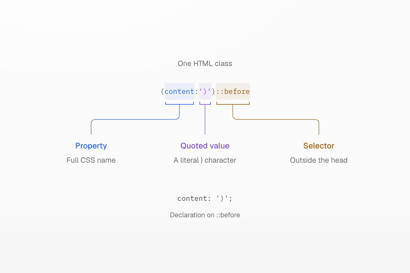
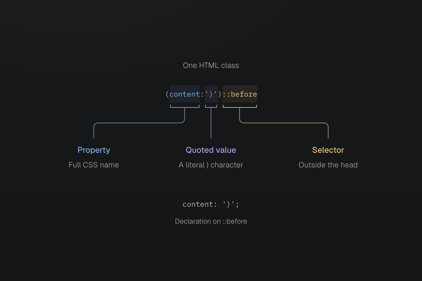
第一个右括号是引号内的值文本。下一个才结束声明;::before 从声明外开始。
文字说明
- 在 (content:')')::before 中,content 是属性,')' 是带引号的值。
- 字符串内的 ) 会保留。下一个 ) 才结束原生声明头部。
- ::before 后缀指向伪元素,生成的声明为 content: ')';。
头部内的其他 CSS 结构也保留各自边界:
| 类 | 值的边界 |
|---|---|
(width:calc(1px+(2px*3))) | 嵌套括号属于计算式 |
(grid-template-columns:[start]|1fr|[end]) | 方括号包住 Grid 线名称 |
(background-image:url(/ | 大括号属于无引号 URL 令牌 |
生成的 CSS
@layer utilities { .\(background-image\:url\(\/a\{b\.svg\)\) { background-image:url(/a{b.svg) } .\(grid-template-columns\:\[start\]\|1fr\|\[end\]\) { grid-template-columns: [start] 1fr [end] } .\(width\:calc\(1px\+\(2px\*3\)\)\) { width: calc(1px + (2px * 3)) } .\(content\:\'\)\'\)\:\:before::before { content: ')' }}值内仍适用 CSS 转义规则。无引号 URL 若含括号,请改用带引号 URL 或 CSS 转义,保持令牌合法。
无效头部
格式错误的头部不会生成规则,也不会改以工具类或其他类形式重试。
| 拒绝的类 | 原因 |
|---|---|
(display:block | 缺少结束括号 |
(color:red)(display:block) | 一个类内有两个头部 |
(color:red;display:block) | 超过一个声明 |
(display:block;) | 顶层分号,即使出现在结尾也不接受 |
(width:calc(1px]) | 分隔符不配对 |
(width:) | 普通属性的值为空 |
(color:{red}) | 将大括号块作为普通属性值 |
(width:calc(((…1px…)))) 嵌套 65 层 | 括号嵌套深度超过 64 层 |
自定义属性可以有空值或配对完整的大括号块:(--slot:) 和 (--state:{open}) 均合法。(--slot:!important) 是值为空的重要自定义属性,(width:!important) 则无效。
输出与浏览器合法性
语法合法的属性名即使工具没有列出,也能输出声明。原生值不限于预设,但仍必须是目标浏览器中该属性的合法值。例如 (font-size:48) 输出 font-size: 48,不会自动获得 px,而这个非零无单位长度是无效 CSS。请用 (font-size:48px) 表达该长度。(field-sizing:content) 这类原生属性不需要注册工具类。
生成的 CSS
@layer utilities { .\(field-sizing\:content\) { field-sizing: content } .\(font-size\:48px\) { font-size: 48px }}Master CSS 输出特定兼容声明,例如在 backdrop-filter 旁添加 -webkit-backdrop-filter,但不会添加厂商专属选择器,也不会为浏览器功能提供 polyfill。请检查生成的 CSS,并通过兼容性了解浏览器要求与回退设计。
生成的 CSS
@layer utilities { .\(backdrop-filter\:blur\(16px\)\) { -webkit-backdrop-filter: blur(16px); backdrop-filter: blur(16px) } .\(background-color\:\#000\)\:\:-webkit-scrollbar::-webkit-scrollbar { background-color: #000 }}值的编码
空白、字符串与下划线
即使值包含 CSS 引号,HTML 空白仍分隔类。类值内无引号的 | 编码一个空格;引号字符串内的竖线则保持字面含义。逗号和斜线等 CSS 标点应保留原位。
<div class="(color:rgb(30|60|90/80%)) (content:'a|b')::before"></div>生成的 CSS
@layer utilities { .\(animation-name\:slide_in\) { animation-name: slide_in } .\(color\:rgb\(30\|60\|90\/80\%\)\) { color: rgb(30 60 90/80%) } .\(color\:red\)_a a { color: red } .\(content\:\'a\|b\'\)\:\:before::before { content: 'a|b' }}颜色值变为 rgb(30 60 90 / 80%),content 字符串则保留为 'a|b'。CSS 字符串中需要实际空格时,请使用 \000020 这类 CSS 转义:(content:'New\000020collection')::before 产生“New collection”。六位转义可避免 HTML 类中出现终止空格。
原生头部内的下划线是字面字符,例如 slide_in。头部结束后,_ 开始后代选择器:(color:red)_a 指向后代链接。已注册工具类名称不能包含 _,但含下划线的令牌键仍可通过 var(--name) 引用。
函数与显式变量
CSS 函数仍是原生属性的值。Master CSS 规范化 calc(100%-2rem) 中的算术空白,涵盖最多 64 层嵌套括号以及 1px-2px-3px 这类连续减法,更深的内容保留原样。计算由浏览器执行。Master CSS 不会从单独单词推断令牌,也不会将 CSS 函数当作工具类调用求值。
生成的 CSS
@layer theme { :root, :host { --color-red-60: oklch(60.94% .2501 29.2) } :root, :host { --color-red: var(--color-red-60) }}@layer utilities { .\(color\:var\(--color-red\)\) { color: var(--color-red) } .\(width\:calc\(100\%-2rem\)\) { width: calc(100% - 2rem) } .\(width\:calc\(100\%-var\(--spacing-md\)\)\) { width: calc(100%-var(--spacing-md)) }}原生颜色值保留原意:(color:red)、(color:#175fe9) 和 (color:rgb(23,95,233)) 都提供 CSS 值,fg-red 则选择主题令牌。var() 引用必须明确编写;(font-family:mono) 指定 CSS 字体族 mono,不是 --font-mono。令牌解析、模式和派生值见变量与模式。
数字与单位
原生声明保留单位,不会将 rem 转为像素,也不会根据属性推断单位。小数前的零可以省略:(opacity:.5) 和 (opacity:0.5) 提供相同数值。
| 原生值 | 解释 |
|---|---|
(margin:1rem) | 相对于根元素字号的长度 |
(width:50%) | 根据属性上下文解析的百分比 |
(rotate:30deg) | 显式角度 |
(animation-duration:200ms) | 显式时间;.2s 表达相同时长 |
(opacity:.5) | 无单位数值 |
(background-image:image-set(url(a.png)|1x,url(b.png)|2x)) | 以每个 CSS 像素的点数指定原生图像分辨率 |
属性是否接受数字、长度、百分比或其他类型,由 CSS 值与单位规则决定。p(12) 则不同:预设函数会显式将参数乘以 1px。
负值
原生负值写在值内,例如 (margin-top:-2rem)。直接数值参数使用 mt(-8)。负值令牌类则在完整类名前加 -:-mt-sm。负值令牌形式需要数值令牌及支持负值的工具类;padding 不支持负值,因此 -p-sm 会被拒绝。
生成的 CSS
@layer theme { :root, :host { --spacing-sm: .75rem }}@layer utilities { .-mt-sm { margin-top: calc(var(--spacing-sm) * -1) } .mt\(-8\) { margin-top: calc(-8 * 1px) } .\(margin-top\:-2rem\) { margin-top: -2rem }}参数验证不会重新定义 CSS 属性的值约束。
已注册工具类
令牌名称
令牌前缀由工具类定义注册,不会从属性缩写推断。p-md 读取 --spacing-md;fg-red 和 bg-red 都读取 --color-red,但设置不同属性。不会自动产生 padding-md 这类完整属性名形式,也没有 p-4 这类隐式数值刻度:所选命名空间中必须存在该键。
静态名称优先于拼写相同的令牌类。例如,即使项目定义了 --container-full,w-full 仍为 width: 100%;即使存在 --radius-pill,pill 仍为全圆角半径。同名静态工具类与函数各自独立注册。
完整的前缀与命名空间映射见令牌家族索引,注册与替换规则见工具类定义。主题令牌说明如何定义项目值并设置作用域。
固定拼写保留自身定义
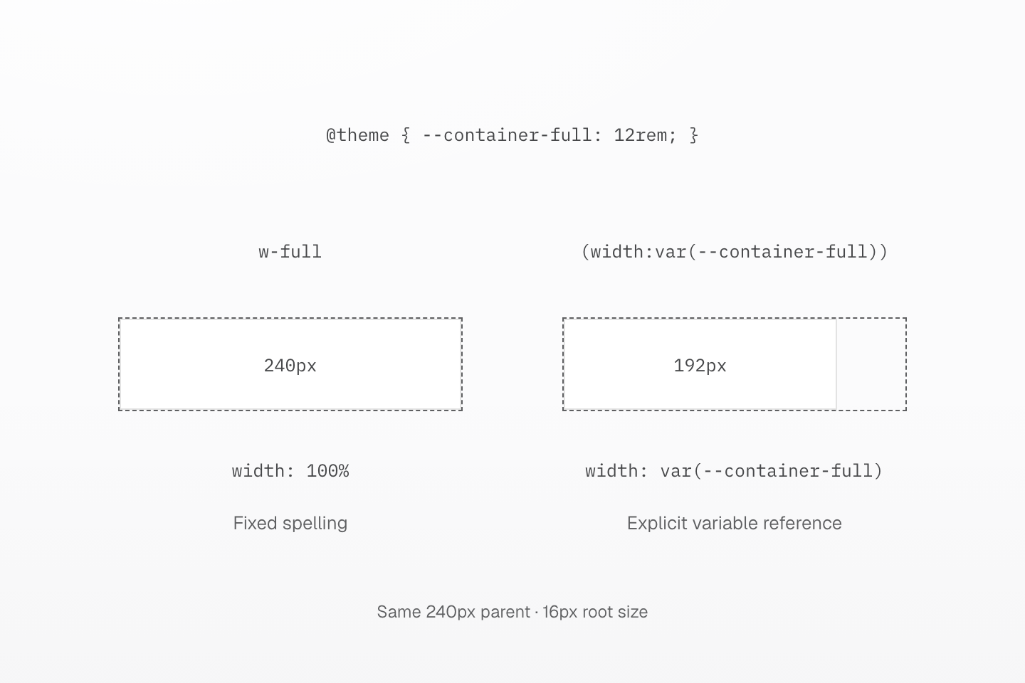
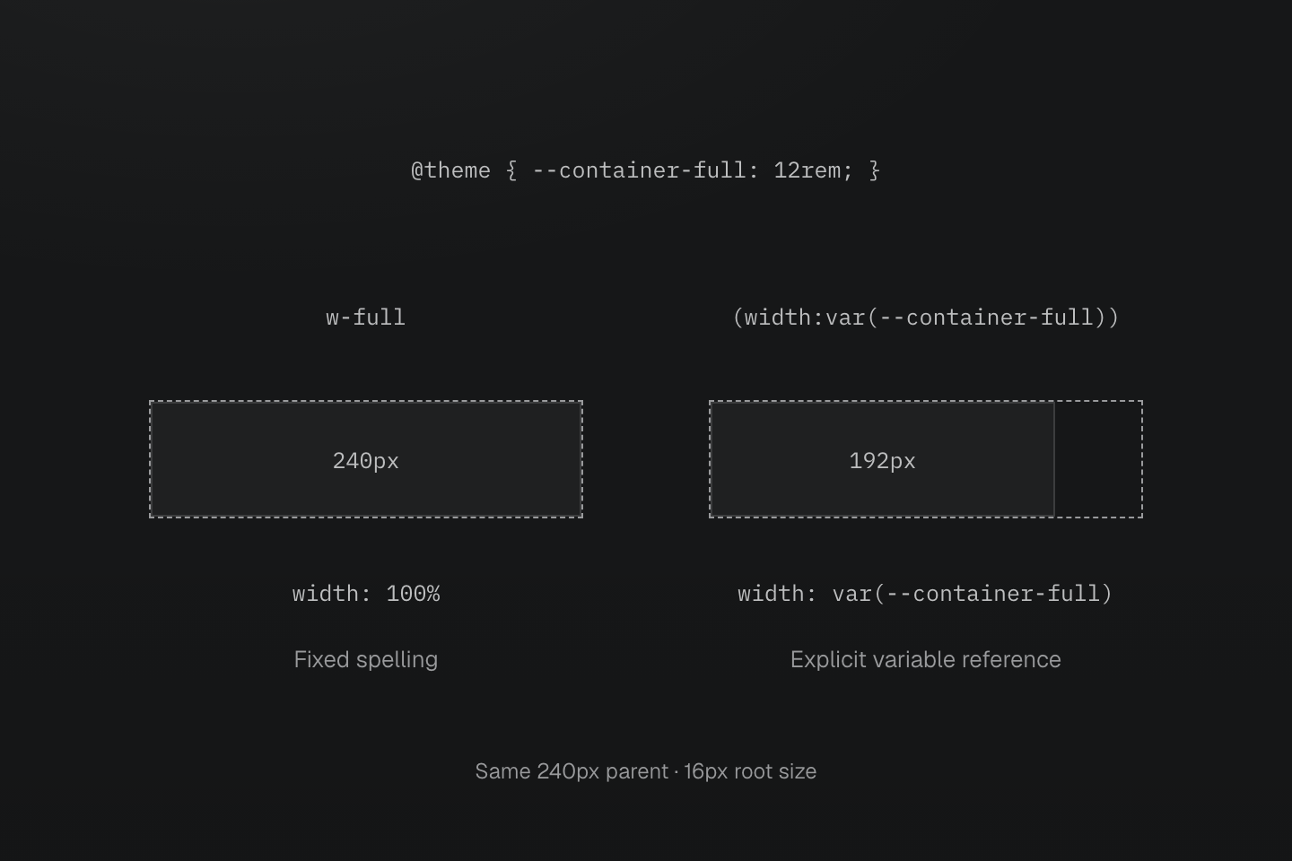
两个父元素均宽 240px。自定义 --container-full 为 12rem(根字号为 16px 时是 192px);w-full 仍是固定的 100% 工具类。
文字说明
- 配置定义 @theme { --container-full: 12rem; }。预设已将完整固定名称 w-full 注册为 width: 100%。
- 因此 w-full 填满 240px 的父元素。显式的 (width:var(--container-full)) 类读取 --container-full,使第二个块宽 192px。
- 令牌仍可通过显式 var() 引用使用;定义它不会替换固定的 w-full 注册。
直接数值
m(4)、b(1) 和 grow(1) 这类预设函数接受一个静态数字。长度函数输出乘以 1px 的运算;grow()、shrink() 和 order() 直接传递数值,其中 order() 要求整数。零、小数和负数参数是否可用,取决于各参数声明的类型。
单位与动态表达式不属于数值参数:m(1px) 和 b(var(--x)) 不会生成规则。这类值请使用 (margin:1rem) 或 (border-width:var(--x))。直接数值提供完整函数列表、参数类型及生成声明。
配方可以协调多个属性或伴随值:text-sm 包含字号、行高和字距,animate-fade 则提供动画简写。查找与覆盖规则分别见文字令牌与动效令牌。
自定义属性
(--name:value) 头部在匹配元素上声明 CSS 自定义属性。它可以使用与其他声明相同的选择器和条件,不会注册工具类或主题令牌。
<div class="(--progress:40%) (--progress:60%):hover (width:var(--progress))">Progress</div>生成的 CSS
@layer utilities { .\(--progress\:40\%\) { --progress: 40% } .\(width\:var\(--progress\)\) { width: var(--progress) } .\(--progress\:60\%\)\:hover:hover { --progress: 60% }}var(--progress) 使用常规 CSS 解析与继承规则。未解析的变量或替换后不兼容的值可能导致引用它的声明失效;请按需使用 CSS 变量回退值。语法教程说明如何固定类名并另行提供动态值。
组合与重要性
分开的类表达独立决策,例如 b(1) b-solid b-line-control。原生简写仍受支持;这项编写偏好不会改变 CSS 语法。需要相同选择器和条件的每个类都要分别添加后缀。
<ul class="block>li:hover@md (font-size:14px)>li:hover@md text-center>li:hover@md">…</ul>在相同层、条件与选择器中,配方排在单声明工具类之前,接着才是原生声明。单声明工具类先按属性家族和覆盖范围排序,再按值来源排序;同一属性中,令牌排在固定值或直接数值之前。HTML 类名顺序不会决定结果:
生成的 CSS
@layer theme { :root, :host { --spacing-md: 1rem }}@layer utilities { .m-md { margin: var(--spacing-md) } .mx-auto { margin-inline: auto } .mt\(0\) { margin-top: calc(0 * 1px) } .p-md { padding: var(--spacing-md) } .p\(12\) { padding: calc(12 * 1px) } .\(padding\:1rem\) { padding: 1rem }}这里原生 padding 排在两个工具类之后,mt(0) 和 mx-auto 则覆盖 m-md 的对应部分。完整排序契约见层叠层。如何选择组件类、@utility 配方或 CSS 混入,请见复用样式。
重要性
末尾的 ! 将该类的声明标为重要。括号值内末尾的原生 !important 效果相同;同时编写两者也只会输出一次。字符串内的 '!important' 仍为内容文字。
生成的 CSS
@layer utilities { .text-center\! { text-align: center !important } .\(color\:red\!important\) { color: red !important } .\(color\:red\!important\)\! { color: red !important } .\(content\:\'\!important\'\)\:\:before::before { content: '!important' }}重要性应用于配方内的每条声明
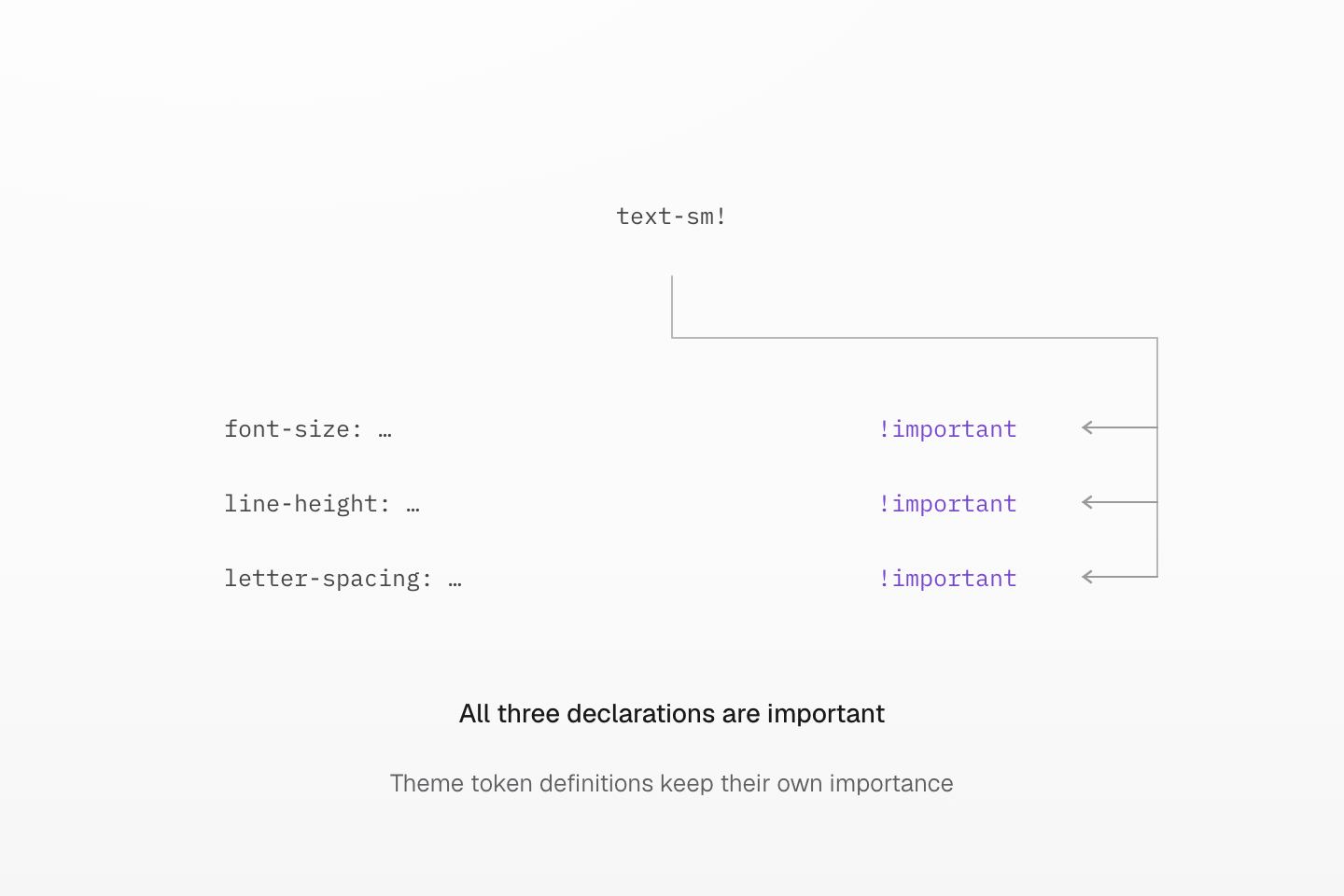
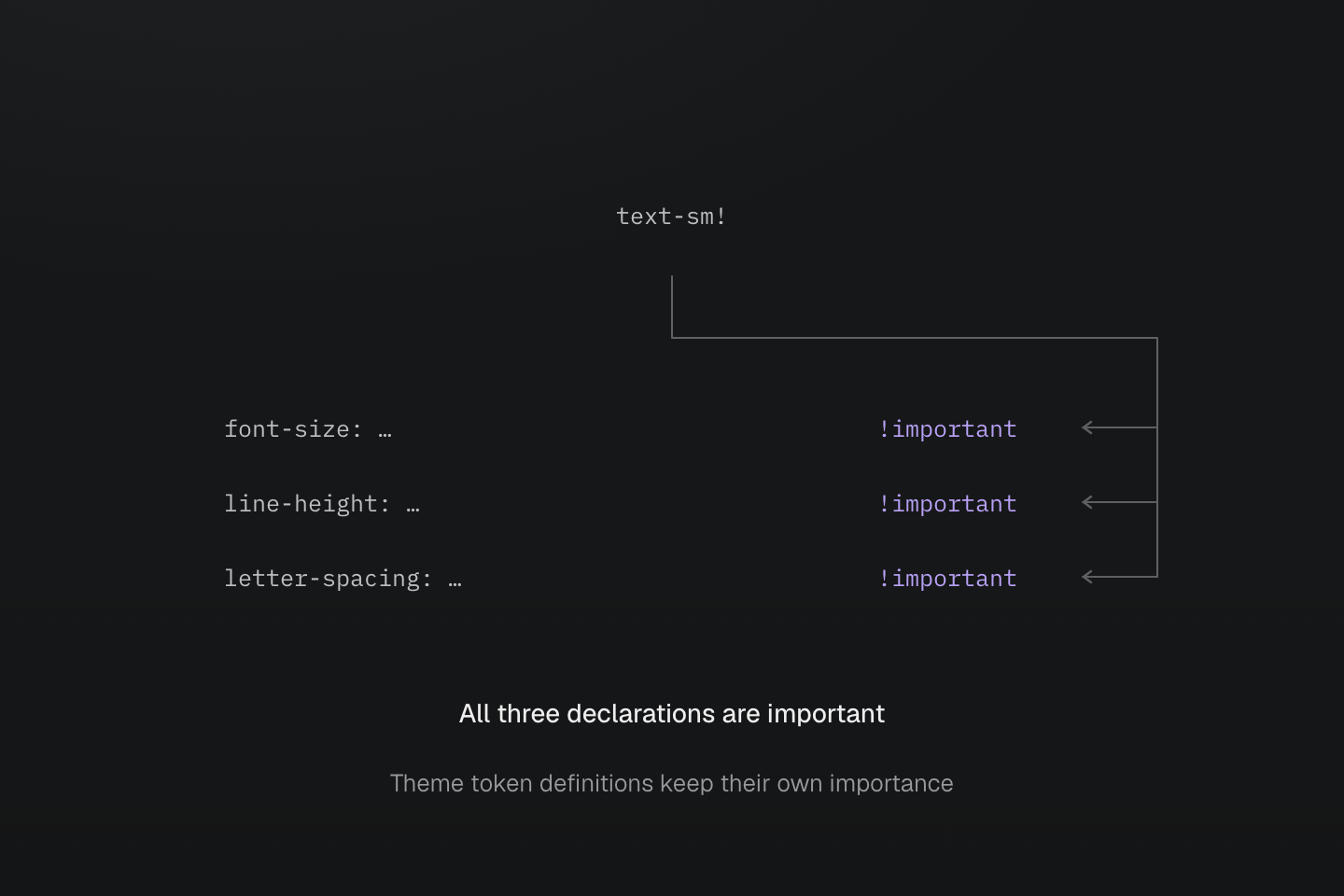
末尾一个 ! 标记全部三条声明;省略号省去令牌引用。它不会将相邻 HTML 类或主题令牌定义标为重要。
文字说明
- text-sm 使用主要令牌及伴随引用,写入 font-size、line-height 和 letter-spacing。
- text-sm! 将三条生成声明均标为 !important。依赖声明仍是普通主题令牌。
固定工具类查询表
预设提供 292 个固定的单声明工具类,每个只设置表中列出的属性:flex-col 不会启用 flex 布局,b-none 不会重置边框宽度,pill 也不会设置尺寸。多声明的 truncate 配方单独列于截断。
| 类, 声明 | CSS |
|---|---|
block | display: block |
inline | display: inline |
inline-block | display: inline-block |
flow-root | display: flow-root |
flex | display: flex |
inline-flex | display: inline-flex |
grid | display: grid |
inline-grid | display: inline-grid |
contents | display: contents |
list-item | display: list-item |
table | display: table |
inline-table | display: inline-table |
table-caption | display: table-caption |
table-cell | display: table-cell |
table-column | display: table-column |
table-column-group | display: table-column-group |
table-header-group | display: table-header-group |
table-footer-group | display: table-footer-group |
table-row | display: table-row |
table-row-group | display: table-row-group |
hidden | display: none |
static | position: static |
relative | position: relative |
absolute | position: absolute |
fixed | position: fixed |
sticky | position: sticky |
visible | visibility: visible |
invisible | visibility: hidden |
isolate | isolation: isolate |
box-border | box-sizing: border-box |
box-content | box-sizing: content-box |
italic | font-style: italic |
oblique | font-style: oblique |
uppercase | text-transform: uppercase |
lowercase | text-transform: lowercase |
capitalize | text-transform: capitalize |
underline | text-decoration-line: underline |
overline | text-decoration-line: overline |
line-through | text-decoration-line: line-through |
flex-row | flex-direction: row |
flex-row-reverse | flex-direction: row-reverse |
flex-col | flex-direction: column |
flex-col-reverse | flex-direction: column-reverse |
flex-wrap | flex-wrap: wrap |
flex-nowrap | flex-wrap: nowrap |
flex-wrap-reverse | flex-wrap: wrap-reverse |
items-normal | align-items: normal |
items-start | align-items: start |
items-end | align-items: end |
items-flex-start | align-items: flex-start |
items-flex-end | align-items: flex-end |
items-center | align-items: center |
items-baseline | align-items: baseline |
items-stretch | align-items: stretch |
content-normal | align-content: normal |
content-start | align-content: start |
content-end | align-content: end |
content-flex-start | align-content: flex-start |
content-flex-end | align-content: flex-end |
content-center | align-content: center |
content-baseline | align-content: baseline |
content-stretch | align-content: stretch |
content-between | align-content: space-between |
content-around | align-content: space-around |
content-evenly | align-content: space-evenly |
self-auto | align-self: auto |
self-normal | align-self: normal |
self-start | align-self: start |
self-end | align-self: end |
self-flex-start | align-self: flex-start |
self-flex-end | align-self: flex-end |
self-center | align-self: center |
self-baseline | align-self: baseline |
self-stretch | align-self: stretch |
justify-normal | justify-content: normal |
justify-start | justify-content: start |
justify-end | justify-content: end |
justify-flex-start | justify-content: flex-start |
justify-flex-end | justify-content: flex-end |
justify-center | justify-content: center |
justify-between | justify-content: space-between |
justify-around | justify-content: space-around |
justify-evenly | justify-content: space-evenly |
justify-stretch | justify-content: stretch |
object-cover | object-fit: cover |
object-contain | object-fit: contain |
object-fill | object-fit: fill |
object-none | object-fit: none |
object-scale-down | object-fit: scale-down |
object-center | object-position: center |
object-top | object-position: top |
object-bottom | object-position: bottom |
object-left | object-position: left |
object-right | object-position: right |
m-auto | margin: auto |
mt-auto | margin-top: auto |
mr-auto | margin-right: auto |
mb-auto | margin-bottom: auto |
ml-auto | margin-left: auto |
mx-auto | margin-inline: auto |
mxs-auto | margin-inline-start: auto |
mxe-auto | margin-inline-end: auto |
my-auto | margin-block: auto |
mys-auto | margin-block-start: auto |
mye-auto | margin-block-end: auto |
top-auto | top: auto |
right-auto | right: auto |
bottom-auto | bottom: auto |
left-auto | left: auto |
inset-auto | inset: auto |
ix-auto | inset-inline: auto |
ixs-auto | inset-inline-start: auto |
ixe-auto | inset-inline-end: auto |
iy-auto | inset-block: auto |
iys-auto | inset-block-start: auto |
iye-auto | inset-block-end: auto |
w-auto | width: auto |
h-auto | height: auto |
size-x-auto | inline-size: auto |
size-y-auto | block-size: auto |
min-w-auto | min-width: auto |
min-h-auto | min-height: auto |
min-size-x-auto | min-inline-size: auto |
min-size-y-auto | min-block-size: auto |
basis-auto | flex-basis: auto |
max-w-none | max-width: none |
max-h-none | max-height: none |
max-size-x-none | max-inline-size: none |
max-size-y-none | max-block-size: none |
w-full | width: 100% |
w-fit | width: fit-content |
w-max | width: max-content |
w-min | width: min-content |
h-full | height: 100% |
h-fit | height: fit-content |
h-max | height: max-content |
h-min | height: min-content |
size-x-full | inline-size: 100% |
size-x-fit | inline-size: fit-content |
size-x-max | inline-size: max-content |
size-x-min | inline-size: min-content |
size-y-full | block-size: 100% |
size-y-fit | block-size: fit-content |
size-y-max | block-size: max-content |
size-y-min | block-size: min-content |
min-w-full | min-width: 100% |
min-w-fit | min-width: fit-content |
min-w-max | min-width: max-content |
min-w-min | min-width: min-content |
min-h-full | min-height: 100% |
min-h-fit | min-height: fit-content |
min-h-max | min-height: max-content |
min-h-min | min-height: min-content |
min-size-x-full | min-inline-size: 100% |
min-size-x-fit | min-inline-size: fit-content |
min-size-x-max | min-inline-size: max-content |
min-size-x-min | min-inline-size: min-content |
min-size-y-full | min-block-size: 100% |
min-size-y-fit | min-block-size: fit-content |
min-size-y-max | min-block-size: max-content |
min-size-y-min | min-block-size: min-content |
max-w-full | max-width: 100% |
max-w-fit | max-width: fit-content |
max-w-max | max-width: max-content |
max-w-min | max-width: min-content |
max-h-full | max-height: 100% |
max-h-fit | max-height: fit-content |
max-h-max | max-height: max-content |
max-h-min | max-height: min-content |
max-size-x-full | max-inline-size: 100% |
max-size-x-fit | max-inline-size: fit-content |
max-size-x-max | max-inline-size: max-content |
max-size-x-min | max-inline-size: min-content |
max-size-y-full | max-block-size: 100% |
max-size-y-fit | max-block-size: fit-content |
max-size-y-max | max-block-size: max-content |
max-size-y-min | max-block-size: min-content |
basis-full | flex-basis: 100% |
basis-fit | flex-basis: fit-content |
basis-max | flex-basis: max-content |
basis-min | flex-basis: min-content |
order-first | order: -999999 |
order-last | order: 999999 |
pill | border-radius: calc(infinity*1px) |
b-solid | border-style: solid |
b-dashed | border-style: dashed |
b-dotted | border-style: dotted |
b-double | border-style: double |
b-none | border-style: none |
bt-solid | border-top-style: solid |
bt-dashed | border-top-style: dashed |
bt-dotted | border-top-style: dotted |
bt-double | border-top-style: double |
bt-none | border-top-style: none |
br-solid | border-right-style: solid |
br-dashed | border-right-style: dashed |
br-dotted | border-right-style: dotted |
br-double | border-right-style: double |
br-none | border-right-style: none |
bb-solid | border-bottom-style: solid |
bb-dashed | border-bottom-style: dashed |
bb-dotted | border-bottom-style: dotted |
bb-double | border-bottom-style: double |
bb-none | border-bottom-style: none |
bl-solid | border-left-style: solid |
bl-dashed | border-left-style: dashed |
bl-dotted | border-left-style: dotted |
bl-double | border-left-style: double |
bl-none | border-left-style: none |
bx-solid | border-inline-style: solid |
bx-dashed | border-inline-style: dashed |
bx-dotted | border-inline-style: dotted |
bx-double | border-inline-style: double |
bx-none | border-inline-style: none |
bxs-solid | border-inline-start-style: solid |
bxs-dashed | border-inline-start-style: dashed |
bxs-dotted | border-inline-start-style: dotted |
bxs-double | border-inline-start-style: double |
bxs-none | border-inline-start-style: none |
bxe-solid | border-inline-end-style: solid |
bxe-dashed | border-inline-end-style: dashed |
bxe-dotted | border-inline-end-style: dotted |
bxe-double | border-inline-end-style: double |
bxe-none | border-inline-end-style: none |
by-solid | border-block-style: solid |
by-dashed | border-block-style: dashed |
by-dotted | border-block-style: dotted |
by-double | border-block-style: double |
by-none | border-block-style: none |
bys-solid | border-block-start-style: solid |
bys-dashed | border-block-start-style: dashed |
bys-dotted | border-block-start-style: dotted |
bys-double | border-block-start-style: double |
bys-none | border-block-start-style: none |
bye-solid | border-block-end-style: solid |
bye-dashed | border-block-end-style: dashed |
bye-dotted | border-block-end-style: dotted |
bye-double | border-block-end-style: double |
bye-none | border-block-end-style: none |
outline-solid | outline-style: solid |
outline-dashed | outline-style: dashed |
outline-dotted | outline-style: dotted |
outline-double | outline-style: double |
outline-none | outline-style: none |
text-left | text-align: left |
text-center | text-align: center |
text-right | text-align: right |
text-start | text-align: start |
text-end | text-align: end |
text-justify | text-align: justify |
overflow-auto | overflow: auto |
overflow-hidden | overflow: hidden |
overflow-clip | overflow: clip |
overflow-visible | overflow: visible |
overflow-scroll | overflow: scroll |
overflow-x-auto | overflow-x: auto |
overflow-x-hidden | overflow-x: hidden |
overflow-x-clip | overflow-x: clip |
overflow-x-visible | overflow-x: visible |
overflow-x-scroll | overflow-x: scroll |
overflow-y-auto | overflow-y: auto |
overflow-y-hidden | overflow-y: hidden |
overflow-y-clip | overflow-y: clip |
overflow-y-visible | overflow-y: visible |
overflow-y-scroll | overflow-y: scroll |
whitespace-normal | white-space: normal |
whitespace-nowrap | white-space: nowrap |
whitespace-pre | white-space: pre |
whitespace-pre-wrap | white-space: pre-wrap |
whitespace-pre-line | white-space: pre-line |
whitespace-break-spaces | white-space: break-spaces |
select-none | user-select: none |
select-text | user-select: text |
select-all | user-select: all |
select-auto | user-select: auto |
pointer-none | pointer-events: none |
pointer-auto | pointer-events: auto |
vertical-baseline | vertical-align: baseline |
vertical-top | vertical-align: top |
vertical-middle | vertical-align: middle |
vertical-bottom | vertical-align: bottom |
vertical-text-top | vertical-align: text-top |
vertical-text-bottom | vertical-align: text-bottom |
vertical-sub | vertical-align: sub |
vertical-super | vertical-align: super |
container-inline | container-type: inline-size |
container-size | container-type: size |
container-normal | container-type: normal |
wrap-anywhere | overflow-wrap: anywhere |
wrap-break-word | overflow-wrap: break-word |
wrap-normal | overflow-wrap: normal |
ellipsis | text-overflow: ellipsis |
start 和 end 保留原生含义,与 flex-start、flex-end 不同。逻辑轴中,x 表示行内轴,y 表示块轴;t、r、b、l 则为物理边。固定工具类接受选择器、条件与 !,在使用时输出 CSS。