本頁目錄
Material UI 與 Master CSS 可以並存。多數專案應先遷移應用程式自行管理的版面、產品表面與重複的 sx 樣式;Material UI 元件的無障礙支援、狀態管理、slot 與 JavaScript 行為仍有價值時,就保留元件。
不要將遷移視為逐一重寫元件。合適的遷移通常會保留 Button、Dialog、Menu、Select、DataGrid 或由主題驅動的元件覆寫,直到產品有明確替代方案。
#遷移策略
對每個由應用程式管理的表面,採用共用遷移流程。Material UI 仍需要時,保留 ThemeProvider、CssBaseline、Emotion 快取與 SSR 設定。
轉換 sx 前先選定邊界:
| 樣式屬於…… | 遷移或保留 |
|---|---|
| 應用程式的版面包裝層 | 解析實際主題刻度後,轉換靜態 sx 值。 |
| 重複的產品表面 | 定義共用 token,必要時加上原生元件 class。 |
| MUI slot 或 owner-state 變體 | 將 slotProps、classes、styleOverrides 或既有包裝層與元件一併保留。 |
| 對話框、選單、選取器或資料網格 | 保留元件行為;考慮替換前,先測試焦點、鍵盤與狀態。 |
許多專案在並存階段就已達成目標:Master CSS 管理應用程式版面與自訂表面,Material UI 繼續管理互動元件。
選擇 token 前先解析主題
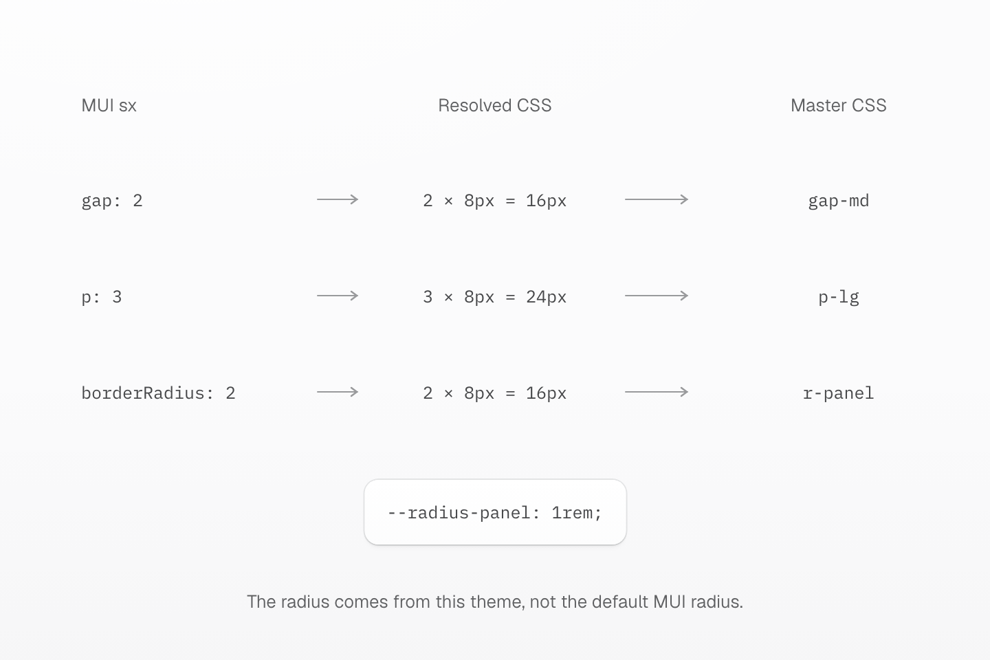
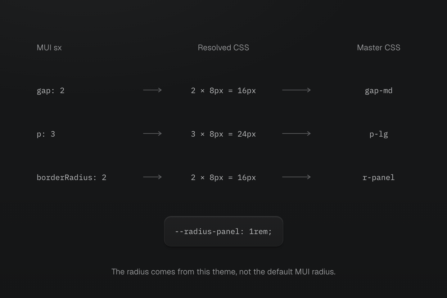
範例使用預設 8px 間距、明確的 8px 基礎圓角與 16px 根字級。sx 中相同數字不一定代表相同 CSS 長度。
文字說明
- 解析間距. 預設間距函式下,gap: 2 是 16px,p: 3 是 24px。
- 解析形狀. 文章將 theme.shape.borderRadius 設為 8px,因此 borderRadius: 2 產生 16px。
- 選擇匹配 token. 16px 根字級下,gap-md 與 p-lg 符合間距;自訂 --radius-panel: 1rem 提供 r-panel。
#在 Material UI 旁加入 Master CSS
從應用程式樣式表匯入 Master CSS,並保留目前的 Material UI providers。
@import "@master/css";多數專案使用預設來源探索即可。只有需要自訂納入、排除、safelist 或 blocklist 行為時,才新增明確的來源指令。
大量遷移前,先閱讀渲染模式。從預設靜態渲染開始:在元件中撰寫完整 class 字串,以已知 class 切換狀態,並透過 CSS 變數傳入變動值。只有應用程式會在瀏覽器建立新 class 名稱時,才選擇執行階段或漸進式渲染。
#將主題值移到 @theme
從 Material UI 元件以外也需要共用的產品值開始。
import { createTheme } from '@mui/material/styles'export const theme = createTheme({ palette: { primary: { main: '#2563eb' }, background: { paper: '#ffffff' }, text: { primary: '#172033' } }, shape: { borderRadius: 8 }})@import "@master/css";@theme { --color-primary: #2563eb; --color-surface: #ffffff; --color-body: #172033; --radius-control: .5rem; --radius-panel: 1rem;}<section class="b(1) b-solid b-line-divider fg-body bg-surface r-control"> ...</section>不要假設 Material UI 的間距、斷點、圓角或色盤刻度與 Master CSS 預設樣式集相同。有意識地搬移產品 token,再檢查任何以預設 token 取代的地方。
#轉換應用程式的 sx
先處理設定版面包裝層、卡片、區段與簡單產品介面的 sx 區塊。
import Box from '@mui/material/Box'export function DashboardPanel({ children }: { children: React.ReactNode }) { return ( <Box component="section" sx={{ display: 'grid', gap: 2, p: 3, borderRadius: 2, bgcolor: 'background.paper', color: 'text.primary' }}> {children} </Box> )}export function DashboardPanel({ children }: { children: React.ReactNode }) { return ( <section className="grid gap-md p-lg bg-surface fg-body r-panel"> {children} </section> )}使用預設間距函式時,gap: 2 解析為 16px,p: 3 為 24px;轉換後的預設值在根字級為 16px 時相同。採用上方主題時,MUI 的 borderRadius: 2會將 8px 基礎圓角乘為 16px。r-panel 以 1rem 表達此面板用途,請依應用程式根字級比較結果。自訂間距函式需要另外建立對照。範例保留相同 section 元素與明確的表面/文字配對,避免這些改變干擾刻度比較。
保留 Material UI 元件提供的行為,先設定應用程式自行管理的包裝層:
<div className="flex justify-flex-end"> <Button variant="contained">Save</Button></div>一般未分層的 Material UI/Emotion 規則優先於分層 Master CSS utility,與匯入順序無關。單靠轉送 className 不保證能覆寫。在專案明確設定並驗證串接層前,元件內部繼續使用 sx、slotProps 或 classes。
#將重複模式轉為元件 class
許多 sx 區塊表達相同產品用途時,可將此用途移為 Master CSS 元件 class。上方產品 token 保留在同一個 CSS 進入點。
@import "@master/css";@layer components { .panel { border-radius: var(--radius-panel); padding: var(--spacing-lg); border: 1px solid var(--color-line-divider); background-color: var(--color-surface); box-shadow: var(--shadow-sm); color: var(--color-body); } .toolbar { display: flex; align-items: center; gap: var(--spacing-sm); min-height: 3rem; }}<section className="panel"> <div className="toolbar"> ... </div></section>專案自行管理的用途,優先使用元件 class。仍屬於設計系統的 Material UI 元件,保留其 Material UI 主題變體。
#處理響應式與狀態樣式
將靜態響應式 sx 轉為相同門檻的條件。預設 Material UI md從 900px 開始;Master CSS 預設 md 從 64rem 開始。請為原本門檻定義條件,而非直接複製名稱。
<Box sx={{ display: 'grid', gridTemplateColumns: { xs: '1fr', md: 'repeat(3, 1fr)' }, gap: 2 }} />@custom-media --mui-md (width >= 900px);<section class="grid (grid-template-columns:1fr) gap-md (grid-template-columns:repeat(3,1fr))@mui-md"> ...</section>元件狀態由自己的標記負責時,優先使用原生狀態或屬性。
<button type="button" class="bg-blue-60 fg-white bg-blue-70:hover (opacity:.5):disabled"> Save</button>selected、expanded、focused 或 error 等 MUI 狀態樣式,若指向應用程式未管理的內部 slot 或行為,就保留在 MUI 覆寫中。
#驗證遷移結果
- 每批工作後執行格式化、lint、型別檢查、測試與正式建置。
- 比較重要畫面在明暗主題、響應式斷點、懸停、focus-visible、停用、選取與載入狀態下的表現。
- 移除 Material UI 元件前,測試對話框、選單、選取器、彈出視窗、portal、轉場與焦點圈限。
- 所有剩餘 Material UI 或 Emotion 路徑都不再需要前,保留 Emotion 快取與 SSR 設定。
- 視覺樣式與元件行為都完成替代後,才移除 Material UI 套件。