本頁目錄
CSS-in-JS 遷移通常應先搬移靜態視覺樣式,最後才處理執行階段行為。Styled Components 與 Emotion 可以留在專案中,讓 Master CSS 一次接手一組元件的 class 樣式。
本指南涵蓋 styled-components、@emotion/react 與 @emotion/styled。仍需要在執行階段生成選擇器或值的元件,不必移除 CSS-in-JS。
#遷移策略
依共用遷移流程建立基準,再拆分目前混合在各樣式包裝元件中的職責:
| 輸入 | 移往何處 | 元件保留的部分 |
|---|---|---|
| 靜態宣告 | 完整標記 class 或 @layer components | DOM 結構與事件處理函式 |
| 有限的視覺變體 | 完整 class 字串對照表 | 公開變體 prop 及其預設值 |
| 持續變動的值 | 透過 style 傳入 CSS 自訂屬性 | 測量、驗證與狀態 |
| 生成的選擇器或關鍵影格 | 有明確替代方式前保留既有 CSS-in-JS | 建立它們的執行階段邏輯 |
替換包裝元件前,先檢查 as、ref、prop 過濾與 SSR 設定。樣式區塊很小的元件,仍可能有很大的公開契約。
一個 class,不同數值
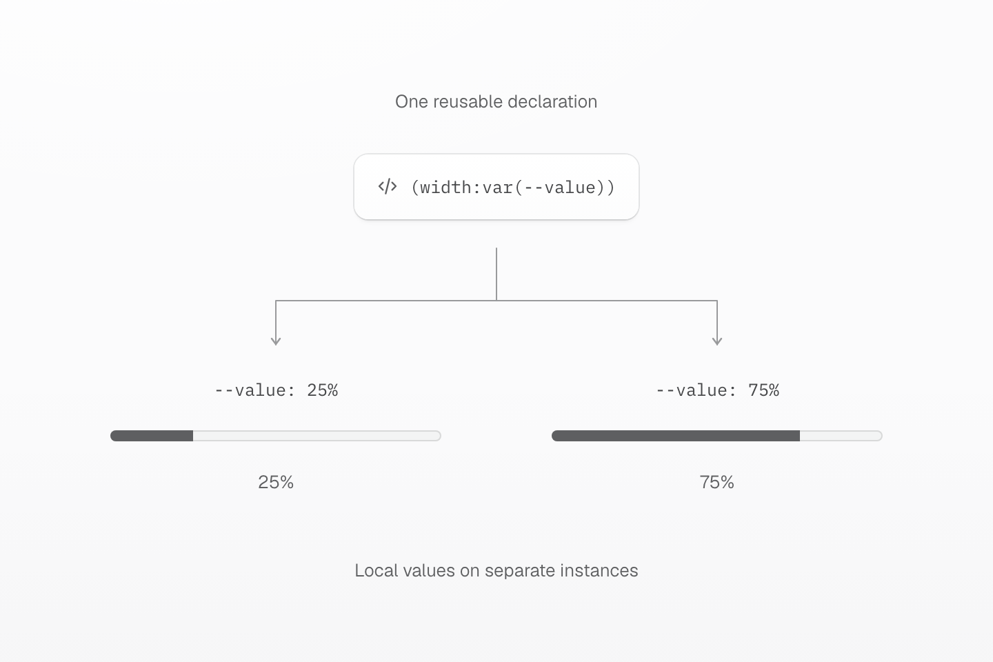
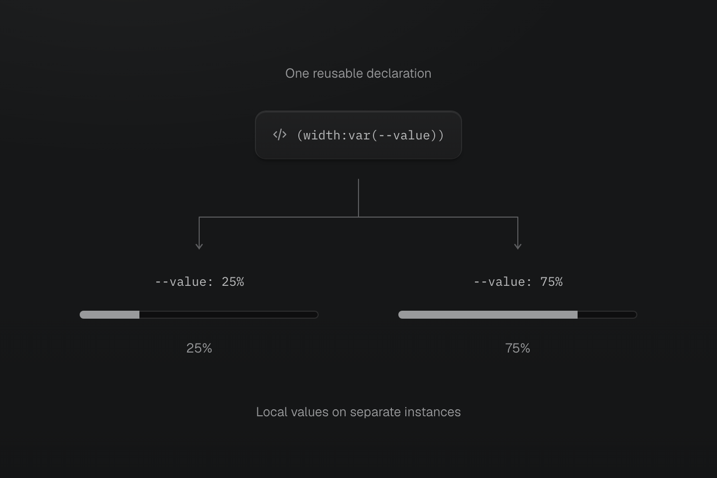
以自訂屬性傳入變動資料。讓掃描器能看見完整 class 字串,狀態驗證則留在元件內。
文字說明
- 穩定 class. 兩個實例都請求 (width:var(--value)),不將百分比插入 class 名稱。
- 局部資料. 每個實例在自己的元素設定 --value,讓同一宣告產生不同寬度。
- 保留行為. 元件仍限制數值範圍,並提供對應的 aria-valuenow。
#轉換靜態樣式元件
從只套用穩定視覺樣式的包裝元件開始。
import styled from 'styled-components'const Button = styled.button` display: inline-flex; align-items: center; gap: .5rem; min-height: 2.5rem; padding: 0 1rem; border-radius: .5rem; background: ${({ theme }) => theme.colors.primary}; color: white;`將可重用的值移到 @theme,再於渲染按鈕的地方使用 class 字串。
@import "@master/css";@theme { --color-primary: #2563eb;}export function Button(props: React.ButtonHTMLAttributes<HTMLButtonElement>) { const { className, type = 'button', ...buttonProps } = props return ( <button className={['inline-flex items-center gap-xs (min-height:2.5rem) py(0) px-md r-lg bg-primary fg-white', className].filter(Boolean).join(' ')} type={type} {...buttonProps} /> )}原本的 .5rem 圓角對應預設樣式集的 r-lg,而非 r-md。以具名 token 替換固定值時,請比較計算值。此包裝元件預設為 type="button";提交表單時傳入 type="submit"。請檢查既有表單的使用處,因為未設定 type 的原生按鈕預設會送出表單。
此範例替換的是視覺包裝元件。若要替換契約更廣的元件,請另外保留既有 ref 轉送、多型 as prop 與事件行為。
如果專案需要具名元件 class,保留上方 @theme 區塊,並在下方新增元件層:
@import "@master/css";@layer components { .btn { display: inline-flex; align-items: center; justify-content: center; border-radius: var(--radius-lg); gap: var(--spacing-xs); padding-block: 0; padding-inline: var(--spacing-md); background-color: var(--color-primary); color: oklch(100% 0 none); min-height: 2.5rem; &:hover { background-color: var(--color-blue-70); } &:disabled { opacity: 0.5; } }}<button type="button" class="btn">Save</button>#將變體轉為 class 對照表
避免用字串片段組合 Master CSS class 名稱。完整 class 字串最適合靜態渲染與 lint。
const toneClasses = { neutral: 'bg-surface-base fg-text-body b-line-divider b-solid b(1)', primary: 'bg-blue-60 fg-white bg-blue-70:hover', danger: 'bg-red-70 fg-white bg-red-80:hover'}const sizeClasses = { sm: '(min-height:2rem) px-sm font-sm', md: '(min-height:2.5rem) px-md font-sm', lg: '(min-height:3rem) px-lg font-md'}type ButtonProps = React.ButtonHTMLAttributes<HTMLButtonElement> & { tone?: keyof typeof toneClasses size?: keyof typeof sizeClasses}export function Button({ tone = 'neutral', size = 'md', className, type = 'button', ...props }: ButtonProps) { return ( <button className={['inline-flex items-center r-md', sizeClasses[size], toneClasses[tone], className].filter(Boolean).join(' ')} type={type} {...props} /> )}包裝元件會先取出 tone 與 size,再展開其餘原生 props。替換 styled-components 的暫態 props 或 shouldForwardProp 時,請保留過濾:樣式專用 props 不應傳到原生元素。如果舊公開 API 使用 $tone,請保留此拼法,直到有意識地遷移各使用處。
如果變體不只控制視覺樣式,就保留 prop,只遷移視覺宣告。使用最小高度,能讓標籤換行或放大,不會被固定高度限制。
附加 className 會保留呼叫端的 class,但不保證它們優先於衝突的 utility。HTML class 順序不決定串接。使用變體 props 選定一個值,或將可覆寫的預設值放入 @layer components,讓呼叫端 utility 可以覆寫。
#以 CSS 變數處理動態值
執行階段值不應變成生成的 class 名稱。保持 class 固定,以 CSS 變數傳入變動值。這與 Emotion 的動態樣式建議相同:變動值屬於元素,可重用宣告則維持穩定。
export function Meter({ value }: { value: number }) { const percent = Number.isFinite(value) ? Math.max(0, Math.min(100, value)) : 0 return ( <div role="progressbar" aria-label="Progress" aria-valuemin={0} aria-valuemax={100} aria-valuenow={percent} className="overflow-hidden (height:0.5rem) pill bg-surface-inset"> <div className="h-full (width:var(--value)) bg-text-muted (transition-property:width) (transition-duration:var(--duration-fast))@motion-safe (transition-timing-function:var(--easing-smooth))" style={{ '--value': `${percent}%` } as React.CSSProperties} /> </div> )}在 25% 與 75% 時,內部元素仍使用 (width:var(--value)),只改變 --value。限制範圍後的數值也會提供給 aria-valuenow,讓視覺值與無障礙值一致。
如果元件必須依執行階段資料建立選擇器、關鍵影格或樣式區塊,且無法清楚以 CSS 變數表達,就保留 CSS-in-JS。
#謹慎搬移全域樣式
全域樣式常包含應用程式的基礎結構。請分成小批搬移。
import { Global, css } from '@emotion/react'export function GlobalStyles() { return <Global styles={css` body { margin: 0; background: var(--color-surface-base); } `} />}@import "@master/css";@layer base { body { margin: 0; }}@layer defaults { body { background: var(--color-surface-base); }}原先使用這些全域樣式的每個路由、shell 與伺服器渲染路徑都載入替代 CSS 進入點前,請保留 CSS-in-JS 全域樣式。
#驗證遷移結果
- 每批工作後執行格式檢查、lint、型別檢查、測試與正式建置。
- 若 CSS-in-JS 設定包含 SSR 擷取或 hydration 邏輯,請比較伺服器渲染輸出。
- 檢查深色模式、響應式斷點、懸停、focus-visible、停用、選取與多型
as狀態。 - 確認所有剩餘元件都不再需要後,才移除 Babel 外掛、Emotion 快取設定、styled-components SSR 串接設定與套件相依性。