선언과 값
허용되는 클래스 형식, 네이티브 값 파싱, 단위, 중요도, 고정 유틸리티입니다.
이 페이지의 내용
클래스는 등록된 유틸리티나 네이티브 선언으로 시작하며 선택적으로 선택자, 조건, 중요도 표시가 뒤따릅니다. 이 페이지는 선언 형식, 값 파싱, 거부 규칙을 정의합니다. 단계별 예시는 구문 튜토리얼을, 네이티브 속성의 의미는 CSS 참조를 참고하세요.
아래 이름 기반 형식은 @import '@master/css'로 기본 프리셋을 불러왔다고 가정합니다. 프로젝트 정의로 유틸리티를 추가하거나 바꿀 수 있습니다. 네이티브 선언에는 등록된 유틸리티가 필요하지 않습니다.
허용 형식
| 형식 | 예제 | 의미 |
|---|---|---|
| 정적 유틸리티 | flex | 등록된 이름. 여기서는 display: flex |
| 토큰 유틸리티 | p-md | 등록된 접두사와 토큰 키. 여기서는 padding: var(--spacing-md) |
| 함수 유틸리티 | p(12) | 인수를 받는 등록된 함수. 여기서는 padding: calc(12 * 1px) |
| 네이티브 선언 | (padding:1rem) | 완전한 CSS 속성과 값 하나 |
이들은 서로 바꿔 쓸 수 있는 표기가 아니라 구문 형태입니다. 정적, 토큰, 함수 유틸리티는 모두 여러 선언을 포함할 수 있으며 truncate, text-sm, grid-cols(2)는 조합 스타일입니다. 네이티브 선두 부분은 정확히 선언 하나를 포함하며 CSS 단축 속성을 사용할 수 있습니다.
생성된 CSS
@layer theme { :root, :host { --spacing-md: 1rem }}@layer utilities { .flex { display: flex } .p-md { padding: var(--spacing-md) } .p\(12\) { padding: calc(12 * 1px) } .\(padding\:1rem\) { padding: 1rem }}모든 형식은 접미사를 허용합니다. p(12):hover@sm!에서 선두는 p(12), 선택자는 :hover, 조건은 @sm이며 !는 중요도 표시입니다. 접미사는 자신의 클래스에만 영향을 줍니다. 전체 계약은 선택자와 조건을 참고하세요.
네이티브 선언
완전한 속성 이름으로 (property:value)를 작성하세요. Master CSS는 괄호가 균형을 이루는 선두 부분을 읽은 뒤 접미사를 파싱합니다. 단독 이름 뒤의 콜론은 선택자를 시작합니다. flex:hover는 등록된 flex 유틸리티를 선택하며 display:block은 (display:block)의 대안이 아닙니다.
닫는 경계
문자열, 주석, 이스케이프, 중첩 괄호와 대괄호, 따옴표 없는 url() 토큰은 CSS 구성 값 경계를 따릅니다. 따옴표 문자열 안의 )는 선두 부분을 닫지 않습니다.
<span class="(content:')')::before"></span>따옴표 안의 괄호는 값의 일부
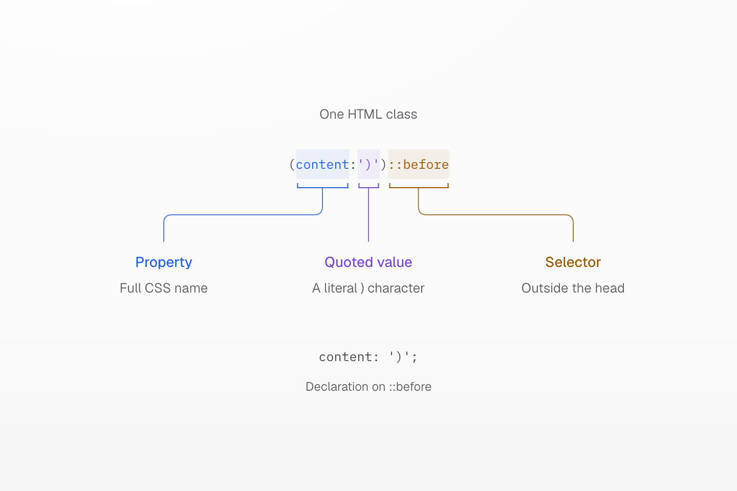
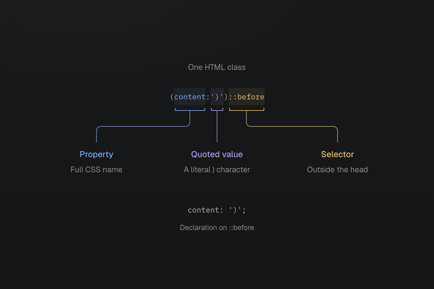
첫 번째 닫는 괄호는 따옴표 안의 값 텍스트입니다. 다음 괄호가 선언을 닫고 ::before는 그 바깥에서 시작합니다.
텍스트 설명
- (content:')')::before에서 content는 속성이고 ')'는 따옴표로 감싼 값입니다.
- 문자열 안의 )는 유지됩니다. 다음 )가 네이티브 선언의 선두 부분을 닫습니다.
- ::before 접미사는 의사 요소를 대상으로 합니다. 생성 선언은 content: ')';입니다.
선두 부분 안의 다른 CSS 구조도 각자의 경계를 유지합니다.
| 클래스 | 값 경계 |
|---|---|
(width:calc(1px+(2px*3))) | 중첩 괄호는 계산식에 속함 |
(grid-template-columns:[start]|1fr|[end]) | 대괄호가 Grid 선 이름을 감쌈 |
(background-image:url(/ | 중괄호는 따옴표 없는 URL 토큰에 속함 |
생성된 CSS
@layer utilities { .\(background-image\:url\(\/a\{b\.svg\)\) { background-image:url(/a{b.svg) } .\(grid-template-columns\:\[start\]\|1fr\|\[end\]\) { grid-template-columns: [start] 1fr [end] } .\(width\:calc\(1px\+\(2px\*3\)\)\) { width: calc(1px + (2px * 3)) } .\(content\:\'\)\'\)\:\:before::before { content: ')' }}값 안에서도 CSS 이스케이프가 적용됩니다. 따옴표 없는 URL에 괄호가 있다면 따옴표로 감싸거나 CSS 이스케이프를 사용해 토큰이 유효하게 유지되도록 하세요.
잘못된 선두 부분
형식이 잘못된 선두 부분은 규칙을 생성하지 않으며 유틸리티나 다른 클래스 형식으로 다시 시도하지 않습니다.
| 거부되는 클래스 | 이유 |
|---|---|
(display:block | 닫는 괄호가 없음 |
(color:red)(display:block) | 한 클래스에 선두 부분이 두 개 있음 |
(color:red;display:block) | 선언이 둘 이상임 |
(display:block;) | 끝에 있어도 최상위 세미콜론은 허용하지 않음 |
(width:calc(1px]) | 구분자가 일치하지 않음 |
(width:) | 일반 속성의 값이 비어 있음 |
(color:{red}) | 중괄호 블록을 일반 속성 값으로 사용 |
(width:calc(((…1px…)))) 65단계 중첩 | 괄호 중첩 깊이가 64단계를 초과함 |
사용자 지정 속성에는 빈 값이나 균형 잡힌 중괄호 블록을 사용할 수 있으므로 (--slot:)와 (--state:{open})는 허용됩니다. (--slot:!important)는 값이 빈 중요 사용자 지정 속성이지만 (width:!important)는 유효하지 않습니다.
출력과 브라우저 유효성
구문이 유효한 속성 이름은 도구 목록에 없어도 선언을 출력할 수 있습니다. 네이티브 값은 프리셋에 제한되지 않지만 대상 브라우저에서 해당 속성에 유효해야 합니다. 예를 들어 (font-size:48)은 font-size: 48을 출력하며 px가 추가되지 않습니다. 이 0이 아닌 단위 없는 길이는 유효하지 않은 CSS입니다. 해당 길이는 (font-size:48px)를 사용하세요. (field-sizing:content) 같은 네이티브 속성은 유틸리티 등록이 필요하지 않습니다.
생성된 CSS
@layer utilities { .\(field-sizing\:content\) { field-sizing: content } .\(font-size\:48px\) { font-size: 48px }}Master CSS는 backdrop-filter 옆에 -webkit-backdrop-filter를 추가하는 등 일부 호환 선언을 출력합니다. 하지만 공급업체별 선택자를 추가하거나 브라우저 기능을 폴리필하지는 않습니다. 생성 CSS를 확인하고 브라우저 요구사항과 폴백 설계는 호환성을 참고하세요.
생성된 CSS
@layer utilities { .\(backdrop-filter\:blur\(16px\)\) { -webkit-backdrop-filter: blur(16px); backdrop-filter: blur(16px) } .\(background-color\:\#000\)\:\:-webkit-scrollbar::-webkit-scrollbar { background-color: #000 }}값 인코딩
공백, 문자열, 밑줄
값에 CSS 따옴표가 있어도 HTML 공백은 클래스를 구분합니다. 클래스 값의 따옴표 밖에 있는 |는 공백을 인코딩하며 따옴표 문자열 안의 파이프는 문자 그대로 유지됩니다. 쉼표와 슬래시 같은 CSS 구두점은 그대로 두세요.
<div class="(color:rgb(30|60|90/80%)) (content:'a|b')::before"></div>생성된 CSS
@layer utilities { .\(animation-name\:slide_in\) { animation-name: slide_in } .\(color\:rgb\(30\|60\|90\/80\%\)\) { color: rgb(30 60 90/80%) } .\(color\:red\)_a a { color: red } .\(content\:\'a\|b\'\)\:\:before::before { content: 'a|b' }}색상 값은 rgb(30 60 90 / 80%)가 되고 content 문자열은 'a|b'로 유지됩니다. CSS 문자열 안에 실제 공백이 필요하면 \000020 같은 CSS 이스케이프를 사용하세요. (content:'New\000020collection')::before는 “New collection”을 만듭니다. 여섯 자리 이스케이프는 HTML 클래스에 종료 공백을 넣지 않아도 됩니다.
네이티브 선두 부분 안의 밑줄은 slide_in처럼 문자 그대로입니다. 선두 부분이 닫힌 뒤의 _는 하위 선택자를 시작하며 (color:red)_a는 하위 링크를 대상으로 합니다. 등록된 유틸리티 이름에는 _를 넣을 수 없지만 밑줄이 있는 토큰 키는 var(--name)으로 참조할 수 있습니다.
함수와 명시적 변수
CSS 함수는 네이티브 속성의 값으로 남습니다. Master CSS는 calc(100%-2rem)의 산술 공백을 최대 64단계의 중첩 괄호와 1px-2px-3px 같은 연속 뺄셈까지 정규화하고 더 깊은 내용은 그대로 둡니다. 계산은 브라우저가 수행합니다. 단독 단어에서 토큰을 추론하거나 CSS 함수를 유틸리티 호출로 평가하지 않습니다.
생성된 CSS
@layer theme { :root, :host { --color-red-60: oklch(60.94% .2501 29.2) } :root, :host { --color-red: var(--color-red-60) }}@layer utilities { .\(color\:var\(--color-red\)\) { color: var(--color-red) } .\(width\:calc\(100\%-2rem\)\) { width: calc(100% - 2rem) } .\(width\:calc\(100\%-var\(--spacing-md\)\)\) { width: calc(100%-var(--spacing-md)) }}네이티브 색상 값은 의미를 유지합니다. (color:red), (color:#175fe9), (color:rgb(23,95,233))는 CSS 값을 제공하며 fg-red는 테마 토큰을 선택합니다. var() 참조는 명시적입니다. (font-family:mono)는 CSS 글꼴 계열 mono를 뜻하며 --font-mono가 아닙니다. 토큰 해석, 모드, 파생 값은 변수와 모드를 참고하세요.
숫자와 단위
네이티브 선언은 단위를 유지합니다. rem을 픽셀로 변환하거나 속성에서 단위를 추론하지 않습니다. 소수 앞의 0은 생략할 수 있으며 (opacity:.5)와 (opacity:0.5)는 같은 숫자 값을 지정합니다.
| 네이티브 값 | 해석 |
|---|---|
(margin:1rem) | 루트 글꼴 크기에 상대적인 길이 |
(width:50%) | 속성의 맥락에서 해석하는 백분율 |
(rotate:30deg) | 명시적인 각도 |
(animation-duration:200ms) | 명시적인 시간. .2s도 같은 지속 시간을 표현 |
(opacity:.5) | 단위 없는 숫자 |
(background-image:image-set(url(a.png)|1x,url(b.png)|2x)) | CSS 픽셀당 도트 수로 지정하는 네이티브 이미지 해상도 |
속성이 숫자, 길이, 백분율 또는 다른 타입을 허용하는지는 CSS 값과 단위 규칙이 결정합니다. p(12)는 다릅니다. 프리셋 함수가 인수에 1px을 명시적으로 곱합니다.
음수 값
네이티브 음수는 (margin-top:-2rem)처럼 값 안에 씁니다. 직접 숫자 인수는 mt(-8)을 사용합니다. 음수 토큰 클래스는 전체 클래스 앞에 -를 붙여 -mt-sm으로 씁니다. 이 형식에는 숫자 토큰과 음수를 지원하는 유틸리티가 필요합니다. padding은 음수를 지원하지 않으므로 -p-sm은 거부됩니다.
생성된 CSS
@layer theme { :root, :host { --spacing-sm: .75rem }}@layer utilities { .-mt-sm { margin-top: calc(var(--spacing-sm) * -1) } .mt\(-8\) { margin-top: calc(-8 * 1px) } .\(margin-top\:-2rem\) { margin-top: -2rem }}인수 검증이 CSS 속성의 값 제약을 재정의하지는 않습니다.
등록된 유틸리티
토큰 이름
토큰 접두사는 유틸리티 정의가 등록하며 속성 약어에서 추론하지 않습니다. p-md는 --spacing-md를 읽습니다. fg-red와 bg-red는 모두 --color-red를 읽지만 서로 다른 속성을 설정합니다. padding-md 같은 전체 속성 이름 형식이나 p-4 같은 암묵적 숫자 척도는 없습니다. 선택한 네임스페이스에 해당 키가 있어야 합니다.
같은 철자의 토큰 클래스보다 정적 이름이 우선합니다. 예를 들어 프로젝트에 --container-full이 있어도 w-full은 width: 100%를 유지합니다. --radius-pill이 있어도 pill은 완전히 둥근 모서리 반지름을 유지합니다. 이름이 같은 정적 유틸리티와 함수는 독립적으로 등록됩니다.
전체 접두사와 네임스페이스 매핑은 토큰 계열 색인을, 등록과 교체 규칙은 유틸리티 정의를 참고하세요. 프로젝트 값의 정의와 범위 지정 방법은 테마 토큰에서 설명합니다.
고정 표기는 자신의 정의를 유지
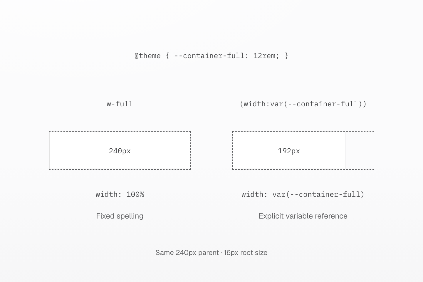
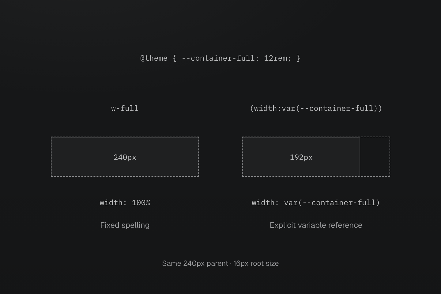
두 부모의 너비는 240px입니다. 사용자 정의 --container-full은 12rem이며 루트 글꼴 크기 16px에서는 192px입니다. w-full은 고정된 100% 유틸리티를 유지합니다.
텍스트 설명
- 설정은 @theme { --container-full: 12rem; }을 정의합니다. 프리셋은 이미 완전한 고정 이름 w-full을 width: 100%로 등록합니다.
- 따라서 w-full은 240px 부모를 채웁니다. 명시적인 (width:var(--container-full)) 클래스는 --container-full을 읽어 두 번째 블록의 너비를 192px로 만듭니다.
- 토큰은 명시적인 var() 참조로 계속 사용할 수 있습니다. 토큰 정의는 고정된 w-full 등록을 교체하지 않습니다.
직접 숫자 값
m(4), b(1), grow(1) 같은 프리셋 함수는 정적 숫자 하나를 받습니다. 길이 함수는 1px을 곱하는 식을 출력합니다. grow(), shrink(), order()는 숫자를 그대로 전달하며 order()는 정수가 필요합니다. 0, 소수, 음수 인수는 각 매개변수에 선언된 타입을 따릅니다.
단위와 동적 식은 숫자 인수가 아니므로 m(1px)와 b(var(--x))는 규칙을 생성하지 않습니다. 이런 값은 (margin:1rem)이나 (border-width:var(--x))를 사용하세요. 전체 함수 목록, 매개변수 타입, 생성 선언은 직접 숫자 값에 있습니다.
레시피는 여러 속성이나 보조 값을 함께 조정할 수 있습니다. text-sm은 크기, 줄 높이, 자간을 포함하고 animate-fade는 애니메이션 단축 속성을 제공합니다. 조회와 재정의 규칙은 텍스트 토큰과 모션 토큰을 참고하세요.
사용자 지정 속성
(--name:value) 선두 부분은 일치하는 요소에 CSS 사용자 지정 속성을 선언합니다. 다른 선언과 같은 선택자와 조건을 사용할 수 있으며 유틸리티나 테마 토큰을 등록하지는 않습니다.
<div class="(--progress:40%) (--progress:60%):hover (width:var(--progress))">Progress</div>생성된 CSS
@layer utilities { .\(--progress\:40\%\) { --progress: 40% } .\(width\:var\(--progress\)\) { width: var(--progress) } .\(--progress\:60\%\)\:hover:hover { --progress: 60% }}var(--progress)는 일반 CSS 해석과 상속을 사용합니다. 해석되지 않은 변수나 호환되지 않는 치환 값은 이를 참조하는 선언을 무효화할 수 있으므로 필요하면 CSS 변수 대체 값을 사용하세요. 클래스를 고정하고 동적 값을 별도로 전달하는 방법은 구문 튜토리얼에서 설명합니다.
조합과 중요도
b(1) b-solid b-line-control처럼 클래스를 나누어 독립적인 결정을 표현합니다. 네이티브 단축 속성도 지원되며 이 작성 권장 방식이 CSS 문법을 바꾸지는 않습니다. 선택자와 조건이 필요한 각 클래스에 접미사를 반복해서 붙이세요.
<ul class="block>li:hover@md (font-size:14px)>li:hover@md text-center>li:hover@md">…</ul>같은 레이어, 조건, 선택자 안에서는 레시피, 단일 선언 유틸리티, 네이티브 선언 순으로 정렬됩니다. 단일 선언 유틸리티는 값의 출처보다 속성 계열과 적용 범위를 먼저 따릅니다. 같은 속성에서는 토큰이 고정 값이나 직접 숫자 값보다 앞에 옵니다. HTML 클래스 순서는 결과를 결정하지 않습니다.
생성된 CSS
@layer theme { :root, :host { --spacing-md: 1rem }}@layer utilities { .m-md { margin: var(--spacing-md) } .mx-auto { margin-inline: auto } .mt\(0\) { margin-top: calc(0 * 1px) } .p-md { padding: var(--spacing-md) } .p\(12\) { padding: calc(12 * 1px) } .\(padding\:1rem\) { padding: 1rem }}여기서는 네이티브 padding이 두 유틸리티 뒤에 오고 mt(0)과 mx-auto가 m-md의 해당 부분을 재정의합니다. 전체 정렬 규칙은 캐스케이드 레이어를 참고하세요. 컴포넌트 클래스, @utility 레시피, CSS 믹스인을 선택하는 방법은 스타일 재사용에 있습니다.
중요도
마지막 !는 클래스의 선언을 중요 선언으로 표시합니다. 괄호 값 안의 끝에 쓰는 네이티브 !important도 같은 효과가 있으며 둘 다 써도 한 번만 출력됩니다. 문자열 안의 '!important'는 콘텐츠로 유지됩니다.
생성된 CSS
@layer utilities { .text-center\! { text-align: center !important } .\(color\:red\!important\) { color: red !important } .\(color\:red\!important\)\! { color: red !important } .\(content\:\'\!important\'\)\:\:before::before { content: '!important' }}중요도는 레시피의 모든 선언에 적용
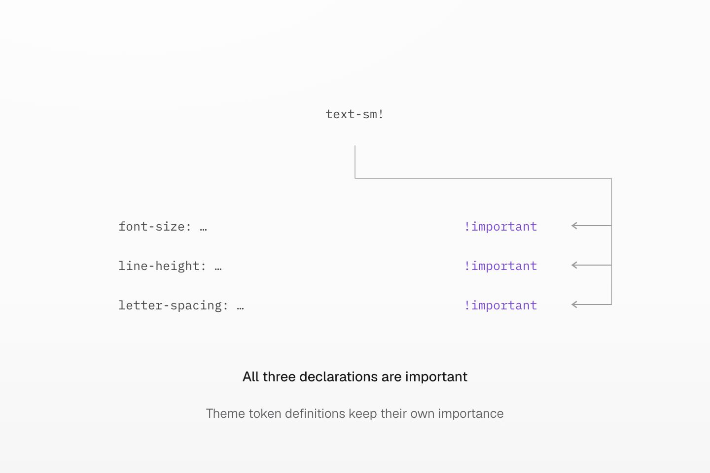
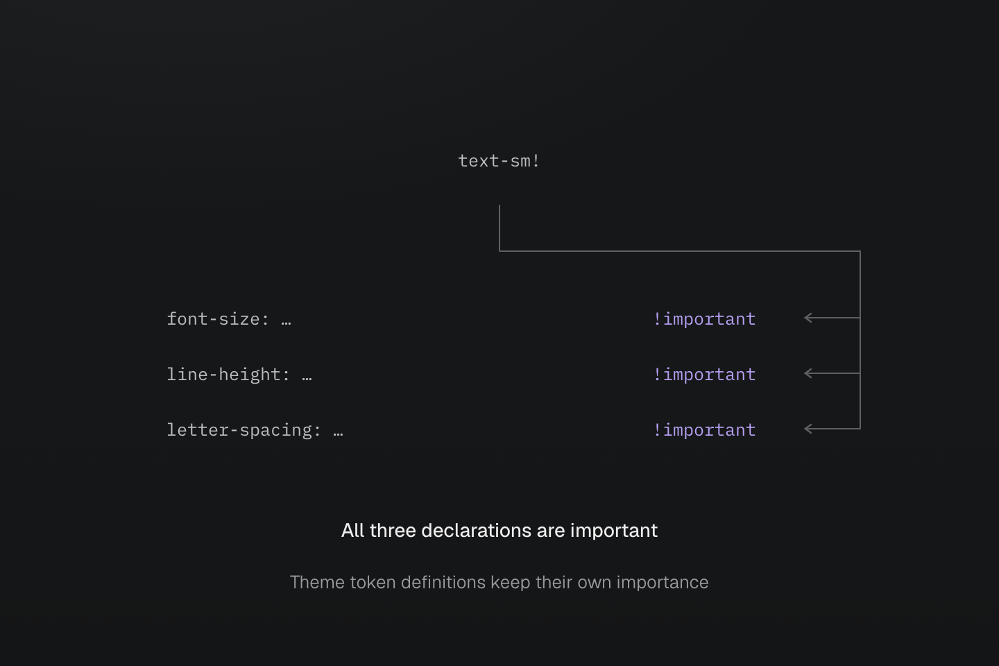
마지막 ! 하나가 세 선언을 모두 표시합니다. 말줄임표는 토큰 참조를 생략한 것입니다. 주변 HTML 클래스나 테마 토큰 정의를 중요하게 표시하지는 않습니다.
텍스트 설명
- text-sm은 주 토큰과 보조 참조를 사용해 font-size, line-height, letter-spacing을 작성합니다.
- text-sm!은 생성된 세 선언을 모두 !important로 표시합니다. 의존 대상 선언은 일반 테마 토큰으로 유지됩니다.
고정 유틸리티 조회표
프리셋은 고정된 단일 선언 유틸리티 292개를 제공합니다. 각 유틸리티는 표에 나오는 속성만 설정합니다. flex-col은 flex 레이아웃을 활성화하지 않고 b-none은 테두리 너비를 초기화하지 않으며 pill은 크기를 설정하지 않습니다. 다중 선언인 truncate 레시피는 잘라내기에 별도로 나옵니다.
| 클래스, 선언 | CSS |
|---|---|
block | display: block |
inline | display: inline |
inline-block | display: inline-block |
flow-root | display: flow-root |
flex | display: flex |
inline-flex | display: inline-flex |
grid | display: grid |
inline-grid | display: inline-grid |
contents | display: contents |
list-item | display: list-item |
table | display: table |
inline-table | display: inline-table |
table-caption | display: table-caption |
table-cell | display: table-cell |
table-column | display: table-column |
table-column-group | display: table-column-group |
table-header-group | display: table-header-group |
table-footer-group | display: table-footer-group |
table-row | display: table-row |
table-row-group | display: table-row-group |
hidden | display: none |
static | position: static |
relative | position: relative |
absolute | position: absolute |
fixed | position: fixed |
sticky | position: sticky |
visible | visibility: visible |
invisible | visibility: hidden |
isolate | isolation: isolate |
box-border | box-sizing: border-box |
box-content | box-sizing: content-box |
italic | font-style: italic |
oblique | font-style: oblique |
uppercase | text-transform: uppercase |
lowercase | text-transform: lowercase |
capitalize | text-transform: capitalize |
underline | text-decoration-line: underline |
overline | text-decoration-line: overline |
line-through | text-decoration-line: line-through |
flex-row | flex-direction: row |
flex-row-reverse | flex-direction: row-reverse |
flex-col | flex-direction: column |
flex-col-reverse | flex-direction: column-reverse |
flex-wrap | flex-wrap: wrap |
flex-nowrap | flex-wrap: nowrap |
flex-wrap-reverse | flex-wrap: wrap-reverse |
items-normal | align-items: normal |
items-start | align-items: start |
items-end | align-items: end |
items-flex-start | align-items: flex-start |
items-flex-end | align-items: flex-end |
items-center | align-items: center |
items-baseline | align-items: baseline |
items-stretch | align-items: stretch |
content-normal | align-content: normal |
content-start | align-content: start |
content-end | align-content: end |
content-flex-start | align-content: flex-start |
content-flex-end | align-content: flex-end |
content-center | align-content: center |
content-baseline | align-content: baseline |
content-stretch | align-content: stretch |
content-between | align-content: space-between |
content-around | align-content: space-around |
content-evenly | align-content: space-evenly |
self-auto | align-self: auto |
self-normal | align-self: normal |
self-start | align-self: start |
self-end | align-self: end |
self-flex-start | align-self: flex-start |
self-flex-end | align-self: flex-end |
self-center | align-self: center |
self-baseline | align-self: baseline |
self-stretch | align-self: stretch |
justify-normal | justify-content: normal |
justify-start | justify-content: start |
justify-end | justify-content: end |
justify-flex-start | justify-content: flex-start |
justify-flex-end | justify-content: flex-end |
justify-center | justify-content: center |
justify-between | justify-content: space-between |
justify-around | justify-content: space-around |
justify-evenly | justify-content: space-evenly |
justify-stretch | justify-content: stretch |
object-cover | object-fit: cover |
object-contain | object-fit: contain |
object-fill | object-fit: fill |
object-none | object-fit: none |
object-scale-down | object-fit: scale-down |
object-center | object-position: center |
object-top | object-position: top |
object-bottom | object-position: bottom |
object-left | object-position: left |
object-right | object-position: right |
m-auto | margin: auto |
mt-auto | margin-top: auto |
mr-auto | margin-right: auto |
mb-auto | margin-bottom: auto |
ml-auto | margin-left: auto |
mx-auto | margin-inline: auto |
mxs-auto | margin-inline-start: auto |
mxe-auto | margin-inline-end: auto |
my-auto | margin-block: auto |
mys-auto | margin-block-start: auto |
mye-auto | margin-block-end: auto |
top-auto | top: auto |
right-auto | right: auto |
bottom-auto | bottom: auto |
left-auto | left: auto |
inset-auto | inset: auto |
ix-auto | inset-inline: auto |
ixs-auto | inset-inline-start: auto |
ixe-auto | inset-inline-end: auto |
iy-auto | inset-block: auto |
iys-auto | inset-block-start: auto |
iye-auto | inset-block-end: auto |
w-auto | width: auto |
h-auto | height: auto |
size-x-auto | inline-size: auto |
size-y-auto | block-size: auto |
min-w-auto | min-width: auto |
min-h-auto | min-height: auto |
min-size-x-auto | min-inline-size: auto |
min-size-y-auto | min-block-size: auto |
basis-auto | flex-basis: auto |
max-w-none | max-width: none |
max-h-none | max-height: none |
max-size-x-none | max-inline-size: none |
max-size-y-none | max-block-size: none |
w-full | width: 100% |
w-fit | width: fit-content |
w-max | width: max-content |
w-min | width: min-content |
h-full | height: 100% |
h-fit | height: fit-content |
h-max | height: max-content |
h-min | height: min-content |
size-x-full | inline-size: 100% |
size-x-fit | inline-size: fit-content |
size-x-max | inline-size: max-content |
size-x-min | inline-size: min-content |
size-y-full | block-size: 100% |
size-y-fit | block-size: fit-content |
size-y-max | block-size: max-content |
size-y-min | block-size: min-content |
min-w-full | min-width: 100% |
min-w-fit | min-width: fit-content |
min-w-max | min-width: max-content |
min-w-min | min-width: min-content |
min-h-full | min-height: 100% |
min-h-fit | min-height: fit-content |
min-h-max | min-height: max-content |
min-h-min | min-height: min-content |
min-size-x-full | min-inline-size: 100% |
min-size-x-fit | min-inline-size: fit-content |
min-size-x-max | min-inline-size: max-content |
min-size-x-min | min-inline-size: min-content |
min-size-y-full | min-block-size: 100% |
min-size-y-fit | min-block-size: fit-content |
min-size-y-max | min-block-size: max-content |
min-size-y-min | min-block-size: min-content |
max-w-full | max-width: 100% |
max-w-fit | max-width: fit-content |
max-w-max | max-width: max-content |
max-w-min | max-width: min-content |
max-h-full | max-height: 100% |
max-h-fit | max-height: fit-content |
max-h-max | max-height: max-content |
max-h-min | max-height: min-content |
max-size-x-full | max-inline-size: 100% |
max-size-x-fit | max-inline-size: fit-content |
max-size-x-max | max-inline-size: max-content |
max-size-x-min | max-inline-size: min-content |
max-size-y-full | max-block-size: 100% |
max-size-y-fit | max-block-size: fit-content |
max-size-y-max | max-block-size: max-content |
max-size-y-min | max-block-size: min-content |
basis-full | flex-basis: 100% |
basis-fit | flex-basis: fit-content |
basis-max | flex-basis: max-content |
basis-min | flex-basis: min-content |
order-first | order: -999999 |
order-last | order: 999999 |
pill | border-radius: calc(infinity*1px) |
b-solid | border-style: solid |
b-dashed | border-style: dashed |
b-dotted | border-style: dotted |
b-double | border-style: double |
b-none | border-style: none |
bt-solid | border-top-style: solid |
bt-dashed | border-top-style: dashed |
bt-dotted | border-top-style: dotted |
bt-double | border-top-style: double |
bt-none | border-top-style: none |
br-solid | border-right-style: solid |
br-dashed | border-right-style: dashed |
br-dotted | border-right-style: dotted |
br-double | border-right-style: double |
br-none | border-right-style: none |
bb-solid | border-bottom-style: solid |
bb-dashed | border-bottom-style: dashed |
bb-dotted | border-bottom-style: dotted |
bb-double | border-bottom-style: double |
bb-none | border-bottom-style: none |
bl-solid | border-left-style: solid |
bl-dashed | border-left-style: dashed |
bl-dotted | border-left-style: dotted |
bl-double | border-left-style: double |
bl-none | border-left-style: none |
bx-solid | border-inline-style: solid |
bx-dashed | border-inline-style: dashed |
bx-dotted | border-inline-style: dotted |
bx-double | border-inline-style: double |
bx-none | border-inline-style: none |
bxs-solid | border-inline-start-style: solid |
bxs-dashed | border-inline-start-style: dashed |
bxs-dotted | border-inline-start-style: dotted |
bxs-double | border-inline-start-style: double |
bxs-none | border-inline-start-style: none |
bxe-solid | border-inline-end-style: solid |
bxe-dashed | border-inline-end-style: dashed |
bxe-dotted | border-inline-end-style: dotted |
bxe-double | border-inline-end-style: double |
bxe-none | border-inline-end-style: none |
by-solid | border-block-style: solid |
by-dashed | border-block-style: dashed |
by-dotted | border-block-style: dotted |
by-double | border-block-style: double |
by-none | border-block-style: none |
bys-solid | border-block-start-style: solid |
bys-dashed | border-block-start-style: dashed |
bys-dotted | border-block-start-style: dotted |
bys-double | border-block-start-style: double |
bys-none | border-block-start-style: none |
bye-solid | border-block-end-style: solid |
bye-dashed | border-block-end-style: dashed |
bye-dotted | border-block-end-style: dotted |
bye-double | border-block-end-style: double |
bye-none | border-block-end-style: none |
outline-solid | outline-style: solid |
outline-dashed | outline-style: dashed |
outline-dotted | outline-style: dotted |
outline-double | outline-style: double |
outline-none | outline-style: none |
text-left | text-align: left |
text-center | text-align: center |
text-right | text-align: right |
text-start | text-align: start |
text-end | text-align: end |
text-justify | text-align: justify |
overflow-auto | overflow: auto |
overflow-hidden | overflow: hidden |
overflow-clip | overflow: clip |
overflow-visible | overflow: visible |
overflow-scroll | overflow: scroll |
overflow-x-auto | overflow-x: auto |
overflow-x-hidden | overflow-x: hidden |
overflow-x-clip | overflow-x: clip |
overflow-x-visible | overflow-x: visible |
overflow-x-scroll | overflow-x: scroll |
overflow-y-auto | overflow-y: auto |
overflow-y-hidden | overflow-y: hidden |
overflow-y-clip | overflow-y: clip |
overflow-y-visible | overflow-y: visible |
overflow-y-scroll | overflow-y: scroll |
whitespace-normal | white-space: normal |
whitespace-nowrap | white-space: nowrap |
whitespace-pre | white-space: pre |
whitespace-pre-wrap | white-space: pre-wrap |
whitespace-pre-line | white-space: pre-line |
whitespace-break-spaces | white-space: break-spaces |
select-none | user-select: none |
select-text | user-select: text |
select-all | user-select: all |
select-auto | user-select: auto |
pointer-none | pointer-events: none |
pointer-auto | pointer-events: auto |
vertical-baseline | vertical-align: baseline |
vertical-top | vertical-align: top |
vertical-middle | vertical-align: middle |
vertical-bottom | vertical-align: bottom |
vertical-text-top | vertical-align: text-top |
vertical-text-bottom | vertical-align: text-bottom |
vertical-sub | vertical-align: sub |
vertical-super | vertical-align: super |
container-inline | container-type: inline-size |
container-size | container-type: size |
container-normal | container-type: normal |
wrap-anywhere | overflow-wrap: anywhere |
wrap-break-word | overflow-wrap: break-word |
wrap-normal | overflow-wrap: normal |
ellipsis | text-overflow: ellipsis |
start와 end는 flex-start, flex-end와 구분되는 네이티브 의미를 유지합니다. 논리 축에서 x는 인라인 축, y는 블록 축이며 t, r, b, l은 물리적인 면입니다. 고정 유틸리티는 선택자, 조건, !를 허용하며 사용될 때 CSS를 출력합니다.