테마 토큰
공유 디자인 값을 정의하고 토큰 수정이 사용 측에 미치는 영향을 확인하며 로컬 재정의, 정적 전달, 인라인 치환을 선택합니다.
이 페이지의 내용
#개요
카드 간격, 동작 색상, 본문 열 너비처럼 여러 요소가 함께 바뀌어야 할 때 토큰을 정의하세요. 앱 스타일시트의 기존 @import '@master/css' 뒤에 @theme으로 작성하고 마크업에서 대응하는 클래스를 사용합니다.
세 공유 값으로 만든 카드
@theme { --color-brand: #4f46e5; --spacing-card: 1.5rem; --radius-card: 0.5rem;}<article class="max-w-sm mx-auto p-card r-card bg-surface-raised fg-text-body shadow-sm"> <p class="flex items-center gap-xs m(0) text-xs fg-text-muted"> <span aria-hidden="true" class="h(8) w(8) pill bg-brand"></span>Brand color</p> <h2 class="mt-sm mb-xs text-lg font-regular">Field notes</h2> <p class="m(0) text-sm fg-text-muted">Keep the details that matter.</p></article>생성된 CSS
@layer theme { :root, :host { --color-zinc-30: oklch(78% .0025 265); --color-zinc-40: oklch(68.6% .0028 265); --color-zinc-60: oklch(48.6% .003 265); --color-zinc-70: oklch(39.8% .0028 265); --color-zinc-90: oklch(24.6% .0022 265) } :root, :host { --color-surface-raised: light-dark(var(--color-white), var(--color-zinc-90)); --color-text-body: light-dark(var(--color-zinc-70), var(--color-zinc-30)); --color-text-muted: light-dark(var(--color-zinc-60), var(--color-zinc-40)) } :root, :host { --color-white: oklch(100% 0 none) } :root, :host { --font-weight-regular: 400; --font-size-xs: .75rem; --font-size-sm: .875rem; --font-size-lg: 1.125rem; --text-xs: var(--font-size-xs); --text-xs--line-height: 1.5; --text-xs--letter-spacing: 0; --text-sm: var(--font-size-sm); --text-sm--line-height: 1.5; --text-sm--letter-spacing: 0; --text-lg: var(--font-size-lg); --text-lg--line-height: 1.5; --text-lg--letter-spacing: 0; --spacing-xs: .5rem; --spacing-sm: .75rem; --container-sm: 24rem } :root, :host { --shadow-sm: 0 0 0 1px light-dark(oklch(0% 0 none / .04), oklch(100% 0 none / .05)), 0 1px 1px -.5px light-dark(oklch(0% 0 none / .045), oklch(0% 0 none / .3)), 0 2px 2px -1px light-dark(oklch(0% 0 none / .04), oklch(0% 0 none / .26)), 0 4px 4px -2px light-dark(oklch(0% 0 none / .04), oklch(0% 0 none / .24)) } :root, :host { --color-brand: #4f46e5; --spacing-card: 1.5rem; --radius-card: .5rem }}@layer utilities { .text-lg { font-size: var(--text-lg); line-height: var(--text-lg--line-height, normal); letter-spacing: var(--text-lg--letter-spacing, normal) } .text-sm { font-size: var(--text-sm); line-height: var(--text-sm--line-height, normal); letter-spacing: var(--text-sm--letter-spacing, normal) } .text-xs { font-size: var(--text-xs); line-height: var(--text-xs--line-height, normal); letter-spacing: var(--text-xs--letter-spacing, normal) } .items-center { align-items: center } .bg-brand { background-color: var(--color-brand) } .bg-surface-raised { background-color: var(--color-surface-raised) } .r-card { border-radius: var(--radius-card) } .pill { border-radius: calc(infinity * 1px) } .shadow-sm { box-shadow: var(--shadow-sm) } .fg-text-body { color: var(--color-text-body) } .fg-text-muted { color: var(--color-text-muted) } .flex { display: flex } .font-regular { font-weight: var(--font-weight-regular) } .gap-xs { gap: var(--spacing-xs) } .h\(8\) { height: calc(8 * 1px) } .m\(0\) { margin: calc(0 * 1px) } .mx-auto { margin-inline: auto } .mb-xs { margin-bottom: var(--spacing-xs) } .mt-sm { margin-top: var(--spacing-sm) } .max-w-sm { max-width: var(--container-sm) } .p-card { padding: var(--spacing-card) } .w\(8\) { width: calc(8 * 1px) }}p-card는 padding: var(--spacing-card)를 생성하며 브라우저가 카드 요소에서 사용자 지정 속성을 해석합니다. 모든 사용 측을 함께 바꿔야 하면 토큰을 수정하고, 한 요소만의 변경이라면 로컬 값을 사용하세요.
#하나의 값으로 모든 사용 측 변경하기
--spacing-card는 카드 안쪽 여백과 목록 간격을 모두 제공할 수 있습니다. 값을 1.5rem에서 2rem으로 바꾸면 마크업을 편집하지 않고 두 곳이 함께 바뀝니다:
<article class="p-card">Field notes</article><ul class="flex gap-card"> <li>Draft</li> <li>Ready</li></ul>하나의 공유 값으로 안쪽 여백과 간격 함께 변경하기
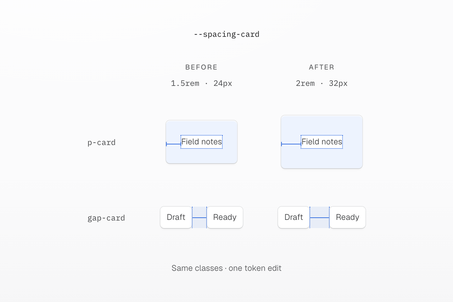
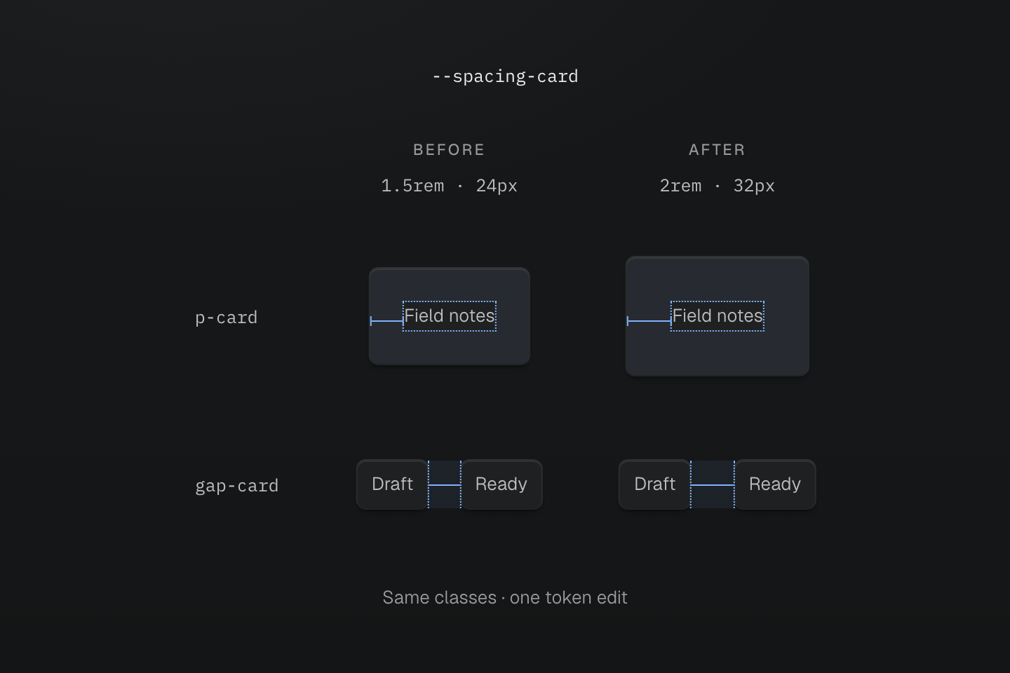
두 열의 마크업은 같습니다. 측정은 루트 글꼴 크기 16px를 가정하며 강조 영역은 안쪽 여백과 간격의 실제 상대 크기를 보여 줍니다.
텍스트 설명
- 변경 전. 루트 글꼴 크기가 16px이면 --spacing-card: 1.5rem은 p-card로 24px 안쪽 여백을, gap-card로 24px 간격을 제공합니다.
- 변경 후. 토큰을 2rem으로 바꾸면 클래스를 편집하지 않아도 두 측정값 모두 32px로 늘어납니다.
- 연동 선택. 이 간격들이 함께 바뀌어야 할 때만 하나의 토큰을 사용하세요. 현재 값이 같아도 별도 디자인 결정에는 별도 토큰이 필요합니다.
이 연동은 디자인 결정입니다. 카드는 여유롭게 하되 목록 간격은 유지해야 한다면 별도 토큰을 사용하세요. 지금 같은 수치를 쓴다는 이유만으로 두 인터페이스 부분이 항상 함께 바뀌어야 하는 것은 아닙니다.
#네임스페이스에 따라 토큰 명명하기
토큰 접두사가 네임스페이스를 선택하고 각 클래스 계열은 자신이 지원하는 네임스페이스를 읽습니다. --spacing-card는 p-card, m-card, gap-card에, --radius-card는 r-card에, --container-panel은 max-w-panel에 쓰입니다. 같은 키도 계열에 따라 다른 값이 될 수 있습니다. p-lg는 간격을, r-lg는 반경을 읽습니다.
@theme { --color-text-action: var(--color-brand); --font-family-sans: Geist, ui-sans-serif, system-ui, sans-serif; --container-panel: 28rem;}클래스 토큰을 등록하는 것은 @theme 선언뿐이며 다른 위치의 네이티브 사용자 지정 속성은 등록하지 않습니다. 처음 사용한 컴포넌트가 아닌 brand, card 같은 공유 결정에 따라 이름을 지으세요. --spacing-lg 같은 프리셋 키를 재정의하면 프로젝트 전체의 값을 바꿀 수 있습니다. 클래스별 네임스페이스는 계열 색인, 해석 방식은 변수와 모드를 참고하세요.
#토큰 별칭과 재정의
한 토큰이 다른 토큰을 따르게 하려면 var()를 사용하세요. 별칭은 상속 전에 해석됩니다. 루트에서 --color-text-action을 선언했다면 자손에서 --color-brand를 덮어써도 상속된 별칭은 다시 연결되지 않습니다. 해당 범위에서 별칭을 재선언하세요.
로컬 브랜드 색상과 상속된 별칭
@theme { --color-brand: light-dark(#1d4ed8, #93c5fd); --color-text-action: var(--color-brand);}@layer components { [data-brand="plum"] { --color-brand: light-dark(#86198f, #f0abfc); } [data-rebind-action] { --color-text-action: var(--color-brand); }}<section data-brand="plum" class="p-lg r-lg bg-surface-raised"> <h2 class="m(0) text-lg font-regular fg-brand">Plum brand scope</h2> <p class="mt-md mb(0) text-sm font-regular fg-text-action">Inherited action: blue</p> <p data-rebind-action class="mt-sm mb(0) text-sm font-regular fg-text-action">Rebound action: plum</p></section>생성된 CSS
@layer components { [data-brand="plum"] { --color-brand: light-dark(#86198f, #f0abfc); } [data-rebind-action] { --color-text-action: var(--color-brand); }}@layer theme { :root, :host { --color-zinc-90: oklch(24.6% .0022 265) } :root, :host { --color-surface-raised: light-dark(var(--color-white), var(--color-zinc-90)) } :root, :host { --color-white: oklch(100% 0 none) } :root, :host { --font-weight-regular: 400; --font-size-sm: .875rem; --font-size-lg: 1.125rem; --text-sm: var(--font-size-sm); --text-sm--line-height: 1.5; --text-sm--letter-spacing: 0; --text-lg: var(--font-size-lg); --text-lg--line-height: 1.5; --text-lg--letter-spacing: 0; --radius-lg: .5rem; --spacing-sm: .75rem; --spacing-md: 1rem; --spacing-lg: 1.5rem } :root, :host { --color-brand: light-dark(#1d4ed8, #93c5fd); --color-text-action: var(--color-brand) }}@layer utilities { .text-lg { font-size: var(--text-lg); line-height: var(--text-lg--line-height, normal); letter-spacing: var(--text-lg--letter-spacing, normal) } .text-sm { font-size: var(--text-sm); line-height: var(--text-sm--line-height, normal); letter-spacing: var(--text-sm--letter-spacing, normal) } .bg-surface-raised { background-color: var(--color-surface-raised) } .r-lg { border-radius: var(--radius-lg) } .fg-brand { color: var(--color-brand) } .fg-text-action { color: var(--color-text-action) } .font-regular { font-weight: var(--font-weight-regular) } .m\(0\) { margin: calc(0 * 1px) } .mt-md { margin-top: var(--spacing-md) } .mt-sm { margin-top: var(--spacing-sm) } .mb\(0\) { margin-bottom: calc(0 * 1px) } .p-lg { padding: var(--spacing-lg) }}상속된 별칭은 계산된 값을 유지
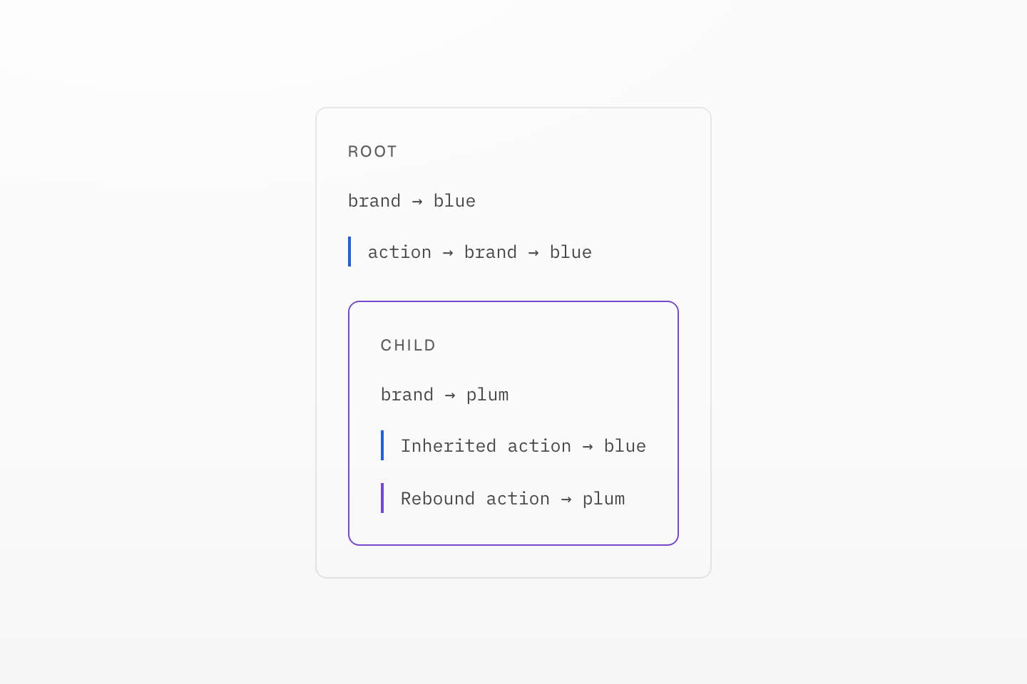
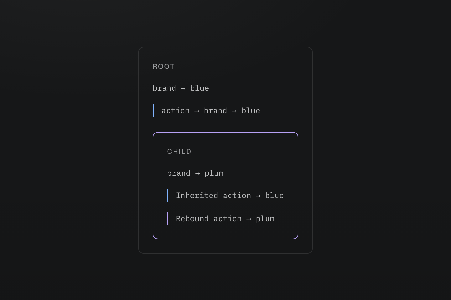
파란색과 보라색 표시는 두 값 경로를 구분합니다. 추가 테마 전환이 아닌 범위 다이어그램입니다.
텍스트 설명
루트에서 action 별칭을 파란색으로 해석합니다. 자식이 brand를 자두색으로 바꾸어도 해당 자식에서 별칭을 재선언하기 전까지 상속된 별칭은 파란색으로 남습니다.
라이트 및 다크 모드를 따르는 색상에는 토큰 값으로 light-dark()를 사용하고 --color-surface-card처럼 모드와 무관한 이름을 유지하세요. 모드 활성화는 색상을 참고하세요.
#토큰 전달과 값 치환 선택하기
두 수정자는 서로 다른 질문에 답합니다:
| 요구 사항 | 선택 | 결과 |
|---|---|---|
| 프로젝트에서 사용할 때 값 출력 | 일반 @theme | 필요할 때 선언하며 클래스는 토큰 참조를 유지합니다. |
| 사용 측이 발견되지 않아도 값 유지 | @theme static | 외부 통합 등에서 토큰 선언을 계속 사용할 수 있습니다. |
| 스타일이 적용된 각 요소에서 참조 변수 해석 | @theme inline | 생성 선언에서 토큰 값을 한 번 치환합니다. |
정적 탐색이 볼 수 없는 통합에서 읽는 값에는 static을 사용하세요:
@theme static { --color-integration-brand: #4f46e5; }클래스를 사용하는 요소에서 해석해야 하는 네이티브 변수를 연결하려면 inline을 사용하세요:
@theme inline { --color-brand: var(--app-brand); }:root { --app-brand: #4f46e5; }[data-theme="ocean"] { --app-brand: #0369a1; }<section data-theme="ocean"> <div class="bg-brand">Ocean background</div></section>여기서 bg-brand는 background-color: var(--app-brand)를 출력하므로 내부 요소는 section에서 상속된 ocean 값을 읽습니다. 치환은 중간 --color-brand 참조를 제거하며 모든 요소에 고정 색상을 복사하는 것은 아닙니다.
두 동작이 모두 필요하다면 @theme static inline으로 수정자를 조합하세요. 인라인 치환은 클래스와 @apply에 적용되며 직접 작성한 네이티브 CSS는 기존 참조를 유지합니다. 테마 계약을 참고하세요.
유지와 치환을 독립적으로 선택
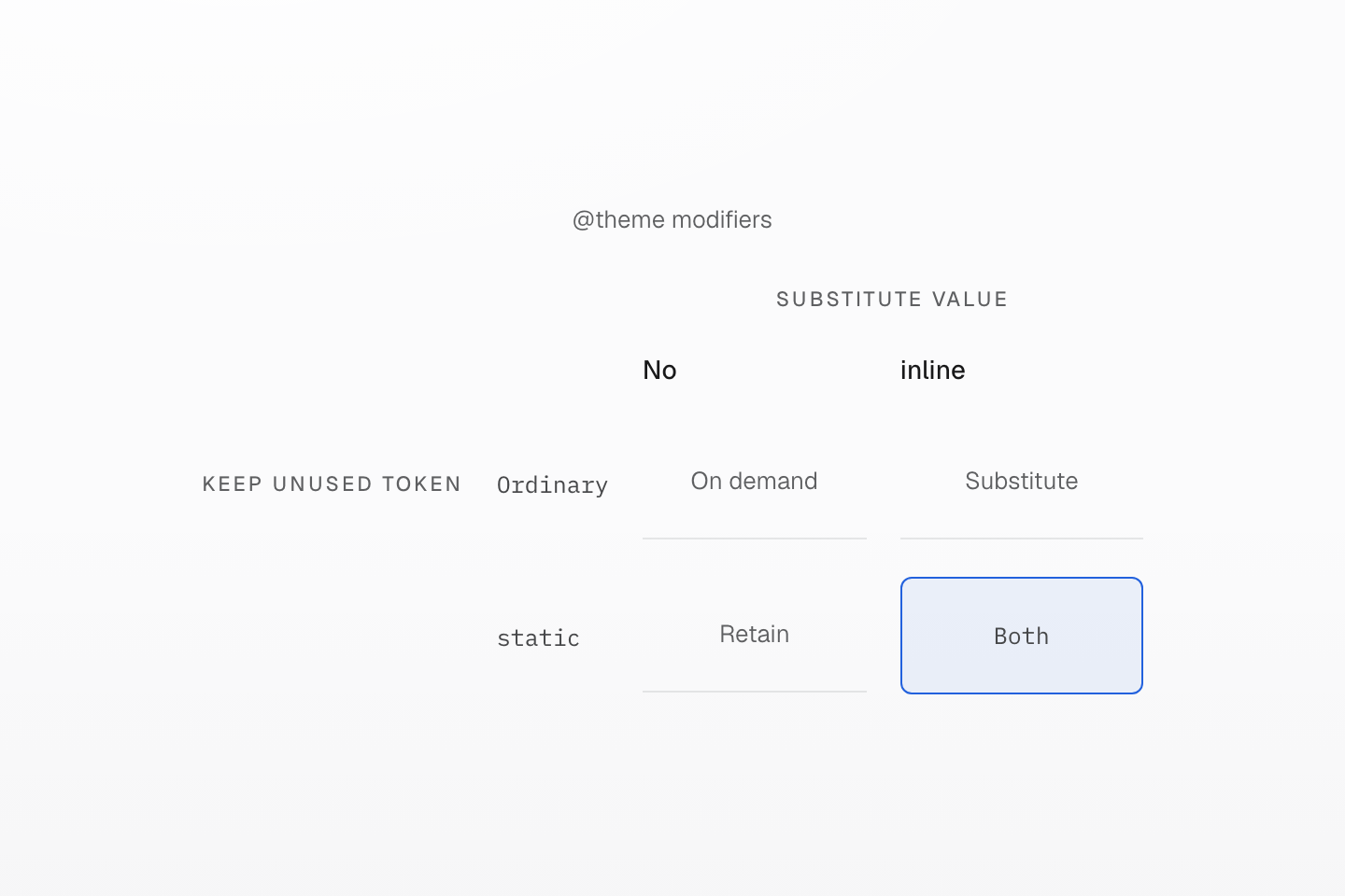
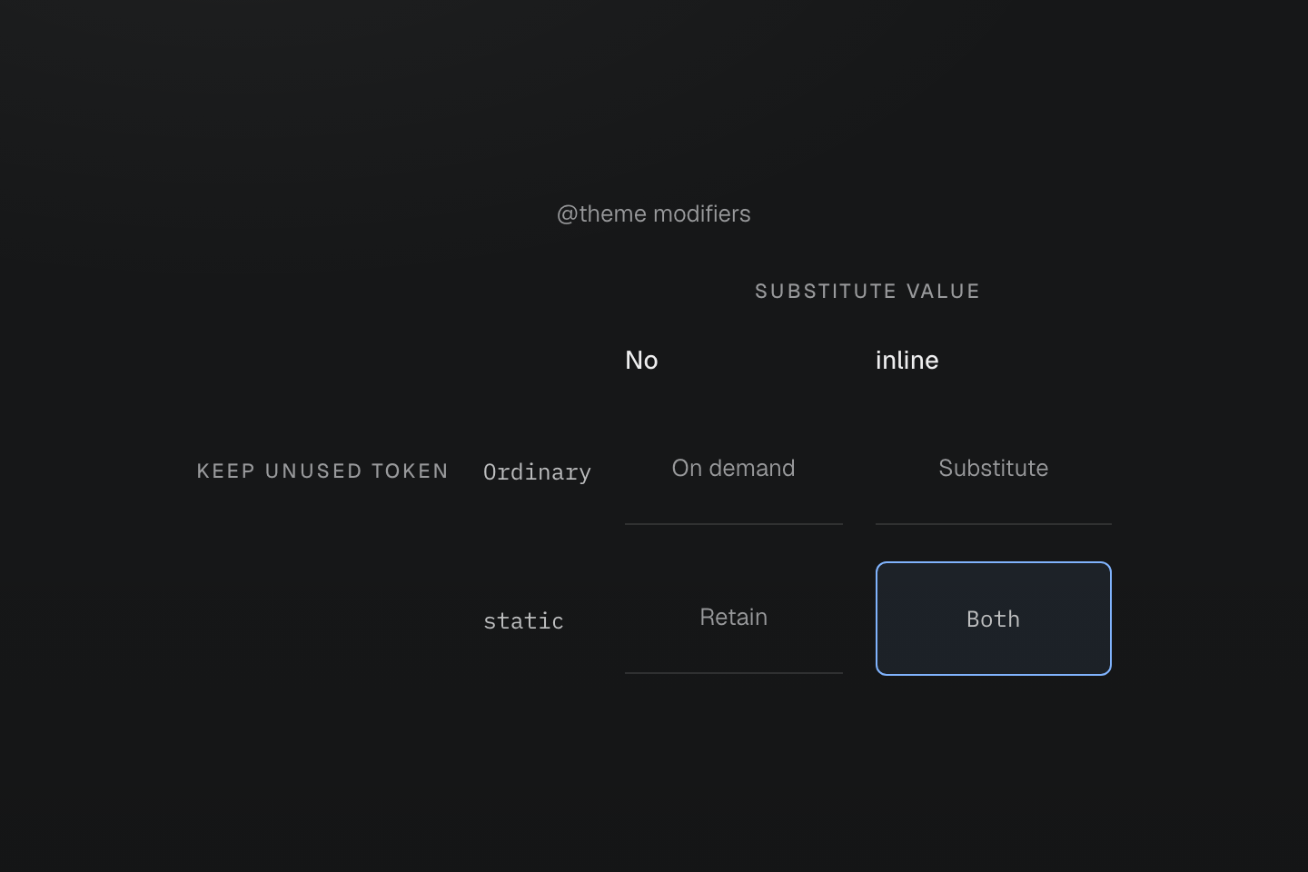
static은 유지를, inline은 치환을 제어합니다. 하나를 사용한다고 다른 하나도 적용되는 것은 아닙니다.
텍스트 설명
서로 직교하는 두 축이 사용 측 없이 토큰을 유지하는 것과 값을 생성 선언에 치환하는 것을 나눕니다.
#모션 토큰 정의하기
--animate-* 토큰은 완전한 animation 단축 속성이므로 키프레임 이름, 지속 시간, 이징 토큰을 조합할 수 있습니다. 키프레임은 그 옆에 네이티브 CSS로 작성하세요:
실제 동작에 따라 실행되는 모션
@theme { --duration-enter: 180ms; --easing-emphasized: cubic-bezier(.16, 1, .3, 1); --animate-dialog-in: dialog-in var(--duration-enter) var(--easing-emphasized) both;}@keyframes dialog-in { from { translate: 0 0.5rem; opacity: 0; }}<dialog class="animate-dialog-in@motion-safe">…</dialog>이 토큰에는 반복 횟수가 없으므로 진입 애니메이션이 한 번 실행됩니다. 프리셋의 animate-* 토큰은 반복됩니다. 동작 줄이기를 요청하면 @motion-safe가 대화 상자를 정지 상태로 유지합니다. 키프레임은 기본적으로 스타일시트에 남으며, @prune native에서는 참조된 애니메이션 토큰이 자신의 키프레임을 유지합니다. JavaScript만 적용하는 이름에는 @safelist keyframes "dialog-in";을 추가하세요. 모션과 키프레임 계약을 참고하세요.