层叠层
使用工具类覆盖共用组件,排查规则冲突、未分层 CSS 与重要性带来的影响。
本页内容
#概述
局部调整无需提高选择器优先级。将共用组件规则放在 components 层,再由各个实例的工具类覆盖需要改变的属性。
靠后的层决定局部内边距
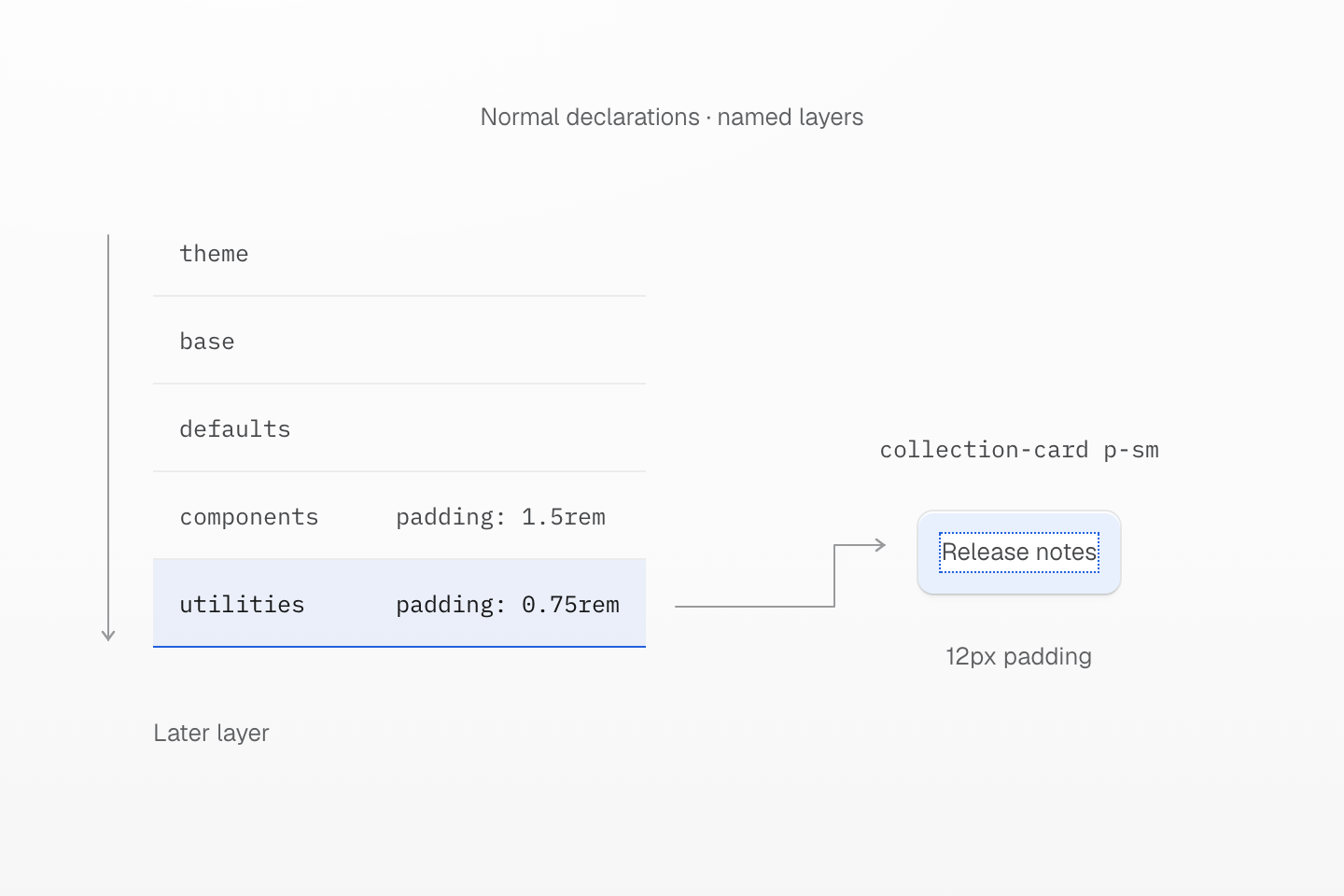
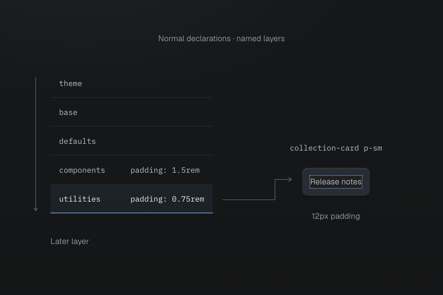
在这些普通声明之间,utilities 的优先级高于 components。HTML 中的 class 顺序不会改变结果。
文字说明
- 建立顺序. 预设依次声明 theme、base、defaults、components、utilities。
- 比较声明. 原生 collection-card 组件提供 1.5rem 内边距。同一元素上的 p-sm 则在靠后的 utilities 层提供 0.75rem 内边距。
- 观察结果. 在这些普通声明之间,工具类会生效。根字号为 16px 时,计算后的内边距为 12px。
#局部覆盖组件样式
CSS 层叠层会先确定各组声明的顺序,再比较选择器优先级。将可复用的组件样式放在 components 层;当某个实例需要不同的值时,再添加工具类:
共用组件,局部调整
@layer components { .collection-card { padding: 1.5rem; border: 1px solid var(--color-line-divider); border-radius: var(--radius-lg); background-color: var(--color-surface-raised); }}<div class="grid-cols(1) gap-lg wrap-anywhere"> <article class="collection-card"> <h2 class="m(0) text-lg font-regular">Release notes</h2> <p class="mt-xs mb(0) text-sm fg-text-muted">Updates for your workspace.</p> </article> <article class="collection-card p-sm"> <h2 class="m(0) text-lg font-regular">Release notes</h2> <p class="mt-xs mb(0) text-sm fg-text-muted">Updates for your workspace.</p> </article></div>生成的 CSS
@layer components { .collection-card { border: 1px solid var(--color-line-divider); border-radius: var(--radius-lg); background-color: var(--color-surface-raised); padding: 1.5rem; }}@layer theme { :root, :host { --color-zinc-40: oklch(68.6% .0028 265); --color-zinc-60: oklch(48.6% .003 265); --color-zinc-90: oklch(24.6% .0022 265) } :root, :host { --color-surface-raised: light-dark(var(--color-white), var(--color-zinc-90)); --color-line-divider: light-dark(oklch(0% 0 none / .12), oklch(100% 0 none / .12)); --color-text-muted: light-dark(var(--color-zinc-60), var(--color-zinc-40)) } :root, :host { --color-white: oklch(100% 0 none) } :root, :host { --font-weight-regular: 400; --font-size-sm: .875rem; --font-size-lg: 1.125rem; --text-sm: var(--font-size-sm); --text-sm--line-height: 1.5; --text-sm--letter-spacing: 0; --text-lg: var(--font-size-lg); --text-lg--line-height: 1.5; --text-lg--letter-spacing: 0; --radius-lg: .5rem; --spacing-xs: .5rem; --spacing-sm: .75rem; --spacing-lg: 1.5rem }}@layer utilities { .text-lg { font-size: var(--text-lg); line-height: var(--text-lg--line-height, normal); letter-spacing: var(--text-lg--letter-spacing, normal) } .text-sm { font-size: var(--text-sm); line-height: var(--text-sm--line-height, normal); letter-spacing: var(--text-sm--letter-spacing, normal) } .grid-cols\(1\) { display: grid; grid-template-columns: repeat(1, minmax(0, 1fr)) } .fg-text-muted { color: var(--color-text-muted) } .font-regular { font-weight: var(--font-weight-regular) } .gap-lg { gap: var(--spacing-lg) } .m\(0\) { margin: calc(0 * 1px) } .mt-xs { margin-top: var(--spacing-xs) } .mb\(0\) { margin-bottom: calc(0 * 1px) } .wrap-anywhere { overflow-wrap: anywhere } .p-sm { padding: var(--spacing-sm) }}预设为普通声明建立以下顺序:
@layer theme, base, defaults, components, utilities;p-sm 工具类的优先级高于组件的内边距声明,与这个 class 在 HTML 属性中的位置无关。层叠规则说明了这一顺序及其适用范围。
这个工具类只改变内边距,不会替换组件或移除其他声明。因此,小幅的局部调整不需要新增组件变体,也不需要使用 !important。
#将原生规则放在正确的层中
不属于任何层的普通规则,优先级高于命名层中的普通规则。如果工具类已经编译却没有效果,请检查是否存在未分层的组件规则:
/* This normal rule wins over a layered padding utility. */.collection-card { padding: 1.5rem;}如果这个共用规则应当允许工具类覆盖,就将它移到 @layer components 中。不要仅仅为了弥补非预期的分层方式而添加 !important。
未分层规则的优先级高于层内的普通规则
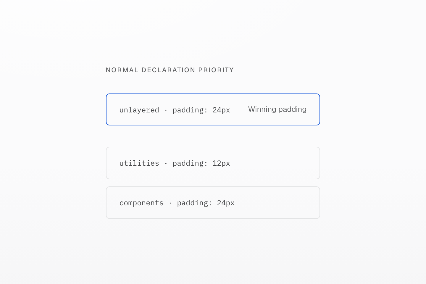
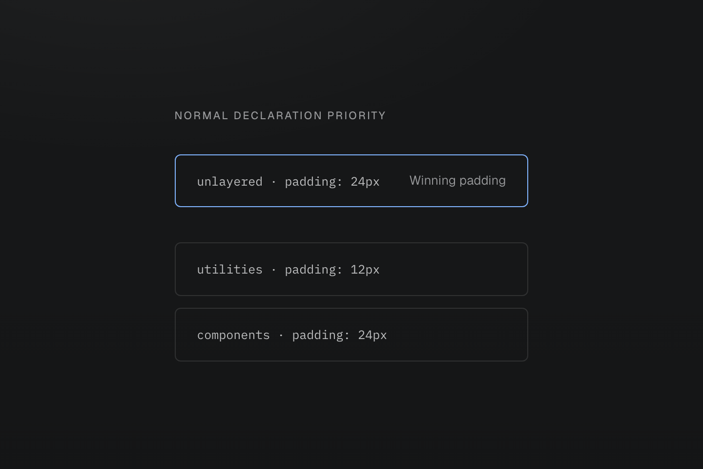
这里比较的是作者样式中的普通声明。重要声明采用不同的层优先级。
文字说明
图中先将 components 排在 utilities 之前,再将未分层规则单独放在两者上方。最终生效的内边距来自该未分层规则。
分层不会取代层叠的其他规则。重要性会先于普通层的优先级进行比较,而 !important 会反转层与层之间的顺序。行内声明、动画与过渡也各有其优先级。这些规则请参阅 CSS 层叠规范;预设的层顺序则见 Master CSS 分层规则。
#排查相互竞争的声明
- 在浏览器开发者工具中选中元素,在计算样式中找到该属性,再追查最终生效的声明。
- 确认两个规则都选中该元素,而且各自的条件均成立。
- 检查每个声明所属的层,也要留意层外的原生 CSS。
- 添加局部覆盖之前,先将广泛适用的默认样式放回原本规划的层。
- 如果仅凭层顺序仍无法解释结果,就继续检查重要性与原生层叠规则。
通过正常的 Master CSS 入口加载基础样式表。生成的规则会包含所属的 layer 块,但不会自行添加基础层顺序声明。
将 collection-card p-sm 对调为 p-sm collection-card 无法解决问题:HTML 中的 class 顺序不会控制层叠结果。如果同一条件下的两个工具类相互重叠,可用代码检查找出冲突,再决定要保留哪个声明。